Logo Maker Wix vs. Canva vs. Mojomox
Updated: Sep 14, 2022
What’s the best online logo maker? A review.
In this article, we’ll go over what modern logos are, how to brainstorm modern logo design ideas, how to design a logo using one of the popular logo makers, such as the Canva and Wix logo maker, pricing for these online apps, and how to tie everything together into cohesive branding—the baseline for building a successful business.
A brief intro into brand design
A logo is often considered the most important visual, outward-facing element of a brand’s identity.
Now what is “brand identity”? Brand identity is the picture that a customer has in mind when thinking of the brand: What does it sound like? What does it look like? What does it make me feel like? If a brand were a person, what things come to mind first? Does the person have red hair or does she always wear the color black? Does she talk fast? Is he friendly or is he loud?
Shapes, colors, and tone of voice are all identifiers that make a person or a brand unique. There’s limited space in people’s minds—memories distilled into their most unique elements.
As a marketer or brand designer, you create what those unique distinctions are that will be on your customer’s mind when thinking of you. A logo is one of those brand elements that allow you to embody one or two of those traits. Is it sustainable, quirky, hyper-professional?
What is good logo design?
Finding your brand traits can be a challenging exercise. But it’s like mise-en-place in cooking: Once you’ve washed, chopped and prepared everything in small bowls, it’s simple—you just follow the recipe. But what is the recipe for a modern logo?
“Keep it simple. Make it smart,” is a great principle to follow by famous graphic designer Paula Scher.
6 things to know before using a logo maker
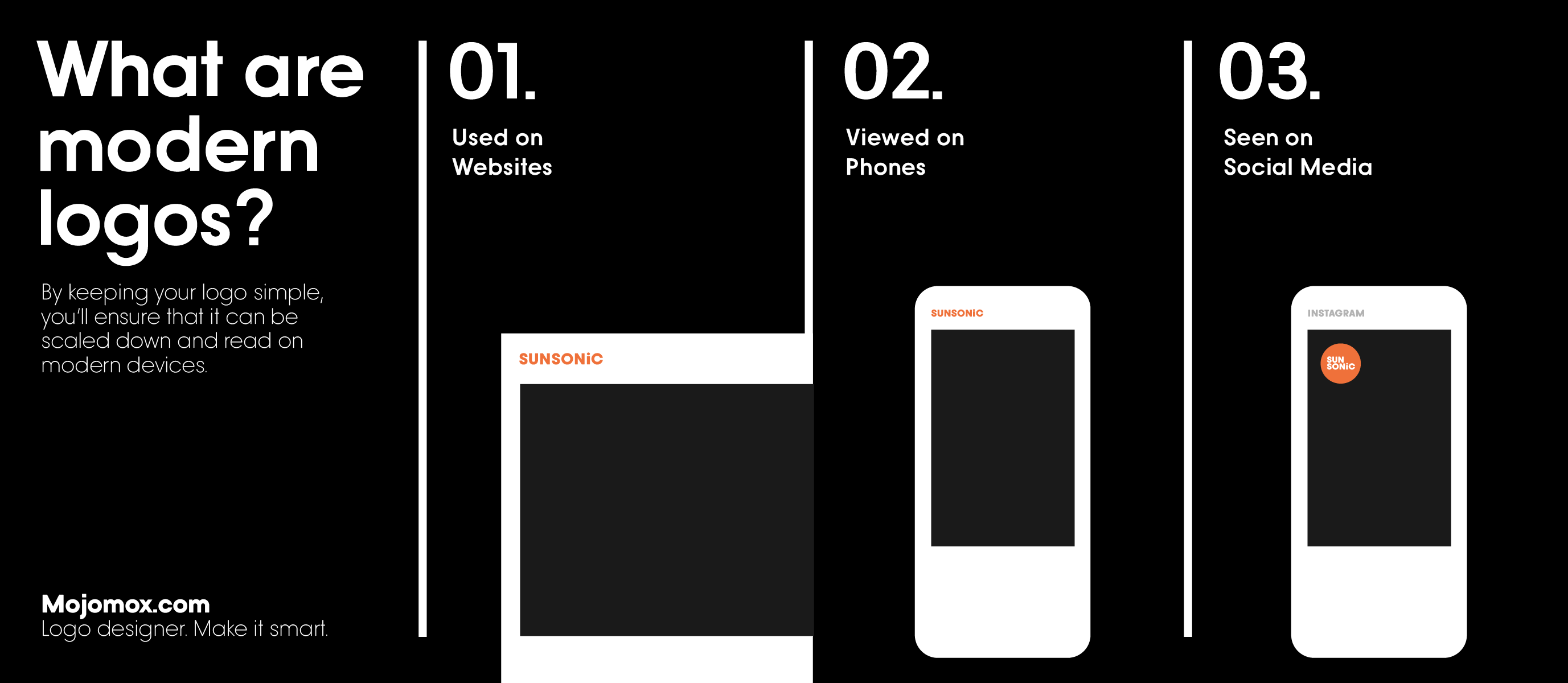
1. Modern logos are used on websites. These logos most often sit in the top left corner and get hardly more space than half of your thumb size which means they need to work small.
2. Modern logos are seen on phones even more than on websites. In 2019, Google enabled “mobile first” indexing as a default for a reason: more people view websites on their phone than on a desktop computer or on a tablet. And this means that a logo will be looked at in even smaller sizes.
3. Modern logos are used on social media: LinkedIn, Facebook, Instagram, TikTok and co. You’ll need a logo version that fits in a square or in a circle. That space may be even smaller than your website corner, especially when viewed on a phone.
4. Serif versus sans-serif typefaces? Serif type (fonts with feet) is always a bit more sophisticated, elevated, and can feel more mature. Sans-serif type (fonts with no feet), however, is more approachable, simple and can feel younger and stronger. Both styles can feel classy, but sans-serifs are often more versatile in the long run. Serif designs will need more care and design attention because of the details that can get lost more easily when viewed in small.
5. Wordmarks or logo symbols? Symbols or icons have one big advantage—they can literally become iconic more easily. But wordmarks are a modern way of designing logos. The idea is to find something iconic in the wordmark that acts similarly to a symbol: typefaces with eccentric extras or letters that look special and stand out.
6. The best logos work in black and white too. Print your logo on a pen or do a cool die cut sticker? Logos that use shades of a color will have a harder time getting transferred into many marketing materials. Multiple colors? The more colors a logo has the more expensive certain print materials will be. And for some materials, like a logo on a pen, only one color can be printed.
What are the differences between logo makers?
Good logos have meaning. We’ve touched a little on brand strategy in the first paragraph but the reason why it’s so hard to make good logos with online logo makers is that there’s no story as to why a logo should look one way or the other. Is the type thin, is it thick? Is it spaced out or set tightly? Is it uppercase or lowercase or neither? Is there a symbol in addition to the wordmark? What shape does the symbol have? Is it a rectangle, a circle or a triangle? Is it abstract or an illustration? Where is the symbol positioned—above, on the left or in the middle of the wordmark?
The more elements, the more logo versions you’ll need to create for different purposes. If you’re designing a logo, you’ll need to think through all of these different options and decide what each option means to you and the viewer. Online logo makers won’t take the work out of your hands but some make it easier than others.
Different logo makers, different processes. And sometimes not so much. Most online logo makers, such as Wix and Canva, use a library of logo symbols (from realistic icons to abstract shapes) and open source or free fonts. Mojomox has fewer fonts and fewer logo symbols but they are unique to the platform and can be customized by the user.
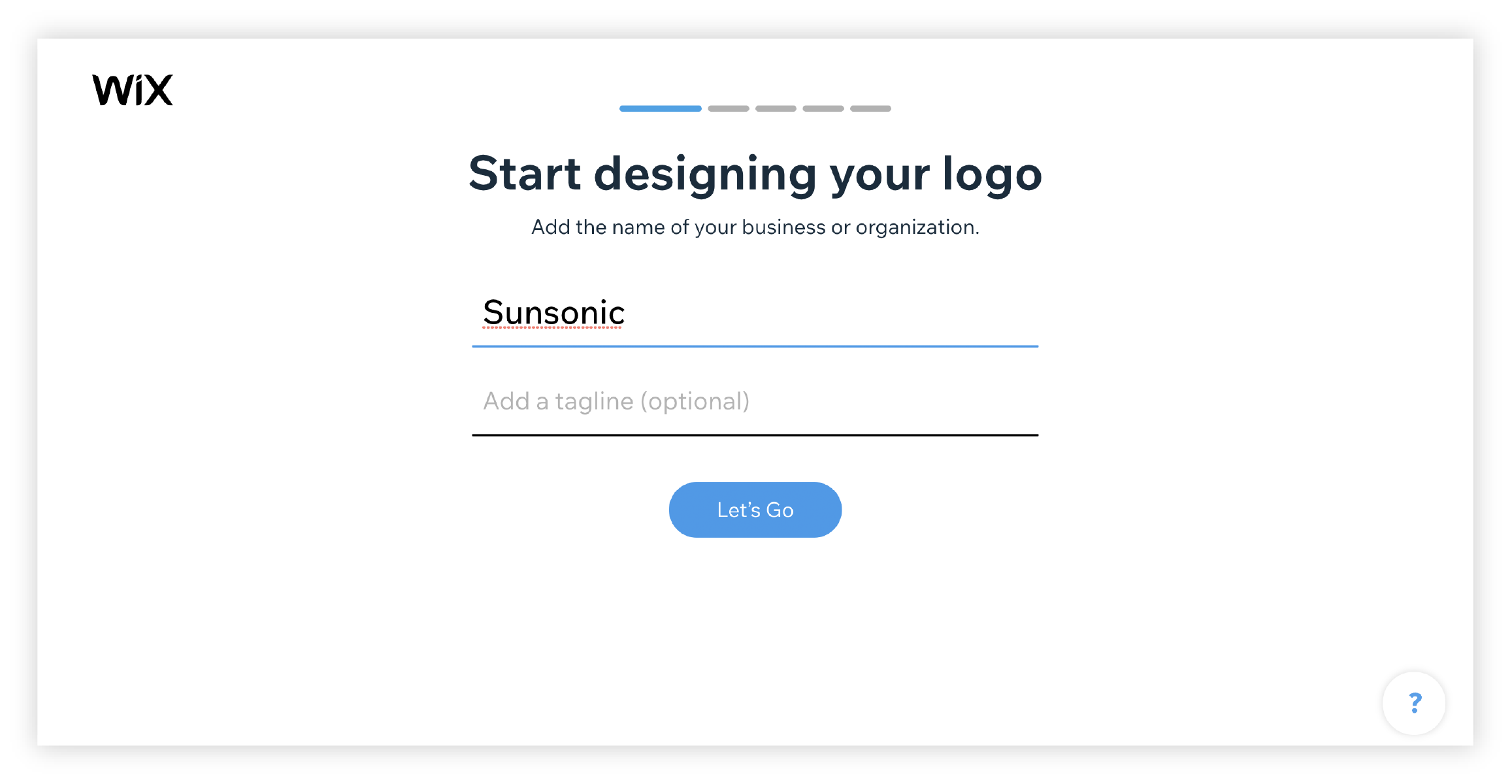
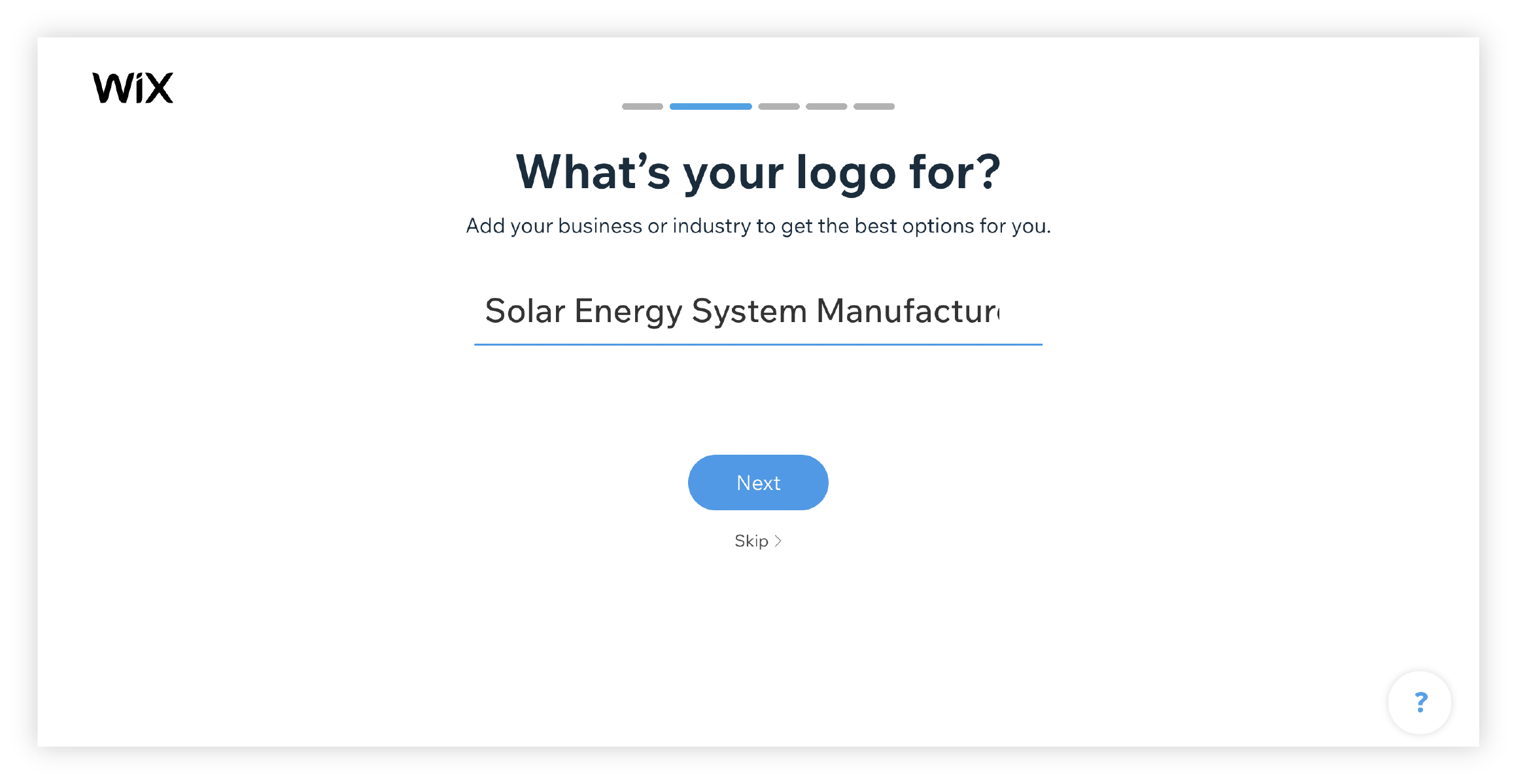
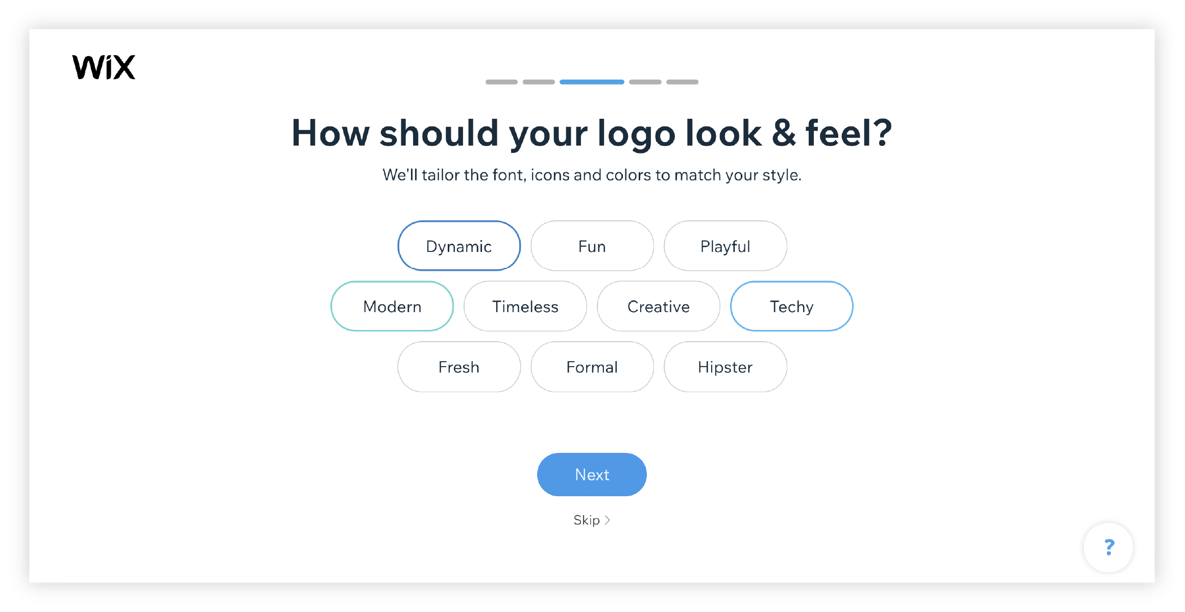
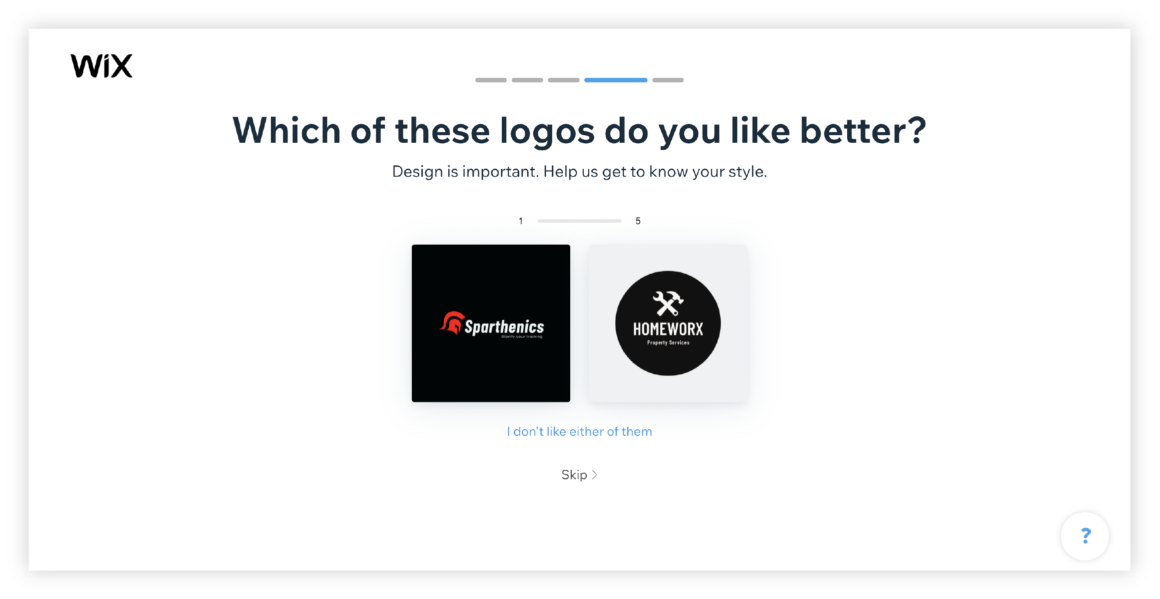
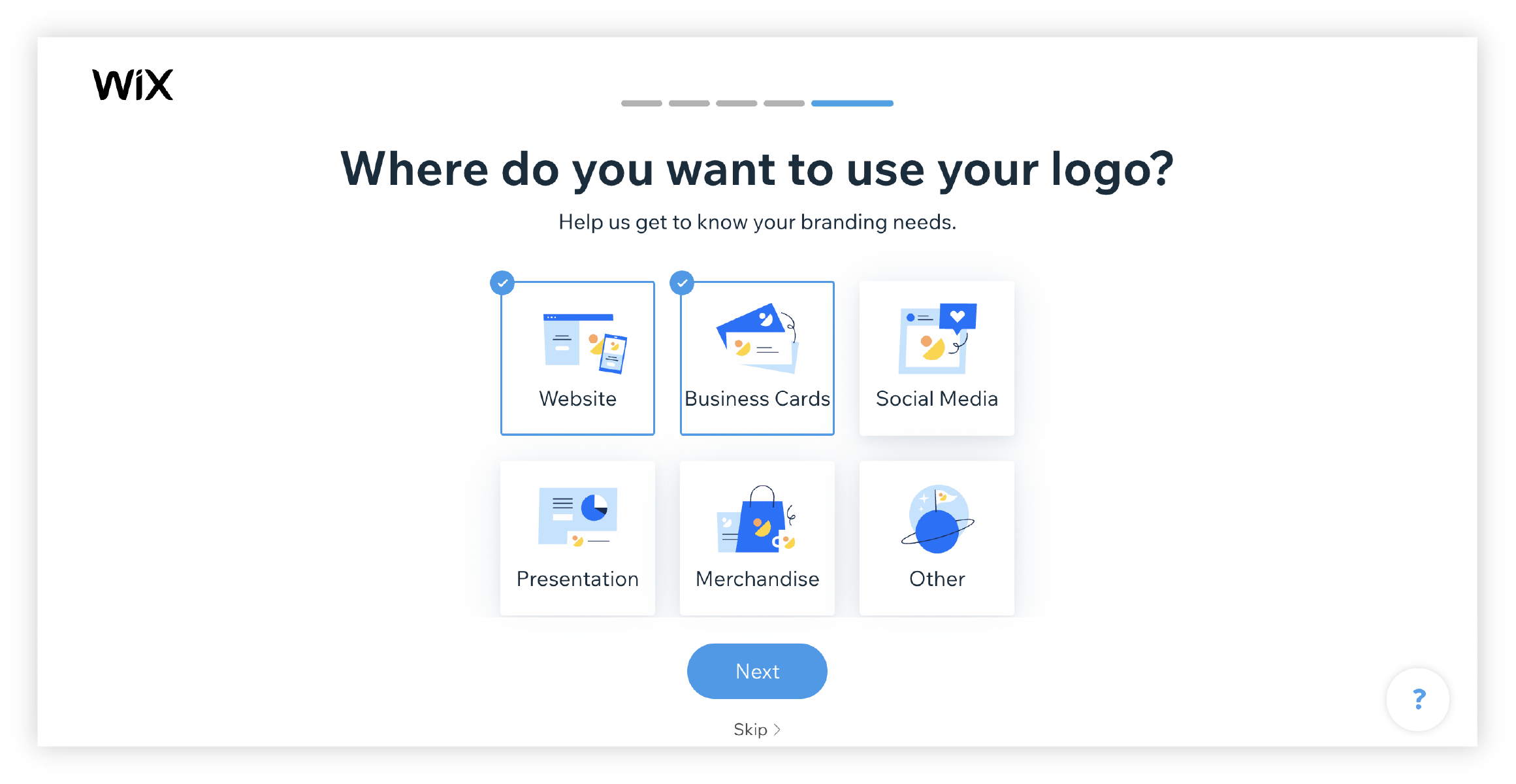
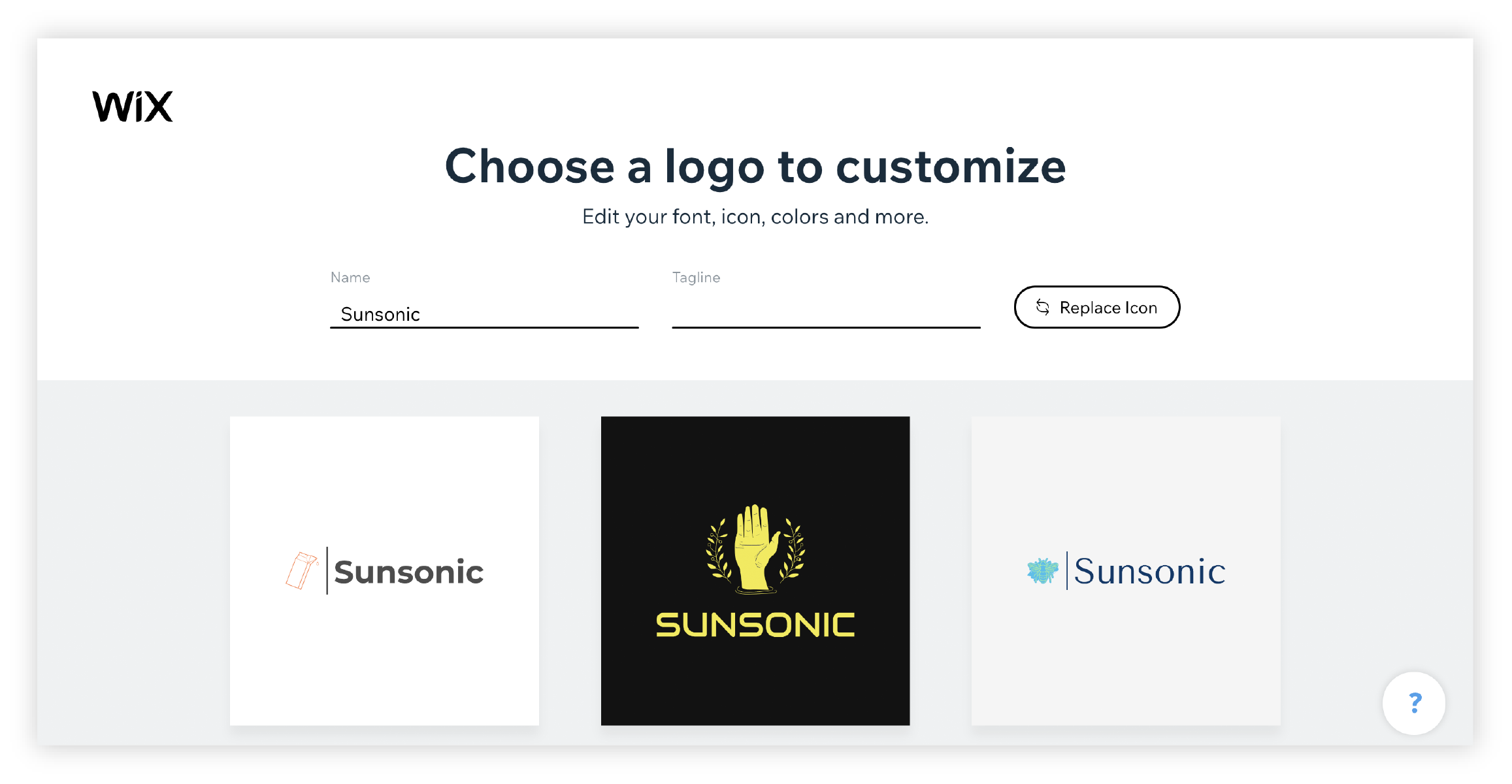
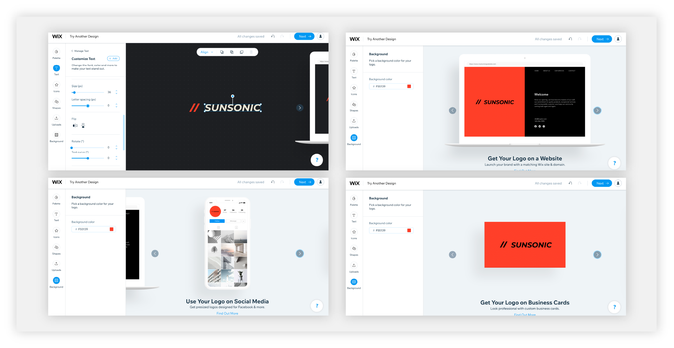
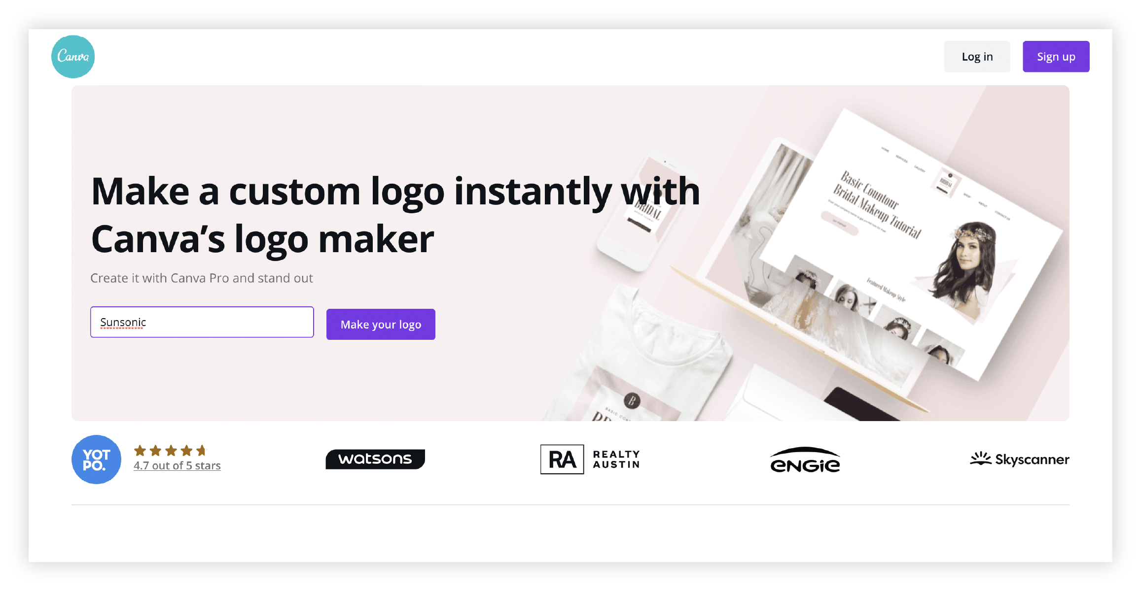
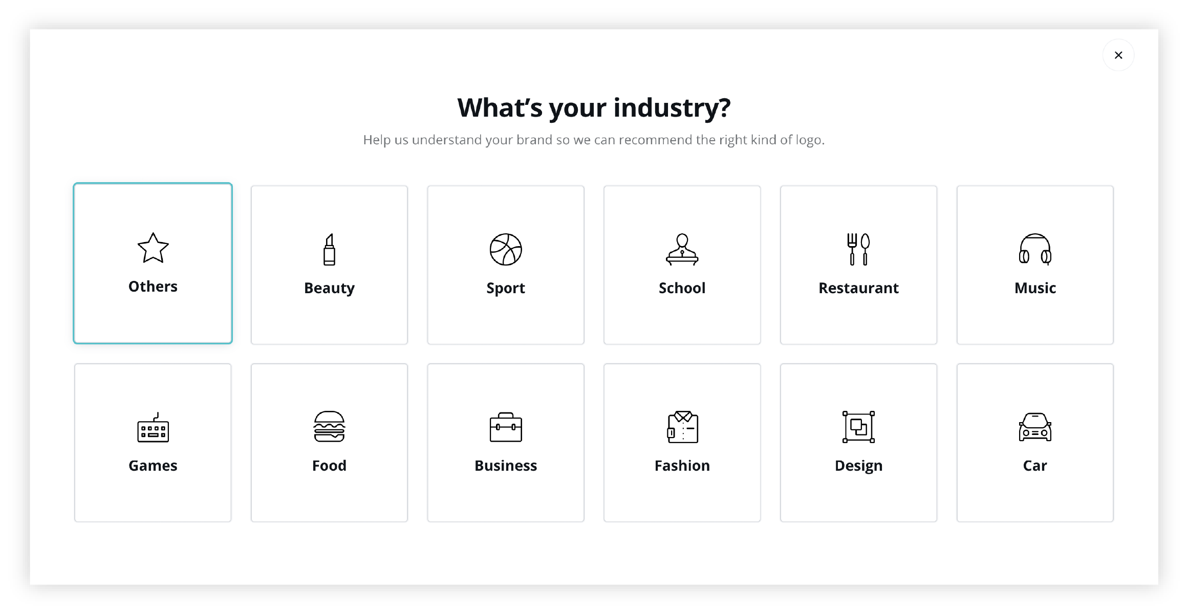
Step one for all logo makers is to enter your brand name. For Wix and Canva, in step two you’ll set your industry, step three will let you pick a few references of styles that you like and step four will give you options for customization, like colors, free fonts and icons that are available on the internet. For Mojomox, steps two and three are combined in order to save one step: instead of selecting an industry and picking references, you’ll immediately see your brand in designed preview options. You’ll select your favorite one as the baseline for customization.
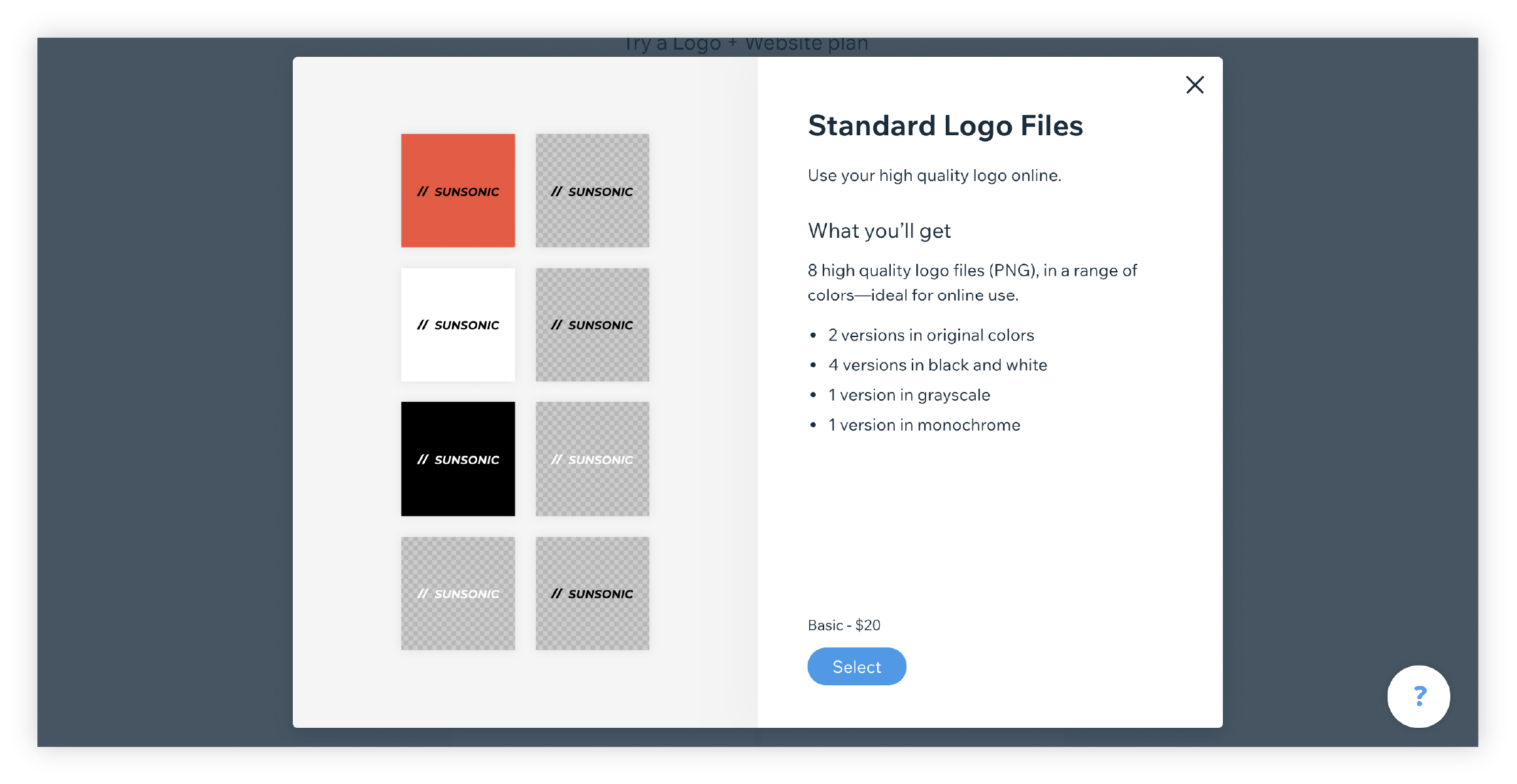
For all three logo makers, in the last step, you’re able to download your logo file. Below is a walkthrough of all three online logo makers, Wix, Canva, and Mojomox:
The Wix Logo Maker
The Canva Logo Maker
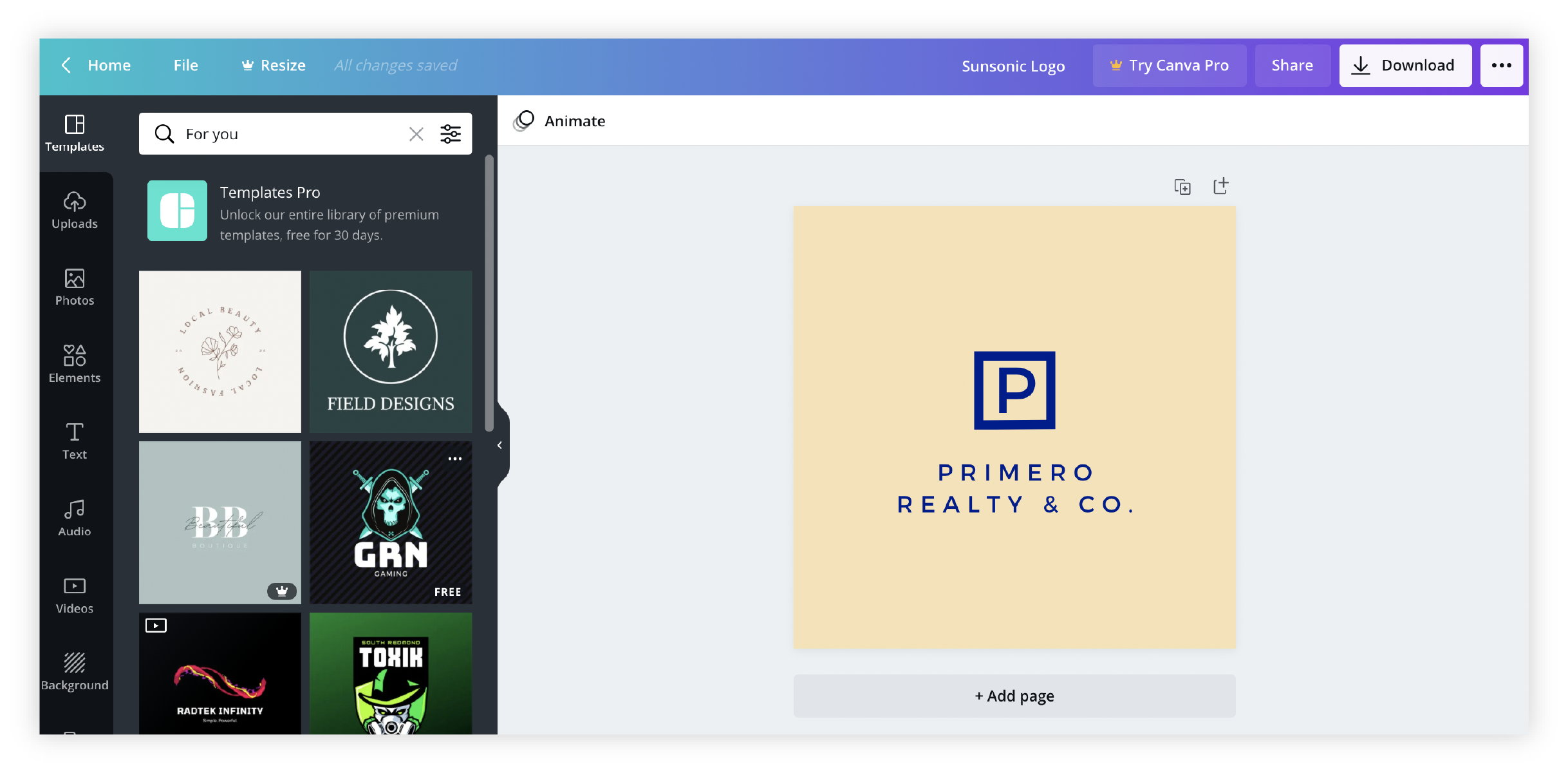
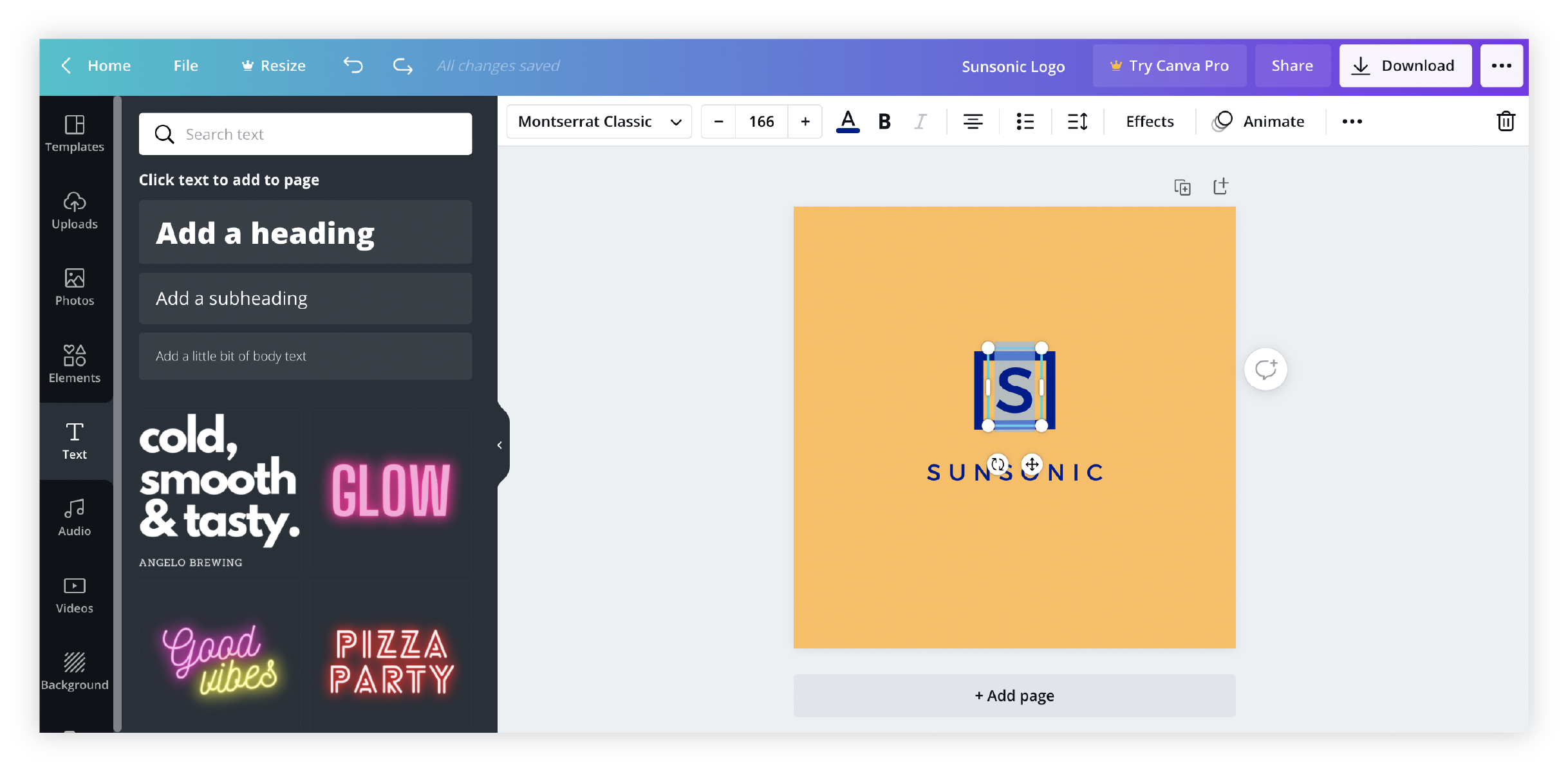
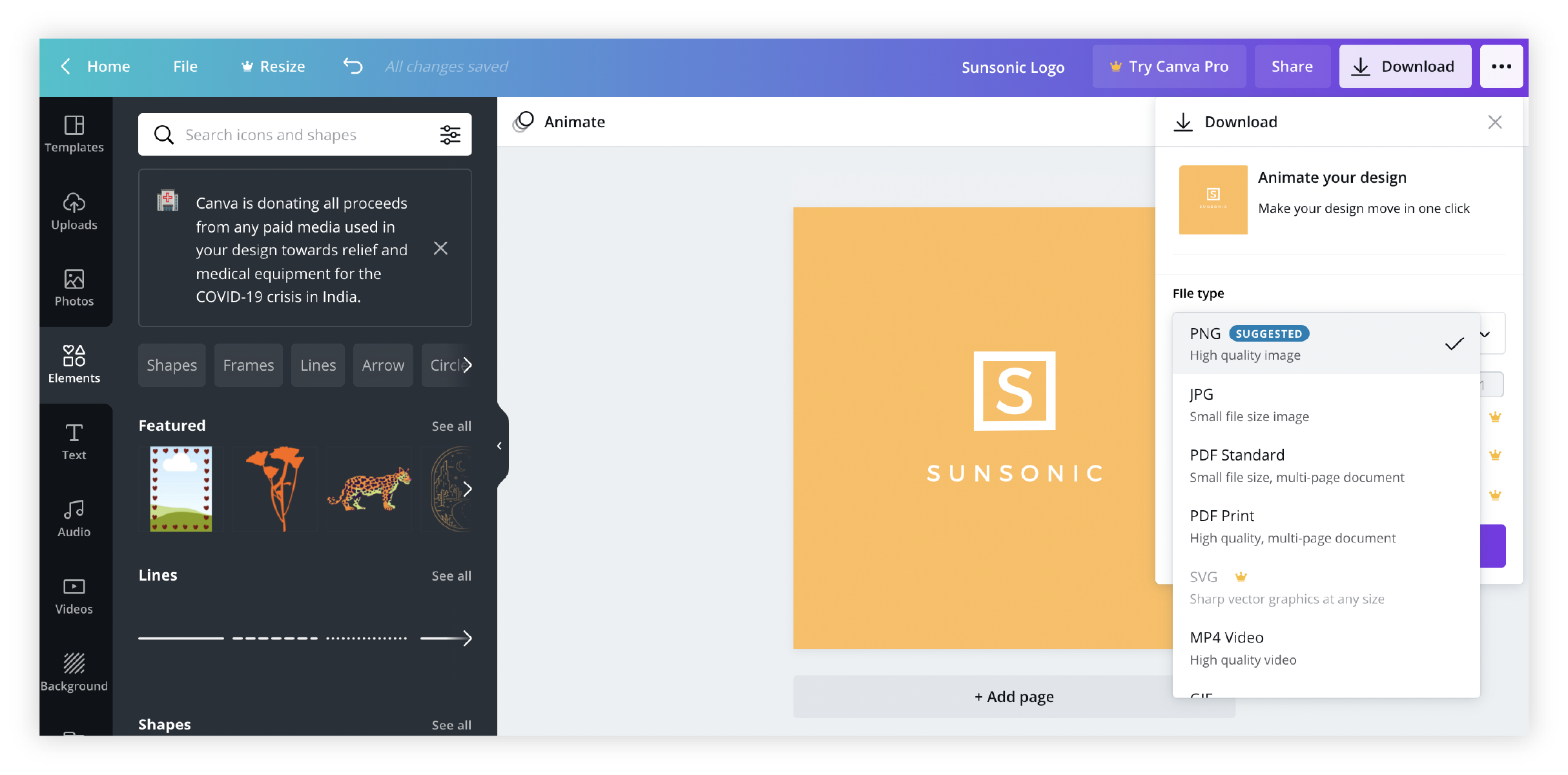
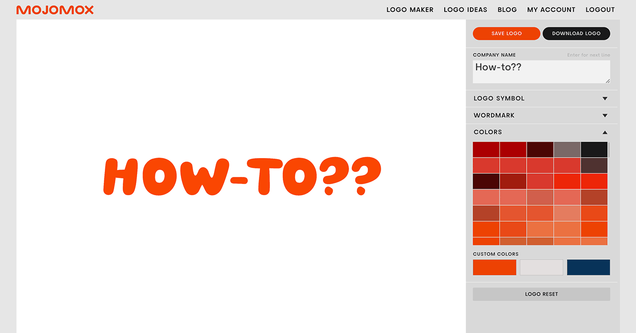
The Mojomox Logo Maker
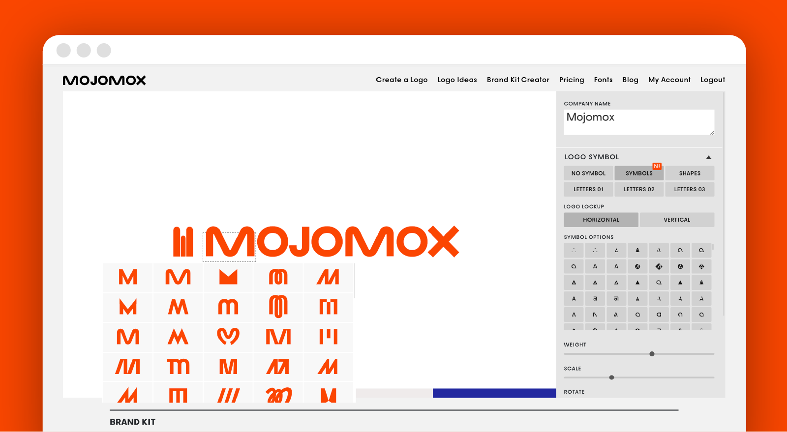
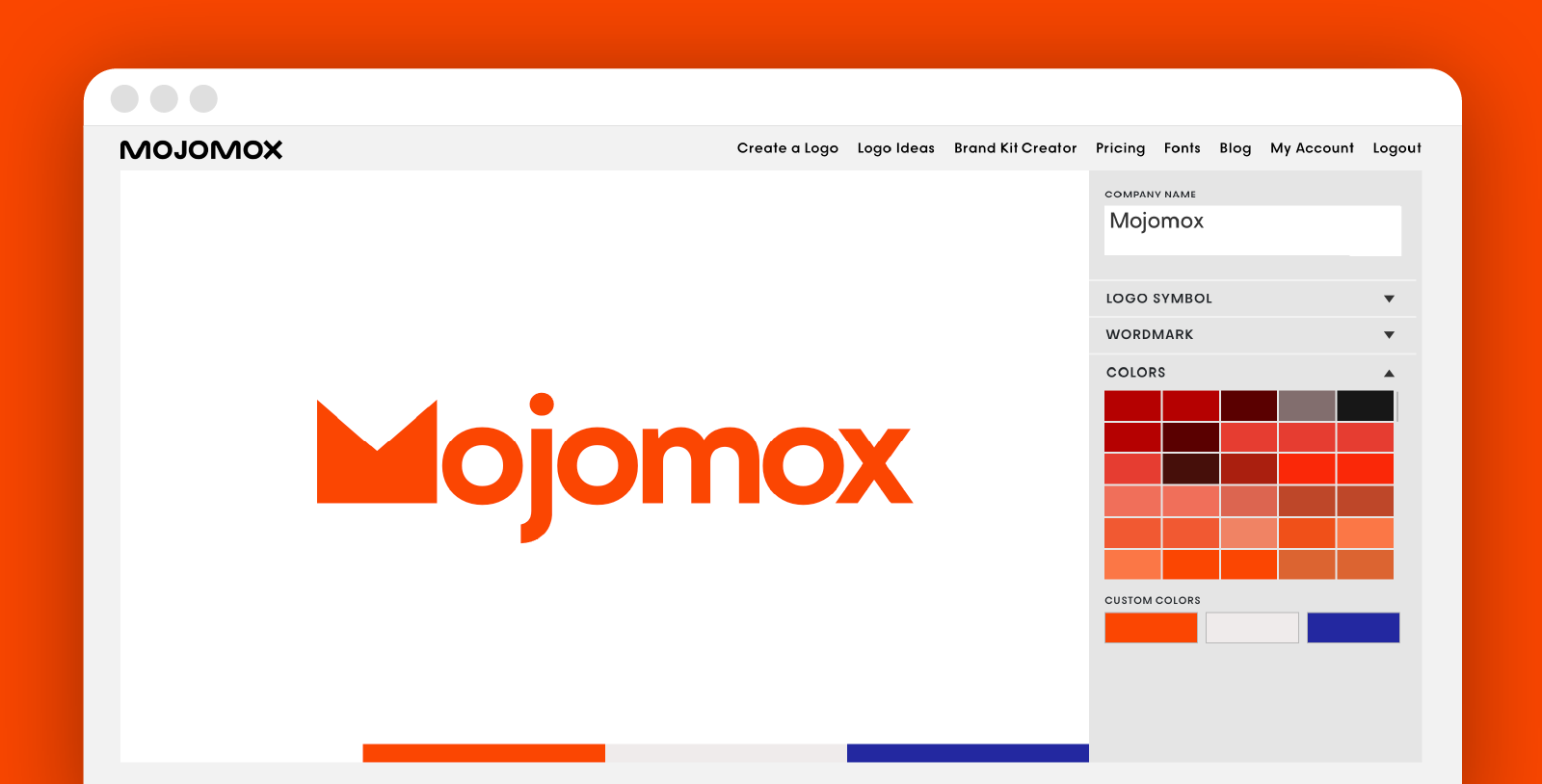
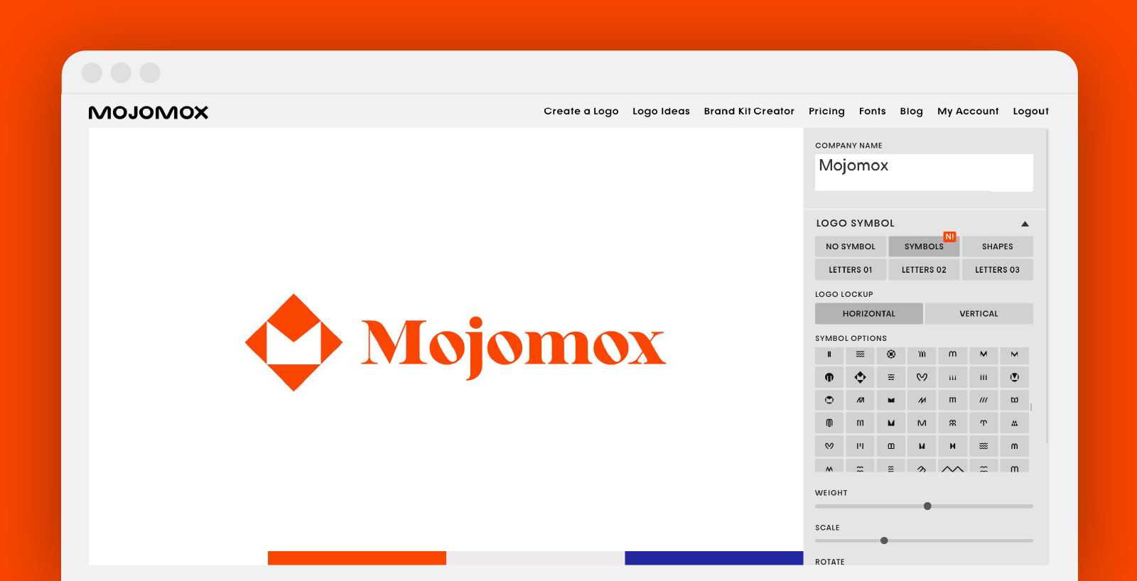
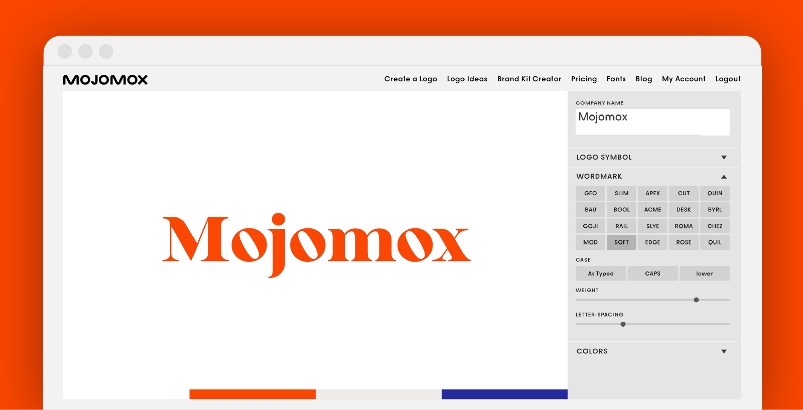
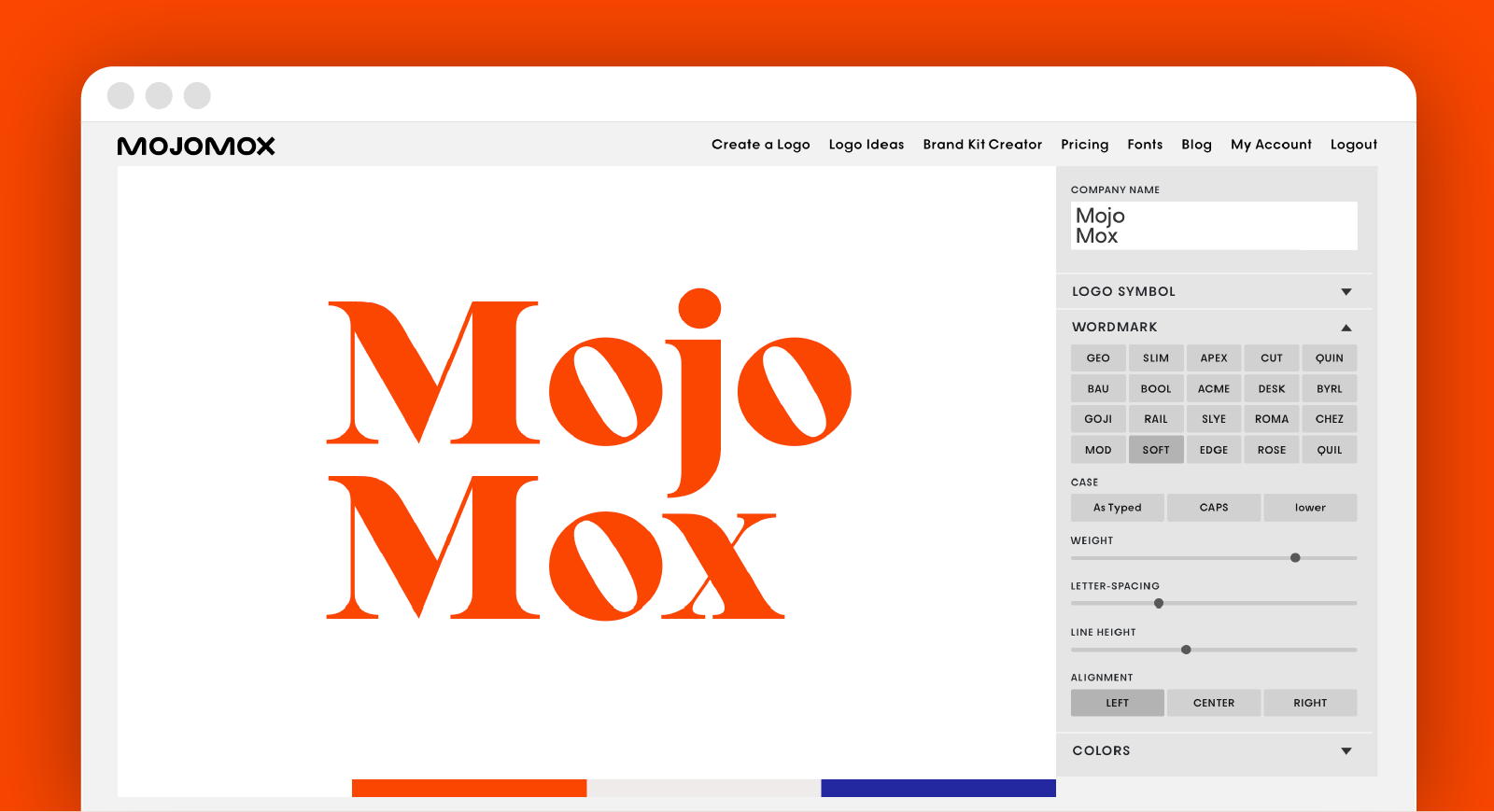
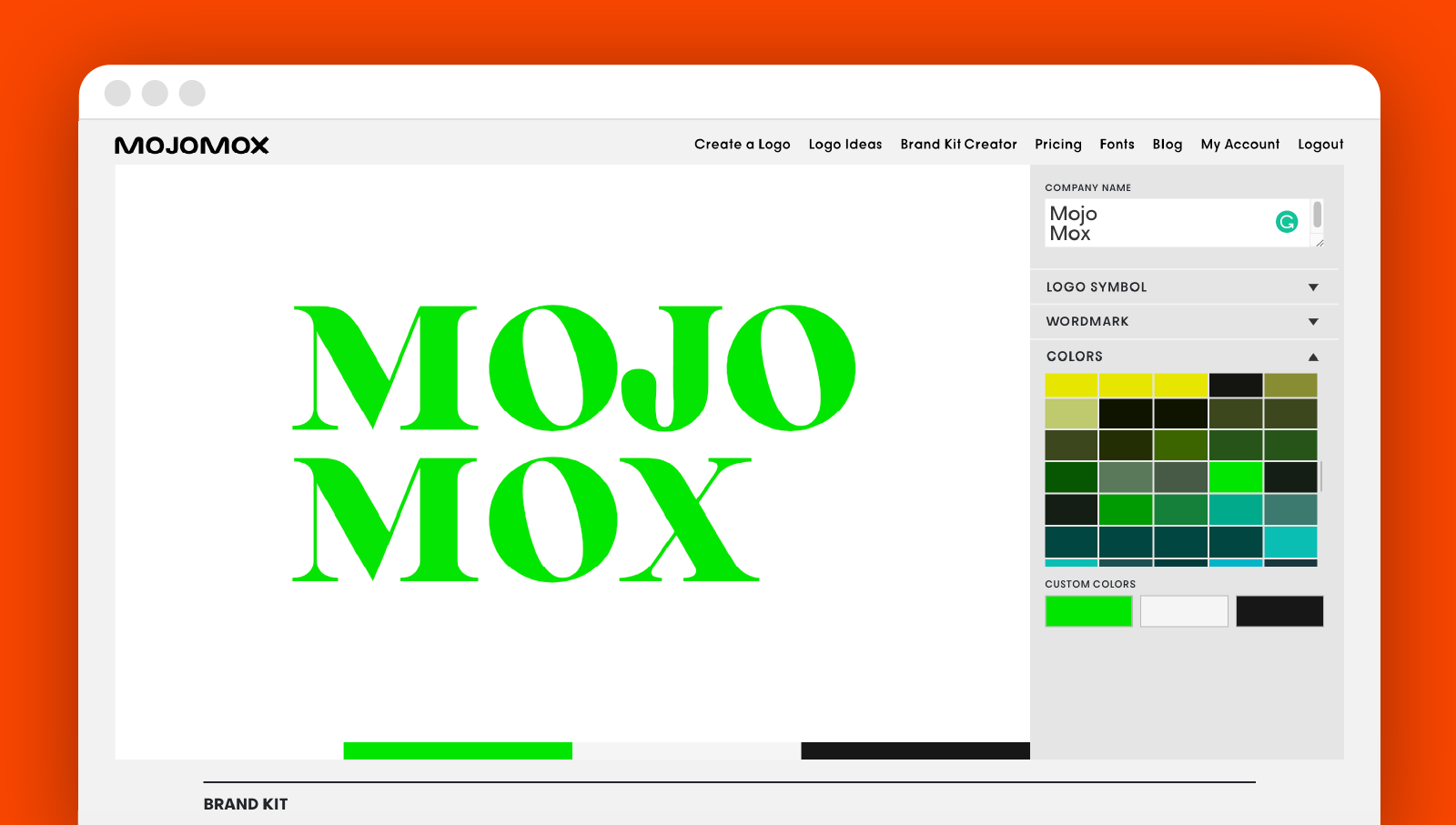
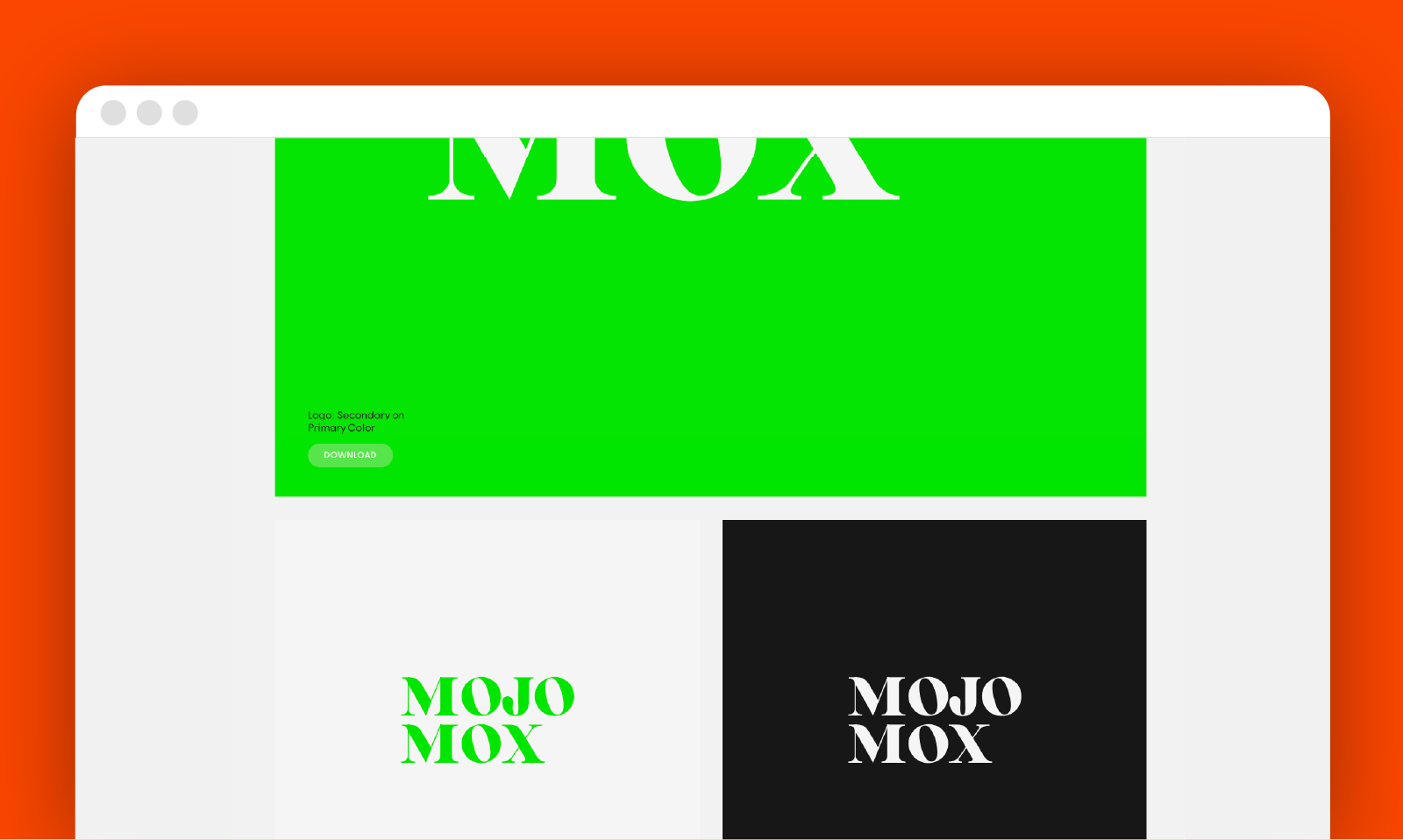
To get started with the Mojomox logo maker, type your brand name into the field below:
In a nutshell: The Wix, Canva, and Mojomox Logo Maker Comparison
Both Wix and Canva include logo symbols into their logo creation process. For that reason, it’s necessary that you pick your industry before getting into the customization editor. If you have a good idea of what your logo design should look like, Wix gives you many editing settings to get to the result you were aiming for. During our testing, we noticed that some designs can require a good amount of fiddling around. Canva, by contrast, puts its focus on using one of the logo templates and making more basic edits, e.g. colors and font style, within those templates.
Mojomox believes in the strength of modern wordmarks but also offers geometric logo symbols. The result will be a more modern logo.
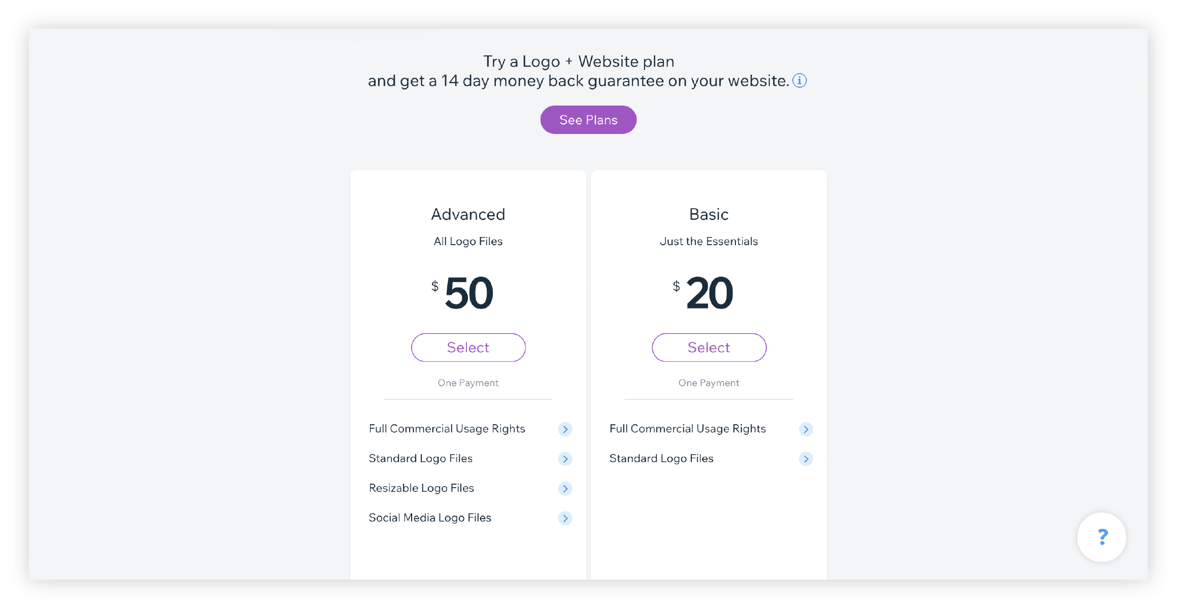
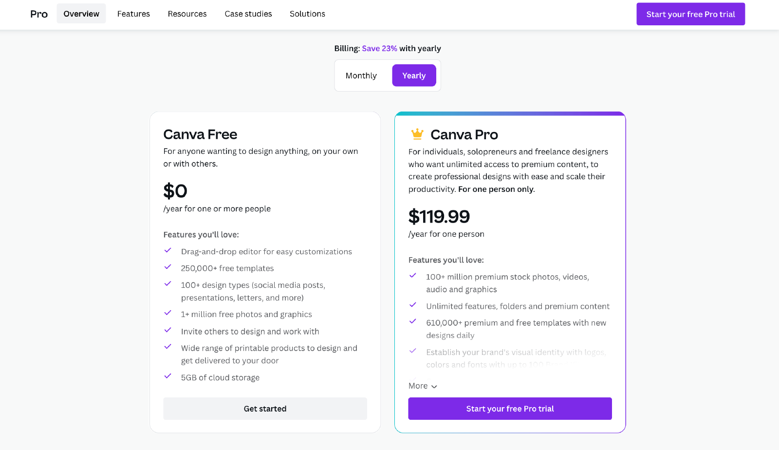
In regards to pricing, Canva offers a basic logo file (with background color) for free. More logo formats come with an annual subscription for $119.99 that includes other marketing templates. Wix has two logo packages, one basic one with standard image files for $49 and an advanced package for $99. With Mojomox, you can create up to 20 logo & brand kits for $10/month. These can be used for multiple versions of your logo or for different brands. Old logos and brand kits can be deleted and reused.
If you have questions—I’m here to help! Send me a note at saskia@mojomox.com.

