Logo maker
Article
Logo for Barber Shop: Ideas, Fonts, Modern Logo Maker

by Saskia Ketz, Branding Designer
Jan 31, 2023
In this article, we’ll look at existing logos for barber shops, learn how to create a modern logo with a logo maker and why it’s often not a good idea to include a barber’s pole in your logo. We’ll review barber shop logo templates that can be used as a starting point for your own logo design, check out modern logo fonts and see overall designs that work well in 2026.
Whether we’re designing a logo for a barber shop, logos for beauty salons, or a regular e-commerce shop, the design path is a similar process for all industries.
In this logo design tutorial, I’ll share ways to make a logo for a barber shop stand out the right way and show you how to add some basic brand strategy into your logo design from the start.
As part of your visual brand identity, we’ll create a color palette that works well for barber shops. At the end, I’ll show you how branding designers test their logos quickly to make sure they work in all necessary forms of applications.
Start with your logo for barber shop now by typing in your shop’s name below or see a hundred designs based on letters with our new logo ideas tool.
Many barber shop logos are wordmark logos with a distinct design. To create wordmarks (also known as text logos) that are a little more memorable, the focus needs to be put on the details, for example, selecting the right type and spacing the letters properly.
Instead of designing a logo for a “barber shop,” think of your shop’s brand independently from its category. In brand strategy, this is called positioning. Or in simple words, what would you like your customer to think when thinking of you? For example, Bonefade Barbers and Pall Mall Barbers come across as classic with a script and a serif typeface, Hairrari looks cutting-edge and appeals to people under 30, and Black Door’s logo looks generally appraochable with its sans serif, rounded font.
If you’re looking for a list of rounded fonts, take a look at the Mojomox rounded font collection.
When designing a logo for barber shop, figure out the type of typography that represents your brand personality.
Besides making a choice for a specific typeface, other design characteristics support the overall design, for example if a logo is capitalized or not and how it’s spaced (tight or wide letter spacing). Bolder font weights, lowercase spelling, and less letter spacing make a brand feel younger. Serif fonts (fonts with little feet) and wide letter-spacing (also called tracking) add a more elegant feel to a barber shop logo.
Take a quick look at the barber shop logos in the gallery above. Click on one of the templates to get into the logo editor. Although we’ve only selected wordmark logos, the Mojomox logo tool lets you add a logo symbol easily too.
Before starting with your own design, take note of the various logo font styles and details. In example 1, the R adds to the mark’s originality. Example 2’s font style (Bauhaus Slye) stands out while still being minimalistic.
Second, review some of the color palettes shown above. The more personal and modern your brand should appear, the more desaturated and sophisticated your colors can be. For a more corporate look, pick a more approachable palette with friendlier and brighter colors.
It’s a good idea to use colors that are different from your competitors’ colors so that your shop can stand out and be more memorable.
The logo mark and the colors don’t have to stand for the same attribute of your brand. It’s better to have a selection of words that you want to get across in your overall brand design and distribute them across your brand elements, such as a logo, a set of colors, or a tagline.
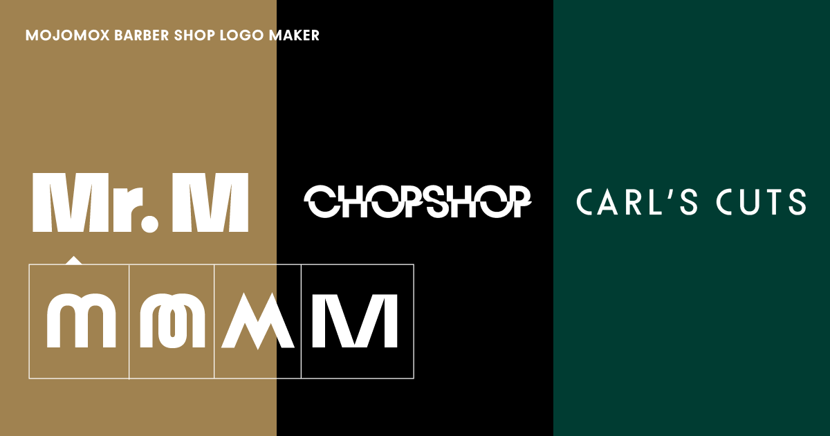
Wordmark logo designs versus logos with a logo symbol generally have a more modern look. Even if you’re using a logo font for your barber shop (logo fonts usually have more character in larger sizes), you’ll add memorability to your logo by making one of the letters stand out—ideally, the first letter so you can use it as an avatar in an app or profile image for your email.
Examples for letters that stand out more are the letter R in logo template 1, the letter M in template 5, and the letter S in template 10.
Type in your name into the barber shop logo maker and design options will start to show right below. Some logo designs have logo symbols and others are simple wordmarks.
If you’re going for a modern brand look, I recommend you start with a wordmark. These types of logos look more minimalistic and show personality rather than having more of a corporate quality.
Then, select one of the designs as a baseline and you’ll get into the Mojomox logo editor.
To give your logo a unique angle, click on one of the letters that are part of your logo. You’ll see alternative options show up right below the letter you clicked. Swap the initial letter by clicking one of the alternative ones. To further modify the logo, play with the sliders for weight and letter spacing in the right sidebar of the app. Always check the brand kit section below the editor to see how the logo looks in different sizes.
Generally speaking, it’s easier for customers to remember a brand when they can assign only one main color to a brand.
But, of course, you’ll need additional colors to complement your brand color palette. Use cases for this are a “Book An Appointment” button on your website that needs to stand out a little more, or colors you’ll paint your shop’s walls with and so on.
Creating a color palette where the colors work well with one another is easy with the Mojomox app: In the right sidebar, go to the “Color” section and start with one of the presets. Then, use the color picker to fine tune them. You can also open up a photo on your computer and use the color picker to get colors from there. While you’re selecting colors, the colors in the brand kit change in real-time below the editor. Picking colors that work well with each other prepares you to have the most flexibility when designing marketing materials in the future.
In logo design, there are two common ways a logo mark is arranged. Having the company name with or without a symbol in one line is called a horizontal lockup; if the logo elements are stacked, it’s called a vertical lockup. For barber shops specifically, we also often see an emblem layout where words and symbols are assembled in a stamp-like format, sometimes called monograms, hipster logos, or vintage style logos. The most recent glory days for emblem designs were around 2014. They look great on business cards and work well for interior wall branding but are not practical for website design and other applications on which a logo needs to be readable in small sizes.
It’s easy to find modern fonts for logo designs with Mojomox, just click through the various font buttons in the sidebar of the logo tool. Aside from the typeface’s personality, you can control a logo’s personality by adjusting the weight. A thinner font style appears more refined, but it’s also more difficult to read at small sizes.
It’s important to design a logo that works in real life. When designing, create multiple versions of the logo, for example versions with thinner weights, thicker weights, more or less letter spacing, or different color nuances. Test them in the environments they’ll live in. Think of all of the uses for your barber shop, such as a flyer, a logo decal on your shop walls, or a classic business card.
Saskia is a designer and the founder of Mojomox. She writes about logos, type, and the working craft of identity.
