Logo maker
Article
How to design beauty logos in 2026
In this article, we’ll look at beauty logo ideas, examples of logos that work best in 2026, and design templates to get started with your own beauty logo. Whether you're designing for a beauty salon, relaxing spa, or luxury cosmetics brand, understanding these principles will help you create a professional logo.
Whether you are looking for logos for a beauty salon, beauty bar logos, or logos of beauty products, the design process specifically for beauty branding is the same. We’ll go over how to include the basics of brand strategy, what “positioning” means in branding and how it matters for the design of beauty logos. Next, we’ll look at the steps for creating your professional beauty logo at lightning speed (60 seconds!)—from finding the right color palette to what typography works well for beauty industry logos and the beauty industry in general.
We’ll review whether minimalist beauty logos or elegant beauty logos are best for your beauty brand, and check out easy ways to make your beauty logo special. Explore our collections of clean beauty logos and modern beauty logos for inspiration. Lastly, we’ll look at the big picture for your brand identity—what modern logo lockup formats are and how designers test their logo designs for applications. Ready to create your logo? Get started with your beauty logo right below, or read on to learn the design secrets of branding professionals.
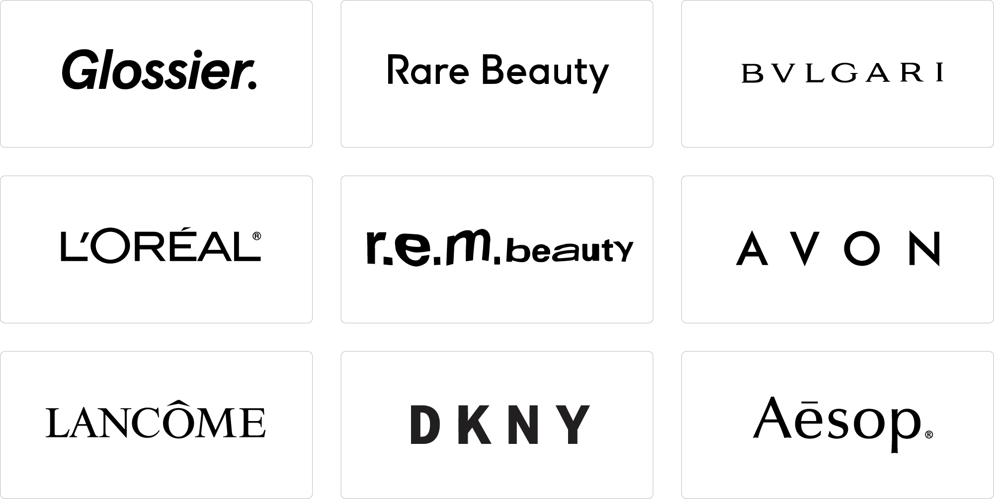
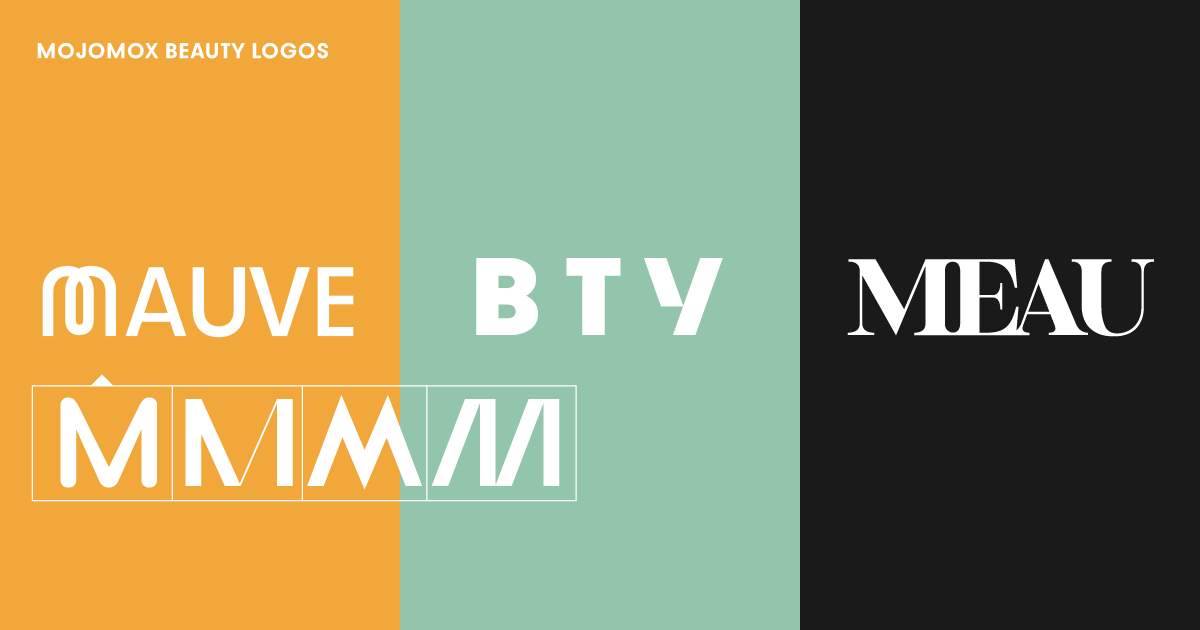
Popular and luxury beauty logos: Glossier, Rare Beauty, Bulgari, L'Oréal, rem beauty, Avon, Lancôme, DKNY, and Aesop. Notice that well-known beauty brands are going for a simple, often wordmark logo design (a wordmark is sometimes called text logo). Whether you're designing for a natural beauty brand or a high-end cosmetics line, the right typography is crucial. To make a wordmark logo stand out, focus on the details of type design: Which font has letter shapes that fit my beauty brand's name? Can I swap one of the letters to make the wordmark unique?
Should my beauty logo have tight tracking, the space between the letters, or should it be wide and open? Tight tracking makes logos feel more compact and stronger, whereas loose tracking gives logos a lightweight feel. Serif fonts (fonts with little feet on their letters) make a brand feel more luxurious and expensive. Sans serif fonts make brands look more approachable, both in personality and cost.
Look at the examples for logos of beautycounters, beauty bars, and beauty products above. If you like, click on one of the templates to modify them. We’ve selected only wordmark templates, but you can easily add your logo symbol in the Mojomox logo maker app after clicking on one.
First, notice how different fonts create different brand feels. Wider fonts (example 1) look modern and bold, perfect for contemporary beauty brands, whereas the humanist typeface (example 3) feels warmer and more caring, ideal for natural beauty products. Secondly, take a look at how different color palettes interact with your font choice. The beauty industry is known for having gray color palettes, but rose gold, black and gold, and skin tone palettes work well. Take a look at your competitors' colors and see if you can pick a different palette to differentiate your beauty brand this way.
A modern way of making your beauty logo stand out is by swapping one of the letters of your wordmark into a more unique-looking one.
Doing so will make you think about the meaning of the alternative letter: The letter Q in example 10 looks like a diamond. The wide U in example 11 brings a smile to the mark.
Beauty logo example 12 shows a humanist typeface (Bauhaus Roma) with the particular letter A in the middle.
Type in your company name, and you’ll immediately see logo options showing up below the company input field. From the variety of logos, you’ll find some with symbols and some that are simple wordmarks. Select one logo as the baseline for your custom design by clicking on it.
For beauty-related logos, we suggest you start with a wordmark. These types of logos look more minimal and communicate clean ingredients and luxury. In general, wordmark logo designs are more versatile on packaging.
After clicking on a baseline design, you’ll land in our Mojomox logo editor.
Once in the editor, click on a single letter of your big logo, and alternative letter shapes will show up right below the letter you clicked. See if one option represents your brand’s personality more and click to swap.
After your logo mark is ready, try different color palettes in the color section in the right sidebar. You’ll see how the colors will work with each immediately right below the logo editor.
It’s best to pick one primary color for your beauty brand. A secondary color can support your primary color–it’s easiest to pick a muted version of your primary color or a warm or cool gray. For your tertiary color, it’s an excellent choice to select a color that serves as an accent color, for example, for website buttons.
With Mojomox, finding the right color palette for your beauty logo is easy. Start with a color palette preset to find the right direction first. Then fine-tune each color by using the color picker. You can also pick a color from an image you have opened on your desktop computer. Below the logo editor, your brand kit gets generated automatically, and you’ll see how your selected colors interact with each other.
A logo set in one line is also called a horizontal logo lockup. If a logo symbol is stacked on the wordmark, the format is called a vertical logo lockup. For modern branding in the beauty industry, a horizontal lockup is most versatile because it takes up less space in the header section of an online shop.
With Mojomox, it’s easy to pick modern fonts for logo designs. When it comes to type design, there are two rules for font weights. First, the thicker the wordmark, the bolder and louder a logo will appear. Lighter font weights make a beauty logo, or any logo design, feel more refined and open—the lighter the logo, the bigger its minimum size needs to be.
Testing out different font weights with the Mojomox logo maker is super easy: use the font-weight slider and see how your logo looks in real-time in big and small right below the design editor.
Test your beauty logo design in all of the environments it will live in. Generate multiple versions of your logo, adjust font weight and font spacing in the sidebar of the Mojomox logo maker app. Then, upload the different versions to your website. See how each logo feels on a desktop computer, mobile phone, and other essential applications to your beauty brand, such as packaging or business cards.

Saskia is a designer and the founder of Mojomox. She writes about logos, type, and the working craft of identity.
