Logo maker
Article
Fashion fonts for logotype in 2026
Generally, there are two types of logo styles—and not just for the fashion industry: There are logos with symbol and there is logotype, also called wordmarks because they’re typography-based, made from only text.
In most creative industries’ branding, such as for fashion, photography, or design, the use of wordmarks instead of logos with symbols is most common. This article looks at famous fashion logos, examples for fashion logotype and why wordmarks are more popular in fashion than other industries. We’ll also review how a logo fits within the overall brand identity system of a fashion brand.
Finally, I’ll show you how to create a fashion logo in three simple steps. This will include the basics of brand strategy and finding a color palette that works best for fashion brands and various positionings.
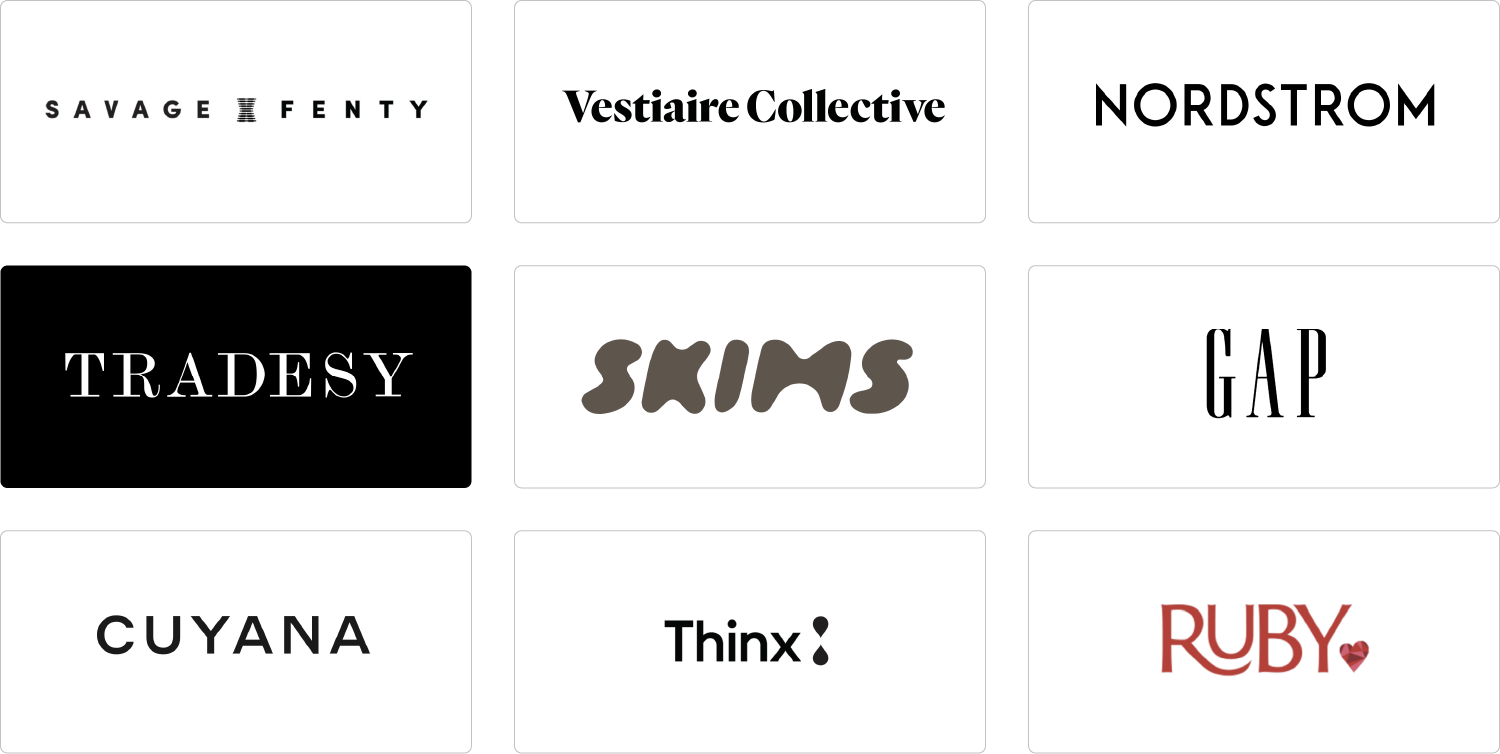
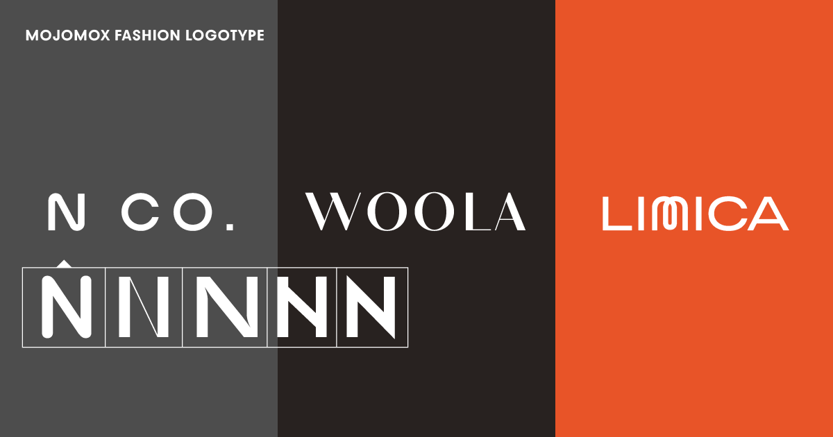
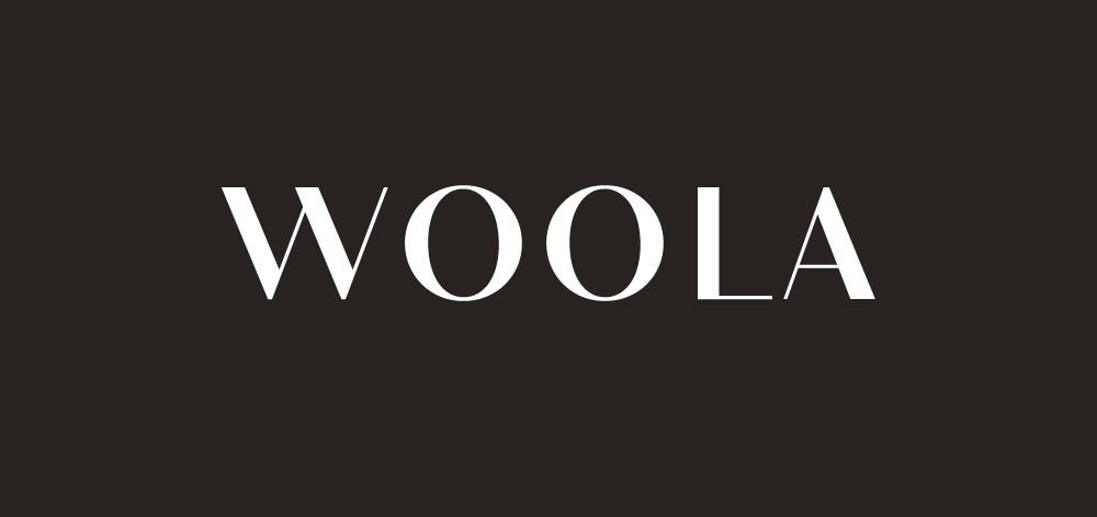
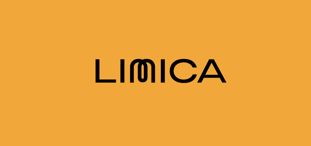
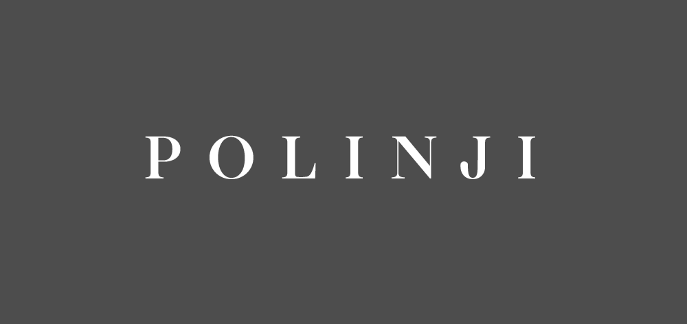
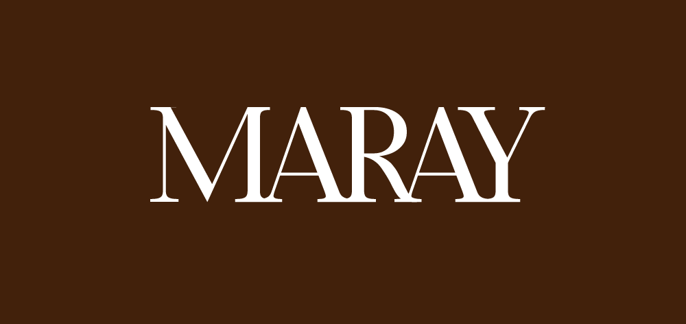
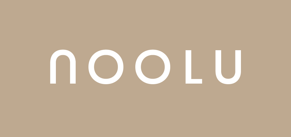
Take a look at some of the biggest or trending fashion logos and their logotype above. Most of them are wordmarks (sometimes called text logos) because they’re set only in type), and some have a small logo symbol, for example, Thinx and Ruby Love. Both font styles, serif and sans serif, are common. Some logotypes look modern and timeless (Cuyana, Thinx, Nordstrom), some are more playful (Ruby, Skims (font download)), and some look more personal or classy (Vestiaire Collective, Tradesy, Gap).
To make a wordmark meaningful, it’s crucial to select a typeface that reflects the character traits of your brand. Is it minimal? Sophisticated? Romantic? Active? Which letter shapes fit the fashion label’s name? Does it make sense to swap a letter with a unique one? How does the logotype feel when the tracking (letter-spacing) is increased or decreased? Should my logo be in all caps to get a stronger, more compact label feel? Check out examples of modern fashion fonts.
Learn more about the advantages and disadvantages of logotype design.
Click on an image below to start your own design based on the template:
We’ve added nine fashion logotype templates above. All of the fonts used are part of our unique mix-and-match Bauhaus font system.
First, notice the different styles—serifs, sans-serifs; letter spacing (tight or open) and font weight (light to bold). Serif typefaces (examples 6 and 7) make a brand feel more personal, whereas a sans serif logo looks more approachable. A humanist type (example 3) feels warmer and elegant.
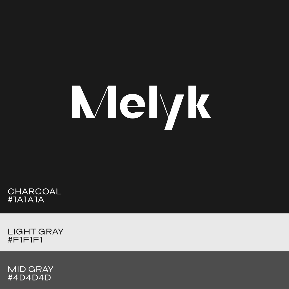
Like other creative industries, fashion companies often choose black and white color palettes, gray tones and maybe an accent color. This makes sense because it’s important for the actual work to stand out—for example on a website, so that clothing colors don’t clash with the brand’s brand colors.
Get started with your own logo based on one of them by clicking one of the designs. Or, test out our little logo ideas tool that lets you create a hundred logos based on type quickly.
Click on a template below to see the full brand kit:
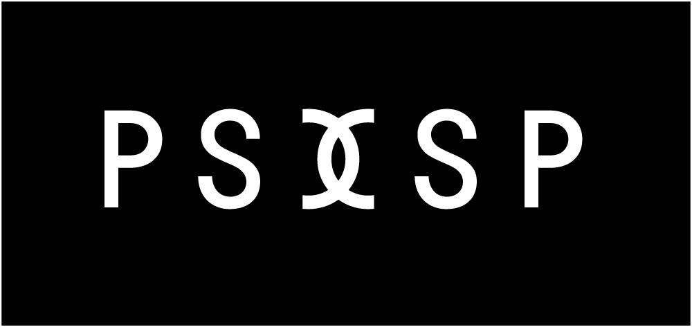
Wordmarks are the trending logo style for all industries. One disadvantage of using only logotype is that the mark can feel less memorable than using a logo symbol (example 12) next to your text mark. However, an easy way to add memorability to your wordmark is by swapping one letter with another one that stands out more. See example 11, the letters Q and O are square shapes.
Swapping out letters is a great way to pull in brand strategy and positioning (positioning is how you want your brand to be perceived). For example, maybe your designs use a lot of square patterns—fashion logotype example 11 would be a great fit. Or possibly your fashion label should be known for using fine threads—example 10 works well for that.
Type your fashion label’s name into the logo maker input field and click the Next Step button. A variety of logo options will show up below the input. Some will have a logo symbol, and some will be simple wordmarks.
For a contemporary fashion logo, we suggest you start with a wordmark first (you can add a symbol later in the logo maker app) by clicking on the design. This will take you into the design app.
The large white area with your big logo is called the artboard. Click on one of the letters on the logo shown on the artboard, and a dropdown of alternative letters shows up. To swap, click on the new letter design. To see how the logo looks in small, scroll down to the brand kit section that shows your mark in different colors.
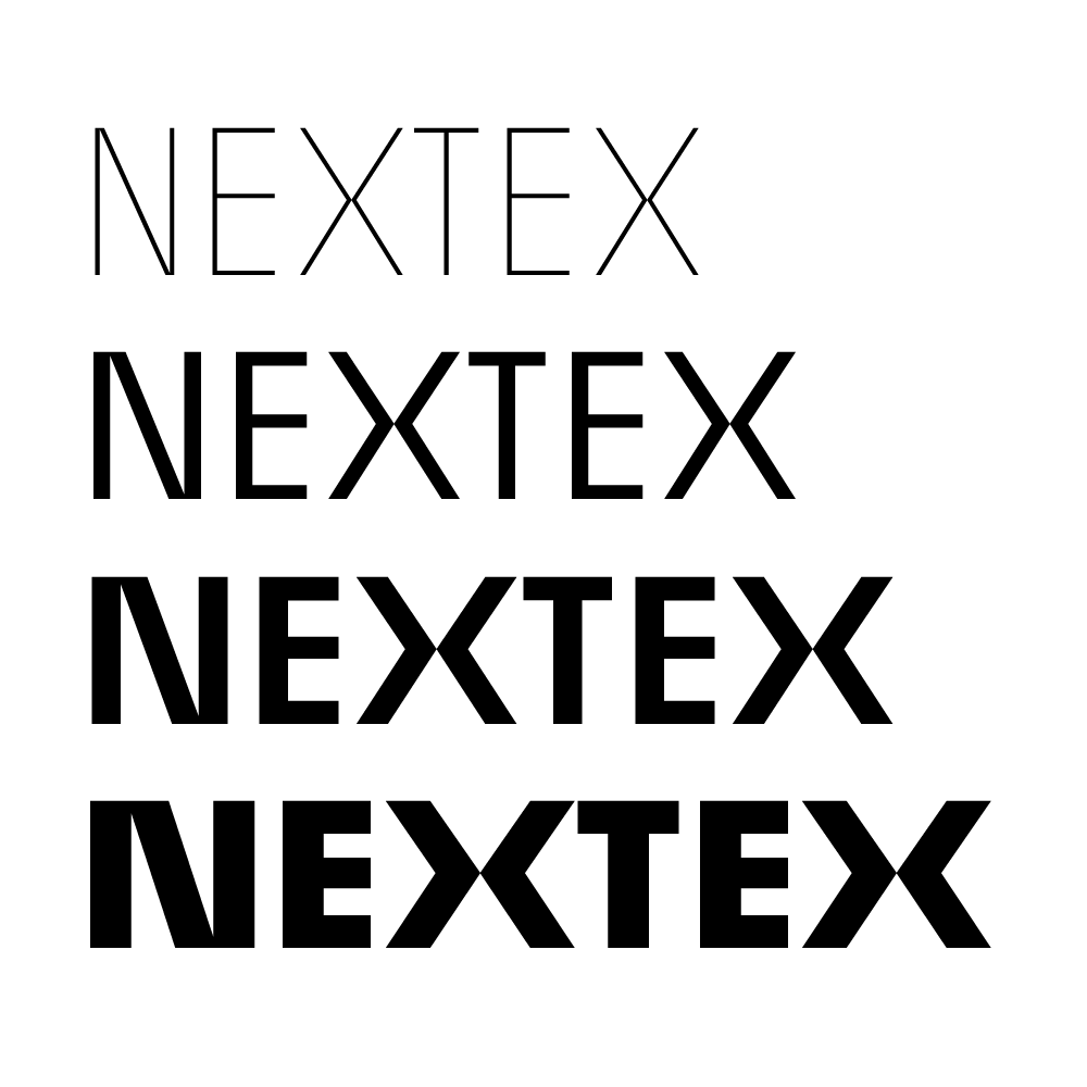
The Mojomox logo maker app lets you select from modern fonts easily. Try out different typefaces first: Serifs are more sophisticated and personal, whereas sans serifs are more approachable with a focus on simplicity. Next, try the weight slider: the lighter the logotype, the more elegant the logo, and the bolder, the stronger the logo appears. While thinner type is more elegant, it is harder to read when the mark is small.
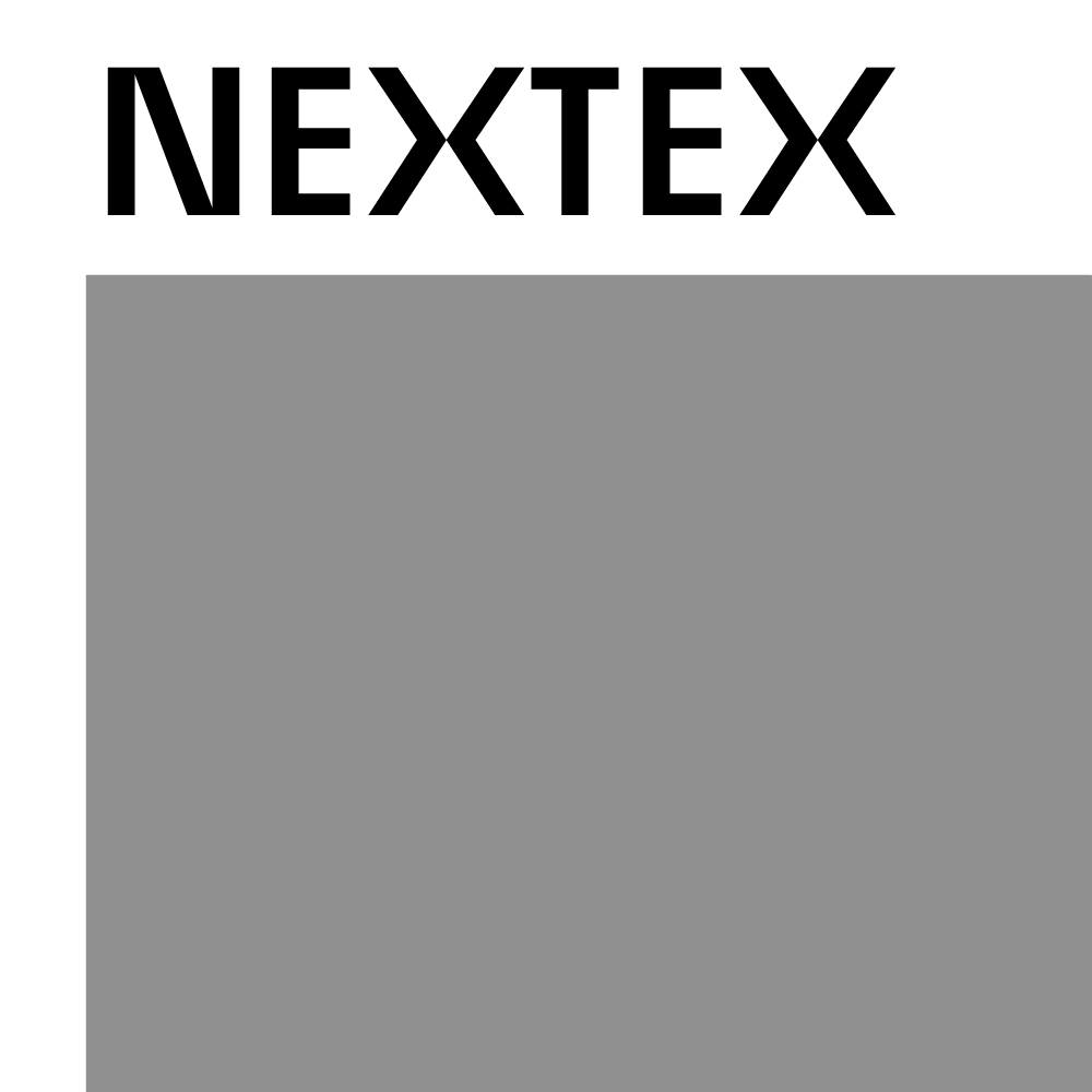
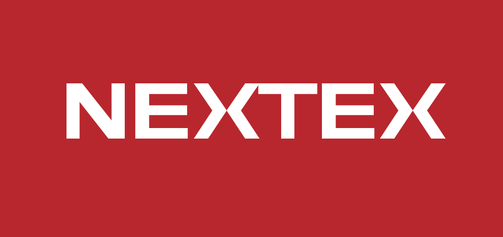
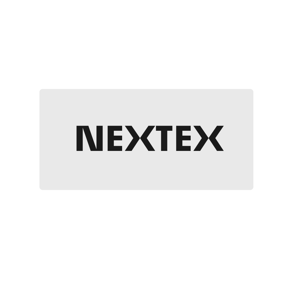
The horizontal lockup (logo elements in one line) is more versatile than the vertical lockup (logo elements stacked on each other). For fashion logotype, you may need a short (sometimes called collapsed logo) version of your logo—often, the first letter or if your brand name is two words, the starting letters of the words are used for that. In our example, “Nextex,” this would be the letter N.
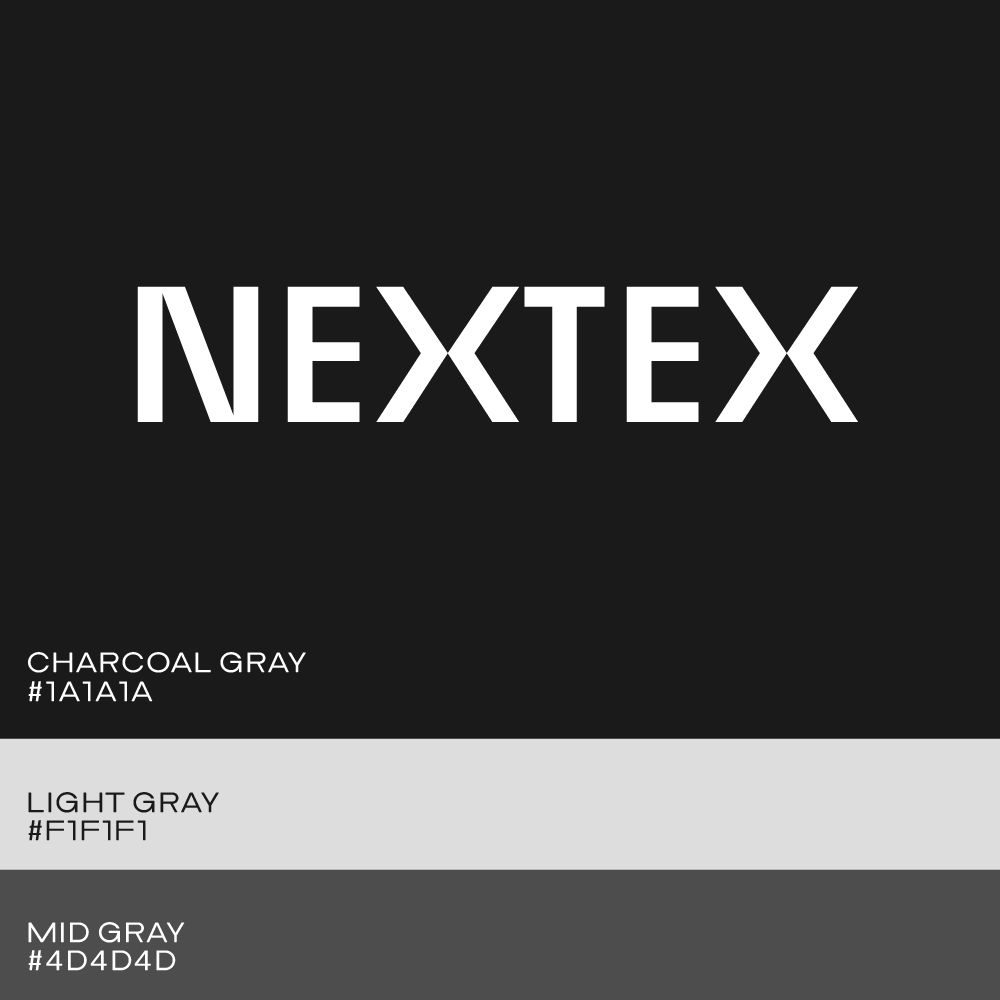
As mentioned earlier, desaturated color palettes (whites, grays, blacks) are typical in fashion. It’s good to have at least one accent color that can, for example, be used for website buttons or highlights on other marketing assets. The Mojomox color palette tool makes it easy to figure out colors that work well with each other. While selecting colors with the picker in the right sidebar, look into the brand kit section below to see if any combination clashes. Then, tweak all colors until they match well.
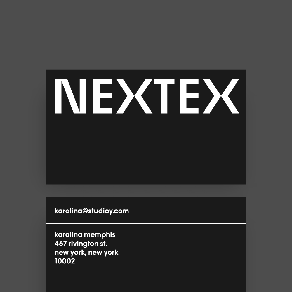
Lastly, test your design because all designers know that good design means that form follows function. A logo should be readable in small sizes (check the Brand in Context section at the very bottom of the logo maker app). Design multiple versions of your logo and upload the files to your e-commerce store, test the mark on a business card, and mount a printed version onto other applications you have in mind. Will your logo be attached to your clothing? How? Is the logo easy to produce with the technique you’ll use?
Try out the Mojomox logo maker:

Saskia is a designer and the founder of Mojomox. She writes about logos, type, and the working craft of identity.
