Logo maker
Article
Real estate logo design: 15 modern ideas
In this article, we’ll look at popular real estate logos for agencies, single agents, and investment companies. We’ll review modern logo examples that work best in 2026 and check out templates to design your own unique mark.
Whether you’re looking for a design of a real estate company or agency, luxury building or tech app logos related to real estate, the design process for creating something meaningful is the same for all industries.
We’ll look at several simple approaches to make a logo based on brand strategy, as well as why understanding brand positioning is critical before beginning to design a logo. Then, in just a minute, we learn how to create a distinctive and contemporary real estate logo!
We’ll also generate a color palette for your branding at the same time. Finally, we'll look at how expert designers swiftly test their logos to ensure that they work flawlessly across all advertising channels.
Get started with your real estate logo below by typing in your company name or keep reading to learn more about how to start the design process.
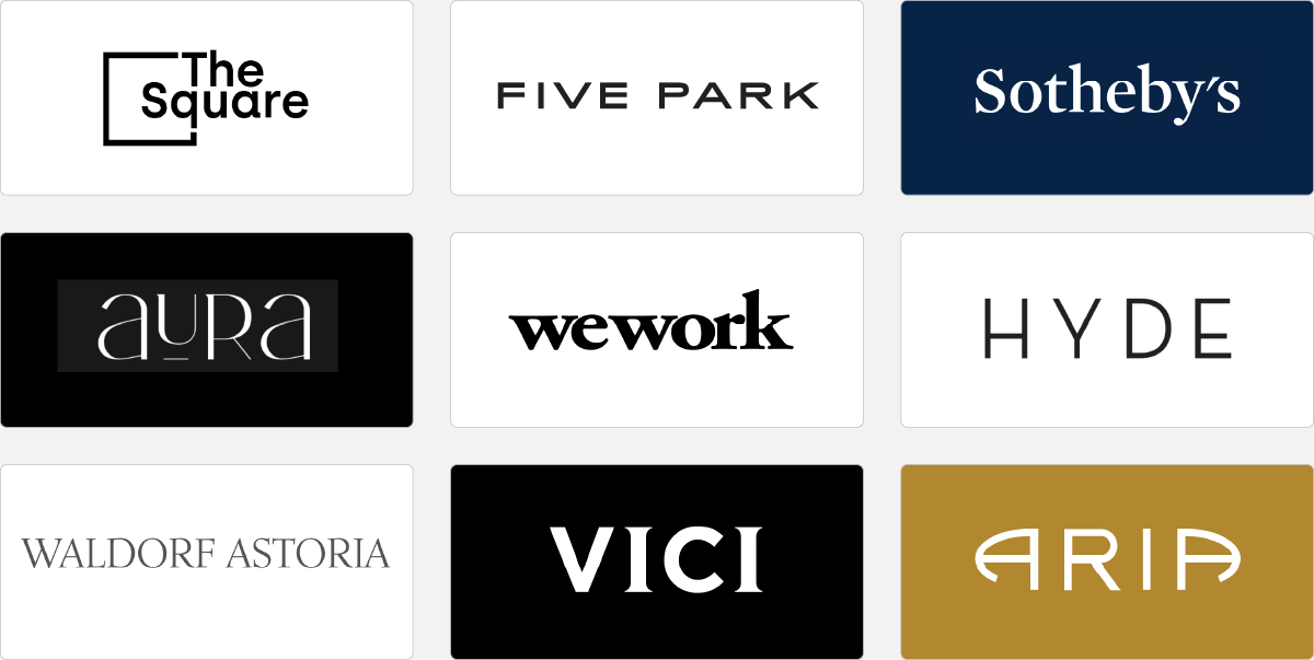
Big-name and luxurious real estate companies commonly choose a simple and sophisticated logo design, often a straightforward wordmark (sometimes called text logo). Therefore, it’s crucial to examine the details when creating wordmarks. What logo font, for example, works best for a company’s personality? What letters from the logo could be swapped out to make the wordmark more recognizable and memorable?
Is it better to have wide or narrow letter spacing? Tight letters give a logo a more powerful and compact appearance, while wider spacing gives it a sleeker appearance. Serif typefaces (those with tiny feet) feel more expensive, personal, and luxurious, whereas sans serif fonts feel more affordable and communicate a more approachable brand image.
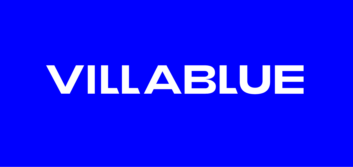
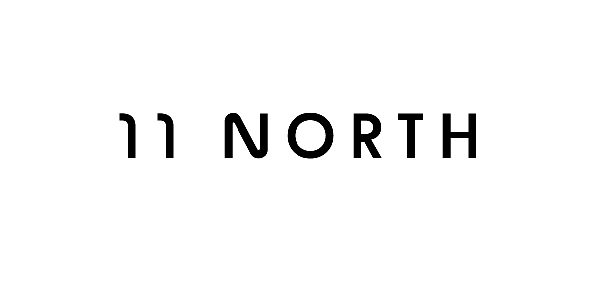
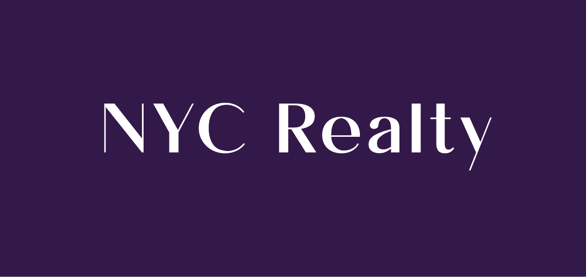
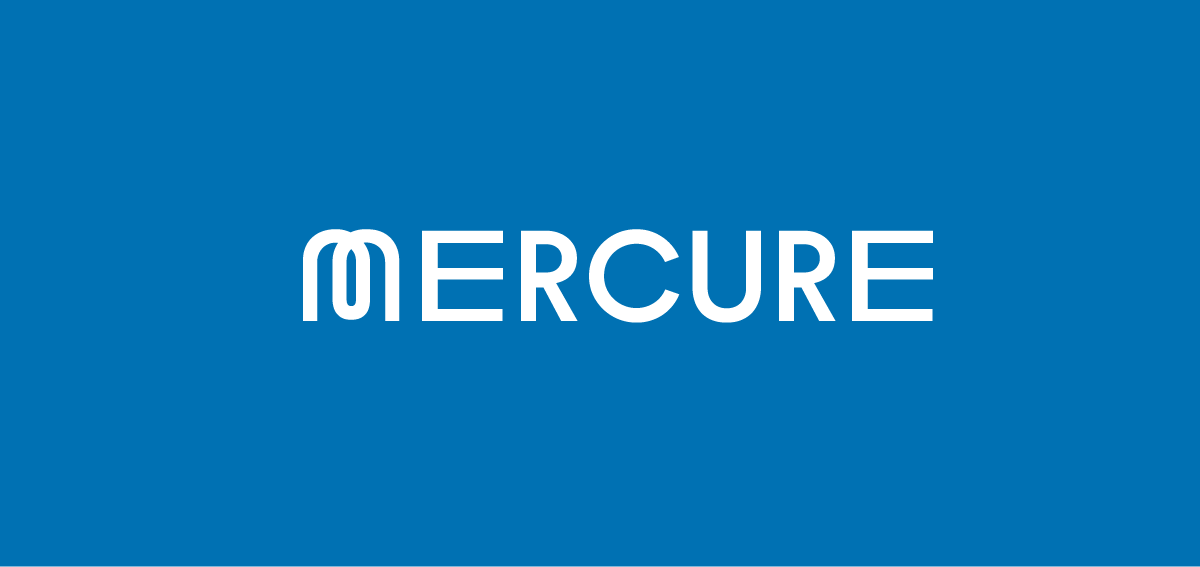
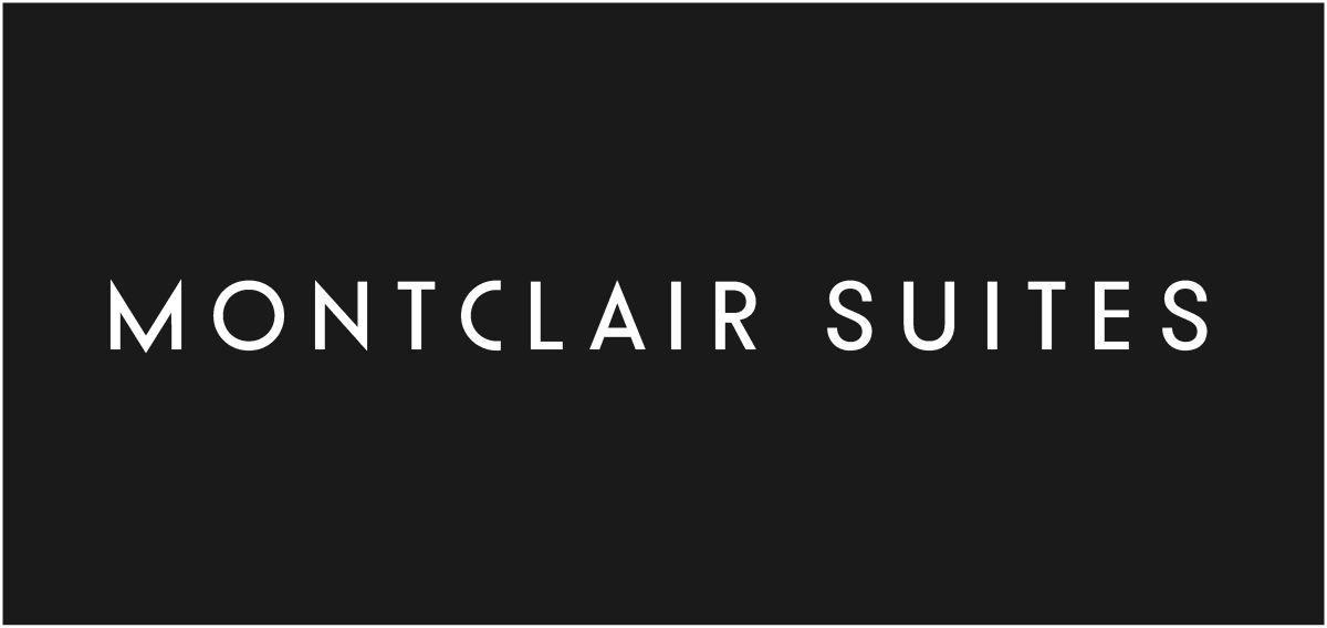
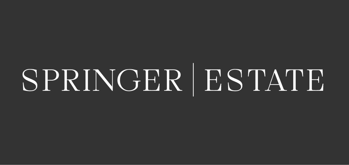
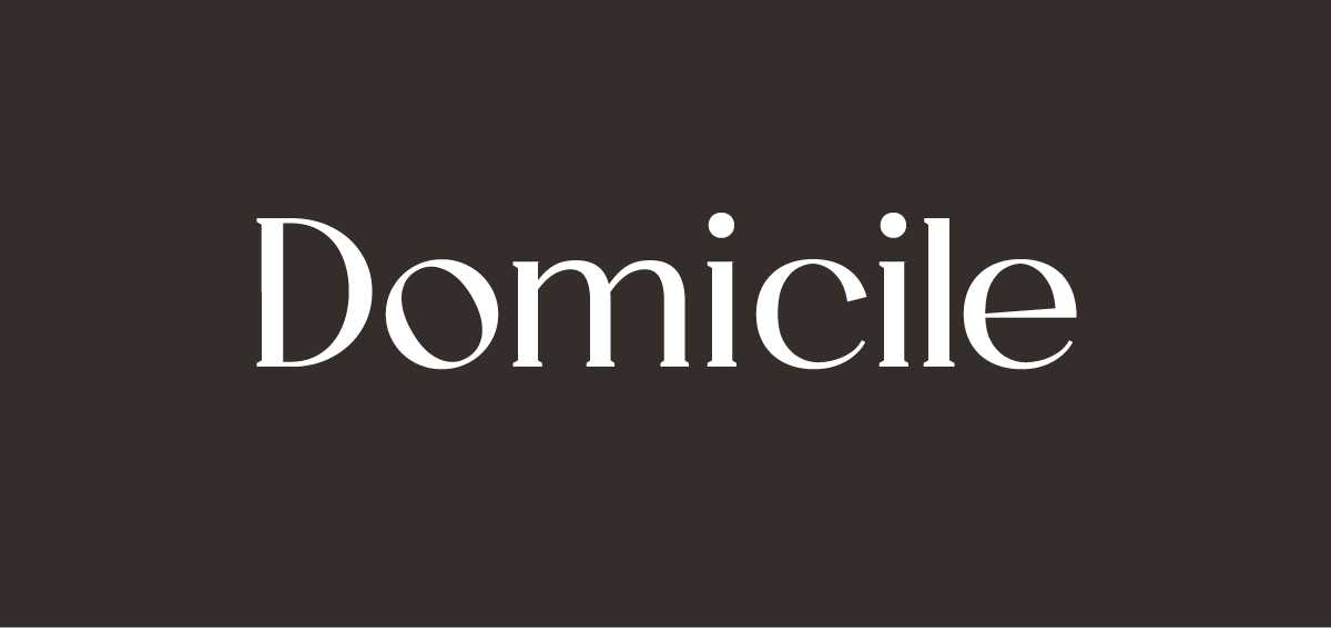
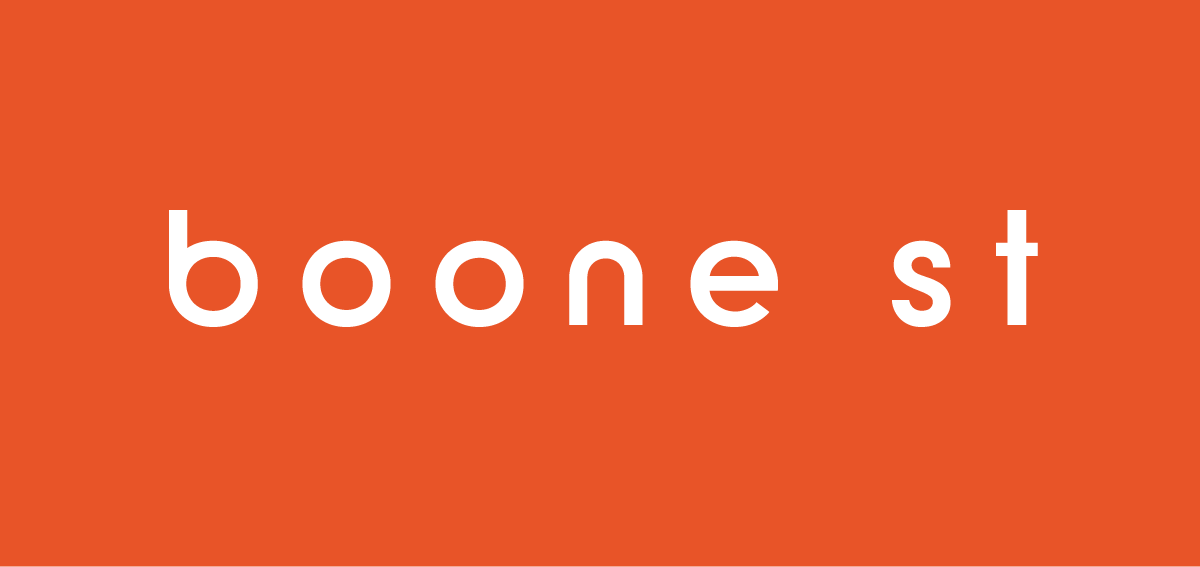
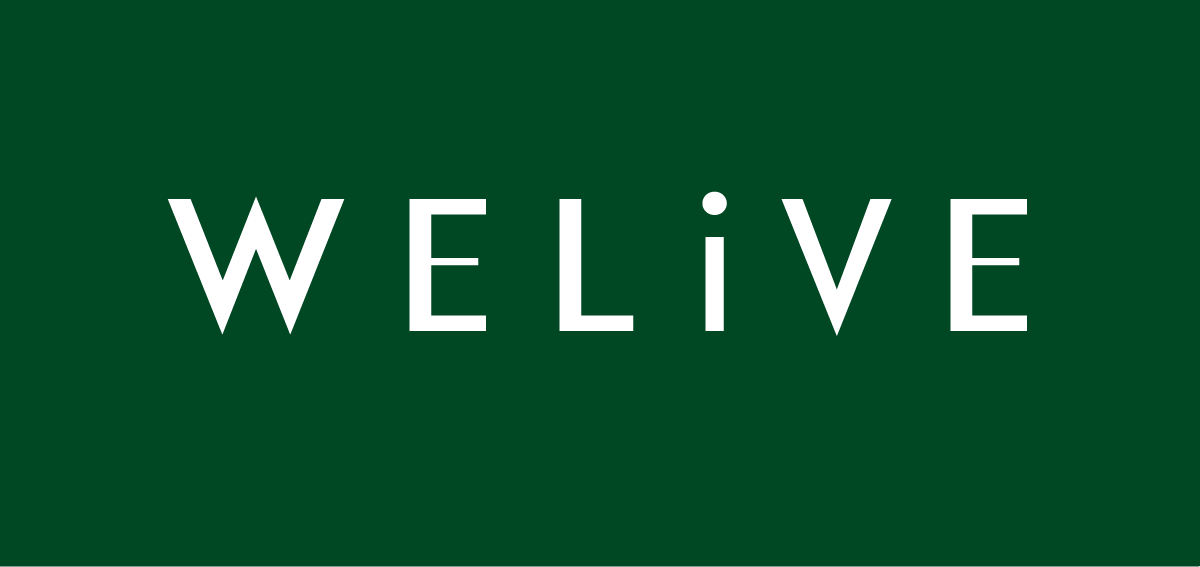
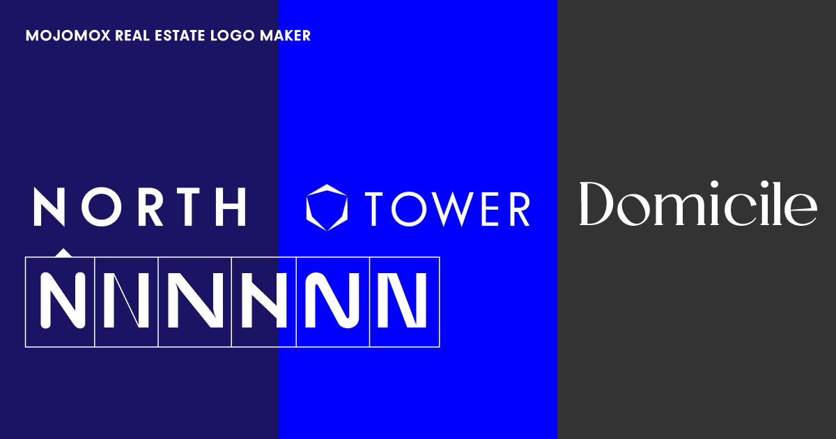
Take a look at the real estate logo examples above. Then, to change one of the templates, click on it. We've only included wordmark templates, but after selecting one, you can easily add a logo symbol with the Mojomox logo builder app. To begin, examine how different fonts trigger distinct brand feelings. Wider typefaces (example 1) appear to be more modern and bold, whereas the humanist typeface (example 3) appears to be warmer and more refined. Second, analyze how other color palettes interact with the font you’ve chosen.
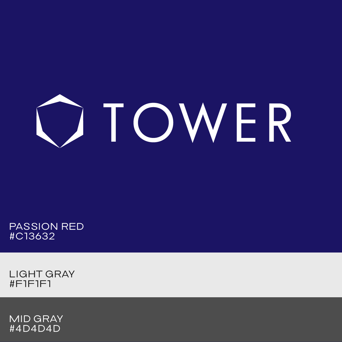
Blue color palettes are popular in the real estate sector, but red and gold tone palettes also go well. Check your competitors’ colors to see if you can choose a different primary color to set yourself apart.
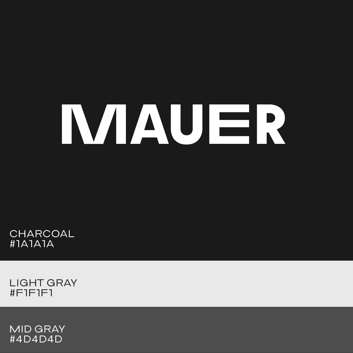
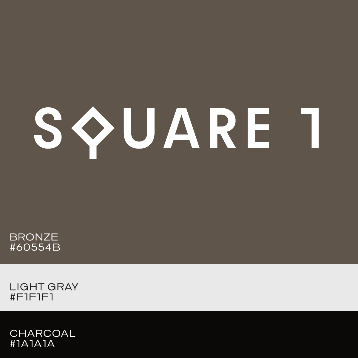
A modern way of making your real estate logo stand out is by swapping one of the letters of your wordmark into a more unique-looking one.
Doing so will make you think about the meaning of the alternative letter: The letter Q in example 10 looks like a square and makes sense if it’s part of the building concept. The wide M in example 10 looks like it consists of leaning bars.
Real estate logo example 12 shows a thin style of a geometric typeface (Bauhaus Apex) with a logo symbol from the Shape series (selectable inside logo maker app).
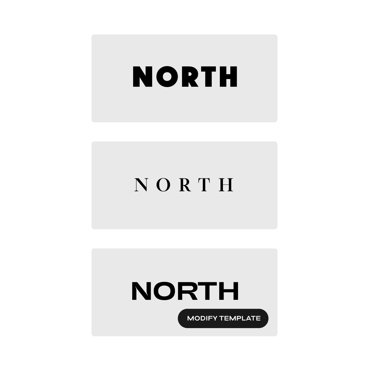
When you type in your company name, you’ll see logo suggestions appear below the company entry form. There are some logos with symbols and some that are basic wordmarks. By clicking on a logo design, you may use it as a starting point for your custom design.
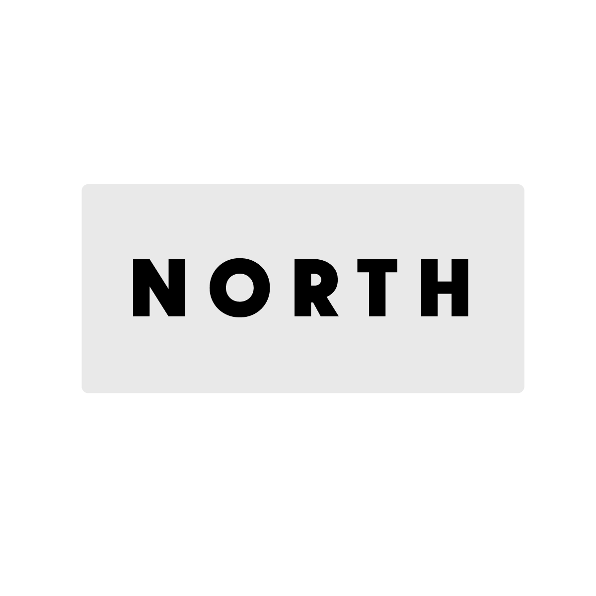
For real estate-related logos, you can start with either a simple wordmark logo or a logo with a symbol. Logos with a symbol have a more corporate quality to its appearance.
After clicking on a baseline design, you’ll land in our Mojomox logo editor.
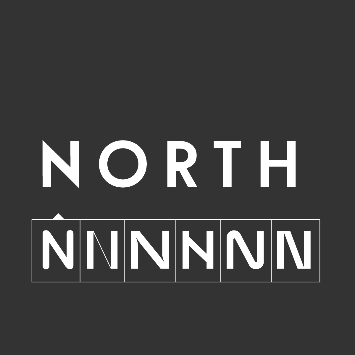
Wordmark logos are the modern choice. In order to make the mark stand out more, click on a letter and swap it by selecting another letter below the initial one.
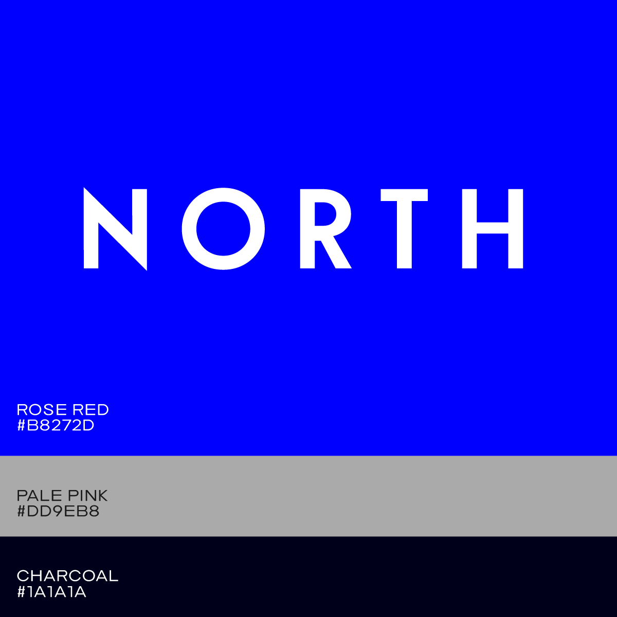
For your real estate brand, it’s important to stick to one primary color. It’s easiest to choose a toned down version of your primary color or a warm or cool gray as a secondary color to support your primary color. For your tertiary color it’s a good idea to choose a color that can be used as an accent color, such as for website buttons.
Finding the correct color palette for your real estate logo is simple with Mojomox. Start with a color palette preset to get a sense of where you want to go. Then use the color picker to fine-tune each color. You can also choose a color from an image on your desktop computer that you've opened. Your brand kit gets generated automatically below the logo editor. This way you’ll see how your selected colors interact with each other.
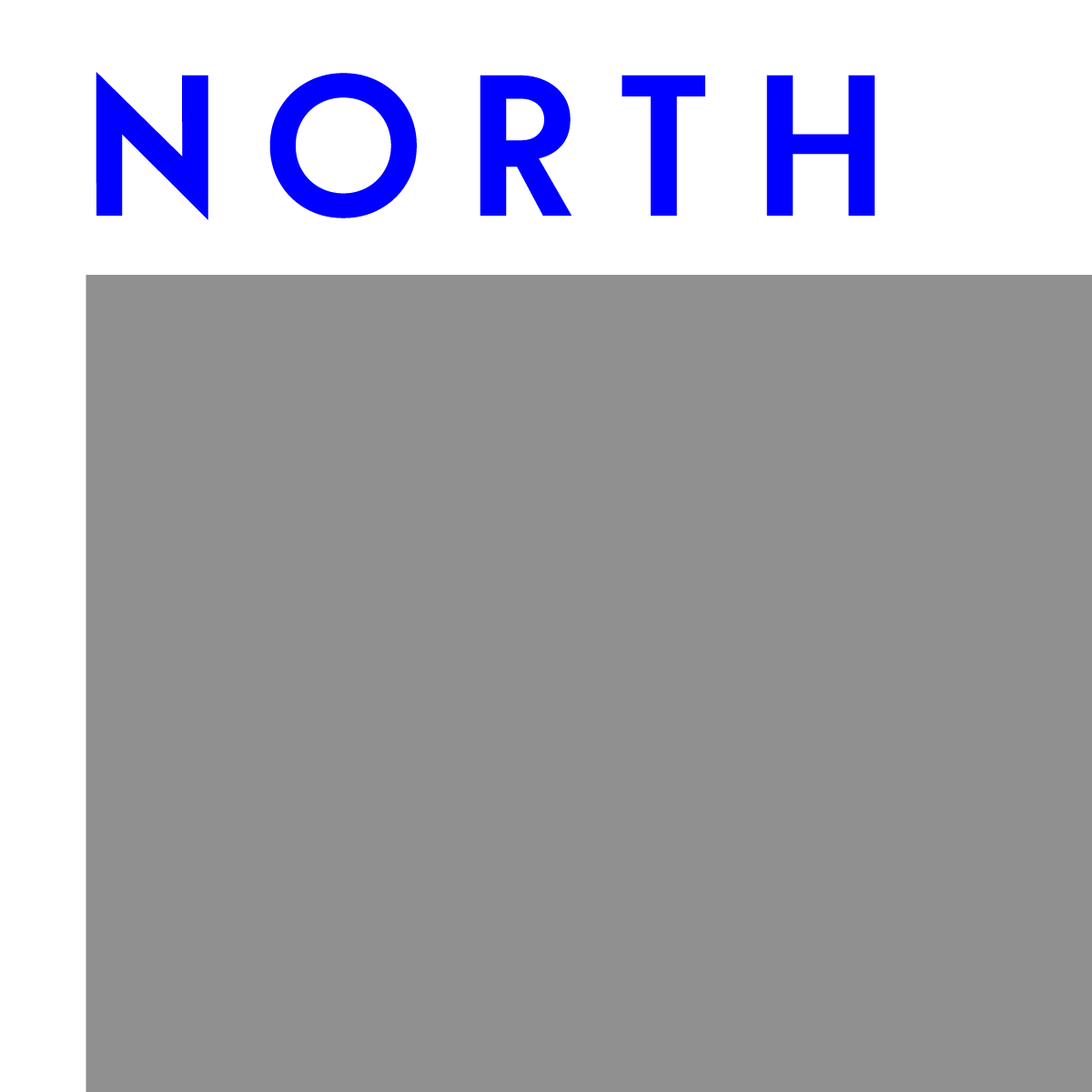
A horizontal logo lockup is a logo that is put in one line. A vertical logo lockup occurs when a logo symbol is layered on top of a wordmark. A horizontal lockup is the most versatile for current real estate branding because it takes up less space in the header part of the website.
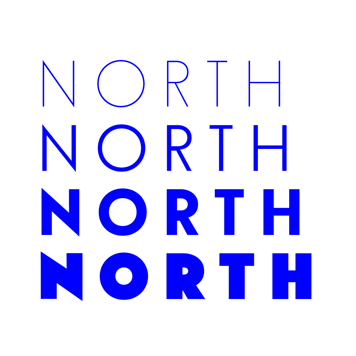
It’s simple to choose modern fonts for logo designs with Mojomox. When it comes to font weights in type design, there are two guidelines to follow. First, a logo will appear bolder and louder if the wordmark is thicker. Lighter font weights give a real estate logo, or any logo design, a more refined and open appearance; nevertheless, the lighter the logo, the larger its minimum size must be.
Trying out different font weights with the Mojomox logo maker is simple: just use the font-weight slider in the design editor to see how your logo looks in real-time in large and small sizes.
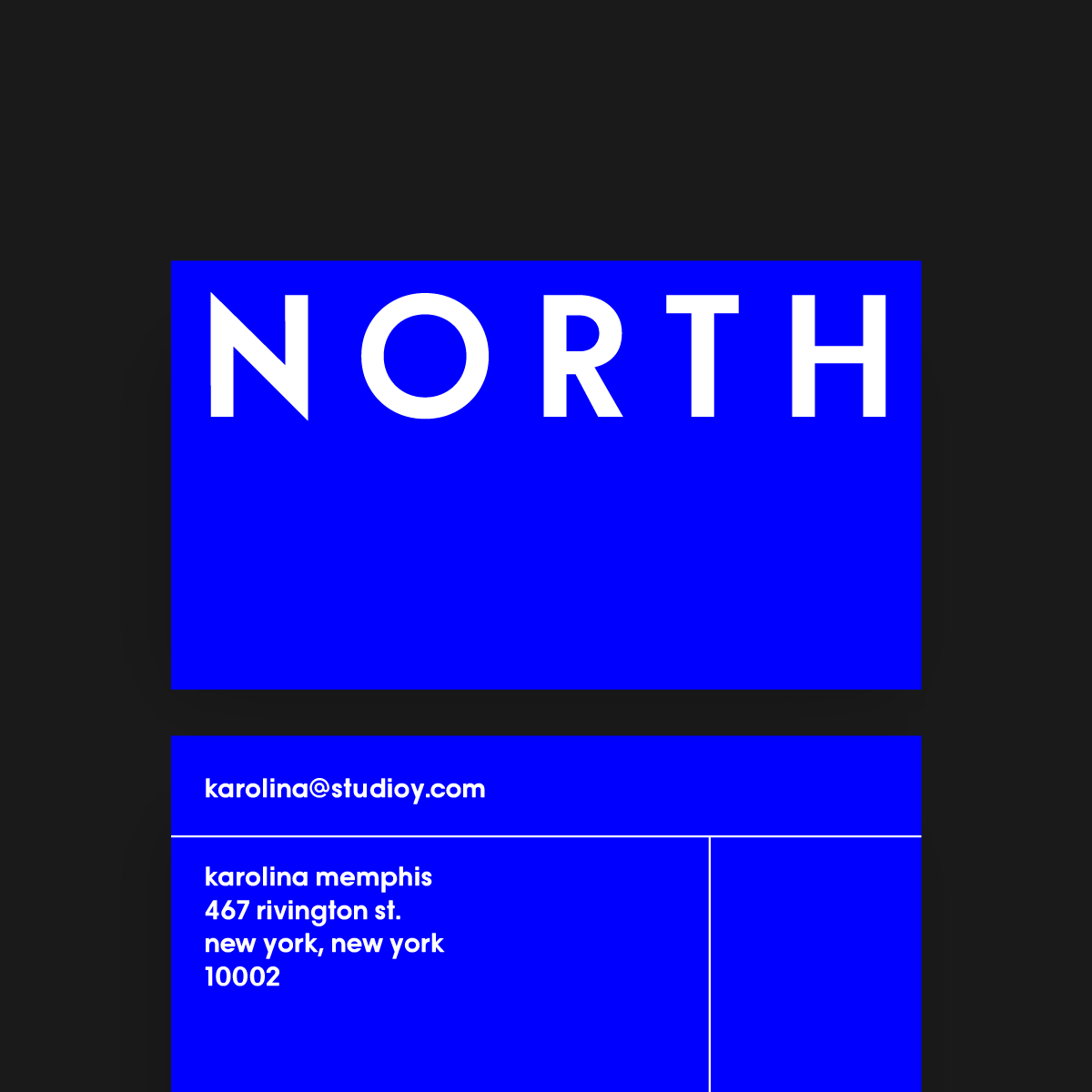
Your real estate logo design should be tested in all of the environments where it will be used. In the sidebar of the Mojomox logo maker tool, you can create numerous variants of your logo and alter font weight and space. Then, on your website, upload the various versions. Examine each logo on a desktop computer, a smartphone, and other important uses for your real estate brand, such as print ads in brochures or business cards.

Saskia is a designer and the founder of Mojomox. She writes about logos, type, and the working craft of identity.