The Power of a Lettermark Logo
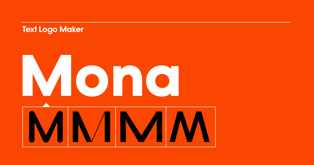

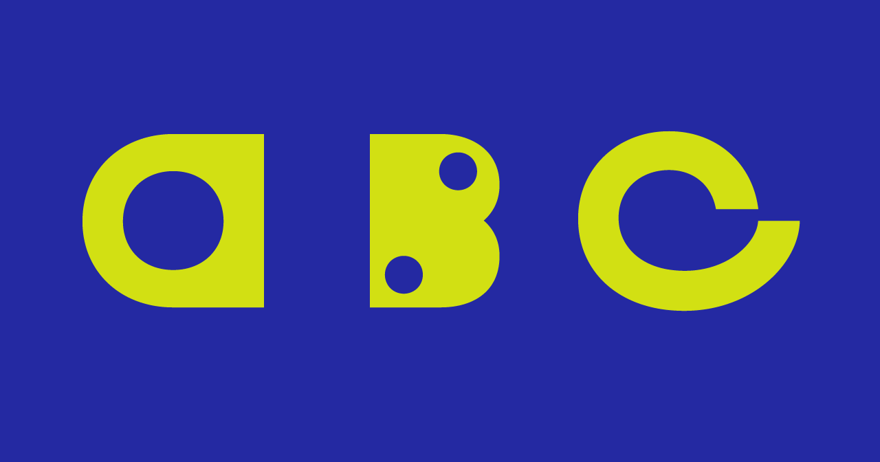
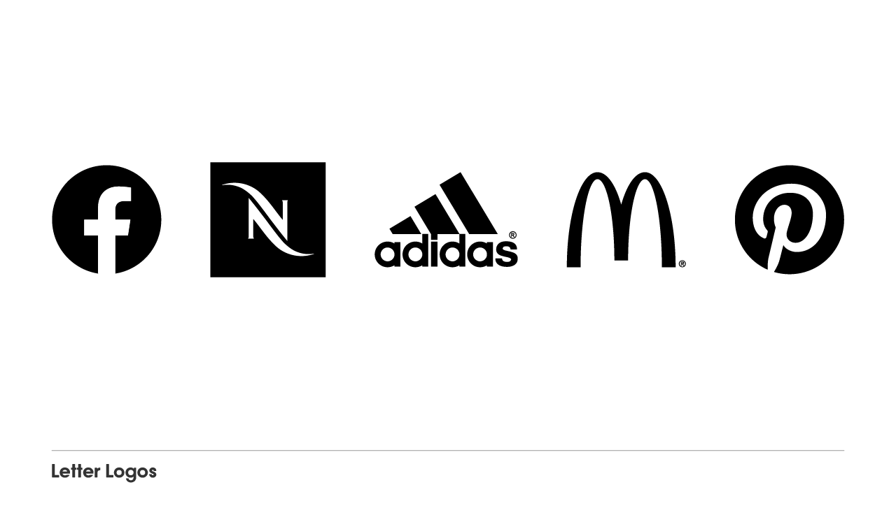
A letter logo is a logo symbol that is often made from shapes that when assembled make up the first letter of a company’s name. In its simplest form, however, a letter logo can also be a letter designed using a specific typeface—minimalistic or ornamental.
With the latest wave of minimalism as a lifestyle and design trend, lettermarks and logotypes have become more popular again. While the architecture, design, fashion and beauty industries are known for using wordmark logos and monograms, companies with a focus on digital now often opt in for a simple logo style with a letter logo too.
One reason for that is that in the early days of a company, finding product-market fit is the most important thing to focus on as a founder. A new brand needs to communicate professionalism—which is what often gets lost when startups try to create complex branding on their own.
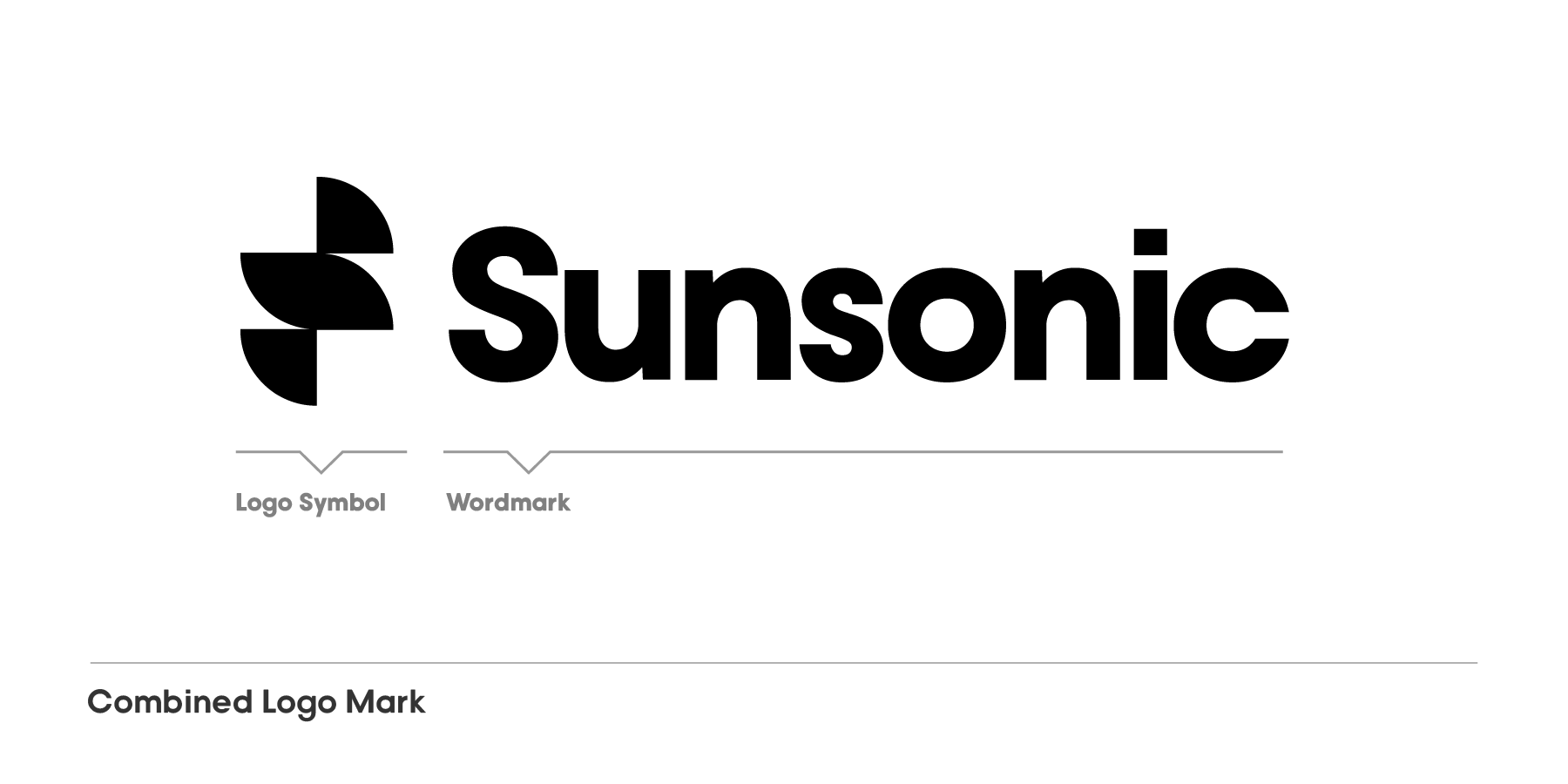
Many startup founders embrace what we call “black dress” design: You’re not trying to create revolutionary brand design, you’re aiming for something simple and timeless that allows a company to pivot. A wordmark with or without additional letter logo provides more flexibility for a brand to develop.
Picking a lettermark logo as a company symbol is a powerful choice because you’ll get additional recognizion value. Lettermarks help customers remember the name of a business because they show the starting letter.
A logo made from the first letter of the business’s name has emblem character—it looks like a heraldic device or company badge.
On top of that, we have to show logos often in small. There are many applications where the full logo wouldn’t fit or be readable—think of app icons, social media profile images, website favicons etc. In these examples, a lettermark works better as an abbreviated version for the entire logo than any other type of logo symbol.
Step 1. – Type and pick your favorite: At the top of the Mojomox logo maker, type in your company name or just the letter or letters that should appear on your letter logo. From the logo ideas page, select one logo that feels closest related to your brand. This logo will be the baseline for your design.
Step 2. – Edit design until it’s perfect: To edit, click on one of the letter logo designs for it to open up within the Mojomox logo maker app page. Next to the main editing workspace, you can change the following design settings for logo symbols: weight, length, morph, scale, rotate, and positioning. The settings are meant to be played around with until the design fits your concept.
If you’re creating a wordmark alongside a letter logo, you can also mix and match letters from other available fonts of the same family by clicking on a letter in the main workspace. Additionally, also in the right-hand sidebar, scroll down to “Colors” and pick from the presets or select your own.
Step 3. – Download letter logo: At the bottom of the logo maker app page, your logo gets updated as you design. You’ll find the logo in all three colors you’ve selected in your color palette. From there, you can save your logo as an image file in a png format on a transparent background.
Browse logos by letter
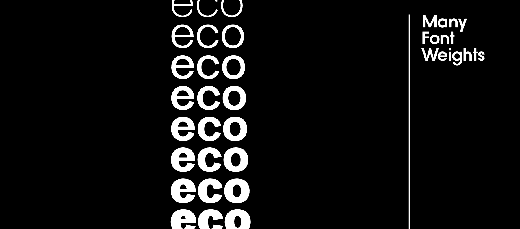
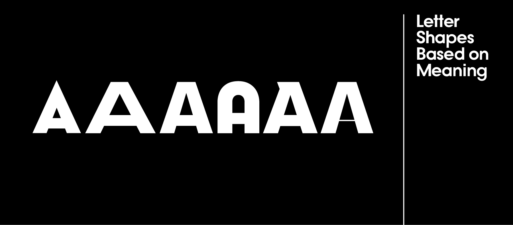
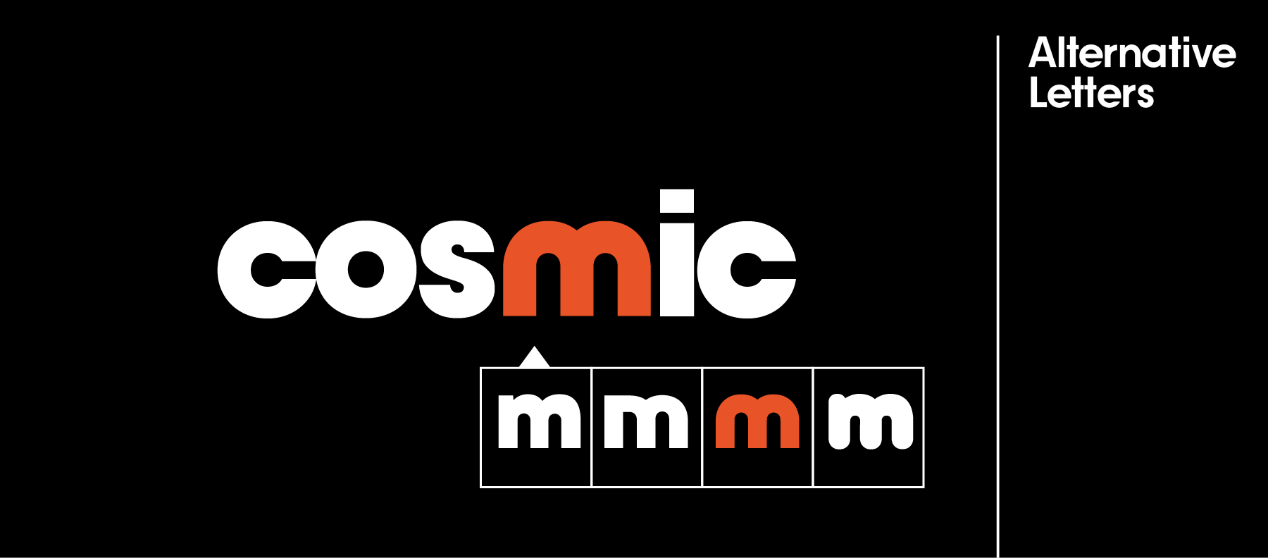
Creating a logo design that stands out in a specific market segment is based on one thing that big brands build on but startups don’t talk about enough: Successful logos, may they be letter logos, wordmarks, or logos with another type of symbol, are rooted in brand strategy—the way you’d like to position a brand.
Brand positioning is usually a longer process that takes competitors into account but a quick way to include brand positioning into your design is the following one:
1. Settle on one word that you’d want your customers to think when they think of your brand (this is also known as “positioning”). And
2. Transfer that one word metaphorically into your design—that’ll give your logo shape and color choice meaning.
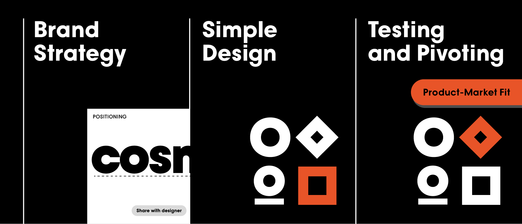
1. Think strategically: What’s your one-word-positioning? If the word were a word, what shape does that word have? Is the shape round—like community, holistic, or a cycle? Is it a square—like a container, a platform or a building block? Or is it a triangle—like an exchange, a pyramid or a sharp mind? What letter font reflects your concept best?
2. Design minimally: Within the lettermark logo maker, you’ll find settings to adjust your design. Use every design setting meaningfully. Uppercase spelling gives authority and strength, lowercase spelling adds a casual feel, a thinner style feels more refined, a thicker weight is bolder and younger, tighter spacing between letters will make a logo feel more compact and united, and spaced-out letters will add lightness to the letter logo design. Click through different logo fonts in the gray sidebar or click on a letter of your brand name inside the editing area to select a different letter style.
3. Test in your environment: Generate multiple versions of your lettermark. They can have different font weights and letter spacing. Then, test the different versions on your website. See what each of the logos looks like on a desktop computer, a mobile phone, and other applications you already have or know you’ll have in the future.