Logo maker
Article
33 modern jewelry logo ideas for 2025 (+ fonts)
We’ll explore jewelry logo ideas and popular jewelry logos of top brands. We’ll look at logo designs that will look modern and beautiful in 2026, what the best fonts for jewelry logos are, as well as templates for creating your own mark.
Whether you’re designing a brand identiy for a brick and mortar jewelry business or creating an online jewelry store logo, professional brand designers put a deep dive into strategy before getting to the perfect logo.
We’ll look at a few simple ways to make a logo based on brand strategy, as well as why knowing your brand’s positioning is so critical before you start designing a logo. Lastly, we’ll learn how to design a unique and modern or luxury jewelry logo the cool way.
In parallel, we’ll create a color palette for your brand idenity. And finally, we’ll look at how professional designers test their logos quickly to check that they’ll work across all marketing channels.
If you’re not ready to start with your brand identity design and if you’re still asking “how do I name my jewelry brand?,” read up on naming a brand first.
Start designing your jewelry logo by typing in your brand name below and selecting your design preferences right after, or continue reading to learn more about how to get started.
Which jewelry brand has a flower logo? The italian brand Buccellati uses an abstract flower as their logo symbol.
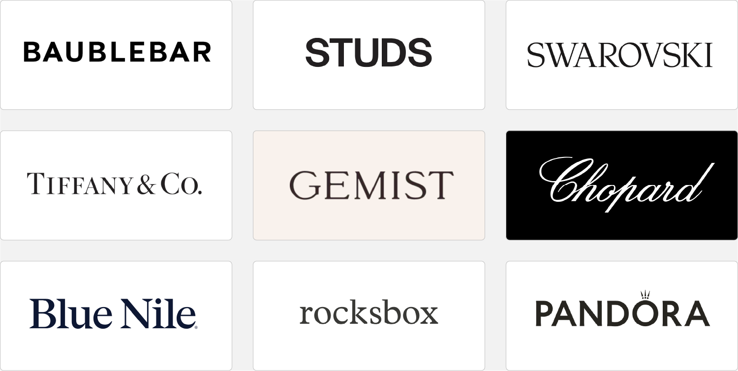
Big-brand jewelry companies typically use a simple but refined logo design, such as a timeles text logo (professionally called wordmark logo or logotype).
It’s important to consider the nuances when creating wordmarks. When it comes to design elements, what logo font, colors, and letter styles represent the brand best? What letters could be swapped out to make the wordmark more recognizable?
Is it better to have wide or narrow letter spacing in my jewelry logo? Tight letters give a logo a more solid and compact appearance, while wider spacing adds it a lighter appearance. Serif typefaces (type with small feet) feel more expensive, personal, and luxurious, whereas sans serif fonts feel more affordable and generally have a more approachable brand personality.
To begin, take a look how different typefaces elicit different brand perceptions. Wider typefaces (example 1) appear more contemporary and powerful, whereas the humanist typeface (example 3) looks warmer, more sensitive and elegant.
Second, dive a little into color psychology, review different palettes and how they work with the font you have in mind.
For jewelry logos, black and gray palettes are common, but gold and playful palettes (if they fit with your brand concept) also work well. Analyze your competition’s color combinations to see if you can choose a distinct palette to make jewelry brand logo stand out.
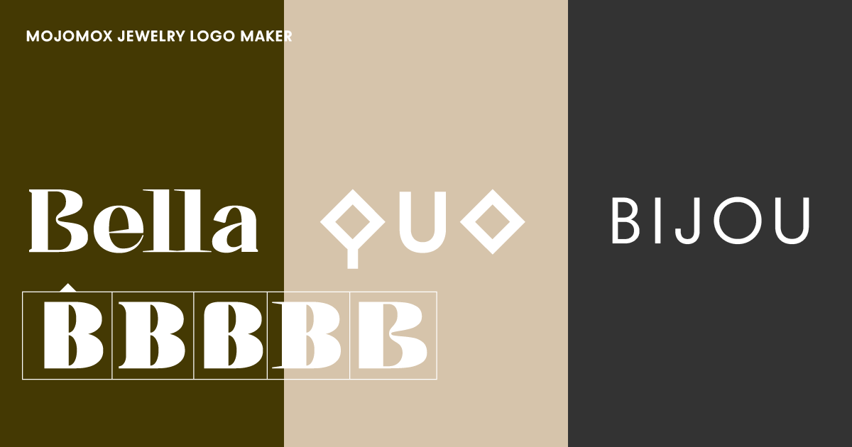
A modern way of making your jewelry logo stand out is by swapping one of the letters of your wordmark into a more unique-looking one.
Doing so will make you think about the meaning of the alternative letter: The letter Q in example 10 looks like a diamond. The wide U in example 11 brings a smile to the mark.
Jewelry logo example 12 shows a humanist typeface (Bauhaus Roma) with the particular letter A in the middle.
Type in your company name, and you’ll immediately see logo options showing up below the company input field. From the variety of logos, you’ll find some with symbols and some that are simple wordmarks. Select one logo as the baseline for your custom design by clicking on it.
For jewelry logos, it’s best to start with a wordmark. These types of logos look more minimal and communicate luxury. Wordmarks are more versatile on packaging or presentation materials because they allow the jewelry works to stand out more.
After clicking on a baseline design, you’ll land in our Mojomox logo maker app.
Once in the editor, click on a single letter of your big logo in the center of the artboard. Alternative letter designs will show up in a popup below the letter you clicked. See if one option represents your brand’s personality more and click to swap.
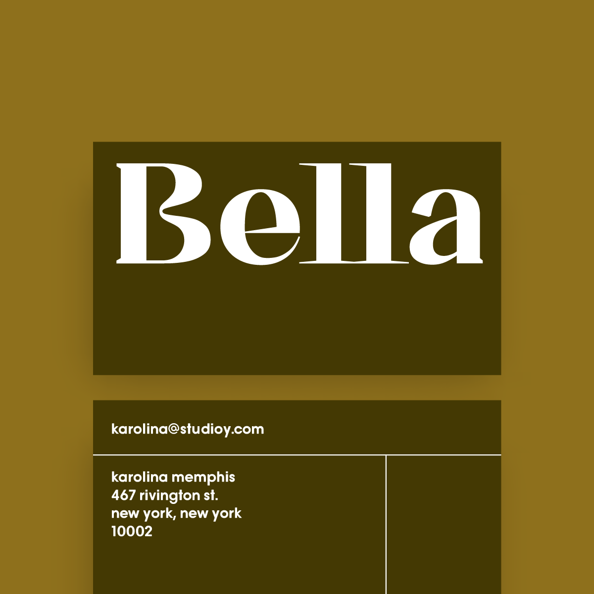
After your logo mark is ready, try different color palettes in the color section in the right sidebar. You’ll see how the colors will work with each immediately right below the logo editor.
It’s best to stick with one color for your jewelry branding. To support your primary color, it’s easiest to use a toned-down version of your primary color or a warm or cool gray as a secondary color. In addition, it’s recommended to choose a tertiary shade that can also be utilized as an accent color, such as for website buttons. If your jewelry brand is not about sophistication but rather fun, you can be more playful with your palette.
Mojomox makes choosing the right color palette for your jewelry logo effortless. Start with a color palette preset to get a picture of where you want to go. Then perfect each color with the color picker. You may even choose tones from an image you’ve opened on your desktop computer.
Your brand kit will be instantly generated below the editor, and you’ll be able to see how your chosen colors relate to one another.
Pro tip: Brand color is one of the most important elements—pick a primary color that sets your jewelry brand apart from the competition so it’s easier for your customers to recognize you.
A horizontal logo lockup is a logo that is put in one line. If a logo symbol is shown on top of a wordmark, it’s called a vertical lockup. A horizontal lockup is the most versatile for modern jewelry branding because it takes up less space in the header part of an online shop.
With Mojomox, selecting trendy fonts for logo designs is a breeze. There are two essential concepts in type design when it comes to font weights. First, a thicker typeface makes a logo mark appear stronger and more robust. A jewelry logo, or any logo design, with lighter font weights, has a more exquisite and open feel; the lighter the logo, the larger the minimum size necessary. Especially for the jewelry industry, refined typography reflects the craft that goes into jewelry-making.
Use the font-weight slider inside the design editor to see how your logo looks in real-time in large and small sizes in the brand kit below. This is a simple way to experiment with different font weights and looking at new brand designs fast.
Your own jewelry logo design should be tested in all of the places where it will be used. In the sidebar of the Mojomox logo maker editor, you can create variants of your logo and alter font weight and letter spacing. Then, on your website, upload the various variations. Assess each logo on a desktop computer, a phone, and other important uses for your jewelry brand, such as industry-specific packaging or business cards.

Saskia is a designer and the founder of Mojomox. She writes about logos, type, and the working craft of identity.
