What is minimal and modern logo design? Wordmarks vs. logo symbols? What comes first, typography or colors? We show you the different dials of a logo maker, such as the weight slider, the tracking slider, alternative letters, and the color palette picker.
01The importance of a brand name for logo design
Finding a good brand name isn't easy. Does it sound like the company's identity? Is the domain available? Is it easy to pronounce? Does it create a compelling picture in the target audience's mind? Whether you're creating a professional corporate logo or a modern startup logo, the right name is crucial.
You’ve finally settled on a name but you probably didn’t really think about what the name looks like when it’s typed out. But when designers design a logo they first examine the letters. Are there any double letters in it? Does the brand name start and end with the same letter? How long is the name? Is it one or multiple words? Do the multiple words have a similar length so the logo mark could be stacked? Are there descenders, the strokes of a letter that reach below the baseline like in g, j, q, p, y? Do the letter forms look better when capitalized? What are the letters that stand out or define the character of the name?
When designing a logo with a logo maker app, it too is important to analyze the name, the letters and how they could relate to your company positioning. What letters lend themselves to expressing something you’d like to say? For example, organic / natural / sustainable could be reflected by roundness—by round letters or by making the letters appear to be more round through picking a typeface that’s more rounded. Being edgy / sharp / witty / unique could literally have an edged or cornered typeface, or some letters could be made more cornered than they naturally are.
The Mojomox logo maker app lets you select a few characteristic letters to give them a different look—so your logo wordmark stands out meaningfully in its own unique way. This technique works particularly well for simple logo designs where every detail counts.
Type out your company name and see what it looks like. One word, two words? Is it short or long? Are there any double letters? Any descenders (strokes that reach below baseline)? Does the logo look better when capitalized? Get a feeling for different looks and decide which suits your direction best.
02What’s first, colors or fonts?
Once you have your strategic word (also called positioning or brand essence) set, you will also create a set of up to five words that paint a picture of your overall brand identity world. These words can be a mix of nouns, verbs or adjectives where each describes one important aspect of your company: this could be your tone (e.g. young, professional, loud), your industry-specific focus (e.g. plus-size, slow-food, on a budget), your company compared to your competition (the fastest, best quality, most modern), your target audience (online card players, urban women or stressed-out fathers) and so forth.
Your set of brand identity words will need to be reflected in the sum of all of your design (and copy) elements such as your logo, your tagline, your website colors, or your choice of business card stock. Rather than trying to say everything with your brand colors, for example, your brand colors, your logo, your tagline each should have only one purpose—and only one or two of your brand words need to be reflected in each. None of the brand elements will usually stand alone. Everything will come together on your company website, packaging, and business card.
Before starting with the Mojomox logo maker app, make a decision what word you’d like to have represented in your logo and in your brand colors. Then start with selecting the typeface. It’s easiest if you start with the Mojomox logo maker where you can type in your company name and immediately see a preview of logo wordmark choices. Pick one as a baseline and you’ll land in the logo maker app to start with your refinements.
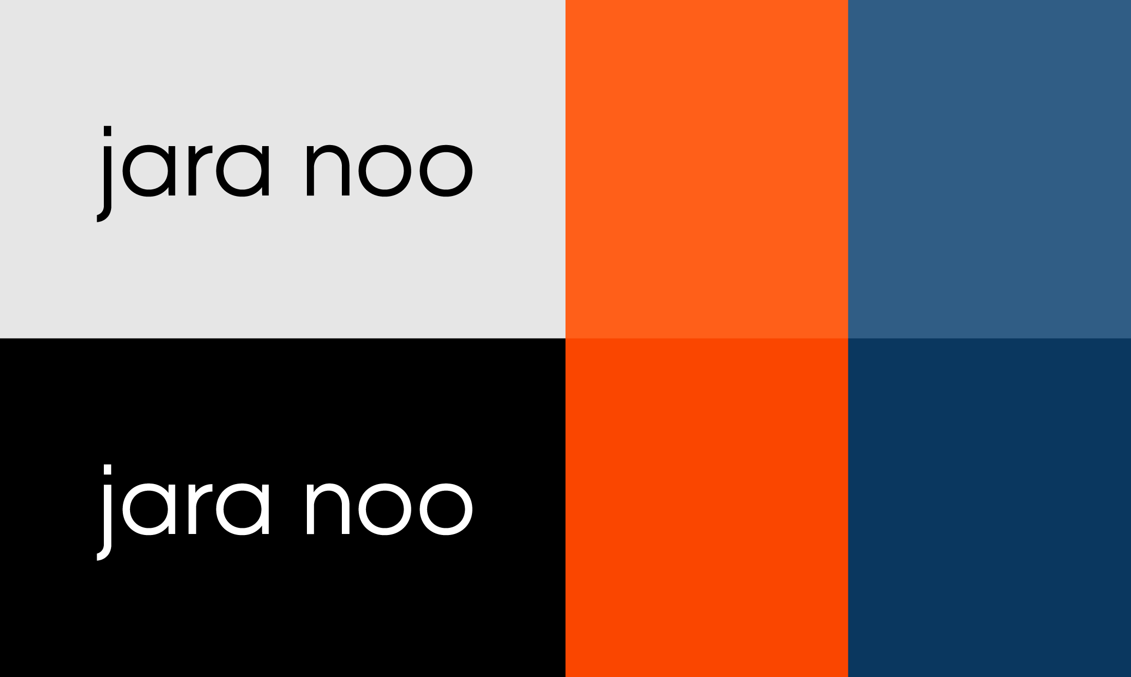
Once you have the overall shape of the logo set, test out colors. The logo maker app has defined presets that you can use to quickly iterate through different options. Use one of the words from your brand identity set to select a color that represents this word best (read more about the meaning of colors). You can use the foreground and background color pickers to further customize your color choice.
Test your logo in black and white first. Invert the logo so that it is white on black. Only after you’re happy with the logo design for the most part, try the logo in different colors.
03Elements of logo design
A. Font selection
The Mojomox logo maker app has many custom typefaces and alternate letter designs. All fonts are specifically designed to meet the needs of modern, straight-forward and versatile logo wordmarks. Mojomox fonts are set slightly tight and works well for long copy that requires a modern, constructed look.
The second geometric but rounded font is “Bauhaus Bau,” the initial idea giver behind the Mojomox logo app concept: All letters across all fonts are interchangeable in their formats due to their shared grid structure. “Bauhaus Bau” is based on the Bauhaus design of the 1920s; it has a very modular, almost playful and architectural feel. It’s rounder and its letters act as shapes because the typeface lacks full-height letter stems.
“Bauhaus Cut” is the third typeface and it’s characterized by its eccentric letter corners that add an edgy, organic and when used sparingly simply a special feel to the logo design.
The rounded typeface “Bauhaus Goji” is a sister type to “Bauhaus Geo;” it has the same structure but rounded corners for a soft, slightly playful, more approachable take on the regular Geo style.
If you are going for a modern wordmark design for your logo and the more minimal your design is, the more care needs to be put into the details. With the Mojomox app you can replace an individual letter with an alternative letter that looks different, e.g. a different letter a, o, or j, as shown above.
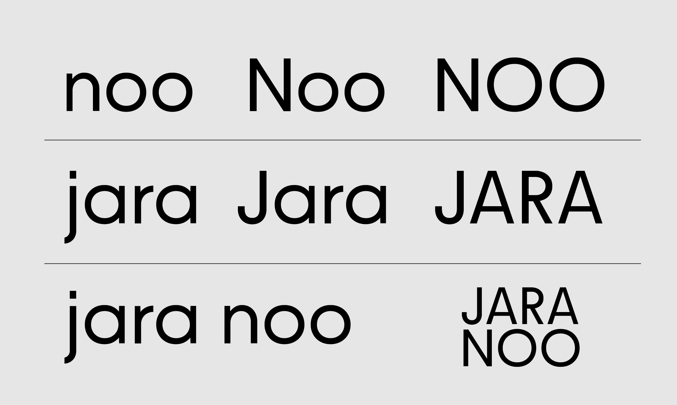
B. Case of the logo
In logo design, brand names can be set in various ways. Each of the following options embody a difference in appearance:
Option 1: "Friendly": lowercase spelling in logos (think amazon, adidas, citibank and intel, mailchimp, west elm, ebay) makes companies more approachable, casual, younger or shows a focus on tech. This style works particularly well for innovative tech logos and friendly brand designs.
Option 2: "Timeless": Leading capital letters, separated by space or hyphen if more than one word is a brand that has grown up and owns its identity: Squarespace, Coca-Cola, Microsoft, The Container Store, or Walmart. This classic approach is perfect for professional business logos and timeless brand designs.
Option 3: All caps is another timeless use and often a design decision to give the type a more unified or stronger look. Think IKEA, MUJI, ZARA, COSTCO, or NETFLIX. This bold approach works well for bold brand statements and clean, minimalist designs.
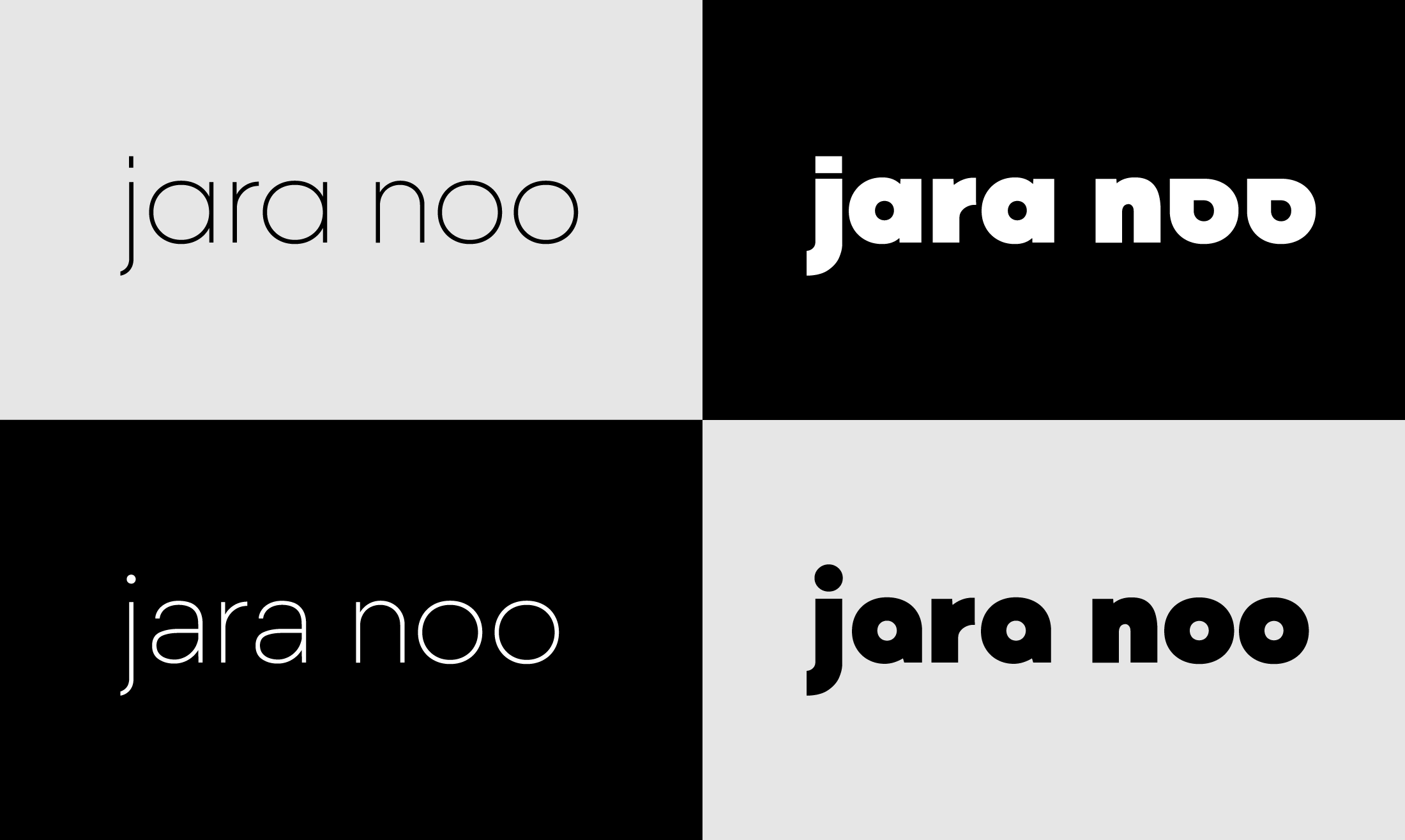
C. Font weight
The Mojomox font family comes in nine different font weights: Thin, ExtraLight, Light, Regular, Medium, SemiBold, Bold, ExtraBold and Black. You can set your custom font weight by using the slider.
There are two general rules for font weights: One, the thicker the bolder and louder a logo will appear. Thinner font weights make a logo design feel more refined and open—the thinner the logo the bigger its minimum size. Test your logo in small in the corner of a website and, on the logo maker app page, take a look at the mockup section below the logo design area to see a preview.
D. Letter-spacing
Tracking, also called letter-spacing, is the spacing between all the letters of a logo wordmark, kerning is the spacing between two letters. The Mojomox Bauhaus font family naturally has a slightly tighter tracking than a text font to give the setting more logo character. You can change the tracking by using the letter-spacing slider in the logo maker app.
04How to design logos in a nutshell
1. Think strategically: Analyze your market situation. What's your one-word-positioning? What shape does that word have? Is the shape round—like community, holistic, or a cycle? Consider a rounded logo design. Is it a square—like a container, a platform or a building block? A geometric logo style might work best. Or is it a triangle—like an exchange, a pyramid or a sharp mind? What typeface resembles that shape best?
2. Design minimally: Within the logo maker, you'll find settings to change your design. Use every setting meaningfully. Uppercase logo spelling gives authority and strength (perfect for professional business logos), lowercase logo spelling adds a casual feel (great for modern tech startups), a thinner style feels more refined (ideal for elegant, sophisticated designs), a thicker weight is bolder and younger (excellent for bold, impactful styles).
Tighter spacing between letters will make a logo feel more compact and united, and spaced-out letters will add lightness to the logo design. It’s generally a good idea to make use of letter spacing adjustments because it makes logos stronger.
3. Test in your environment: Generate multiple versions of your logo, adjust font weight and font spacing in the sidebar and upload the different versions to your website. See how it feels on a desktop computer, on a mobile phone and other applications you already have or know you’ll have in the future.
Logo maker
Type a name, swap a letter, and watch the logo come alive.