Fonts for logo designs in 2026
What are logo fonts?
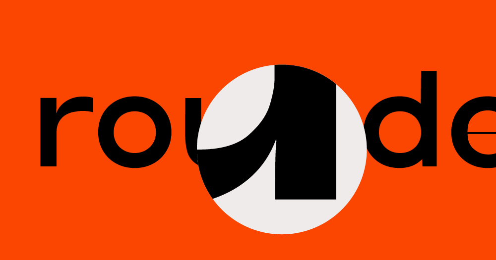
Logo fonts are typefaces designed to represent a brand’s identity in its most simplified form: the logo. They go beyond standard fonts by showing a tone, style, or message a brand could take on in just a few letters. A logo font can be minimalist and modern, bold and expressive, or detailed and artistic—it is often modified in a logo itself but it sets the base tone of a design.
Unlike everyday typefaces, logo fonts are chosen with extra care to make sure they’re distinctive and look good in logos (vs. text where readability is key). They’re made to stand out, stick, and have unifying character.
Test fonts for a logo quickly
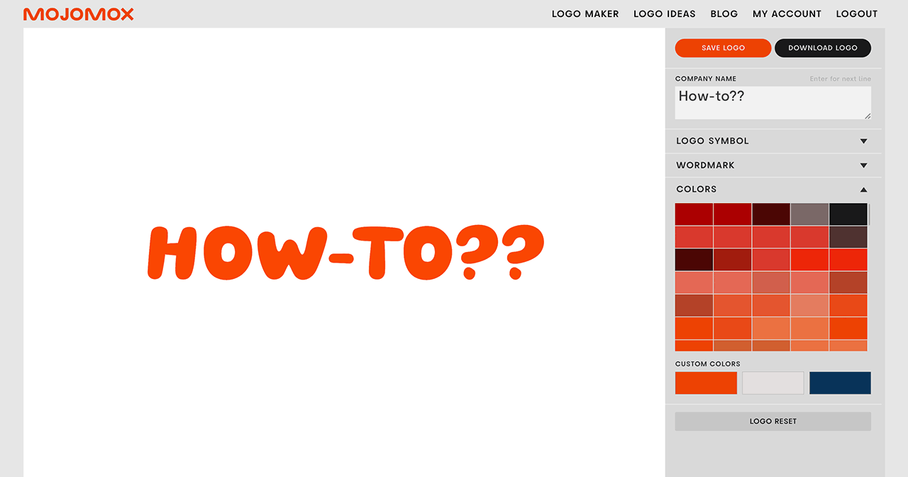
The logo maker helps you test many fonts for a logo in just a few clicks, no font installing and design skills needed. In the gray sidebar on the right, type in brand name, open up the Wordmark section and test different fonts by clicking through the font buttons. You can also pick from Google fonts. The Mojomox custom logo fonts can be fine-tuned: font weight from thin to extra bold and letter spacing. Click on a letter in the main editing area to pull up a popup window with alternate letter designs. Click on one of them to swap the initial letter.
Logo font trends for 2025
Serif and sans serif directions
For logo design in 2026, we will continue using stand-out typefaces with more character—whether it's a few prominent letters or an entire font that tells viewers it’s something different. This is particularly effective for creative agencies and tech startups looking to make a bold statement.
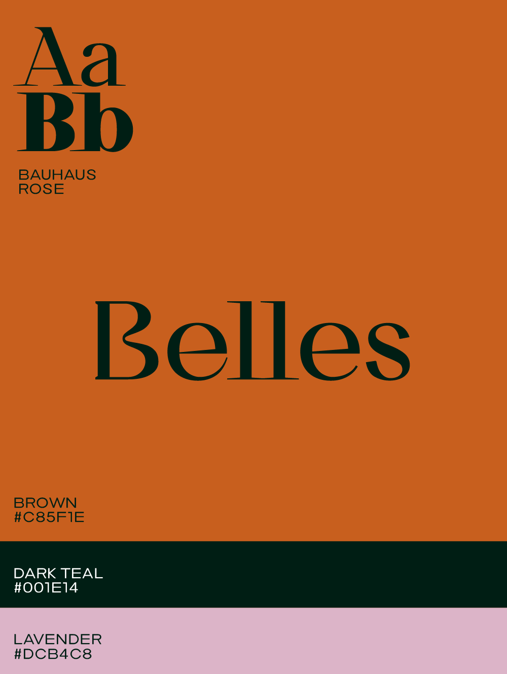
For serif fonts, expect sharp, strong serifs, playful swooshes and crossbars, swirls to create ligatures, and romantic quill-pen terminals.
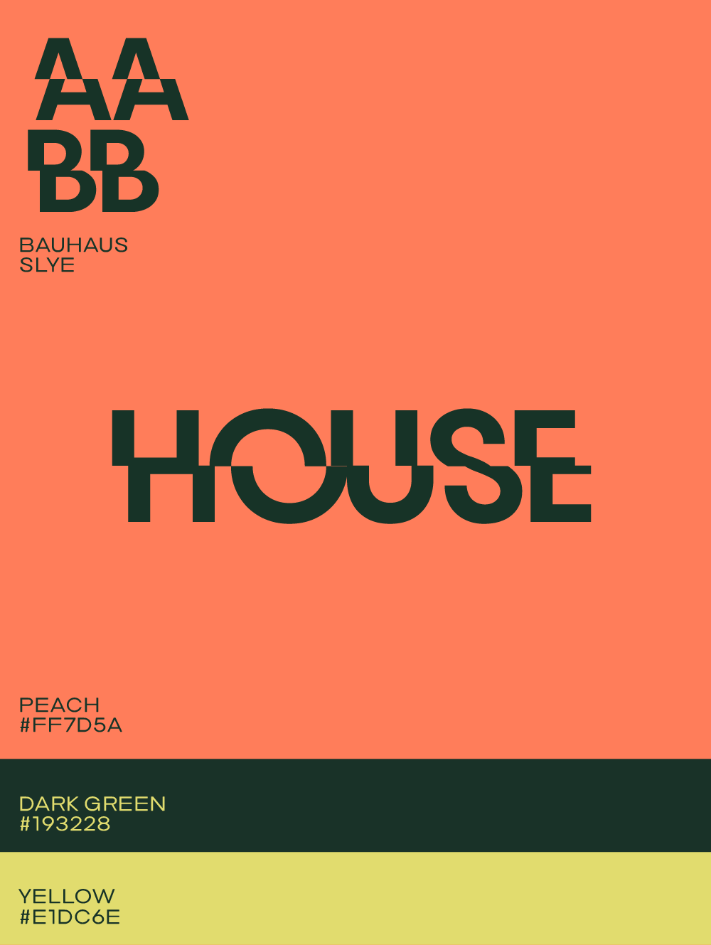
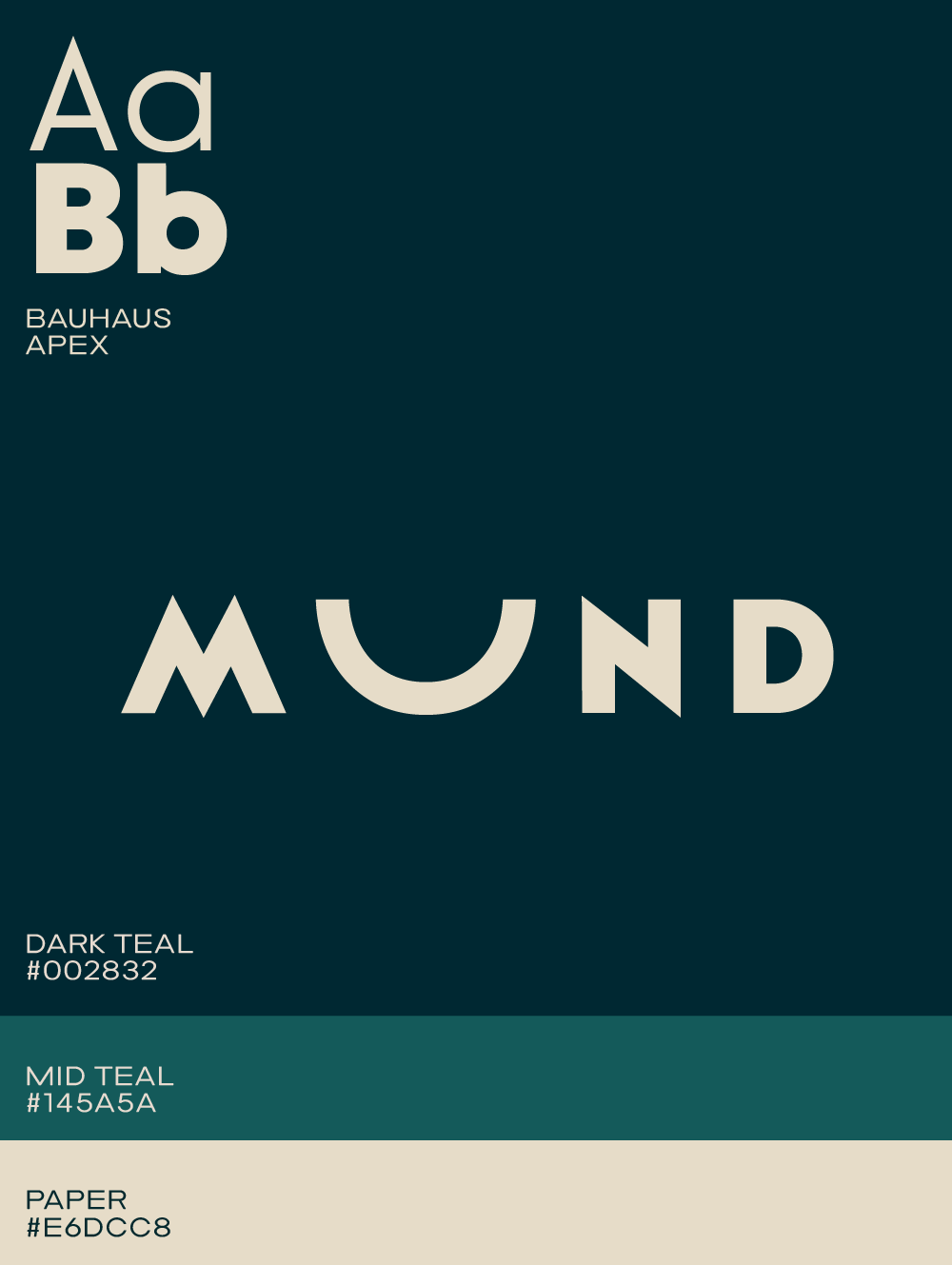
For sans-serif fonts, geometric styles remain key, with wider (extended) cuts continuing to highlight modernity. Designers are becoming more courageous when selecting logo fonts—fun and unique bubble fonts, retro fonts inspired by the 1970s, or Bauhaus-style fonts that emphasize modularity with rounded forms and shapes that feel more like shape designs than traditional letters.
If you want to test new sans-serif logo fonts with strong personalities, try Auria (airy, rounded details), Ark (architectural, technical cuts), Bitec (clean, contemporary tech vibe), or Plox (bold, rounded block shapes).
Minimal designs with tweaks
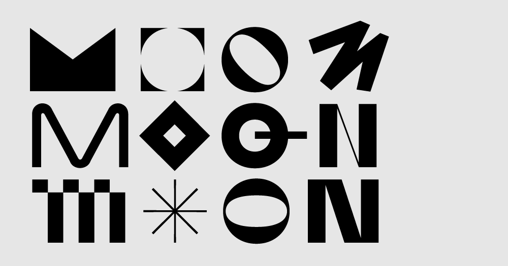
For those who prefer minimal fonts and clean logo designs, tweaking one or more individual letters to stand out has been a trend in recent years and is only gaining traction.
Maximal designs to showcase uniqueness
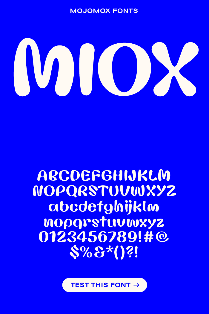
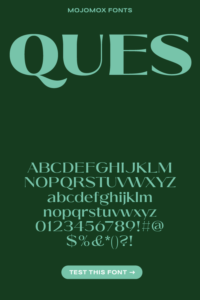
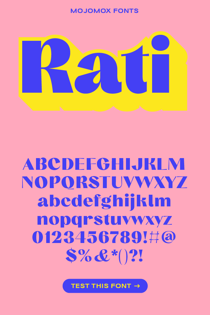
Besides the minimalism trend, there’s also a growing movement toward maximalism—whether through wider color palettes, decorative elements, or fonts that push beyond simple, clean sans serifs. Typefaces like Rati, Ques, and Miox go all in on this look.
Miox is a bold bubble font with decorative characters and alternate glyphs, making it easy to create custom logos. Like all Mojomox fonts, Ques—an elegant, wide contrast font with flared stems—comes in nine weights with stylistic sets for designing delicate logotype design. Rati, also a contrast font but slightly narrower, features unique loops in letters like B, P, and R, making it a great choice for branding aimed at younger audiences across bold and light styles.
Typography trends vs. timeless branding: Finding the balance
We’ve entered the era of “fast type design.” People love typography more than ever and are eager to experiment with it—whether on their websites, social media, or personal branding. This rapid pace is driving font design forward: to stand out, the next generation of typefaces needs to be more cutting-edge. Maximalism is in.
However, what works for personal showcasing doesn’t always work for branding. Branding is about consistency—in color and typography. When designing a logo and brand identity, it’s important to choose a timeless typeface. This ensures your look and feel won’t seem outdated a year from now.
Unique fonts for logos
1. Fun sans-serif fonts
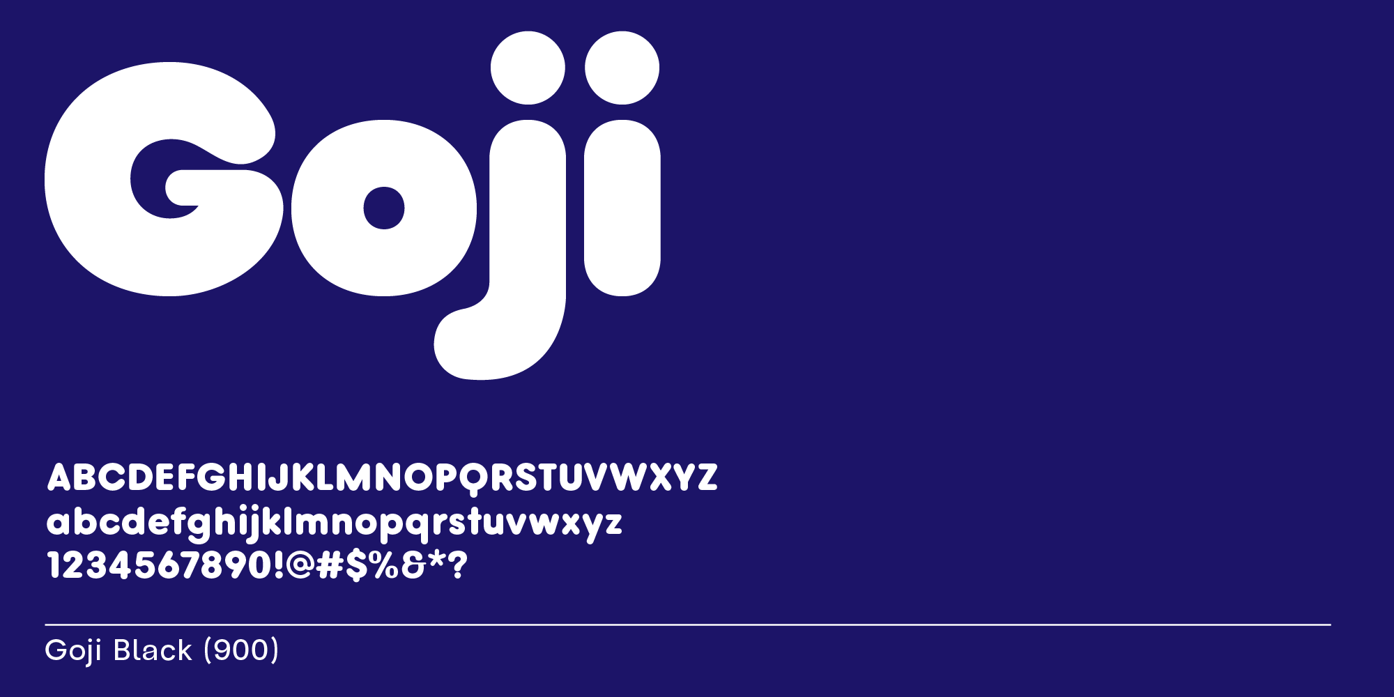
Goji is a rounded sans-serif typeface great for logos aiming for a casual, friendly, or comfortable look, making it perfect for fashion brands, educational institutions, and children's businesses.
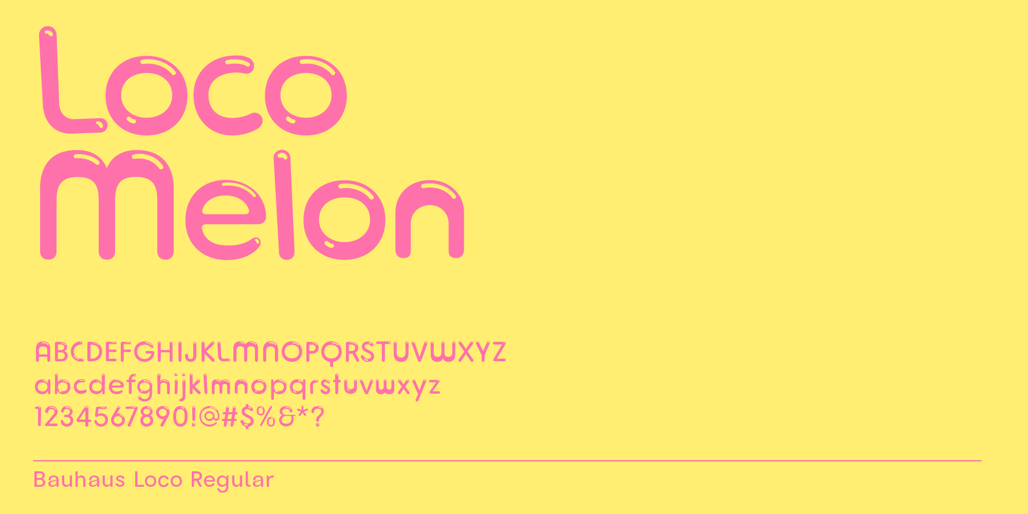
Loco is a bubble font with highlights that works well for kids’ logos and birthday party invitations.
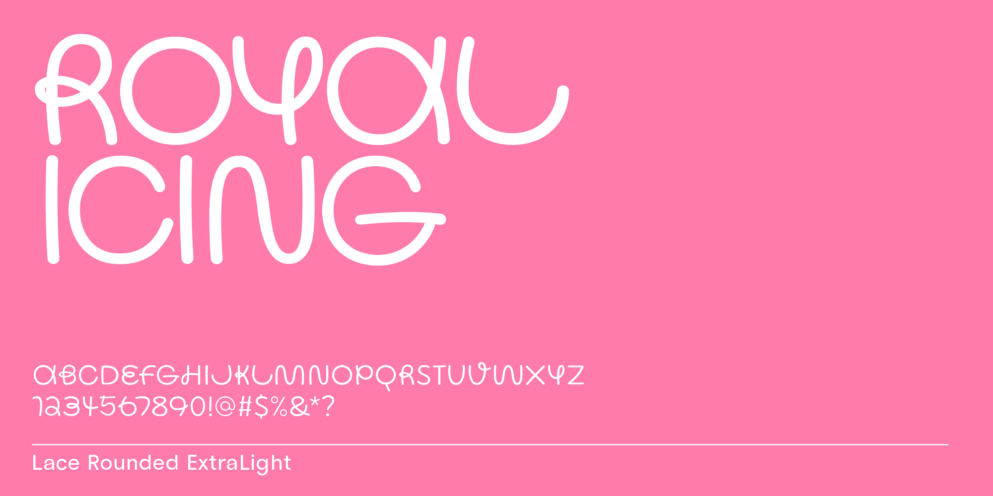
Lace Rounded is the sister font of Lace, a non-rounded handwritten monolinear typeface. Both are great for personal designs, Lace Rounded is slightly more casual.
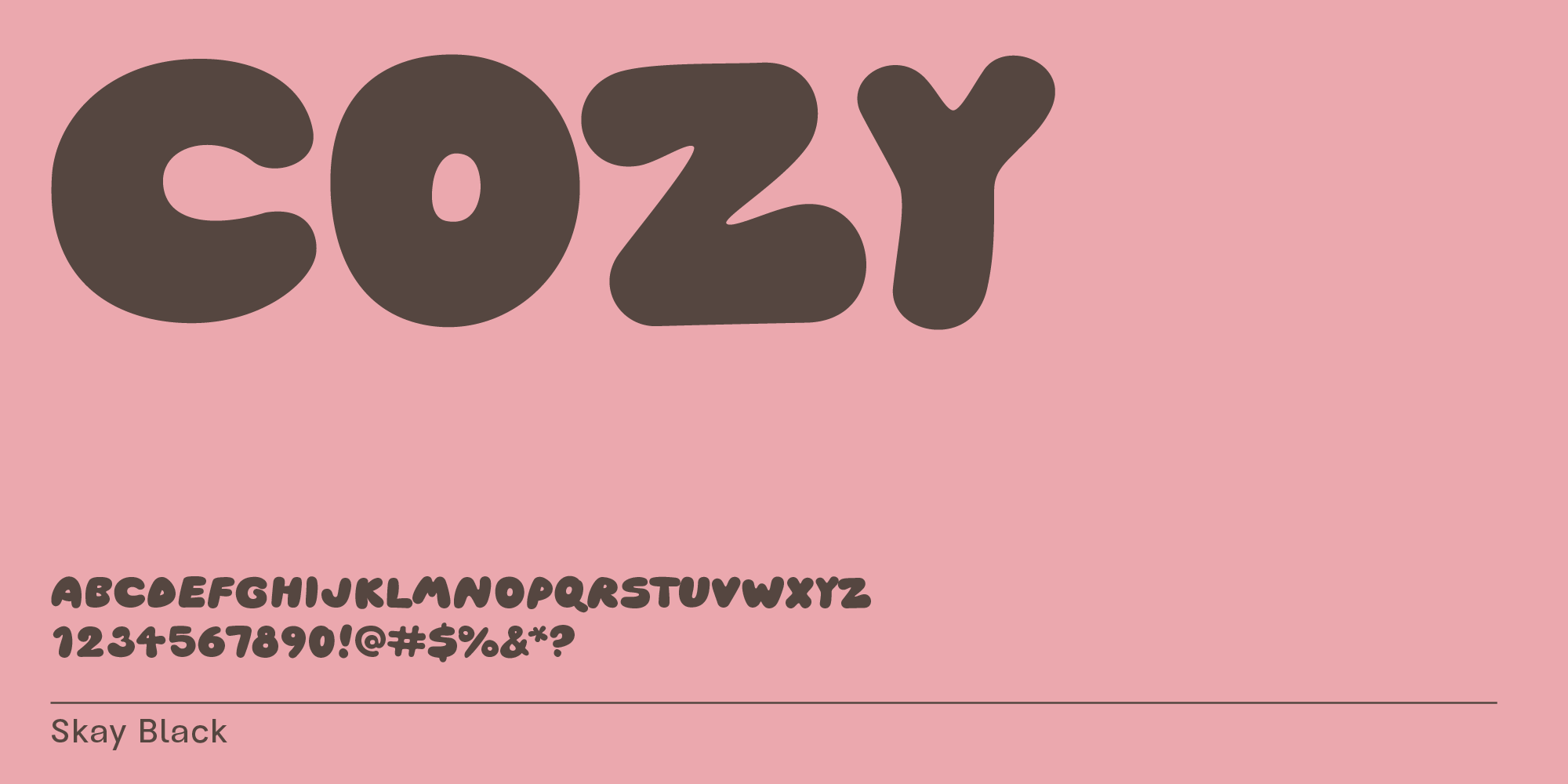
Skay is at its best when set in very bold. It looks organic and fluid, perfect for no-fuss fashion branding.
2. High-contrast & serif fonts
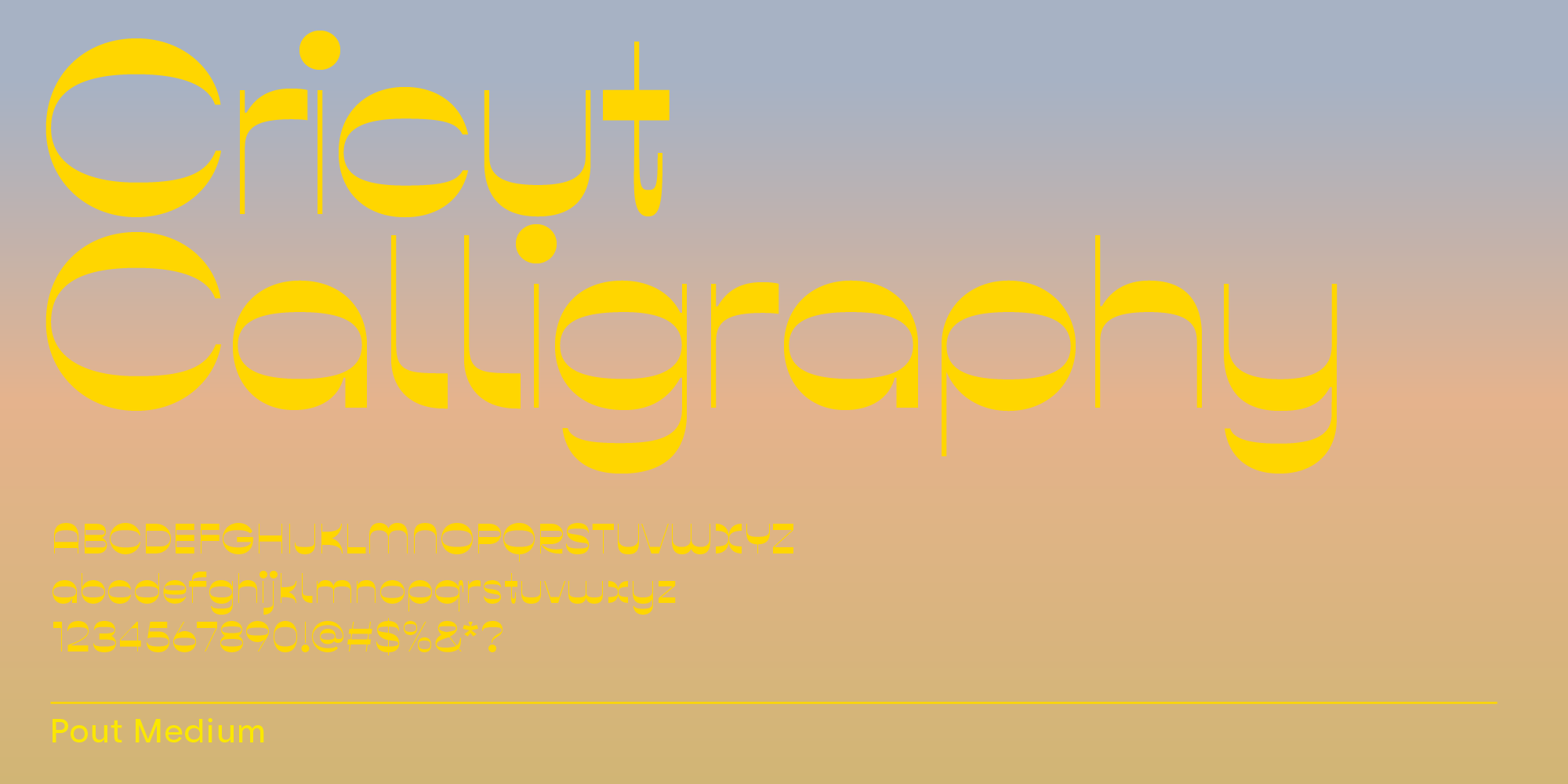
Pout is part of the reverse-contrast font category. It’s a font type that’s less common than many others, which makes it great for logo and headline design because it creates memorability, an important aspect in branding.
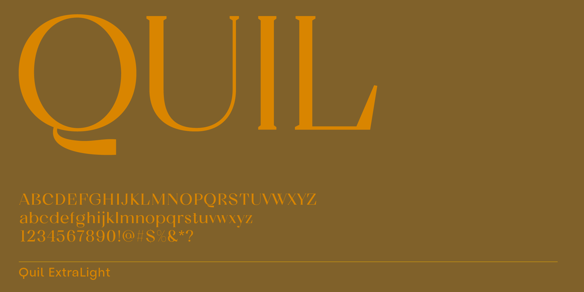
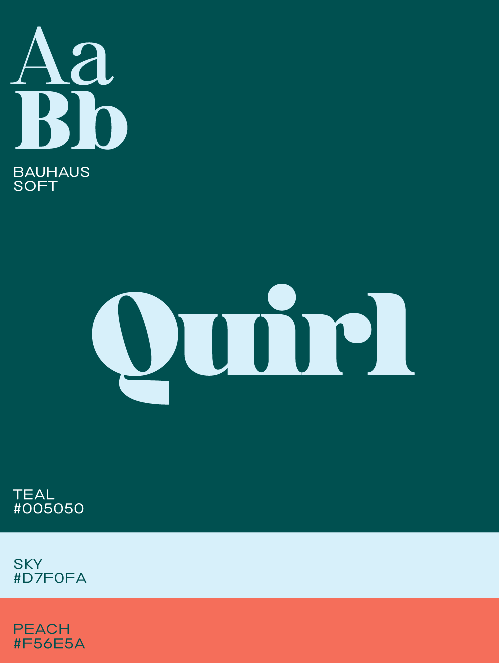
Quil is a serif typeface with short, cut serifs. This style is more casual, and along with other features, e.g. the modern tail of the letter Q, creates a modern, friendly appearance. It works particularly well for legal firms, consultancies, and healthcare providers looking for a professional yet approachable look.
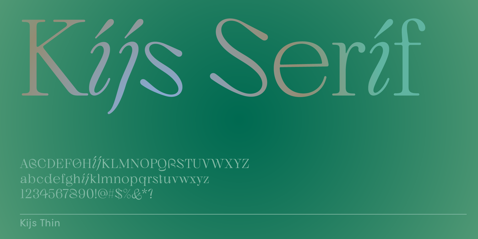
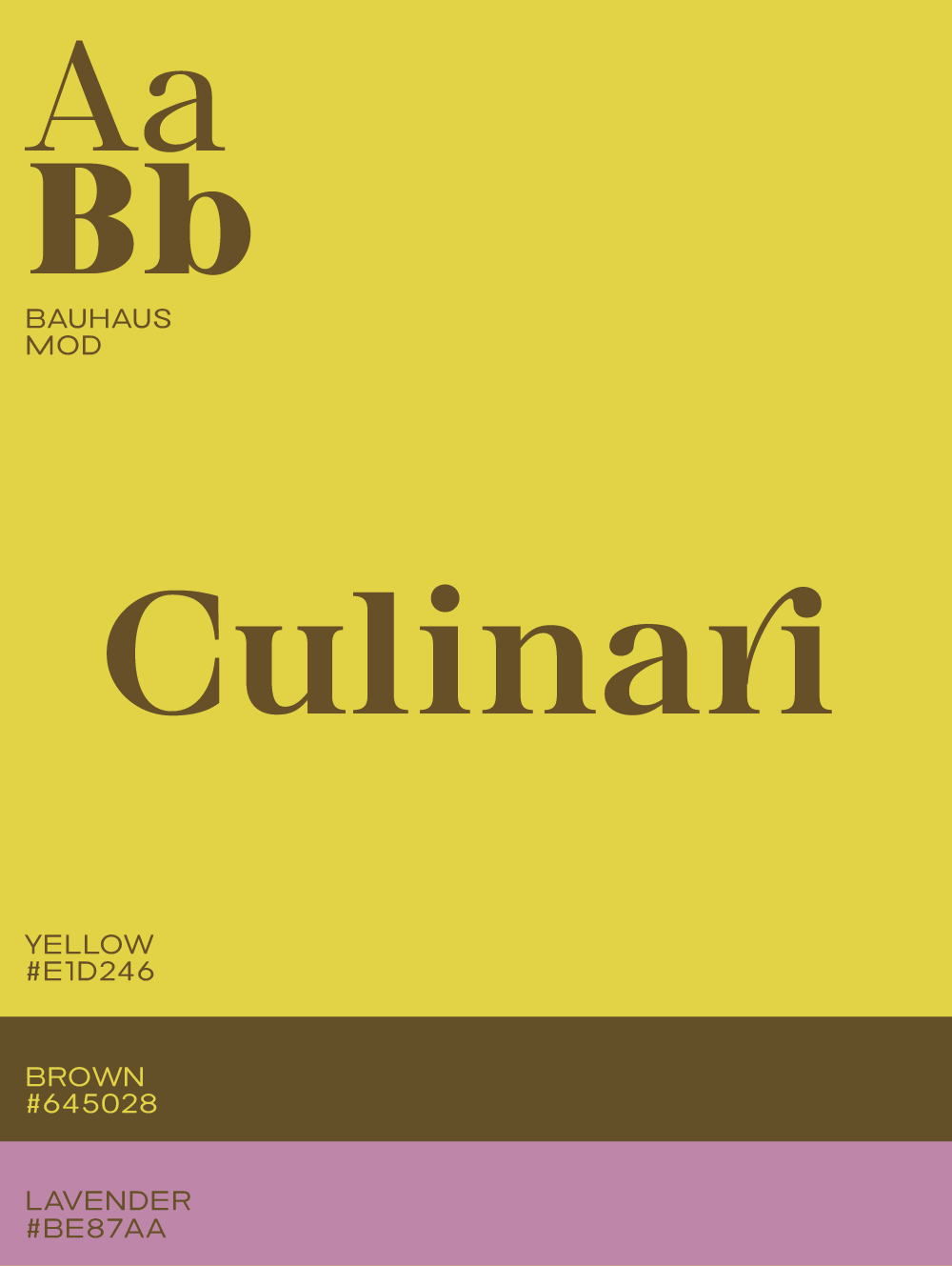
Kijs is a serif typeface with a few cursive letters, giving this typeface a natural, organic look. It’s elegant in both, regular case and all uppercase setting.
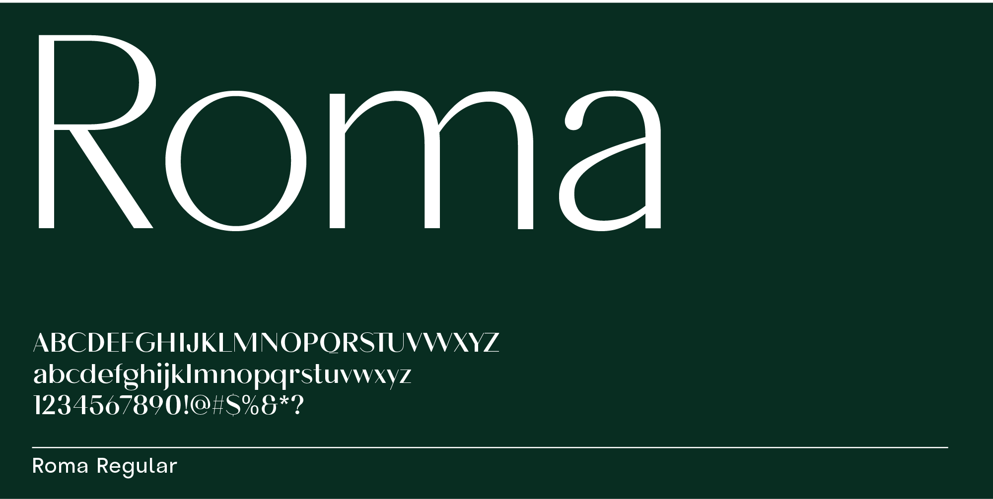
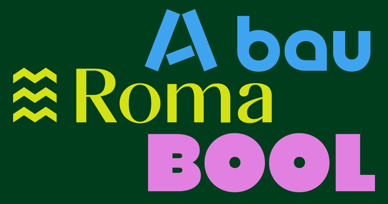
Roma is a versatile typeface that works especially well in lighter and medium weights. It looks minimal and elegant, making it ideal for beauty brands, luxury jewelry, and high-end design firms.
3. Tech branding fonts
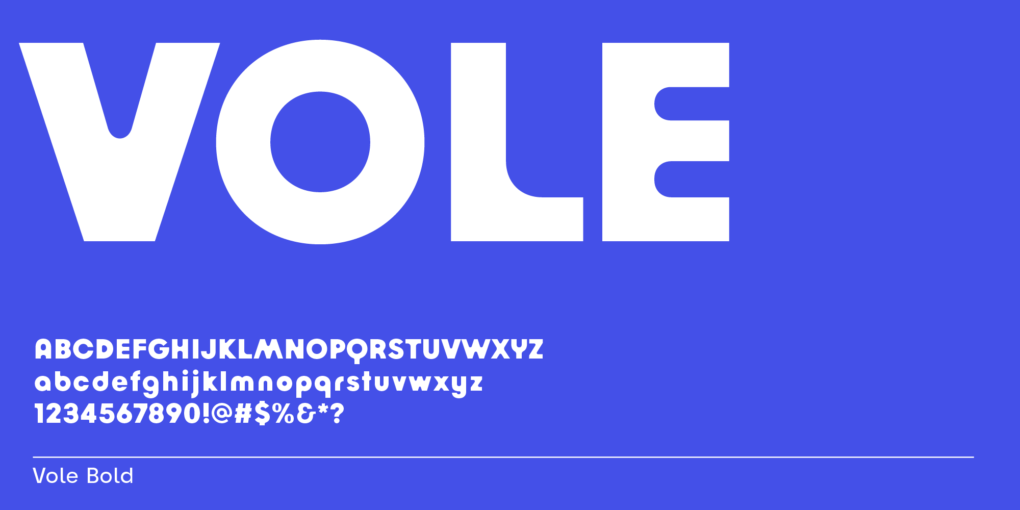
Vole is a sans-serif whose counters and brackets are rounded rather than its letter stems. This adds a unique look, making logo designs with this typeface more memorable.
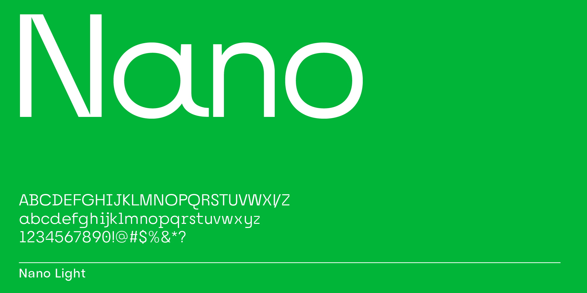
Nano is a mixed sans and serif font. The overall feel is based on a sans design with a monospace look. The partial serifs and angularity make this a typeface great for tech branding.
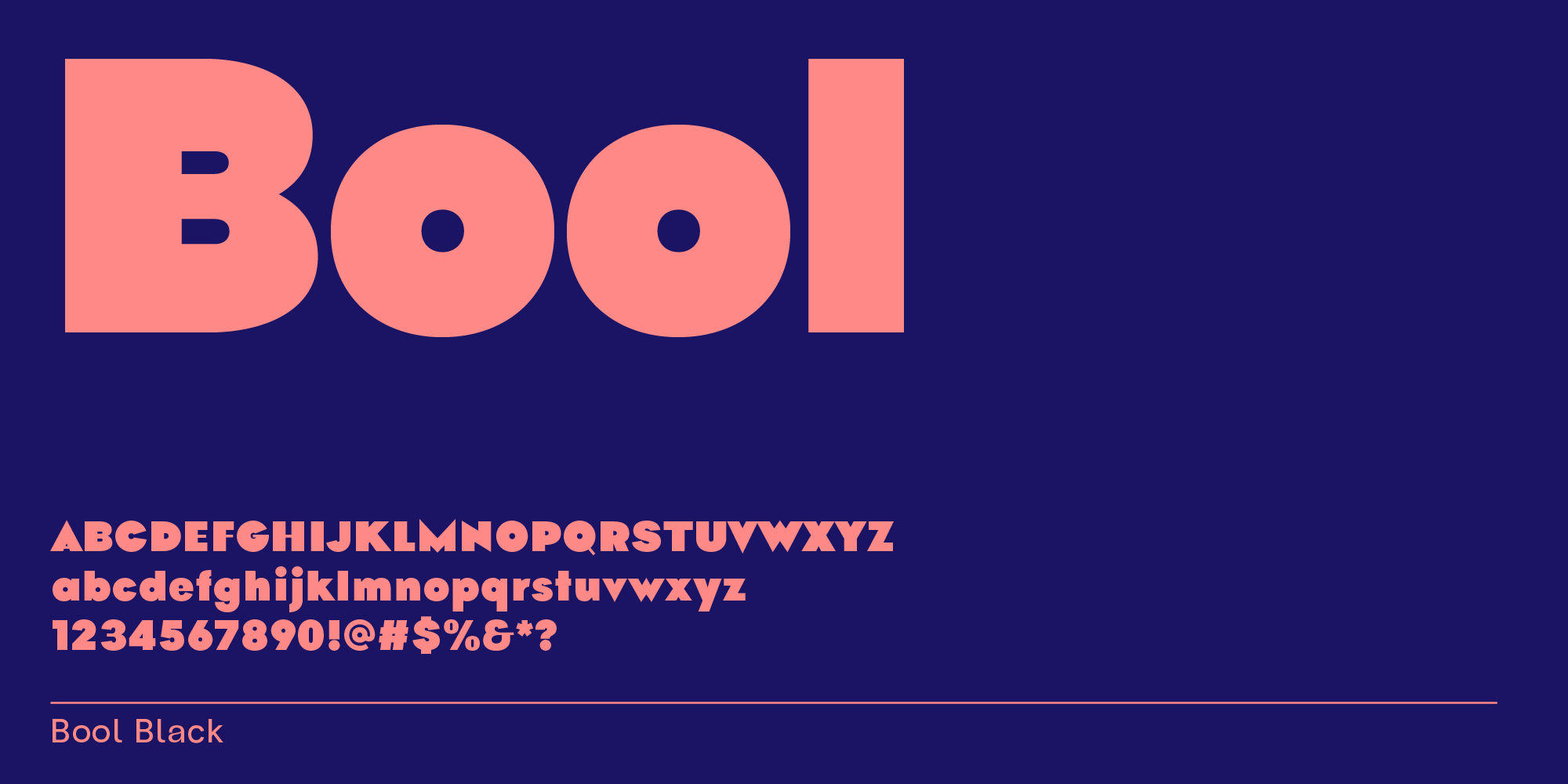
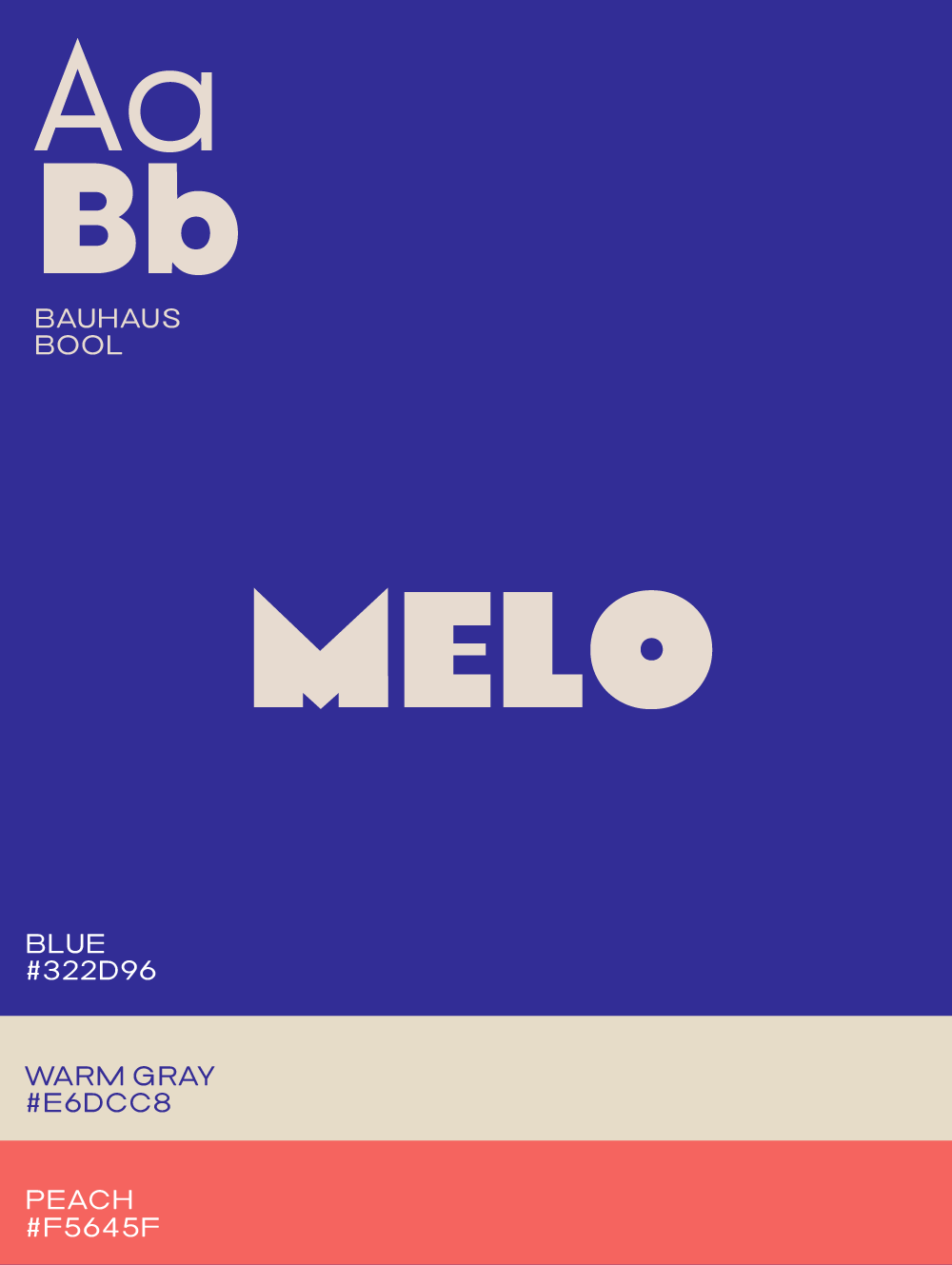
Bool is a sans-serif font with a playful edge. Some counters are offset, bars are lighter in bolder weights, and its letter tips are pointed.
Logo design templates with fonts
Sometimes it’s easiest to try out different fonts together with colors. Clicking on the templates below will get you into a type tester tool that also lets you play around with a color palette. To get started with a baseline design, pick one of the following options:
When to use a wordmark logo versus a logo symbol
Good logo design by a professional designer is, of course, more expensive than designing a logo yourself. And while there are plenty of free logo maker apps out there, they often create something a little too obvious to be interesting (like a speech bubble for a communications company), or something so random it’s not tied to your company at all.
Another approach that will usually get you a more professional output is to use a wordmark instead of a logo symbol—in other words, your company name in a timeless typeface. Avoid trendy fonts or anything overly ornate, and focus on finding something with clean lines that can be easily read at any size.
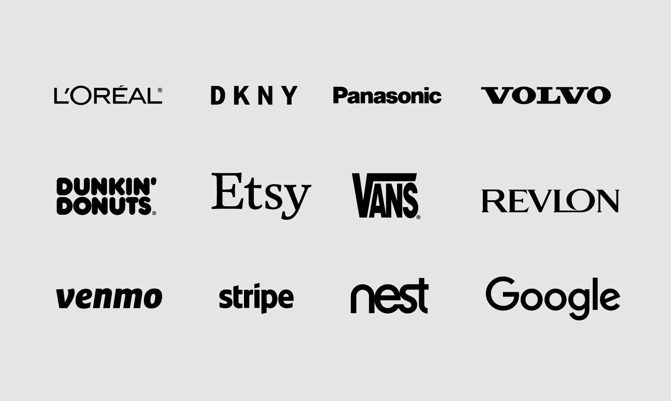
While that may not be the most visually groundbreaking design choice at first glance, it looks far more professional than a cheaply made logo. In fact, many of the biggest brands in the world use a wordmark for their logo.
Examples of company wordmark logos
Is a sans-serif font better than a serif font?
Sans serifs are a versatile choice that can work with a lot of different looks and are easy to read in many sizes, whereas serif fonts may lend a more classic and sophisticated feel to your brand. Serif fonts are prone to lose their details when set small—the serifs (the little feet attached to the letter stems) disappear easily at a tiny font size.
However, there are many applications when a logo needs to work well in small too; for example, at the top left corner of a website, especially when viewed on a phone. For that reason, serif fonts require more attention when it comes to testing a logo in a multitude of environments.
Get inspired by custom logo fonts
When leaving out logo symbols and going for a simple wordmark instead, focusing on the selection of the font is even more crucial. Every typeface has its own character—and finding the right type that has the personality you’d like to convey can be tedious. When scrolling through font platforms and type studio websites, start with having a brand trait in mind that your font choice should also express. Let’s say you’re aiming for a logo that should say “precision,” select a pointy font. This works best if your brand name has letters that can be sharp naturally, for example, the letters A, K, M, N, and W.
In any case, if a serif or a sans serif font is a more suitable font for logo designs, is a matter of what you’d like to convey with your logo rather than going only by readability at small sizes. In fact, make whether to use a sans serif or a serif font your very first decision when selecting a typeface for your brand. Here’s a simple checklist to help you through the process:
Serif fonts: Well-known examples: New York Times, Vogue, Zara, Etsy, Burberry, Volvo. Serif fonts often convey one or more of the following: sophisticated, classy, warm, personal, depth, craftsmanship, elegance.
Sans Serif fonts: Well-known examples: TED, Venmo, Diesel, Dunkin’ Donuts, Stripe, Google. Sans serif fonts often convey one or more of the following: straightforward, clean, technology, approachable, modern.
Which industries should use what fonts for logo designs?
Logos for Food & Restaurants: Use a serif when the focus is on homegrown or homemade; using a sans serif means that the focus is on clean and simple.

Logos for Beauty Salons, Products & Wellness: Use a serif font when focus is on a unique experience or custom, personal formula; a sans serif says clean ingredients, simple care line.

Logos for Marketing & Sales: Use a serif when the focus is on high-end marketing or for publishing industries; use a sans serif when you’re aiming for a broad audience.

Logos for Fitness & Wellness: Consider a serif for a personal experience, focus on women, or finer sports; use a sans serif for a broader audience, or a mix of sports.

Logos for Fashion: Use a serif for sophisticated fashion logo or a fashion brand with a historical background; use a sans serif or humanist tyepface for contemporary fashion branding with a broader appeal. See examples of modern fashion fonts.

Logos for Finance & Legal: Use a serif font for a classy, more expensive firm; use sans serif for more affordable offerings or a younger audience.

Logos for Media & Publishing & Communications: Consider a serif for classic book publishing, sophisticated writing services; use sans serif for contemporary publications, affordable writing services, and modern PR.

Logos for Nonprofits & Politics: Use serif fonts for a more sophisticated audience or nonprofits with educational purposes; use sans serif fonts when the focus is on loud and actionable communication.

Logos for Crafts: Use serifs when focusing on craftsmanship and personal creations; use sans serifs for focus on modularity and modern pieces.

Logos for Pets: Use serifs for a focus on elegance, use sans serifs for a focus on friendly, ease of use, and basic items. A fun font for pet logos could be this type similar to the Cocomelon font.

Logos for Kids: Use serifs for a focus on education, personalized approach, pricier items; use sans serifs for focus on fun, simplicity, and affordability. For a list of fonts that highlight a fun environment and friendly personality, check our 2024 fun fonts collection.

Logos for Apps, IT & Tech: Consider serifs for B2B companies whose customers also use serif fonts or apps offering high-end solutions; most often: use sans serifs to show ease of use and approachability.

What’s the cost of logo fonts?
Option 1: You can buy a single font style from our font studio or on larger font platforms such as MyFonts and Creative Market for around $24. You’ll then need to install that font on your computer and activate it to create a logo with a graphic program that you have on your computer.
Option 2: You can get free fonts from Google Fonts that you can download to use for a logo design. To make your branding more cohesive, you can also use the very same font from Google web fonts for all of your copy on your website, such as Wix, WordPress, Squarespace, and so on.
Option 3: At Mojomox, you can design your logo right here with our logo maker using our modern and unique fonts specifially crafted for logo designs. You don’t need to purchase the font for the logo, but if you can also purchase the same font you picked for your logo to use it in other programs such as Canva.
FAQ: Choosing the Right Logo Font
What common mistakes do beginners make when choosing logo fonts, and how can they avoid them?
One common mistake is picking a font solely because it’s trendy without considering its long-term appeal. Trendy fonts can feel outdated quickly. Another pitfall is choosing a font that’s too intricate or hard to read at smaller sizes. To avoid this, test the font in different scenarios—website headers, business cards, and social media profiles—and think about how it will hold up as your brand evolves.
How do logo fonts differ from regular fonts in design considerations?
Logo fonts are chosen with a focus on distinctiveness, scalability, and brand alignment. Unlike regular fonts, which might be used for body copy or headers, a logo font often serves as a brand’s centerpiece. It has to balance being memorable while remaining legible in a variety of sizes and formats. Details like unique letterforms, ligatures, or playful quirks often make a logo font stand out.
What features in Mojomox help beginners experiment with logo designs easily?
Mojomox offers a logo maker with modern fonts that are already optimized for branding. You can quickly customize fonts, adjust letter spacing, and test colors in real-time. Unlike downloading a font and guessing how it will look, Mojomox allows you to see your logo design take shape instantly with drag-and-drop simplicity.
Can you suggest a quick decision-making process for choosing a logo font?
Start with these three steps:
- Identify your brand personality: Are you aiming for modern, playful, elegant, or bold?
- Decide on a font style: Use sans serifs for a clean and contemporary feel, serifs for a classic or sophisticated tone, or playful fonts for more character.
- Test readability and scalability: Ensure the font looks good in small sizes (like on a website header) and remains clear when scaled up (like on a billboard or packaging).
What’s the simplest way to test if a font looks good across all branding touchpoints?
Create a quick checklist:
- Does the font remain readable in small sizes (e.g., social media icons)?
- Does it look professional in larger formats (e.g., signage or packaging)?
Using a tool like Mojomox’s type tester can simplify this process—you can preview your font in a few preview layouts before making a final decision.
Summary
With the rise of interest in typography, more fonts are available across many websites and platforms. While experimenting with type is fun, professional branding requires consistency and that means keeping your brand’s typeface for years to come. For that reason, it’s key to pick a font that’s classy and won’t go out of style anytime soon.
To get started with your logo, type your brand name into the field below:
