Logo Ideas From a Logo Maker App
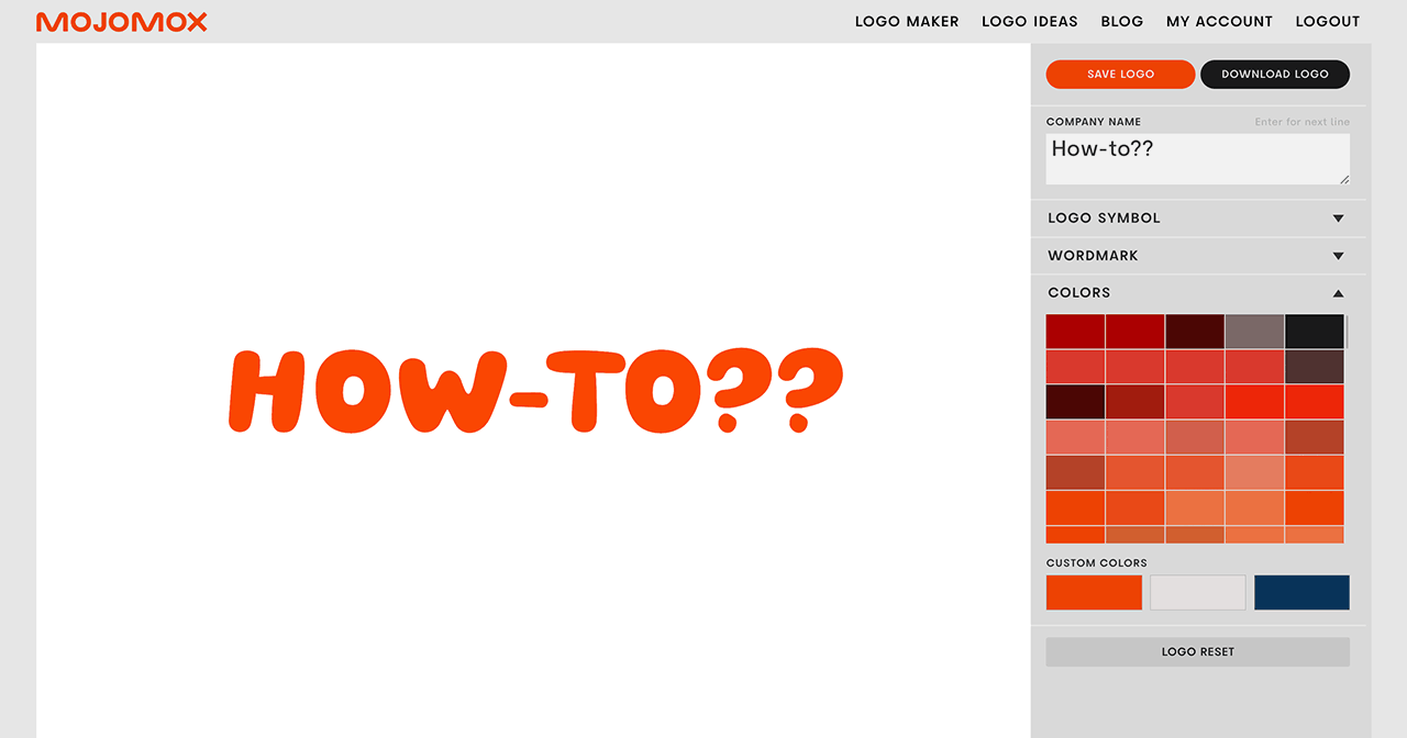
The Mojomox logo maker helps you design a logo quickly—no design skills needed. You can click through symbols, try custom logo fonts you can’t get anywhere else, adjust font weights from light to extra bold, swap letter designs, and create color palettes in a few clicks. The Mojomox app automatically generates a full brand kit right below your logo, so you have everything ready to go in one step.
Logo Ideas by Industry
Logo Symbol Ideas by Topic
Need more logo symbol ideas?
Try our logo maker app for more logo symbol options. First, type your company name into the input field to get into the logo maker. You’ll get a long list of long ideas. Pick any of them to get into the logo maker. Next to the editor, in the gray sidebar, click “Symbol,” select a subcategory and scroll through the many icon options.
Unique one-of-a-kind logo symbols
You can also add a unique logo symbol to your brand. Logo Icons offers one-of-a-kind symbols that, once bought, are removed from the shop so that no one else can purchase the same icon.
Logo Ideas With Fonts (Logotypes)
More font ideas?
See font shop for more logo font collections.
Logo Design Ideas by Style
Starting With Logo Font Templates
How to Include Strategic Branding in a Logo Idea
Before diving into logo ideas, it’s important to understand two key pillars of branding: consistency and uniqueness. Consistency ensures that your brand is easily recognizable—by using the same logo, colors, and tone across all platforms, you help people identify your business quickly and build trust over time.
Uniqueness, on the other hand, helps your brand stand out in a crowded market. Standing out should be strategic—and it should represent your brand’s positioning. Positioning is what people think of a brand—usually that’s one or two words. It’s how people sort a brand into its competitive options.
When brainstorming logo ideas, research your competitors and ensure your design choices (like logo style and colors) are unique. For a modern approach to branding in 2026, consider a wordmark logo—a type-driven logo that highlights your brand name. Unlike logo symbols, such as a camera for a photography shop, wordmarks focus on typography, which makes them more modern, clean, and versatile in many ways.
Use Other Logos as Inspiration
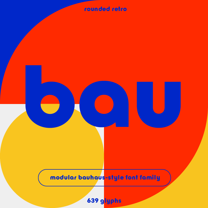
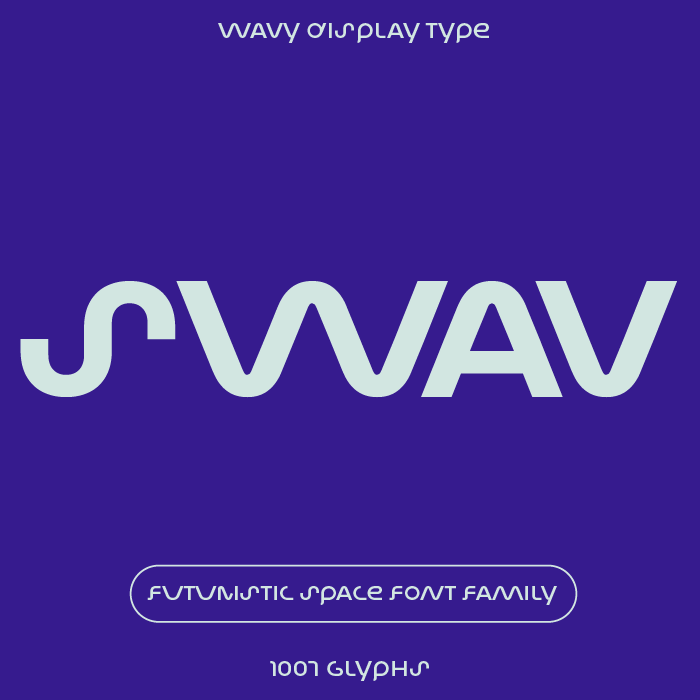
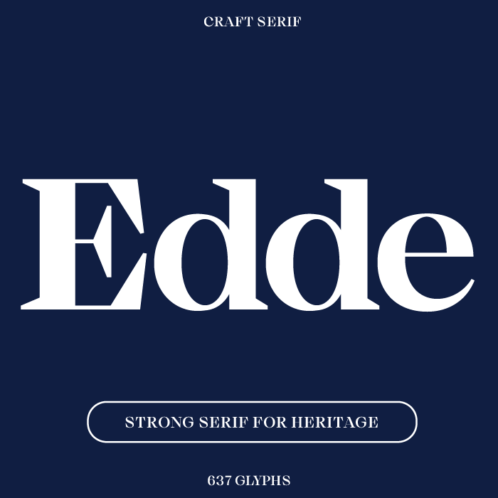
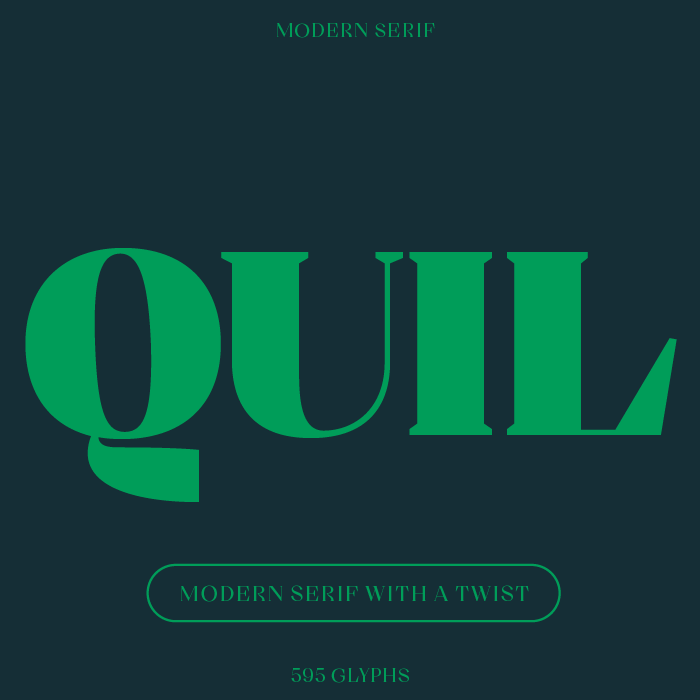
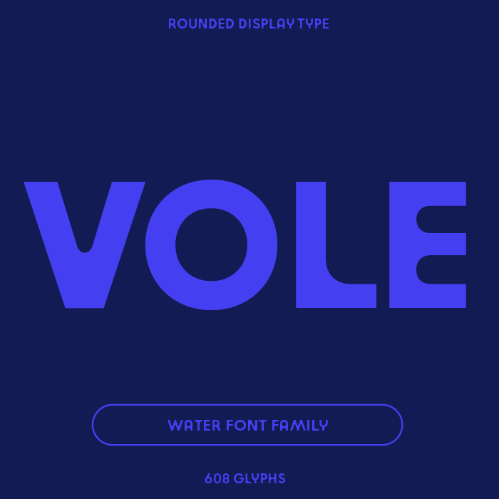
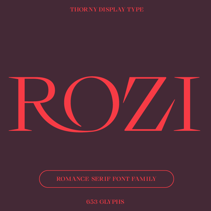
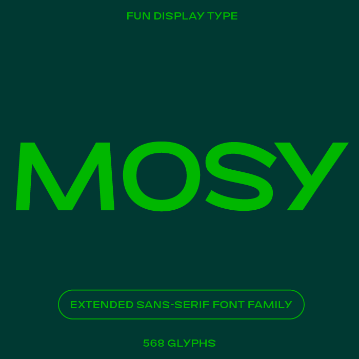
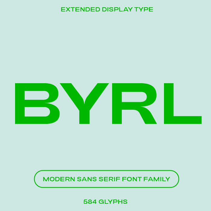
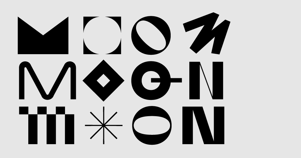
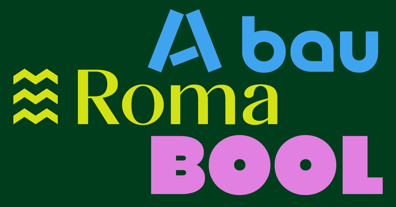
You’ll find nine logo templates above. All of the logo fonts shown are part of our unique mix-and-match Bauhaus font system.
When you look at a logo for inspiration, notice the following 6 things:
- the differences between serif (fonts with little feet) and sans-serif fonts
- letters or details in the fonts that stand out
- spacing between the letters (this is called letter spacing or tracking)
- the case: ALL CAPS, lowercase, or Title Case?
- the weight of the type—is the logo bold or light?
- the color
For a more approachable feel, try a sans serif font first. If you’re going for personality, elegance, or sophistication, a serif font works better. Wider letter spacing makes a logo feel less corporate, tight spacing makes it feel compact. Title case is a good standard for how to spell your business name in a logo. All caps is classy too. Lowercase is very friendly. Thicker type says bold and young, thinner type is elegant. Details in a logo font make the entire logo unique and more memorable.
For example, if you’re aiming to design a logo that communicated strength and precision, select a font with pointy tips. Common letters that can be sharp are the letters A, K, M, N, and W.
Or, if your brand should convey a sophisticated, perhaps natural tone, take a look at these typefaces similar to Nature mag’s font.
Or, if you’re looking to highlight a personal creative brand, a playful identity, or if the brand positioning for a campaign is centered around “fun,” check out this fun fonts collection.
Two Different Ways to Start Your Logo
Start with a template: An easy way to get started with your own logo is by clicking one of the templates above. This will open up the logo maker app for you to customize the business name, design, and colors.
Start with a font: Instead of diving into all logo aspects (symbol, font, colors) at the same time, start with the font. Have a character trait in mind that you want to get across in your brand. Just focus on that. Then, pick a font category that matches your chosen trait or brand tone. For example:
From Idea to Logo Design in 3 Steps
Step 1, Name: Type out company name
Type your company name into the logo maker input field and click the Next Step button. If you’re wondering how to name your company, have questions on spelling and naming formats, you might find reading How to come up with a brand name helpful.
Step 2, Logo ideas: Select baseline design
On the logo ideas page, you’ll see a selection of logos. Uncheck the colors you don’t want to consider, pick an industry if you like and specify the logo style. For a modern or cool logo, try a wordmark first. You can always add a logo symbol later in the logo maker app.
Step 3, Customize: Modify logo
In the main editing area, click on one of the letters of the logo. A dropdown of alternative letters shows up right below the letter you clicked. To select another letter for your logo, click on one of the alternative ones. In the sidebar, use the sliders for logo symbol, font weight, and letter-spacing to change the overall feel of the logo. In short: the lighter, the more elegant; the bolder styles speak to a younger, punchier audience. Read more on how to design logos—the article gives an overview of what fonts to pick, spelling, spacing etc.
Tips for Designing
How to pick the right font?
Whether a logo is a business logo or a mark for a personal brand, the process for finding the right logo font is the same: Have a logo idea in mind and then click through the font options in the right sidebar of the Mojomox logo maker app. Go back to the Logo for Inspiration section above to read about the different meanings of serif and sans serif fonts.
Once you’ve found the right font, tweak it with the sliders. Try, for example, the weight slider: the thinner the logotype, the more elegant the logo. The thicker the type, the stronger a logo appears. Thinner styles are harder to read when the logo mark is small.
What logo format is better—vertical or horizontal?
The most versatile logo format is a horizontal logo (logo on the side of the wordmark), as opposed to a stacked logo (logo symbol on top of the wordmark). You can have both a horizontal and a vertical logo lockup for your brand, but it’s quicker to get started with one that fits nicely into the top bar of a website. If you have a long brand name, consider stacking the words—we’re aiming for a nice, little package.
How to pick colors and how many colors should I have?
It’s a good idea to have a few color options in mind when looking for logo ideas but in the logo design process picking a color palette comes after having the actual logo design done. This way you keep the focus on the font and symbol details of the design. A color palette should support another aspect of your brand strategy than what your logo does. So, if your logo font says elegance, your logo symbol is a group on circles to communicate “We’re about community,” you want to find a color palette that is far away from your competitors’ colors so that people can remember your brand more easily, “the guys with the red umbrellas, not the blue ones.” When it comes to the amount of colors in your palette, there’s no right or wrong, but it’s easiest to own one color (your main color), have a secondary color as support, and a third color as a standout color, for example, for the use of call-to-action buttons on your website.
In Mojomox, the fastest way to find a palette is by starting out with a preset palette. In the gray sidebar, click on Colors and click through the color fields. Each field represents a palette of three colors, the main color being the one that’s shown. Once you have a palette that you want to make adjustments to, click into one of the three color fields below Custom Colors. With the color picker tool, click into an open document on your computer to get a color, move the color navigator, or type in an RGB or Hex number.
When selecting colors, keep looking at the brand kit section below the logo editor to see if all color combinations are easy to make out. If not, fine tune the colors until they all match well—that will make your life easy when designing future assets.
How to quickly test your logo idea before finalizing
Designers know that good design means that form follows function. Whether you’re aiming for a cool logo or a classic logo design, the functionality is most important. In practice, that means: Before exporting your logo files, make sure the mark is readable in small. For that, scroll down inside the logo creator to the Brand in Context section and see if your logo works in small. Tweak the design until it does.
Then, it’s time for testing your design. Download multiple versions of your logo (lighter and bolder weights, more or less letter spacing) and upload them to your website. See which one works best. Try other applications too. For example, if you will have packaging that will be shown on shelves, print out your logo and mount it on a sample box. See if the logo stands out next to competitive products.
Try the Mojomox logo maker (no account needed, it’s free to try) by typing your brand name into the input field at the very top.


