Cool Logos: What Makes Them Cool (And How to Design One)


What makes a cool logo? It’s not about fancy effects or complex designs. Cool logos are really about balance, clarity, and a clear brand personality. Cool logos are the ones that stick in your mind, whether because of a unique typeface choice, custom letters, or just plain simplicity. Think about Nike, Supreme, or NASA—strong, confident, and recognizable.
A big part of a cool logo is the typography. A well-chosen font can do much of the hard work. That’s why modern brands lean on custom typefaces or meticulously selected fonts that create a strong visual identity on their own. In fact, unique fonts—when used for headlines on a website, social posts, and so on—function as a logo without showing the brand name. For example, a simple Mercedes text ad is easy to recognize without seeing a car or the logo. So if you’re designing a logo, it helps to start with a font foundation—one that’s both functional and unique.
What do “functional” and “unique” mean for fonts? Functional is what you need to cover first because it’s about practicality and being able to design things quickly in the future. Functional is you saying, I need a font that lets me type in these languages. Thai or Icelandic? The font you pick needs to have letters for those languages included. Publishing long-copy formats such as books or white papers? You want to find a font that’s easy on the eyes. But: Being super functional may not be needed for finding a logo font unless you also want to use the same font as your brand font and put it to work in all of your marketing assets, headlines, and such.
Then, once you’ve got your functional requirements covered and a selection of fonts in front of you, you’ll look at what makes them unique. “Unique” will make you cool. Not the weirdo unique (I’m way too different), but the I-clearly-look-a-bit-different kind of unique. It means being strong and touching on our current times’ sense of design. Email me if you want my two cents at saskia@mojomox.com :)
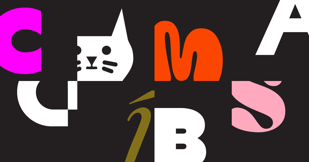
Another factor? Meaning. A cool logo doesn’t repeat itself. If your typeface already says elegance, there’s no need to echo that with an elegant icon. Let your symbol—if you even need one—add something new to the story. Want to say “cool” with a bit of edge? Cool with fun? It could be a cat. Just not a copy cat—you want to look different than your competitor.
But sometimes, cool is cool enough on its own, and a strong wordmark logo does all the talking.
The best logos aren’t just nice to look at, they create a connection, an invitation to join the tribe. Pick something that means something to you as the founder, something people can latch onto and recognize quickly. That’s what it means when we talk about making a logo memorable.
If you’re looking for cool fonts to build a standout logo, check out Mojomox. With a modern logo maker and a collection of custom logo fonts, you can experiment with different logo styles in real time. Whether you’re after something bold and futuristic or refined and elegant, the right typeface (and symbol if you like) will make all the difference.
Read more about logo ideas or check out some cool logo options and type your brand name below: