Logo maker
Article
Best Logos for Restaurants: Ideas, Modern Logo Fonts, Examples
In this feature, we’ll look at some existing logos of restaurants, check out logo ideas for inspiration and learn about logo design for a modern mark with a logo creator. Then, I’ll share various restaurant logo templates that are easy to use as a starting point for your own design. All of the templates use modern logo fonts that work well in 2022.
Professional logo design starts with knowing your brand positioning. Brand positioning is the one word that comes to your customers’ minds when they think of you.
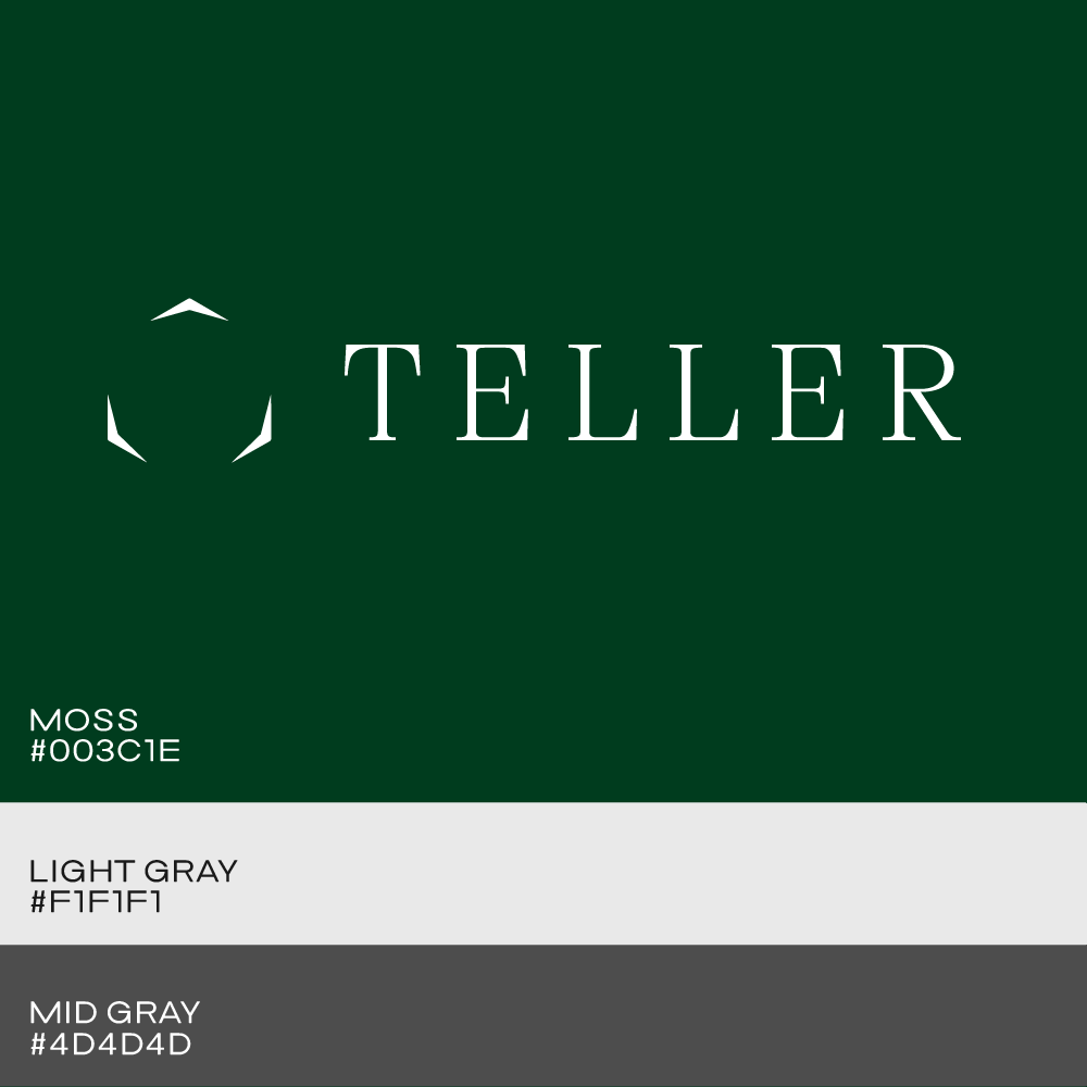
We’ll also create a color palette that supports your brand traits and works well on all of your marketing assets.
And finally, I’ll quickly show you how professional designers test their logos to ensure the mark is functional in the world it’ll live in.
To start with a logo for your restaurant, type its name into the field right below, or keep on reading to learn more about the logo design practice.
While simple wordmark logos (vs. logos with a symbol) are on the rise in logo design for all industries, these types of marks have always been popular in the restaurant industry.
Text logos, that’s what wordmarks are sometimes called too, often have a cooler, more minimalistic look to them. Wordmarks focus only on the typography portion of a logo design and are, for that reason, often more thoughtful in that regard.
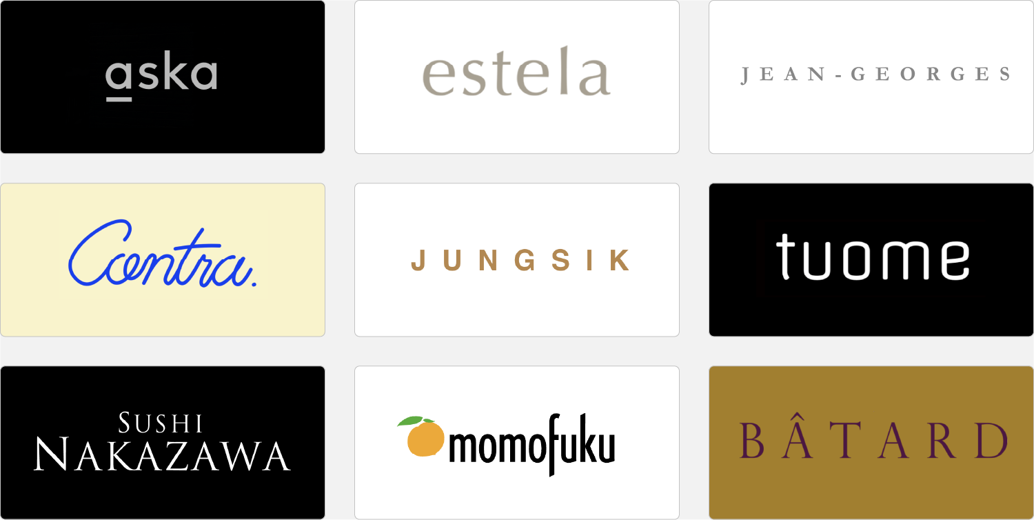
Before starting with looking for the right font for a logo, think about your restaurant’s brand positioning — the brand strategist’s term for what people think of when they think of you. In the logo gallery above, Tuome, Aska look young and approachable but thoughtful.
Sushi Nakazawa, Batard, and Jean-Georges look a bit more elegant with their serif fonts. Contra and Momofuku feel more playful and casual with a handwritten script and a logo symbol. Lowercase spelling is friendlier, uppercase more authoritative.
These seemingly minor font and design differences mirror brand personality and are worth thinking about beforehand.
Another element is letter spacing, sometimes called tracking. The wider the setting, the airier and inviting a logo feels. Jungsik and Jean-Georges are examples for that.
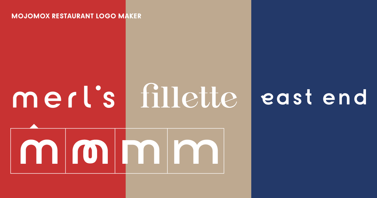
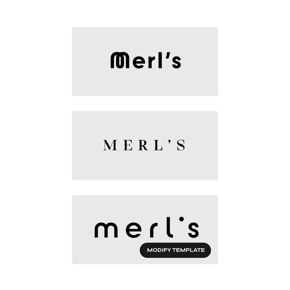
Look at the restaurants’ logos in the template gallery above. Click on one of the templates in order to get into the logo maker app. Although we recommend starting with a wordmark logo for restaurant design, the app lets you add a logo symbol easily later.
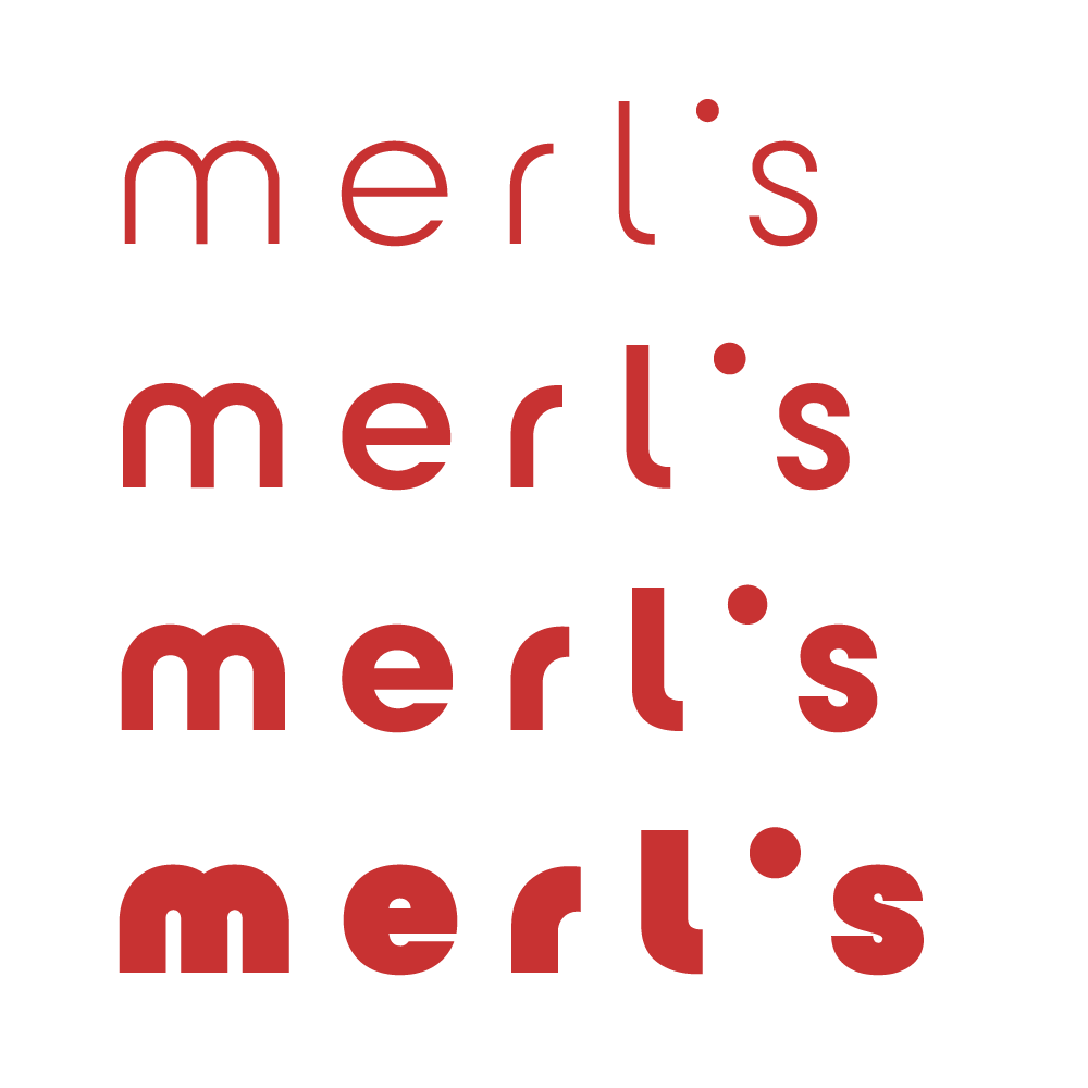
First, look at the different logo font styles and the design details. In example 1, the apostrophe adds to the mark’s originality. Example 2’s first letter e stands out while the overall logo design still feels minimal.
Then, analyze the different colors. For a more personal and sophisticated brand, pick a palette that’s more muted, dark, or pale. Pick a color in the mid or brighter tones for a more corporate look. Most importantly, use a color palette that is different from your competitors’ colors so that your brand stands out and is more memorable.
The actual logo mark and the colors don’t need to communicate the same traits of your brand. Instead, they should complement each other and create a holistic picture of your restaurant.
Although wordmark logos look more modern, they can sometimes lack character, and with that memorability, one of the most important aspects of branding.
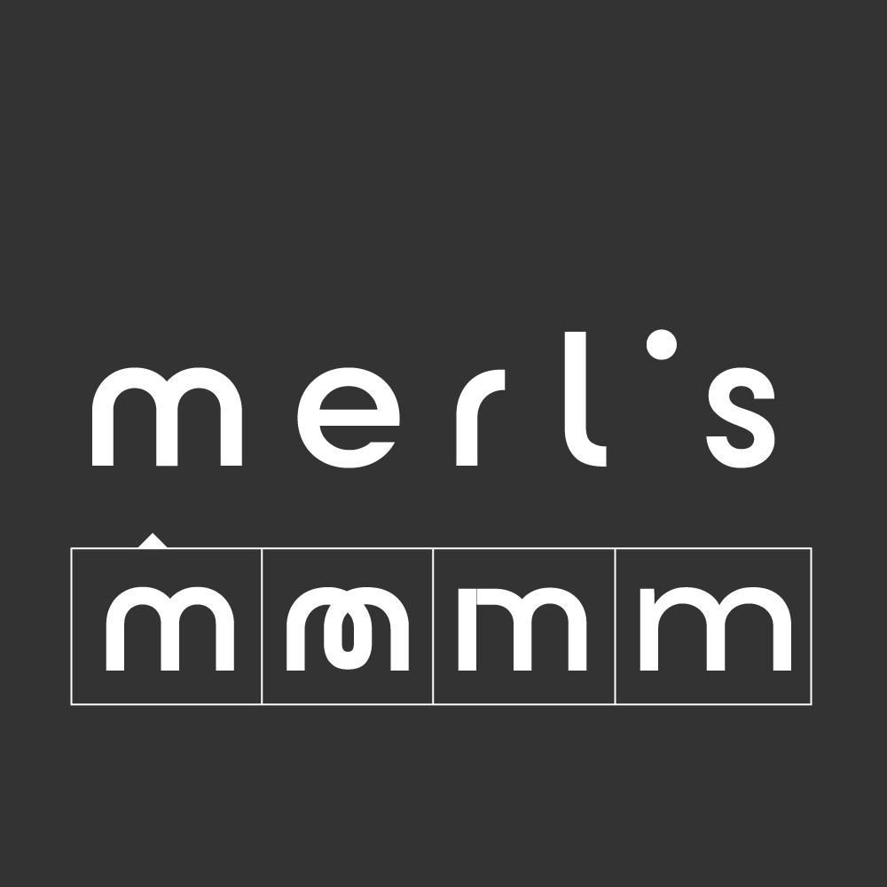
For that reason, it’s necessary to focus on the details in logo design. For example, what letter can stand out more? Which letters are prominent naturally, and how can they be enhanced further?
Professional logo design is about being simple and minimalistic—don’t overdo the concept of standing out, instead, pick one letter or the same letters of one type and see if there’s an alternative letter shape that supports your brand traits and helps the logo stand out.
Swapping a letter with Mojomox is easy. Learn more in the tutorial section below.
To see examples, in the template gallery above, check out the letter R in logo template 6, the letter e in template 2, and the letter Q in template 7.
Type in your name into the logo maker for restaurants and logo designs will populate right below. Some designs have logo symbols, others are simple wordmarks.
We recommend you start with a wordmark if you’re going for a modern brand look. These types of logos look more minimal and focus on a personal style rather than a corporate style.
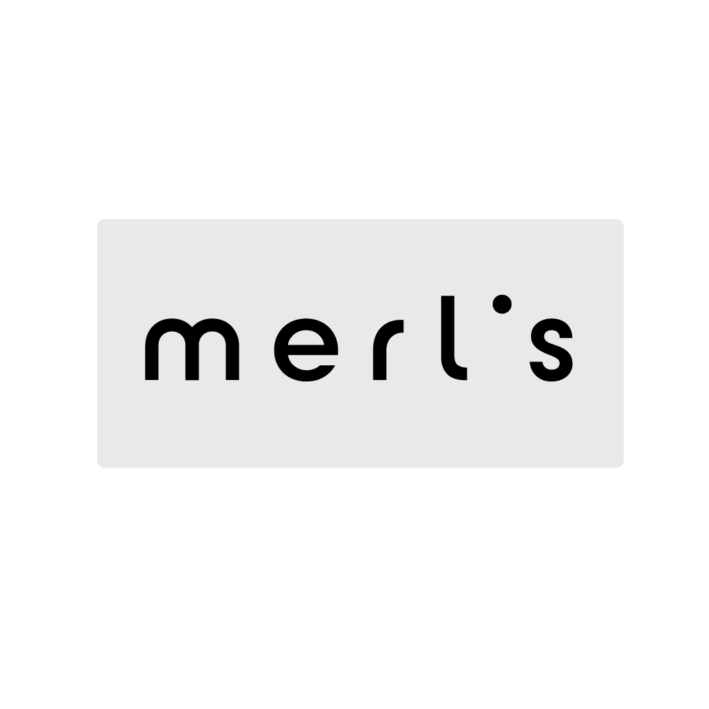
Select a baseline design to modify the design with the Mojomox logo editor.
To add more character to your restaurant logo, click on one of the letters on the big logo in the white, large editing area and change it by picking one of the alternative letters. Use the sliders in the sidebar to adjust font weight and letter spacing.
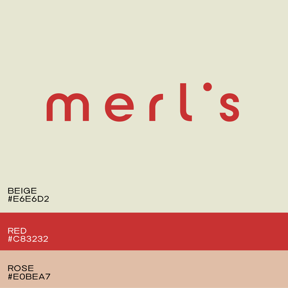
It’s easier to have one main color as your brand color over having multiple colors. People have an easier time remembering one color. From a practical standpoint, you’ll be able to save money for printed materials, like menus and business cards, if you’re going for more high-end printing where each ink used adds to the final cost.
Either way, for some design elements that’ll need to stand out, such as a button on a website, every brand’s design will need more than just one color in its palette. Finding the right secondary or tertiary color is easy with Mojomox: start by selecting one of the color presets from the sidebar and tweak all three colors with the color pickers. You’ll see the colors in the brand kit updated in real-time below the logo. Go for colors that work well with each other—that’ll give you the most flexibility when designing marketing materials in the future.
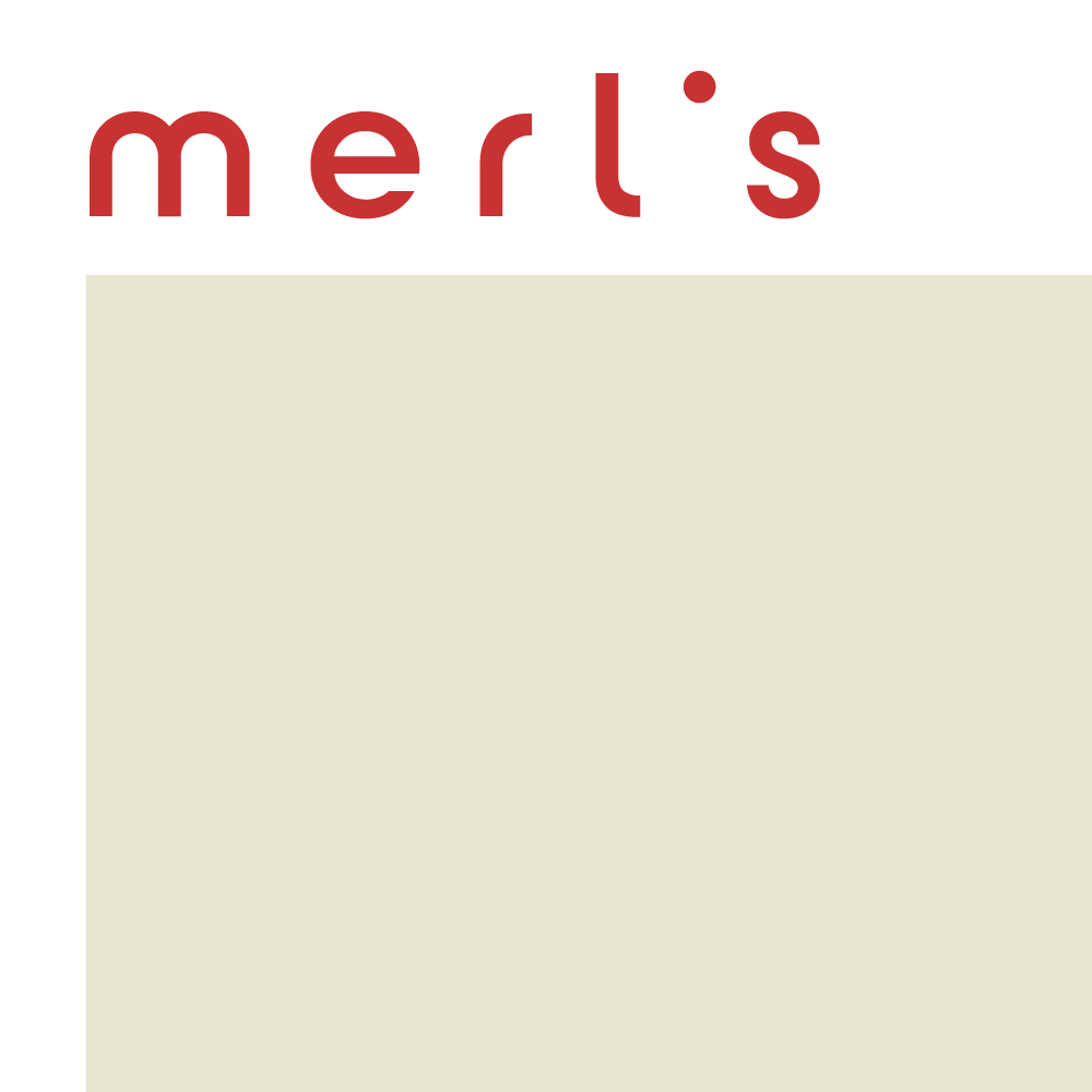
A logo displayed in one line instead of stacked is called a horizontal lockup. Because it takes up less space in critical applications, for example, the header section of the website, this structure is considered the most versatile.
Click through the fonts for logo designs, also in the right sidebar, and select a typeface that reflects your brand positioning. In order to strengthen the font’s personality and refine your brand’s character, use the font weight and letter spacing sliders. Bolder fonts are younger, thinner fonts are more refined. Tight spacing communicates strength, wide spacing means elegance. Very wide spacing takes up more space and is better for short names, very thin font styles are hard to read in small sizes.
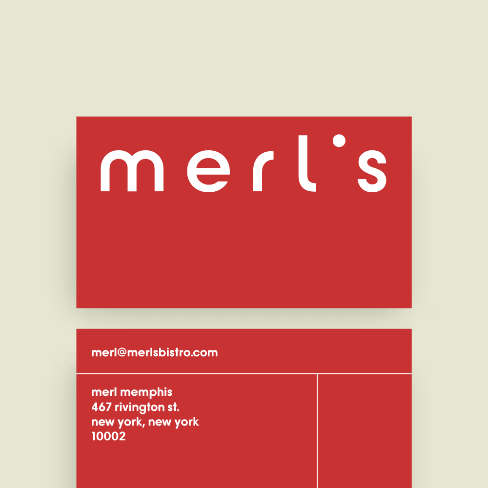
Design and download a couple of versions of your logo and test each logo file in the places where it will be used. For example, upload the variants to your website and check them out on a desktop computer and phone. Think of other uses, too: Your restaurant logo will be on a menu, flyer, or business card.

Saskia is a designer and the founder of Mojomox. She writes about logos, type, and the working craft of identity.
