Mojomox 101: 6-minute intro about the main features
Last updated: September 22, 2022
How-to Video
Video Transcript
Hey guys, my name is Saskia and in this tutorial, I want to show you quickly how to use the Mojomox logo designer and the automatic brand kit creator.
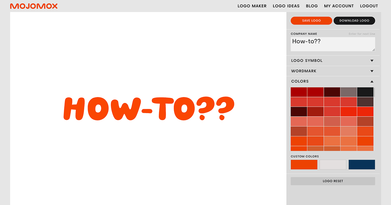
First of all, if you click create a logo, you get this prompt here, let’s type in a name. You will get a very plain simple option for your logo.
This is the wordmark mark section. This is the logo symbol. You can turn off the logo symbol here. You can also select from logo symbols here.
They’re sorted by, it’s kind of alphabetically in a way, sort different H styles, I’s, and so forth. There’s also shapes and there is crazy, crazy letters, dots and so forth.
You can close this out. Here you go. Um, and you can play around with different fonts here in the wordmark section.
You can change quickly the case of your logo. So it’s as typed or uppercase and lowercase. You can change and adjust the weight with these sliders here, below.
You can also adjust the letter spacing. The very cool thing about Mojomox, is the alternative letter designs that you can click if you click a single letter, so you can swap out your designs, by clicking an alternative design, you can, you know, do stuff like this.
And, caps for example, has a lot of different options. So you can even create a design that almost has a little bit of a logo, symbol character without having to use a logo symbol.
So you scroll down, you can also, adjust the colors here, flip through, scroll through the color palettes like this. You can, stylize, if you scroll down on this menu, you can stylize or customize the color by picking a different one like this.
You can also, pick your own color. You can adjust the font weight, and, you can scroll down and you see everything, how it’s working and things need to adjust.
In the brand kit below, you can customize colors this way. You can, use different settings by using these arrows here.
You can pick a different color from anywhere from the file that you have open, you can reset, like, so, you can reset the font by simply clicking on the font again.
I encourage you to kind of play around with, the different styles, and really think about what fits your company positioning.
So this is a modern logo that is playful. You can scroll down here, you can see your brand kit kind of built in real time, so that when you update something, you can immediately see it this way as well.
Applications are here at the bottom, called brand-in context, you can see what your logo will look like on a business card, you know, in small, on a website, that’s always important.
So when you’re designing your logo, you might wanna always check out this section down here and yeah, and if you wanna learn a little bit more about design and branding, you can, click the articles below your brandkit.
Anyway, you can share this as well. Once you save it, you can share this, via the backend and by clicking my account at the top, with other people or, you know, anybody that you know, and you, they can download these assets from that shared page.
All right. Well, that’s it for now? Let me know if you have any questions, and, yeah, have fun with it.
If you have questions—I’m here to help! Send me a note at saskia@mojomox.com.
