12 Ways to Design a Modern Logo for Music
In this article, we’ll take a look at existing logos for music, how much they differ from one another depending on whether the logo is for a music publishing company, a composer, a musician, or a music festival.
We’ll learn about how to design a modern logo for music with a logo maker and why it’s often not a good idea to include music notes into your logo. We’ll review logo templates that can be used as a starting point for your own logo design, we’ll look at modern logo fonts and see what works well in 2022 and the future years.
Designing a logo, whether that’s a logo for music, logos for DJs, or a regular e-commerce shop, it is the same process for all industries.
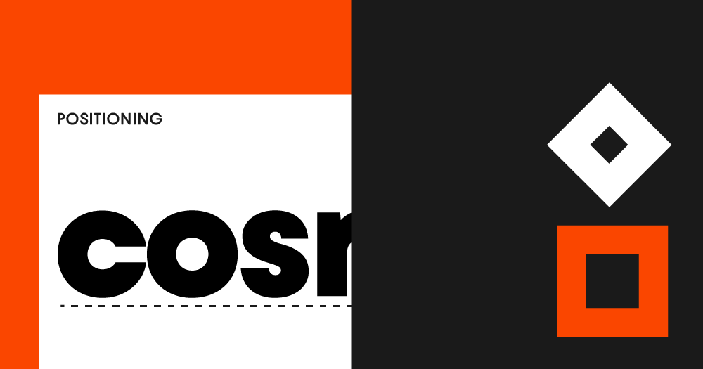
In our simple logo design tutorial, I’ll share a few ways to make a logo for music stand out the right way and teach you how to integrate brand positioning into your design from the start. Brand positioning is the main part of brand strategy and it describes how people perceive your brand.
As part of your brand identity, we’ll make a color palette that works well for music logos. Lastly, I’ll show you how professional designers test their logos to ensure they work in all forms of applications.
Start with getting a few (101 to be precise!) logo ideas or by typing in your company name below:
Famous Music Logos
Many music logos are wordmark logos with a clear design. To make wordmarks (type logos, also known as text logos) more distinctive, the process of selecting a typeface and setting the logo should be more detailed.
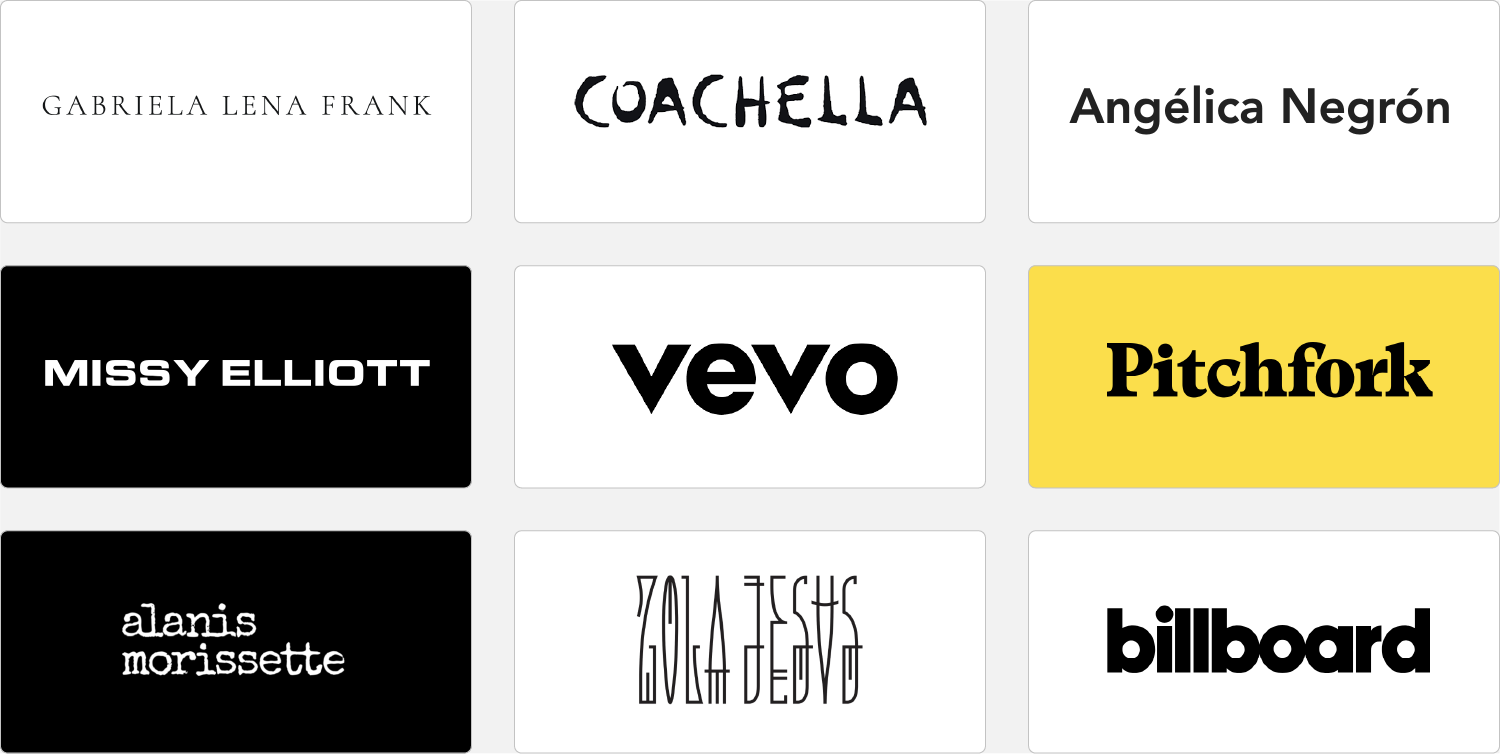
You’ll find a wide variety of font styles in music logos because the music category is broad. Instead of designing a logo for “music,” think of your logo as a brand independently from its category. In brand strategy, this is called positioning—within your specific category, what would you like your listener or customer to think? For example, pianist and composer Gabriela Lena Frank’s logo is set in a serif font, and Missy Elliott’s logo is bolder and set in a modern extended sans serif font. Vevo (music video hosting platform) has a lowercase sans serif style that feels very approachable.
When designing a logo for music, ask yourself what typography embodies my brand personality?
Other design elements besides the font are whether a logo is capitalized or not and how it’s spaced (tight or wide letter spacing). Bolder type, lowercase, and less spacing make a brand feel younger; serif fonts and wide letter-spacing (also called tracking) add a more elegant quality to a music logo.
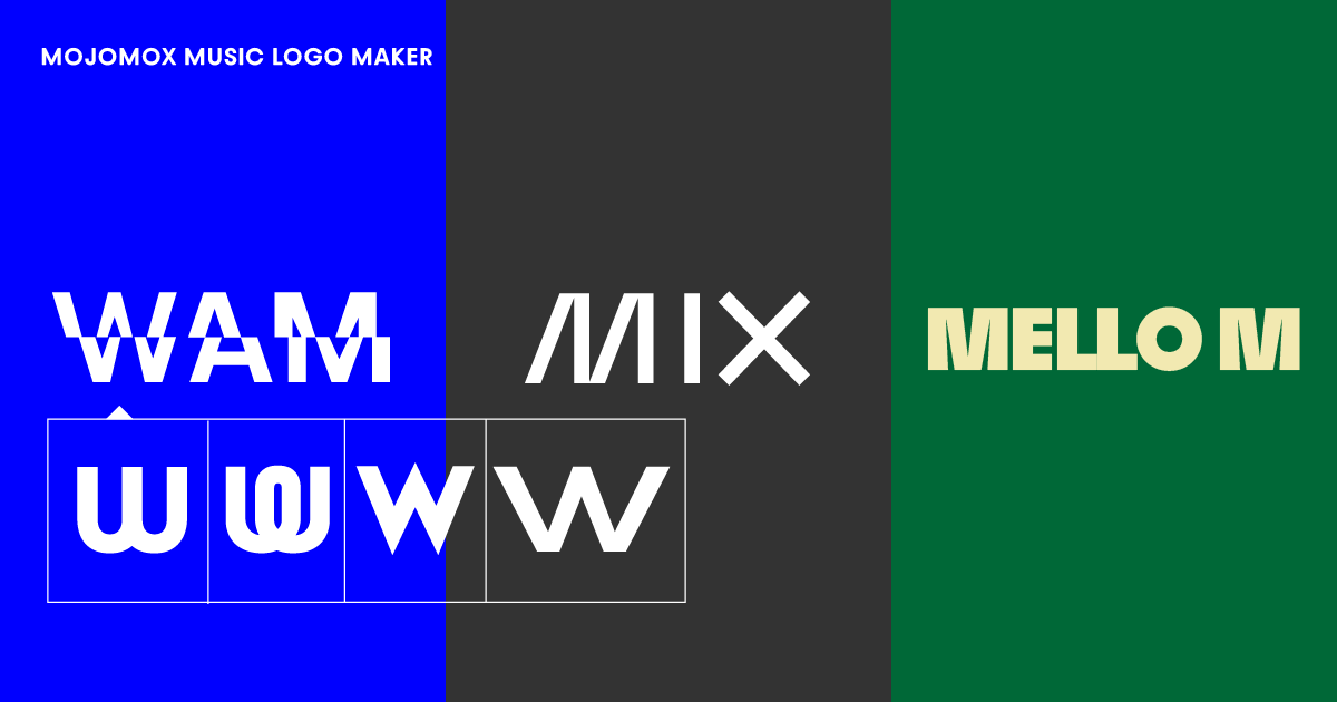
Templates for Music Logos
Wordmark Templates to Get Started
Take a quick look at the music logos in the gallery above. To launch the logo editor, click on one of the templates. Although the examples presented are all wordmark logos, the tool allows you to easily add a logo symbol.
First, take note of the various logo font styles and details. In example 1, the R adds to the mark’s originality. Example 2’s font style (Bauhaus Slye) stands out while being minimalistic.
Second, consider different color palettes. The more personal and modern your brand should appear, the more muted and sophisticated your palette should be. If you’re going for a more corporate look, pick a color in the mid range, like a medium red or blue. It’s ideal to use a color palette that differs from your competitors’ so that you stand out and create a more memorable brand.
Logo mark and colors don’t have to get the same aspect of your brand across; instead they should complement each other and communicate different brand traits.
Making a Wordmark a Logo for Music Unique
Wordmark logo designs versus symbol logos are generally more modern, and that’s true for logos for music too. Even if you’re using a specific logo font, which is usually designed to have more character and finer details, it’s best to add more character or a unique design detail wherever possible to make your mark stand out.
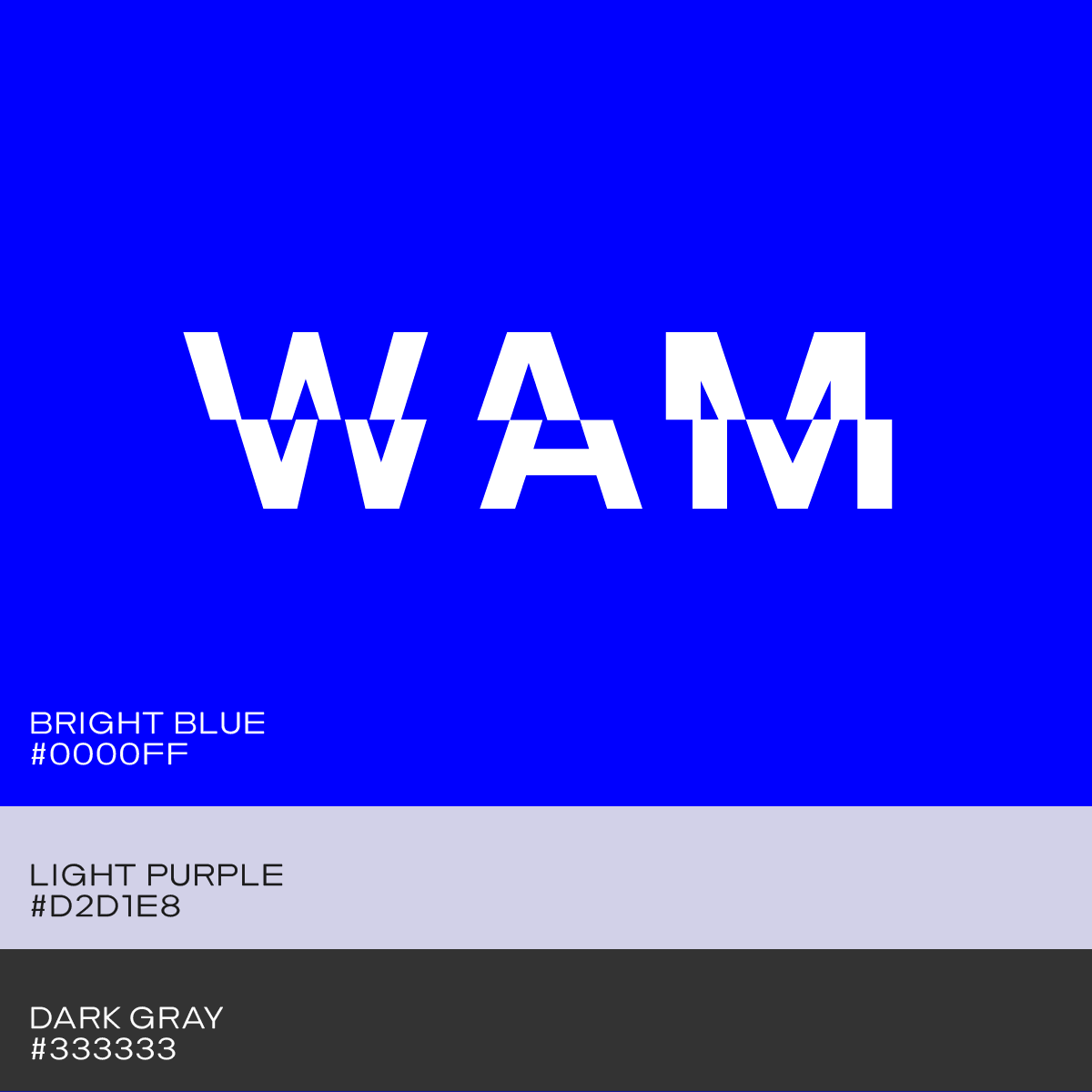
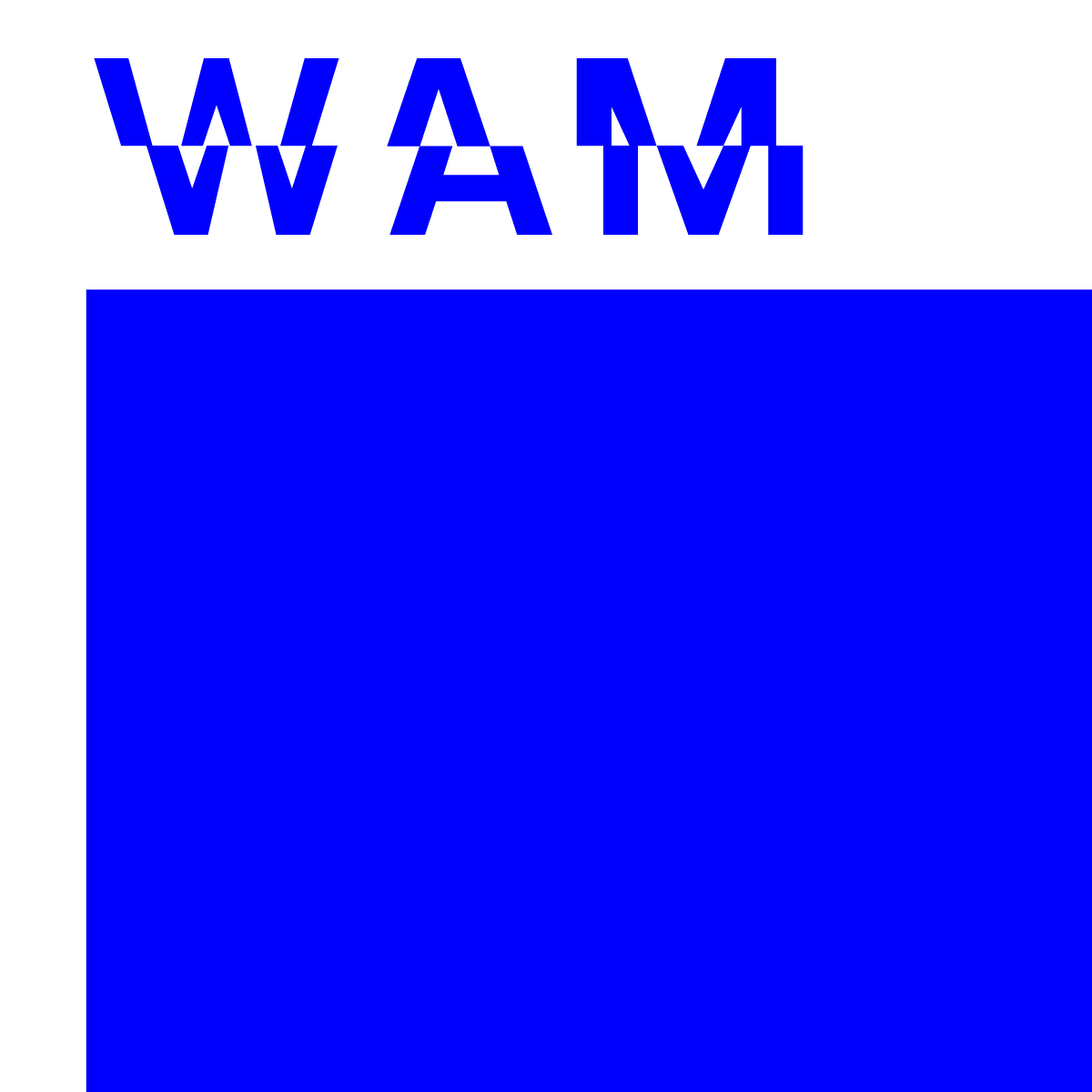
In the examples above, the letter R in logo template 1, the letter M in template 4, and the letter Q in template 9 are good designs to showcase this.
How to Design a Music Logo in 60 Seconds
Step 1: Type your music brand name
Type in your name into the music logo maker and design options will show right below. Some logo designs have logo symbols, others are simple wordmarks.
Step 2: Select design
We always recommend starting with a wordmark if you’re going for a modern brand look. These types of logos look more minimal and focus on personality rather than communicating a corporate quality.
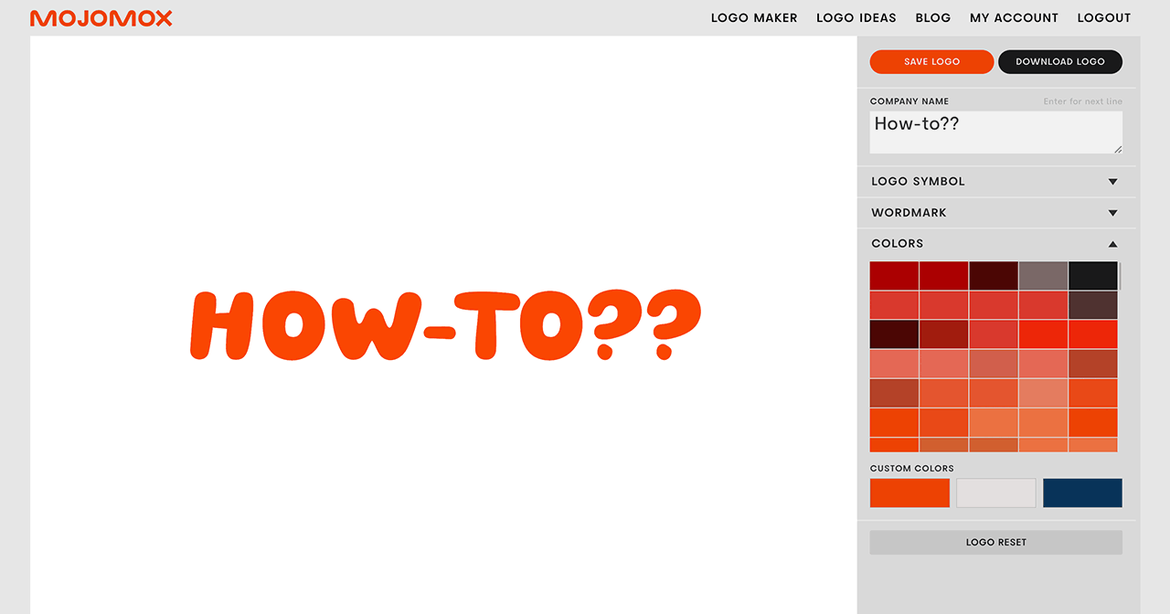
Select a baseline design and you’ll get into the Mojomox logo editor.
Step 3: Modify logo
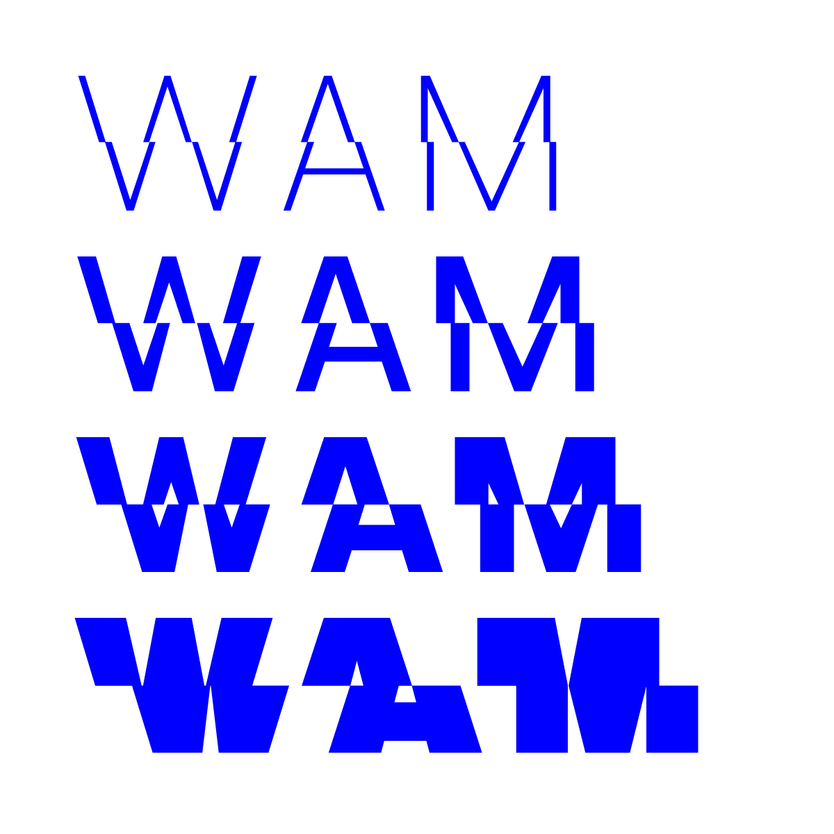
To add more personality to your mark, click on one of the letters on the big logo in the center and swap it by selecting one of the alternative letters. Additionally, use the sliders for weight and letter spacing in the right sidebar of the app.
How Professionals Design Music Logos
A Color Palette That Works
There’s an advantage when a brand has only one main color instead of many colors; it’s easier for people to remember a brand when they can assign one color specifically to it.
However, any brand will have more than just one color, for example for some design elements that need to stand out, such as a button on a website. Finding the right color combinations is easy with the Mojomox app: start with one of the presets by selecting a color in the color palette section in the right sidebar and tweak all three colors with the color pickers. You’ll see the colors in the brand kit change in real-time below the main logo section. Pick colors that work well with each other and you’ll have the most flexibility when designing assets in the future.
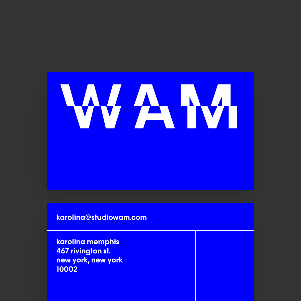
Versatile Logo Formats
A horizontal lockup is when a logo is displayed in one line rather than stacked. Because it takes up less space in the header section of the website, this structure is the most versatile.
The Right Typography for Music Logos
It’s really easy to pick modern fonts for logo designs with Mojomox, just click the font buttons in the sidebar. But, aside from the type’s inherent personality, you can give the mark a particular style by using the weight slider to make the mark stronger or thinner. Lighter font types appear more deliberate and refined, but they are also more difficult to read at small sizes.
Test Your Logo Design
Create multiple versions of your logo and test your them in all of the places where the logo will be used. For example, upload your music logo variants to your website and check them out on a desktop computer and phone. Keep other uses for your music brand in mind, such as a banner, flyer or business card.