Logo maker
Article
The ampersand is defined as the “and sign,” meaning it stands for the word “and.”
Visually, the ampersand is a ligature (letters that are pulled together in writing) of the letters e and t for “et” (Latin for “and”).
Where does the term ampersand come from? The ampersand was and had been many centuries earlier the special last “letter” after z. Still, the actual English term “ampersand” comes from slurring the phrase “and per se and” (meaning “standing by itself” because the ampersand-and was a little extra at the end) when the alphabet was recited in schools in the late thirties of the 19th century, (source).
In German, for example, the ampersand is called “mercantile and” because it was used as a binder word for official company registrations from the late 19th century onward.
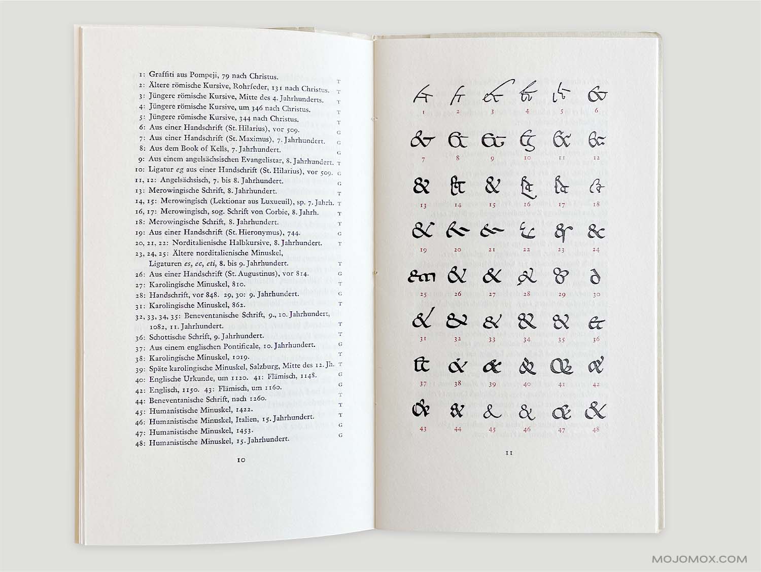
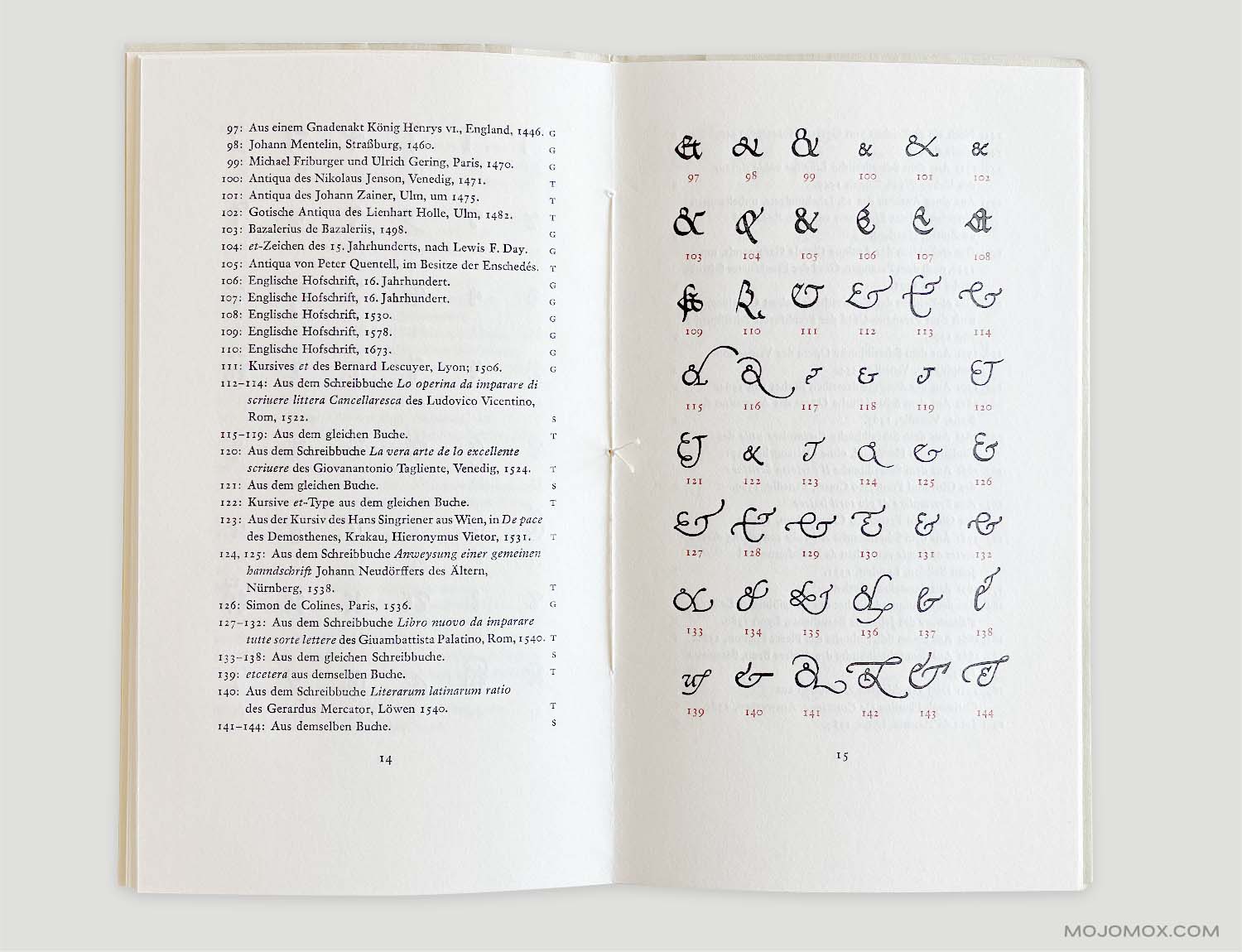
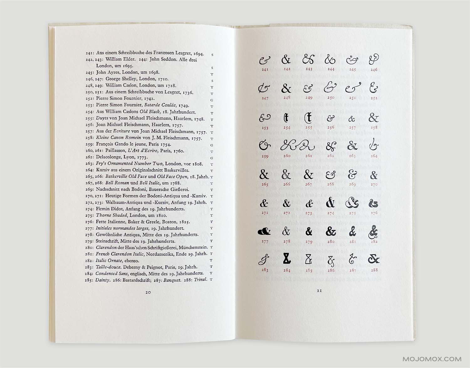
The history of the ampersand offers further inspiration. Diving into historical variations, such as those found in Jan Tschichold’s “Formenwandlungen der Et-Zeichen” (Shape transformations of ampersand symbols), can spark creative ideas. These variations showcase the ampersand’s evolution and the diverse visual interpretations it has held throughout time.
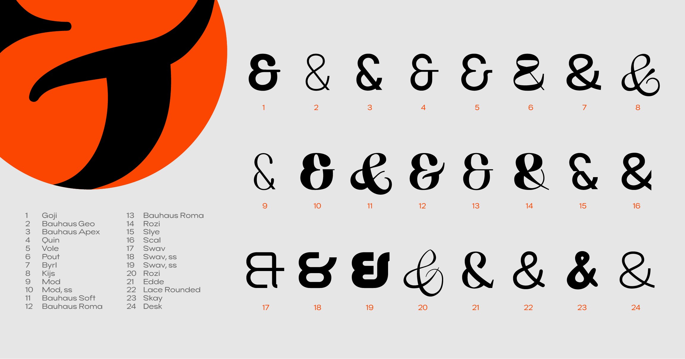
Take a look at the ampersand gallery above. The second symbol variation (ampersand symbol of font Bauhaus Geo) in the first row is probably the most frequently used version. If you look at the first and fourth variations—also pretty standard—you can easily see the origin of the letters e and t.
The ampersand is an exciting symbol in graphic and typography design. Most designers have a soft spot for this ligature—they love designing it and with it.
The ampersand of a typeface reflects the personality of its entire design concept. Is it quirky, modern, sweeping, protruding, based on geometric construction? Does it have flourishes, or is it austere? The ampersand takes a stand and often the freedom to go beyond just fitting in. The ampersand is made for display text such as headlines or signs, which allow for more details and embellishment.
Due to its inherent nature of standing out, the ampersand can function as a logo symbol.

Since the start of the Industrial Revolution in the mid-18th century and the beginnings of the first corporations, the ampersand symbol has been used a binder in company names when multiple people created a partnership.
Ampersand logos are famous in all industries, such as fashion, architecture, jewelry, consulting, and food and wellness products.
Around 2014, the ampersand symbol experienced a wave of revival glory days, being featured in plenty of hipster logos. Overachieving usage was commonly found in logos for barber shops and logos for restaurants.
Experiment with different fonts to find the perfect match for your brand personality. Explore the possibilities of integrating it with other letters or drawing inspiration from historical forms. The ampersand is a conversation starter, a symbol that invites exploration and fosters a sense of connection.
The ampersand’s journey, from its practical origins to its current design prominence, is a testament to its enduring charm. By understanding its history and appreciating its diverse expressions, you can unlock its potential to elevate your brand identity and create a logo that stands out.
To start with a brand design for a logo that includes an ampersand, type your brand name in below and click Get Started:

Saskia is a designer and the founder of Mojomox. She writes about logos, type, and the working craft of identity.
