Logotype design in 2026
What’s a logotype?
“Logotype” is the professional designer’s term for a logo style created using a typeface rather than a logo symbol. The word “typeface” is sometimes used interchangeably with “type” or “font.” You can also say a logotype is a logo made from only text.
This article will show you how to go from design inspiration to logo ideas to creating a logotype—either using your own fonts or with our easy-to-use online logo maker that we built specifically for creating a minimalist logo.
What’s a logo?
In short, a logo is a generic term that describes a company’s mark. A logo is part of a brand identity system that helps customers identify and differentiate one business from another. Other elements of a brand identity system are how to name a brand, a tagline, a color palette, typography, and the image style that you’ll see on marketing assets—for example, a specific type of illustration and/or a photography style.
What are the different logo elements?
Traditionally speaking, when talking about a logo, most people think of a logo as a mark with a symbol (the little picture that’s sometimes called “icon”) rather than a logo made from typography. So a logo can but doesn’t have to consist of a logo symbol and the company name spelled out as text (wordmark or logotype). When both are together, we say it’s a combined logo, or simply a “logo.”
Brand designers call the portion of a logo that’s set in type “wordmark.” (read more about the wordmark logo and how famous and some of the best wordmark logos have changed over time). Other terms for “wordmark” are “typography logo,” “type logo,” “text logo,“ and also “logotype.”
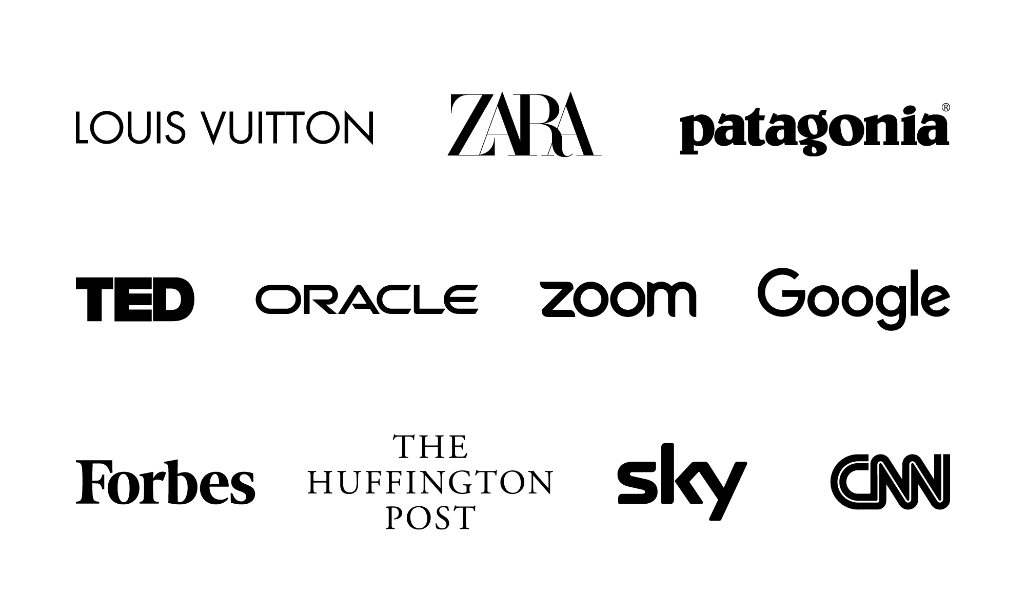
Logotypes have always been popular in the creative industries, such as fashion and architecture, and in the beauty and wellness industries but even many big tech companies have embraced this more minimal logo style right from the start—Google, eBay, Etsy, IBM, and Dell are popular examples.
Advantages of a logotype
There are two reasons why logotype designs are so popular: One, they look more modern and minimal. Wordmark logos say with confidence “this is my name, I don’t need decoration.” Two, logotypes can be more practical when it comes to applying them to a real-life product and marketing assets. A simple logotype design often needs less space; every pixel counts in the navigation bar of a website when viewed on a phone.
With a logo made from type, it’s clear that the collapsed logo version consists of the first letter (or first letters if a brand name consists of more than one word)—common applications are a profile image for email accounts, a social media avatar image, and a favicon for a website. In contrast, while a symbol may often be more memorable than a letter, your audience will first have to memorize the logo symbol alongside your brand name.
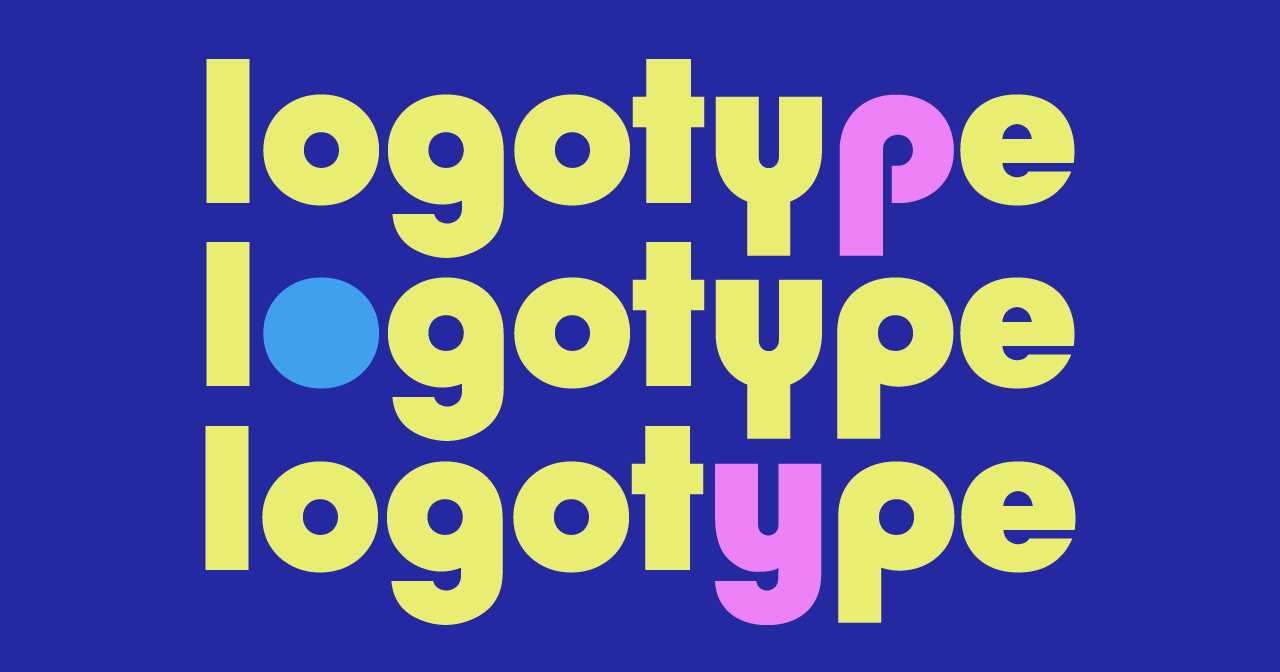
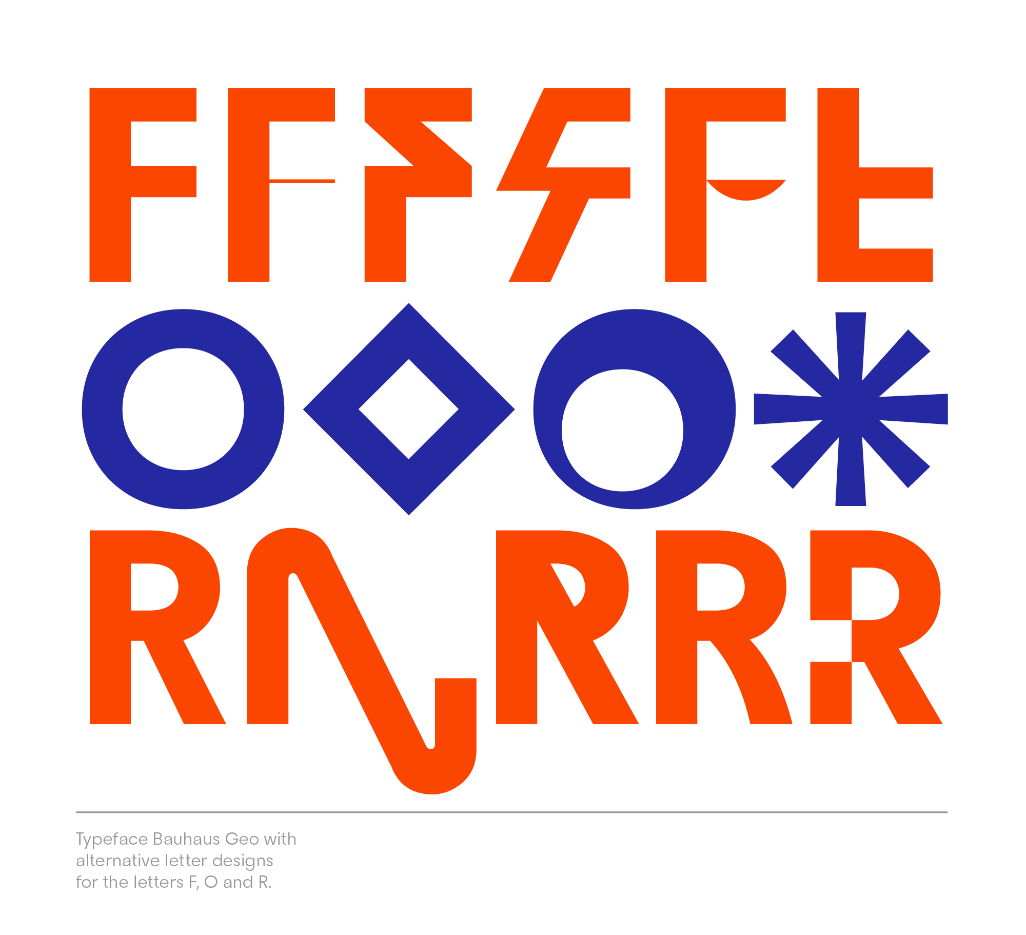
In order to create a logo that stands out, we make a letter or a set of letters, like a double o, unique. That way it takes on the benefit of a logo symbol (= becomes more iconic and memorable) but maintains the upside of a logotype.
This is an extra step that you can skip by using a logotype and collapsing it into its first letter for a shortened application. And, your symbol may still not be unique enough to actually represent your brand. Think of an icon of a playing card for a card game website. While that may look appropriate, literally ALL card-playing websites could use a card as a logo symbol. Using a symbol like that would defeat the purpose of being memorable—unless you expect your audience to memorize the exact look of the cards.
There are, of course, ways to make everything work on all occasions but the reality is that you don’t have to think through every use case when taking the shortcut of using a more minimal typography logo.
The downside of logotype
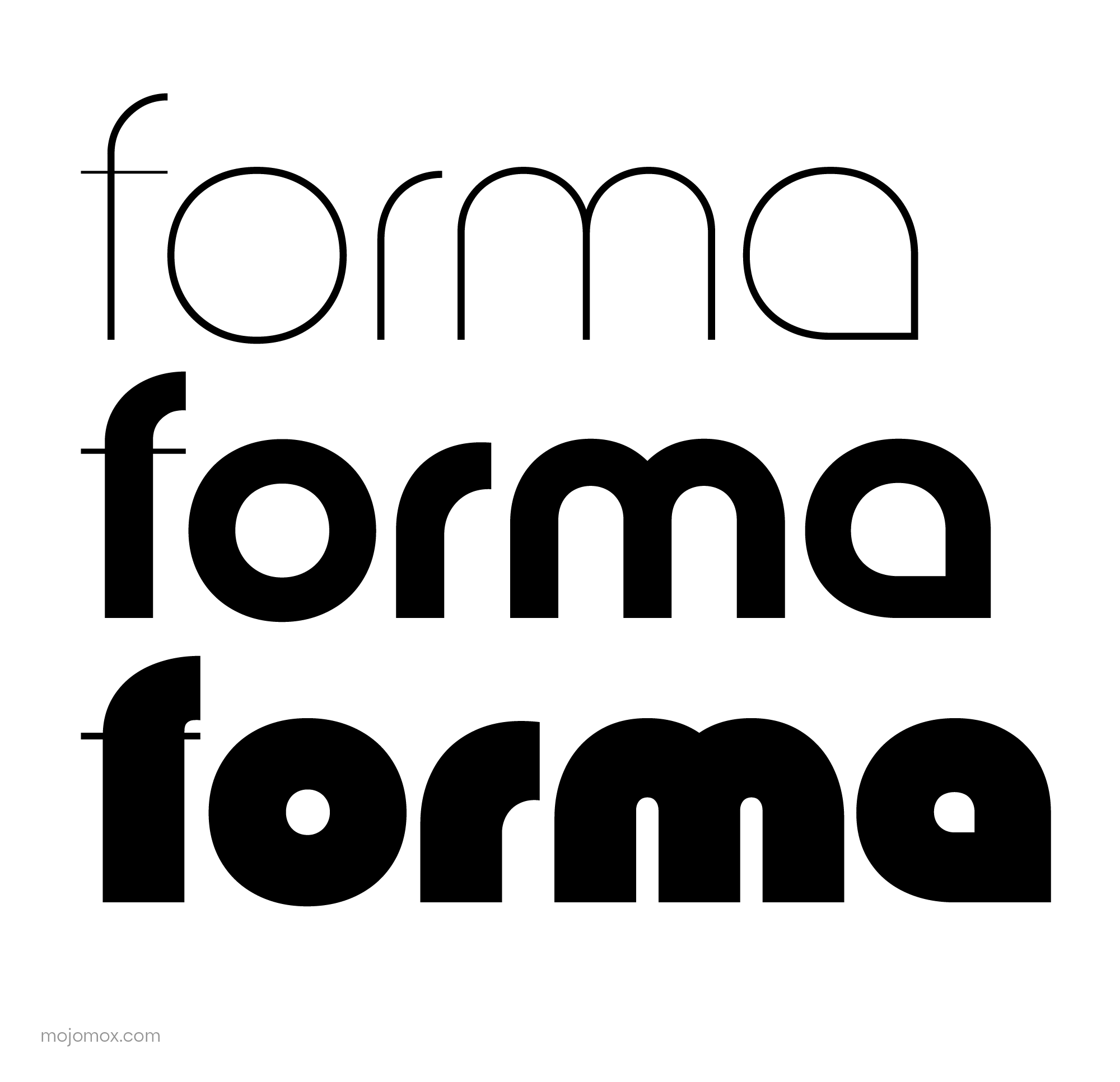
This brings us to the downsides of the minimal logo style of a logotype logo—making them memorable. Sometimes logotypes are so simplified that they run the chance of not being memorable enough—the font style of your competitors’ logos may look like yours.
So how do we fix this when designing a logo?
Creating a logotype that stands out
In order to create a logo that stands out, we make a letter or a set of letters, like a double o, unique. That way it takes on the benefit of a logo symbol (= becomes more iconic and memorable) but maintains the upside of a logotype or a wordmark—having a letter that indicates the name of your company.
For this very reason, ideally, the unique letter is the first letter of your logotype, so that it can also be used as a collapsed logo (such as a favicon). If your company name consists of multiple words, a collapsed version of your logo could consist of all first letters, just like initials.
Examples of logotype logo design
Get inspired by some of the best logo fonts
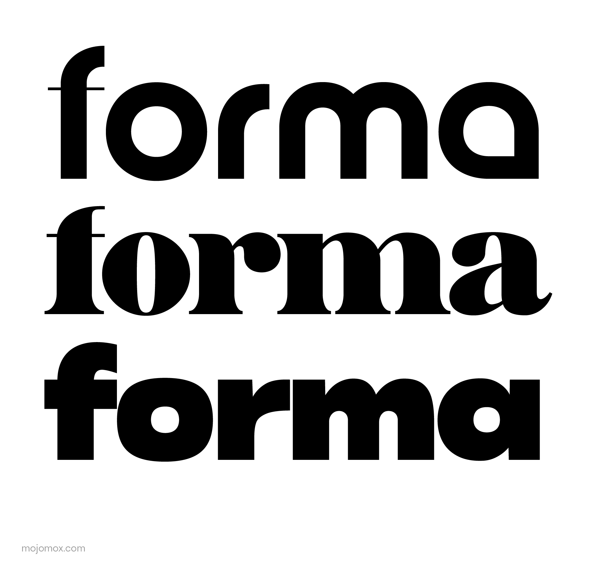
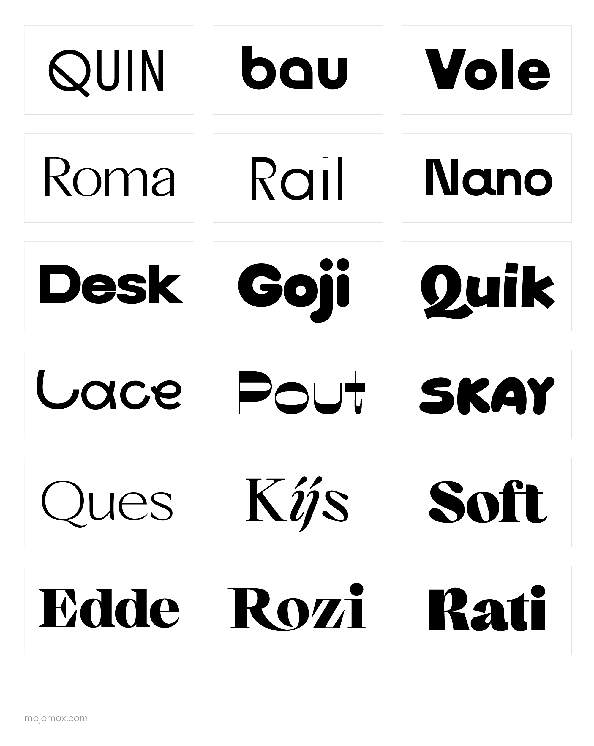
When leaving out logo symbols and going for a wordmark instead, focusing on the selection of the font is even more crucial. Every typeface has its own character—and finding the right type that has the personality you’d like to convey can be tedious. When scrolling through font catalogs online, start with having a brand trait in mind that your font choice should also express. Let’s say you’re aiming for a mark whose trait should be “precision,” select a pointy font. This works best if your brand name has letters that can be sharp naturally, for example, the letters A, K, M, N, and W.
To learn more about designing with fonts and what fonts inform specific brand tones and industries, check out Mojomox’s font blog on type.
Typography logos with a number
Logotype examples for architecture logos
How to use an online logotype maker in 4 steps
Whether you’re using an online logo maker app to go from logo idea to the final png or vector file download, or if you’re using a design program like Canva or Illustrator, the first step is to check out your competition. This part of research can be as extensive as you want it to be, but the minimum requirement is to list five of your closest competitors (close = other offerings your customer would consider as an alternative; for local business the location of a business is important; the price point may play a role etc.). Alongside listing the names of your competitors, write out their color palettes, the style of font they use and what their positioning is. Positioning is the one to three words that come to a customer’s mind when they think of that brand.
Step two: Once you have a good understanding of your competitive landscape, write out your company positioning. For that, pick a word that a) you can fulfill / be the best at / how you’d like to be perceived, b) that’s not yet taken by your competitors and c) is relevant to your customer / a trait they actually care about when thinking of a business like yours.
In the third step, complement your positioning word with 3–5 other words that you’d like to get across in your communications. These words are usually adjectives but they don’t have to be—they can reflect your style of how you do business, your personality as a business owner, an outcome that you’d like the customer to always take away—there is no right or wrong. Together, these are your brand traits, sometimes called brand communication aspects. You’ll want to make sure you always use these words when you answer the phone, when you write copy for your website, or initially, when you’re creating your logo and picking your color palette.
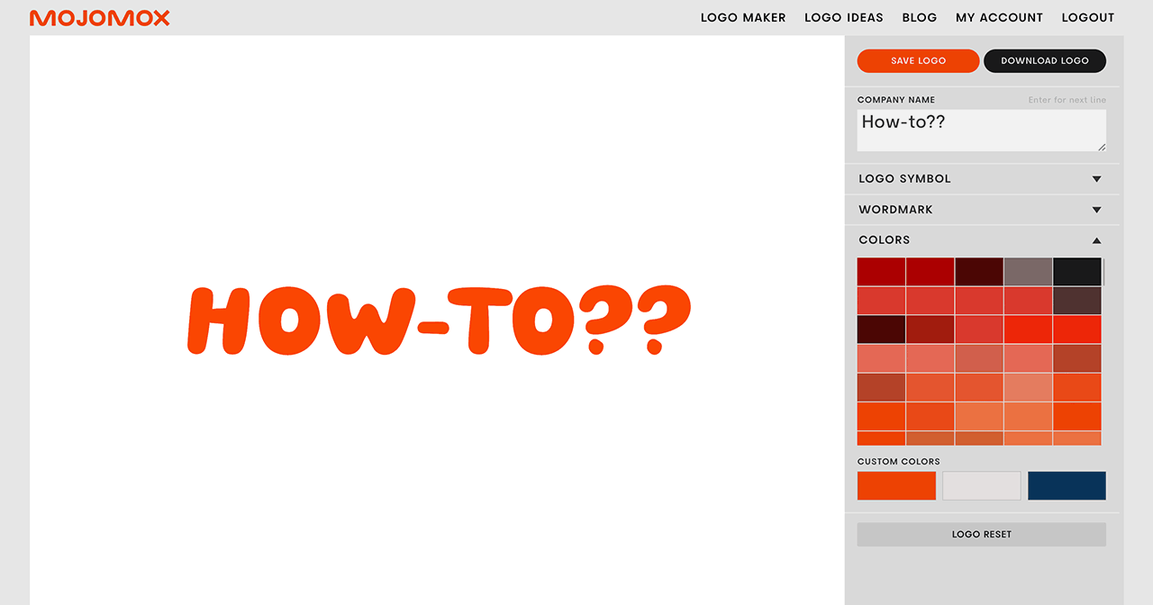
In the fourth step, open up Illustrator or head over to the Mojomox app. Type out your company name and click through various fonts until you find a typography style that matches one of your brand traits.
Another brand trait can be presented by the color palette you pick. In Mojomox, you’ll find lots of modern color presets that work well in branding. You can start with one palette and refine all three colors by clicking into a field below the presets. In Illustrator, you’ll have to manually select a brand color palette—also by using the color picker tool.
Some brand traits lend themselves to be better represented as a font, some are more easily communicated as a color and some are best left as text, like in a tagline or in the company name itself. The work of a brand designer is to figure out what trait gets across best in whichever one of all the options.
Don’t overthink this process—branding is not the creation of visuals. Branding gets developed over time as a holistic view of all of your business aspects, including the way you run your company and what corner it carves out in your customers’ minds. These things you’ll only figure out as you grow your business and your brand along with it. You can always evolve the design as you see fit.
To get started with a logotype design, type your brand name into the field below:
