Logo maker
Article
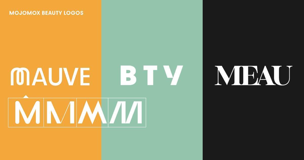
More than any other industry, the beauty and fashion industries often make use of what’s called “wordmark” logos instead of logos with symbols. As the name implies, wordmark logos are text logos. They don’t include symbols, icons, or little pictures—wordmarks are logos that show your brand name simply as type.
If you’re just looking to get some logo inspo quickly, check out the free Mojomox logo ideas maker. On the logo idea page, put your beauty brand company name into the input field and you’ll see lots of logo ideas show up. Each logo has a set color scheme that you can modify later inside the app.
Wordmark logos are brand names set in type. Why do some industries use wordmarks over logos with symbols? Often, wordmarks look more modern because they’re more minimal. This form of visual understatement enforces a brand’s confidence: The strength lies in its choice of strong beauty typefaces. That one typeface usually reflects the brand’s design philosophy: Simple, straight cuts in fashion lines, a focus on pure ingredients in beauty products, or unique, feminine scents can all be transferred into the choice of a typeface and with that, the design of a logo.
Wordmark logos are more minimalistic in the sense that they only have one graphic element—the typeface—to work with and therefore, more attention needs to be paid to its details.
For the wordmark portion of a logo, the following elements play into the design:
For beauty logos, it often makes sense to stick to a wordmark logo because of its versatility or because of the values, such as luxury or high quality, that need to be communicated.
If you want to add a symbol to your logo, make sure it is derived from meaning. Don’t just pick a symbol that looks good to you. Instead, go through the “communications-aspect” exercise below to see what the symbol should say.
Create a set of up to five words that paint a picture of your overall brand identity world. These words can be a combination of nouns, verbs, and adjectives that each explain one significant feature of your company such as tone, industry focus, competition, key audience, and so on.
The five brand words must be mirrored in the total of all of your design (and text) components. So instead of attempting to communicate everything with your brand colors, each of your brand elements such as brand colors, logo, and tagline, etc. should serve a single purpose.
Once you have a word that you’d like to be reflected in your logo symbol, it’ll be easier to design one that is meaningful.
However, even if you’re not using a logo with a symbol but a wordmark instead, the communication-aspect exercise is helpful: Pick a word that your logo should communicate and base your choice of font on that.
Sans-serif fonts are used most often because they’re the most versatile ones and they work with a variety of styles. Sans-serifs always look a bit more modern, they’re easy to read in all sizes, and they have an overall more orderly and clean appearance.
On the other hand, serif fonts may give your business a more traditional and refined sense. Serif typefaces are likely to lose features when reduced in size—the serifs (the little feet linked to the letter stems) vanish quickly at a small font size. Yet, serifs could also be a great choice if you are aiming to evoke feelings of history, tradition, honesty, and integrity in your brand.
We’ve analyzed over 150 logos used in the beauty industry: logos for beauty products and beauty platforms, logos for beauty salons, beauty bars, and hair products, as well as logos of fashion brands that also market beauty and wellness products.
Do most popular beauty logos use wordmark or symbol logos?
How are logos for beauty salons and others spelled—title case, lowercase, or uppercase? How many words do many beauty product names consist of? What brand colors are used most? Do big beauty brands use serif or sans-serif fonts?
Out of 150 beauty brands, only 21.3% use a logo symbol. The remaining 78.7% (118 brands) use only a wordmark logo.
Case used in beauty brand logos: Over two thirds of brands (107 of 150) use uppercase spelling for their logo. Title case and lowercase spelling is pretty equal with about 14% each.
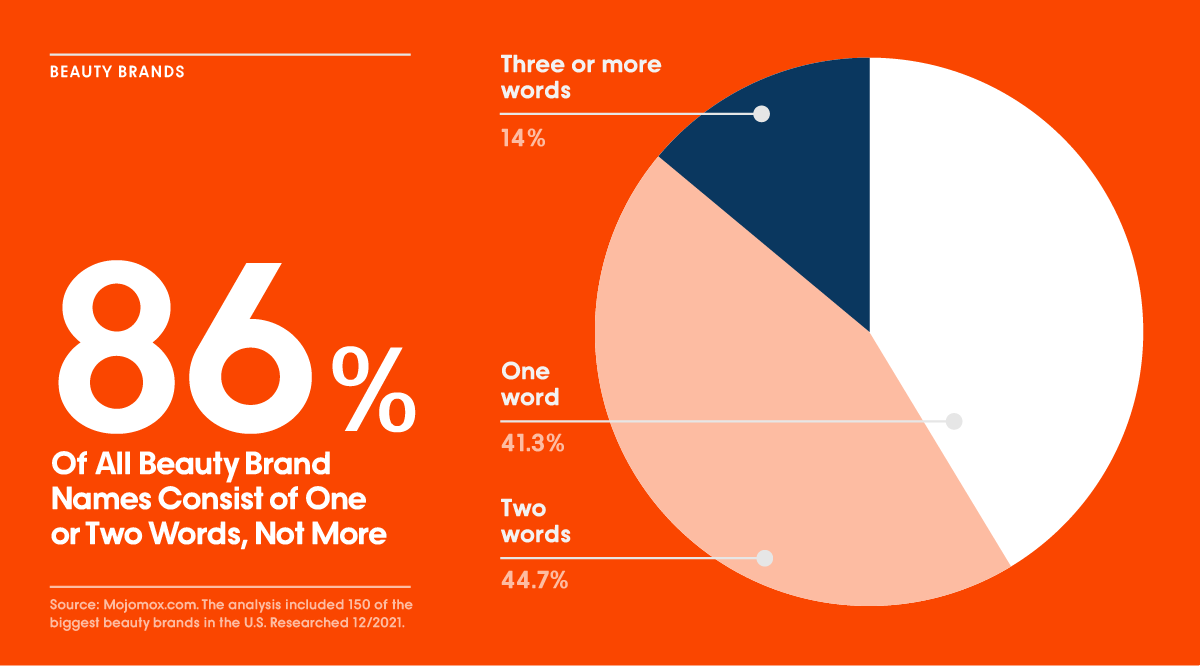
Most beauty brand logos consist of one (41.3%) or two words (44.7%). Only 14% use three or more words in their company names. Word count is based on how brand name is spelled in logo, not in text. Word count includes industry identifier such as “cosmetics” or “beauty” if shown in most logo versions.
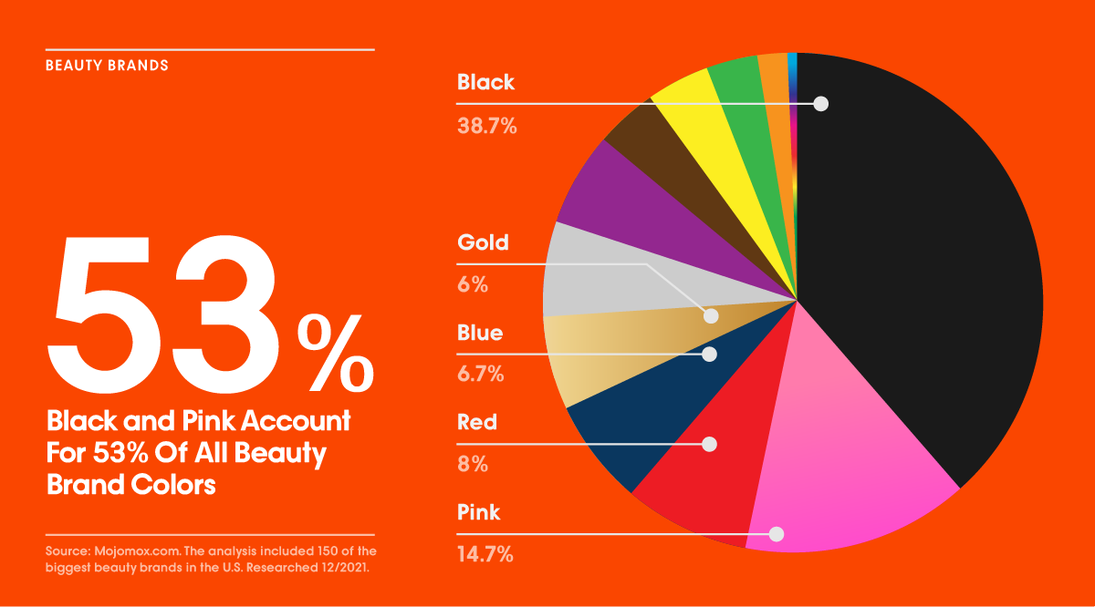
Almost 40% of all beauty brands use black as their main color. In fact, most logos are shown in black or white on the company websites. However, pink (all shades from pale pink to hot pink), red, blue, and gold account for another 35.4%. Orange, green, and yellow are last when it comes to beauty brand colors.
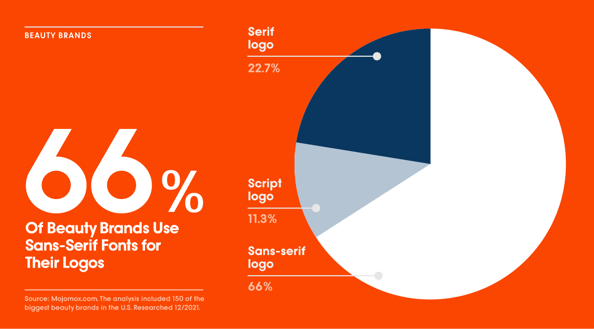
Two thirds (99 logos) of all 150 beauty brands use a sans-serif font as their logo typeface. 34 brands use a serif font and 11.3% (17 brands) use a script or handwritten logo.
During your logo design process, test out different logo designs on the actual surfaces where the logo will appear. If you have a store, take a photo from your storefront and mount your logo on it with Photoshop. A quick sketch will do, it doesn’t need to be perfect. If you don’t have a store yet, take a photo from a storefront that might be similar to the one you’re looking into.
If your main application is on-product, mount your logo on your packaging. You can use Photoshop for a 3d effect or even just print it and tape it on your selected package. Is it on a cardboard box, a tube, or a can? All of them? The better your visualization is, the closer you’ll get to your final result.
Where will the product be sold? On salon shelves, in supermarkets, or only online? Place your product in all of the environments where you’d like it to appear to assess if it stands out the right way. Does it look as expensive as you’d like it to be? Does it hold up against your competition?
Can you get feedback from potential customers? It’s best to make changes before putting thousands of dollars into packaging.
Most beauty brands use a simple wordmark logo (almost 80%), uppercase letters (over 70%), and a sans-serif font (66%) for their logo. Many beauty brands choose black as their main brand color (almost 40%). Other popular brand colors are all shades of pink from pale to hot pink (almost 15%) and the color red (8%).
Whether or not you’re using a memorable logo symbol, a versatile wordmark, or both, ensure to base your design choices on meaning. Sans-serif fonts communicate modernity and cleanliness, serif fonts point toward tradition and refined senses, and scripts and handwritten fonts put a “personal touch” into the foreground. Sans-serifs are most versatile, and script fonts are the least versatile choice for logos.
Don’t forget to share this article if your fellow entrepreneurs could benefit from reading it too. If you’re on Instagram, give us a shoutout or tag us @mojomoxapp for feedback. Happy branding!
Design your logo now:

Saskia is a designer and the founder of Mojomox. She writes about logos, type, and the working craft of identity.
