Wordmark logo
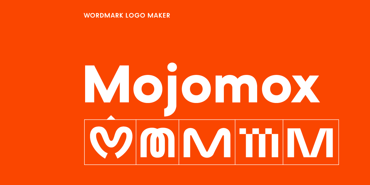

While a logo is a design element that helps customers identify an organization, company, or product, the term "wordmark" describes the text part of a logo. "Logo" is simply the catch-all term for all sorts of visual marks, whether they have an icon or not.
In comparison, a traditional, combined logo often consists of two parts, the icon or logo symbol and a wordmark (the brand name itself).
Another name for wordmark is logotype. "Wordmark" and "logotype" are the terms that professional graphic designers use; colloquially, people also say "text logos" and "typography logos."
A logo structure is more lax than many people think. While brand guidelines themselves are usually very concise and strict about how a logo is used on marketing assets, the actual logo setup can be diverse. For example, companies usually have different lockups, the way the logo shapes up if one were to draw an outline around it. This shows you the kind of space a logo takes up, like a long rectangle or a square. Different assets ask for different layouts: a logo on a pencil might be rather long (horizontal logo lockup), and a logo on a business card might look nicer when big in a vertical lockup where the logo elements are stacked—may that be multiple parts of a wordmark when the company has a longer name or may that be the logo symbol on top and the wordmark below.
With that, sometimes, even if a company uses a combined logo (symbol and wordmark), sometimes only the wordmark is used if that's what the brand designer/s have in mind for the brand—so overall, logos are flexible—they just need to be consistently applied across assets to make a brand look like itself to customers.
Wordmarks are preferred in many industries such as design, fashion, beauty, food products, and film because they embody a more modern and minimalist logo style. They tend to look a bit cooler. For food products specically, the name of the product is usually just written in a unique font that represents what's in the package paired with an often fun color palette and other visual elements. Having a logo symbol paired with the wordmark is not common.
The tech industry has been embracing wordmarks, too. While a geometric symbol is also popular for tech branding, they can appear a bit boring and conservative when they're pictorial and just illustrating the name of the company, like Bitbucket or Zillow, or a basic monogram version, like Freshbooks.
If you're designing a tech wordmark and want it to feel more distinctive than a default geometric sans, a typeface like Ark or Bitec can add a more intentional, product-forward tone.
Modern tech companies such as Stripe, Webflow, Gumroad, and Kickstarter have brought back more attention to wordmark logos over the last decade. Stripe's logo is still pretty traditional with a sans-serif font, but it swaps the i-dot for a slanted rectangle to emulate sliding a credit card through a reader. Webflow's initial logo was a wordmark in a font that illustrated being in flow—it's cursive with rounded, flowing terminals. In 2023, Webflow updated their logo to be more conservative—a classic tech logo with a symbol in blue and a geometric sans-serif font. Kickstarter's wordmark uses a fun, approachable bubble-style font with its counters filled in—not sure what it stands for, but it feels like literally filling in the gaps, maybe the money gaps to get a company off the ground. Gumroad's wordmark is too cool for school—its typeface is modern, young, and almost iconic at this point, with an uppercase/lowercase letter mix and sharp, extremely tapered joints.
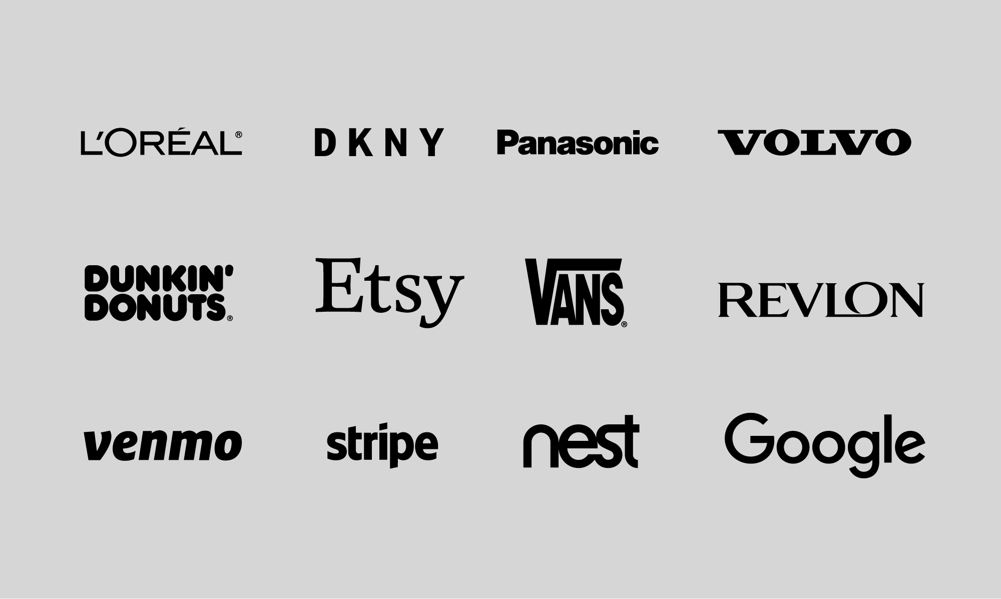
For inspiration, take a look at the logo wordmark examples above. From beauty and fashion wordmarks to tech products (digital or analog), these types of logos easily look like modern logos.
When checking out fonts for logo designs, pick a typeface that reflects your brand positioning and stands out among your competitors.
For more playful or friendly wordmarks, consider a rounded sans-serif like Auria or a bold blocky rounded style like Plox.
The advantage of going for a wordmark logo design is that you can select a stronger, more unique typeface as your logo font. When you have a symbol and a wordmark, both should be balanced and visually support each other as opposed to competing with one another. Often, that means that you have a stronger symbol and a typeface that fits in rather than one that has too much character. But, for wordmark logos, a typeface with character or a letter that stands out will make a logo more memorable.
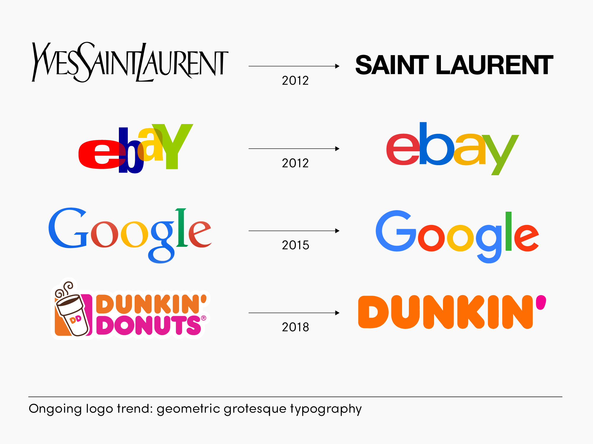
Within wordmark design itself, the trend for the past decade has been to use more geometric, grotesque (used synonymously for sans-serif fonts; when they first appeared, sans-serif fonts were considered ugly aka grotesque) fonts. Sans-serif fonts feel more approachable, younger, and no-fuss. They're confident, straightforward, and simple.
Many designers and brand specialists commiserate this trend because historic brands lose their connection to heritage and, with it, brand recognition value.
How to decide whether a logo should have a wordmark only or include a logo symbol? First, note that a wordmark alone doesn't mean the mark's design cannot be unique.
The opposite is the case—when you're going for a wordmark only, focus on having a large selection of logo ideas first to see what font and logo version has potential to be memorable. You can turn the first letter, or any other letter or letter combinations, into something that has the quality of a logo symbol. Super easy to do in the Mojomox logo maker: Once you're in the logo app, you can click on any letter of your big brand name, a popup of alternative letter designs shows up—swap designs by clicking on an alternate from the popup.
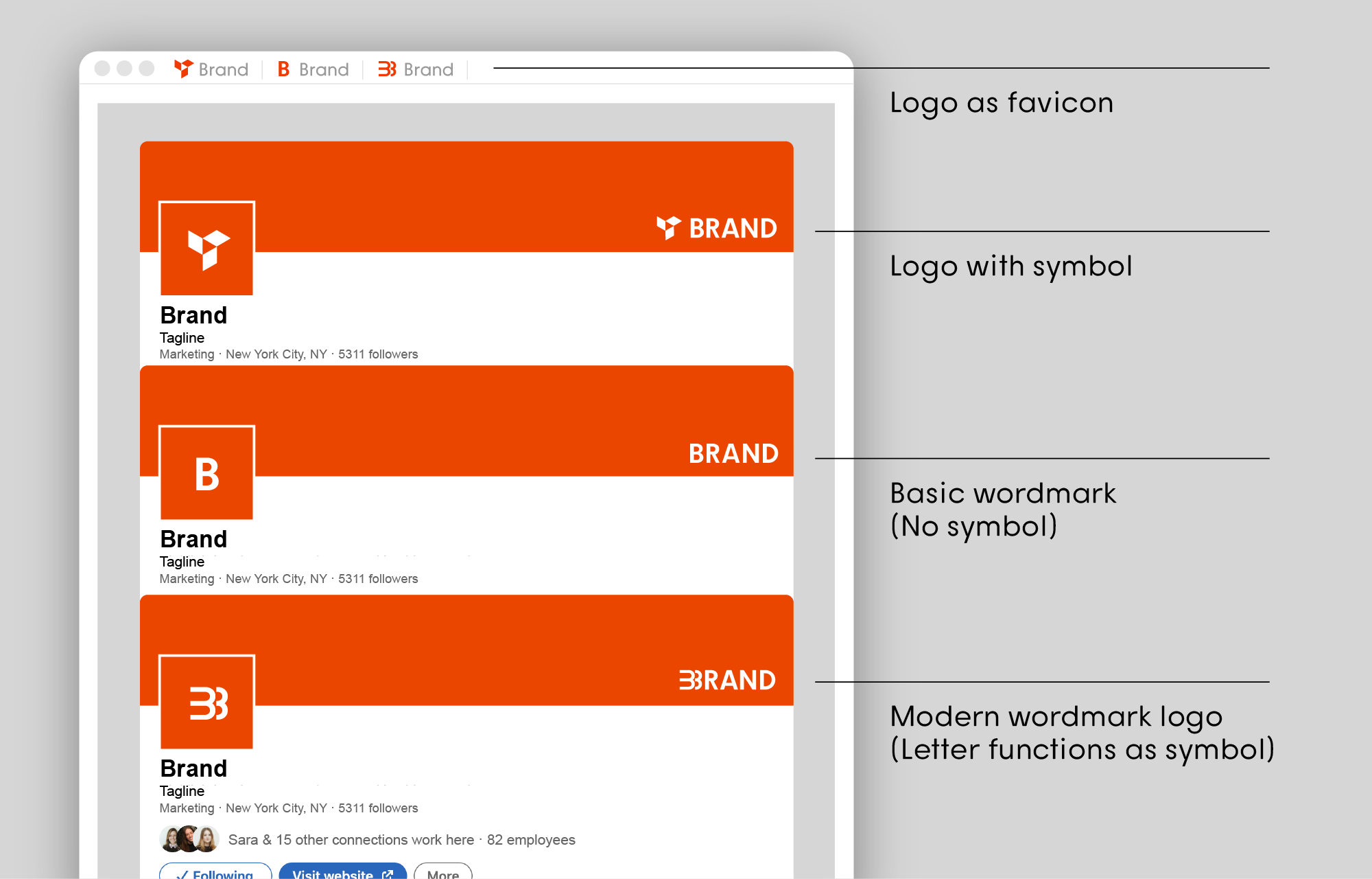
Check out the letter B above shown as different profile images for a LinkedIn banner. The first version shows a logo with a symbol, the second one is a basic wordmark (like Google), and the third one is the letter B in a design that stands out more from the rest of the font. The advantage of the third version is that this logo style is minimal, just like a wordmark but memorable when used in a collapsed way (a collapsed logo is a favicon or a profile image or sometimes called the avatar version of a logo).
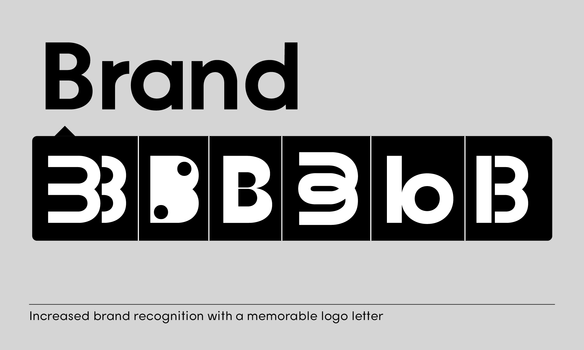
When designing a wordmark with a special letter that stands out, think about the meaning of the design. In the example above, look at the different letter B designs and note what they could mean. From left to right, these thoughts come to mind: Is it a reflection or a ripple effect? Does it look like a little toy? Does it come together in the center, is it a pipe, cooling, warming, consisting of shapes, or is it the number 13?
During the design process, a designer plays around with various ideas to give meaning to the mark—whether it's a logo symbol or the letter that gets transformed.
For startups and small businesses it doesn't make sense to pay for a thorough design process that explores lots of different options. Startups might change directions multiple times until they've found product market fit but designers have to spend a certain amount of hours to come up with a logo design that works with the existing brief.
With the Mojomox logo maker that specializes in wordmarks, you can easily click through lots of different designs quickly. See if one of the letter alternates provides meaning to the work you do. What is your brand positioning—the one word customers think when they think of you and how can it be reflected in your font choice and one or more of your logo letters?
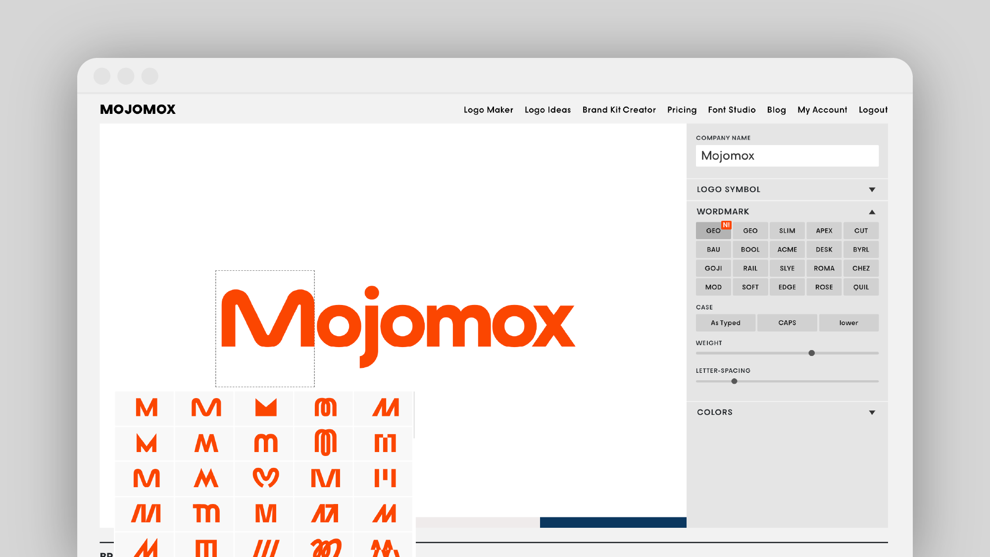
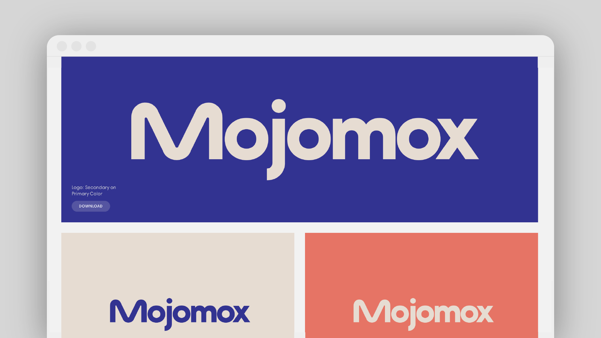
Don't overthink this. It's best to get started and just try many options. Often, the logo solution is super simple to see when you see it.
After you found a good match, use the font-weight sliders to adjust the thickness of the font. When you scroll down, your brand kit gets generated automatically—see how your logo is readable in small before you finalize it.
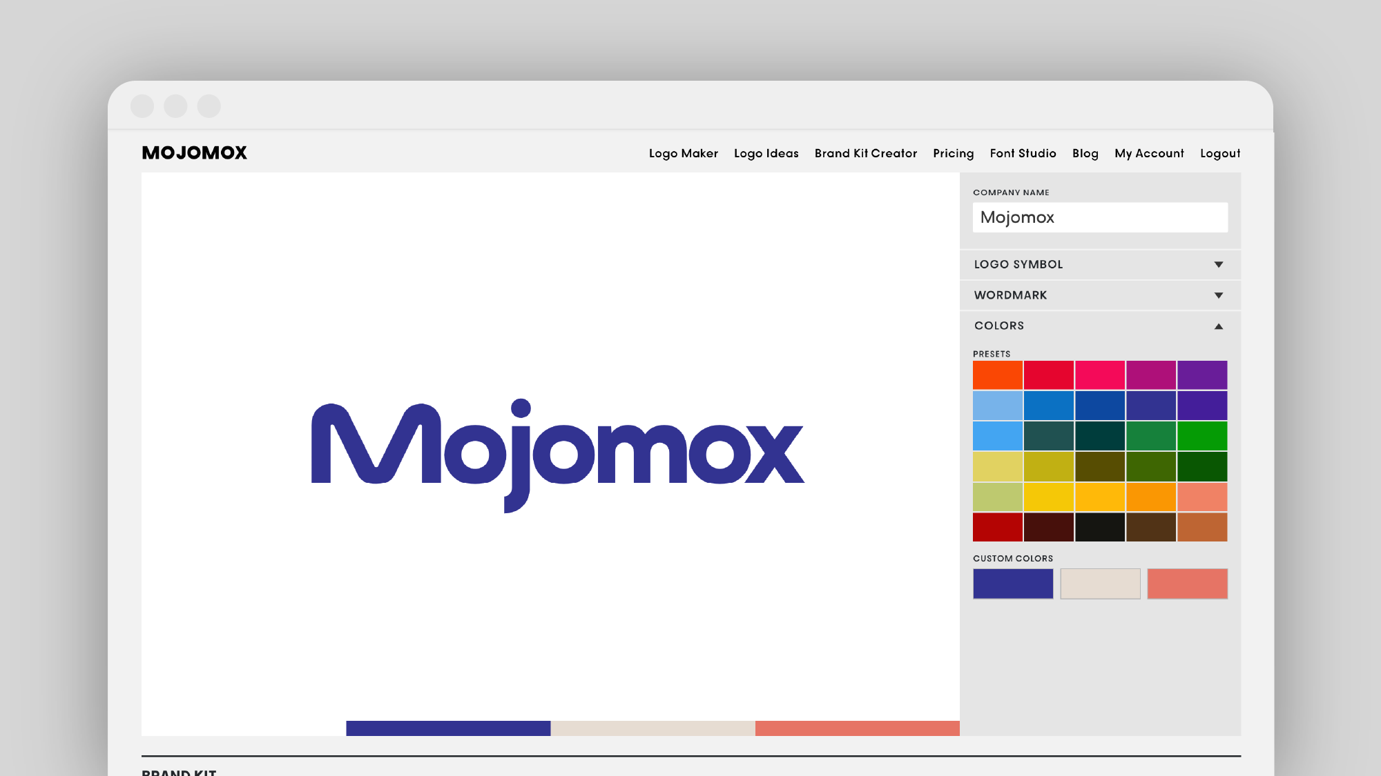
As the last step, set your color palette by picking from the presets or customizing your own with the pickers. Make sure to make your primary color different from your competitors' colors so your target audience has an easier time remembering you.