Logo maker
Article
Yellow Logos: Meaning and How to Use It in Branding
The name yellow comes from Old English “geolu” which stems from the Proto-Germanic word “gelwaz.” Its oldest known use in English is from the year 700.
The yellow ochre pigment was widely available and therefore one of the first colors used in art. Many yellow pigments were accessible but notoriously toxic, e.g. King’s yellow, uranium, Chrome and Naples yellow. [1]
The color yellow’s meaning presents itself in ambivalent ways throughout history and in today’s color psychology. In the early Christian church, yellow was linked to the Pope but was also used to mark religious skeptics. While Saffron yellow was the color for love and lust—the Roman love godess Venus wore a yellow robe—yellow became the color of dirt during the Middle Ages when harlots had to identify themselves with a piece of yellow clothing. A yellow flag was hoisted in towns in which the plague broke out. During the Nazi regime Jews were forced to wear a yellow star. But, in Egypt, Russia and some Balkan countries, yellow is the wedding color.
The German poet and novelist Goethe, known for his extensive work on color theory, writes “The eye rejoices, the heart expands, the mind exhilarates; an instantaneous warmth seems to drift toward us.” Kandinsky, however, describes the impact of a bright yellow with “… troubles the human, stings, agitates and shows the color’s character of explicit violence that acts in an impertinent and intrusive way toward the mind.” [Über das Geistige in der Kunst, 1911]
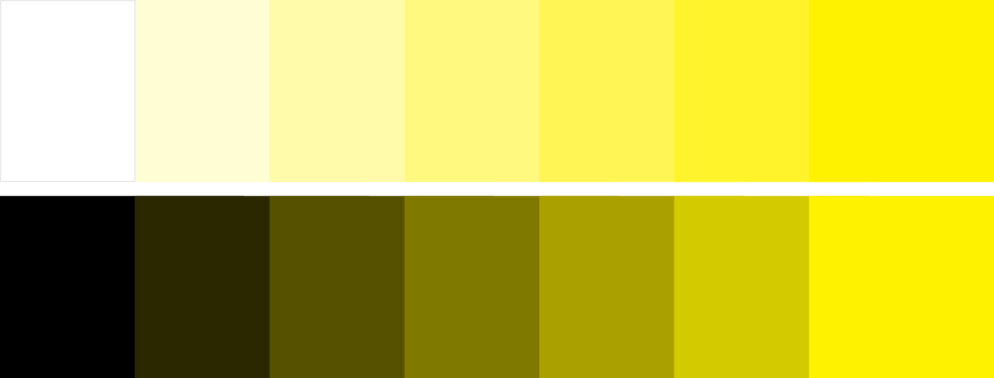
According to surveys in Western cultures, yellow is often associated with humor, joy, spontaneity, but also with duplicity and jealousy. Yellow is modern and decadent—the lighter shades of yellow are calmer, the darker shades of yellow are warmer.
Hex #FFFF00
[1] Clair, Kassia St. The Secret Lives of Color. Penguin Books, 2017.
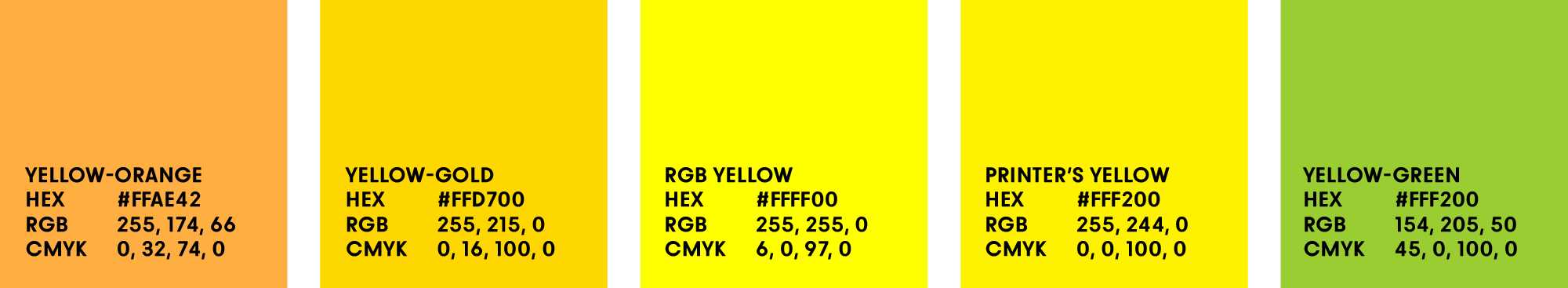
In the RGB color model (a TV screen, a computer screen, a phone), the colors red, green, and blue (RGB) create yellow (RGB yellow), cyan, and magenta when they overlap. In the CMYK color model (anything that gets printed on e.g. a home printer), yellow (printer’s yellow) is one of four inks (Cyan, Magenta, Yellow and Black) that all other colors are mixed from.
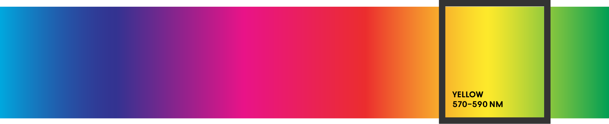
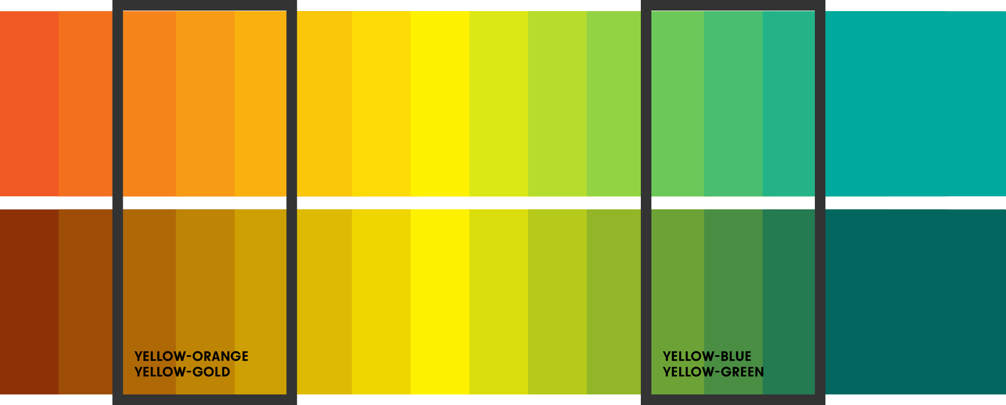
Yellow’s analogous colors (neighboring colors) are yellow-orange and yellow-gold on one side and yellow-green and teal when darker on the other side.
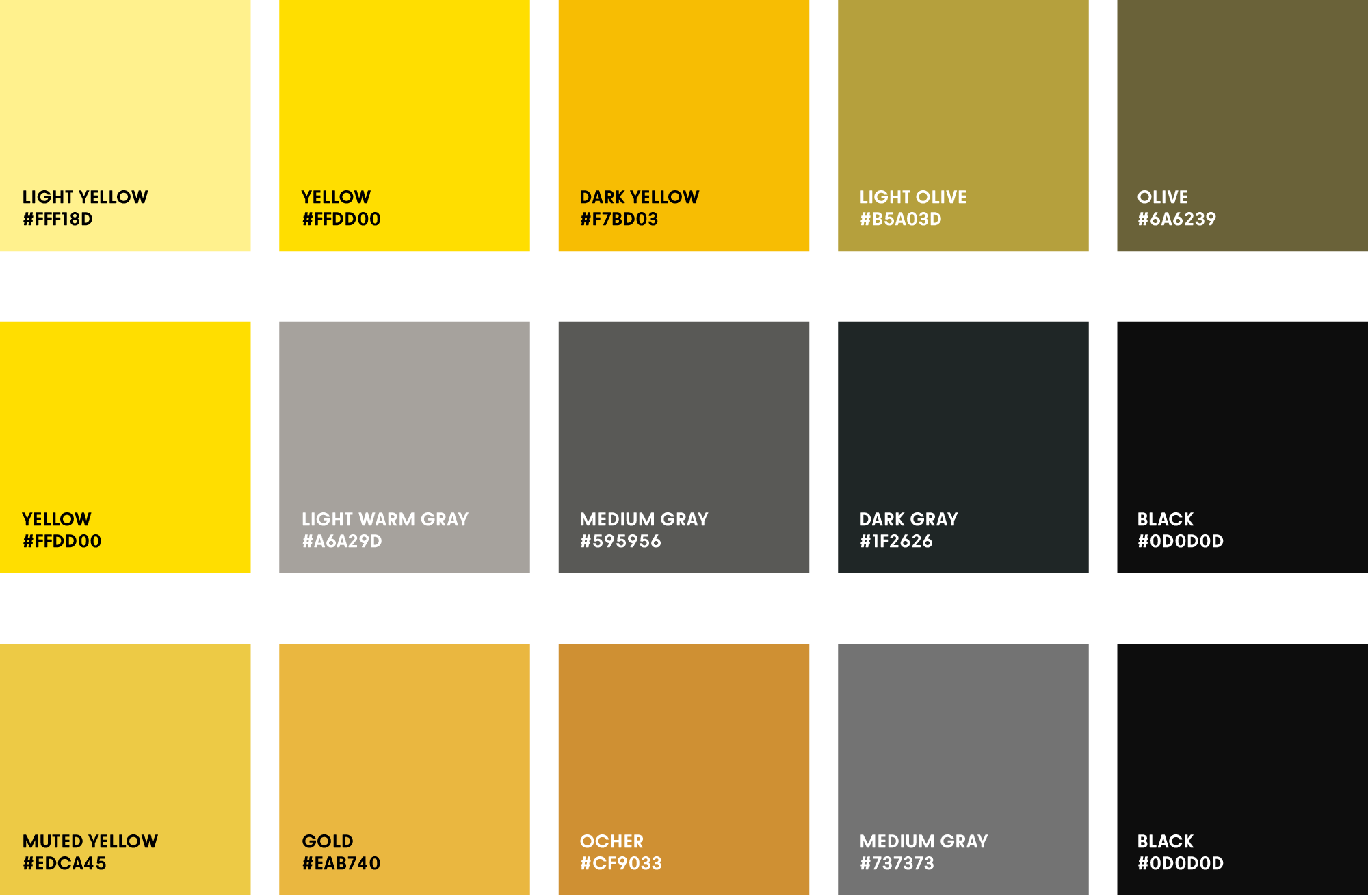
The official HEX color codes for the different yellow tones are:
Hex #FFAE42
Hex #FFD700
Hex #FFFF00
Hex #FFF200
Hex #FFF200

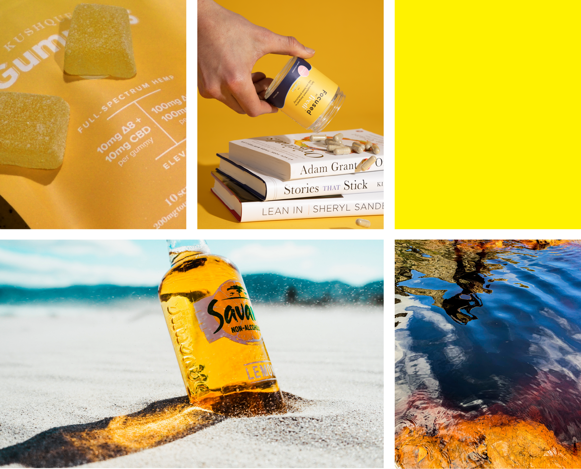

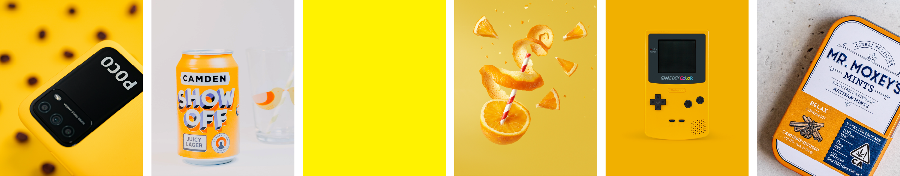
In branding, the color yellow is commonly used in
creative sectors, food industry, finance and technology where friendliness and speed are important.While yellow is hardly ever listed as many people’s favorite color, a comprehensive 2016 publication shows that people have color preferences based on contexts such as clothing, furniture, or general designs as well as personal experiences and cultural backgrounds. The color yellow, for example, has—just like the color red—a special place in Chinese culture: at times, bright yellow could only be worn by the emperor.
Branding agencies take a lot of time choosing the right colors in order to create a color palette that communicates certain brand traits and works well for specific marketing applications. First, agency strategists create a brand strategy which functions as the baseline for all design decisions.
Part of that strategy is looking at the entire industry that the brand is in, listing all competitors, how they communicate and what they look like. What does their logo say? What marketing tone are they using? What are their color palettes? As a second step, the brand designer will create a design that strengthens the brand’s positioning—the way customers think about that brand. In order to make the brand stand out, the designer will pick a color palette that is not used by its strongest competitors.
It might be worth to consider the color yellow for your brand—it’s usually not overly used by other brands, making your brand stand out instantly. Yellow is bright, likeable and naturally asks for attention.
Learn more about how to design logos or get started with cool logo ideas.
Besides selecting a brand color and a logo symbol, picking the best fonts for logos shapes how a brand looks and feels at a glance.
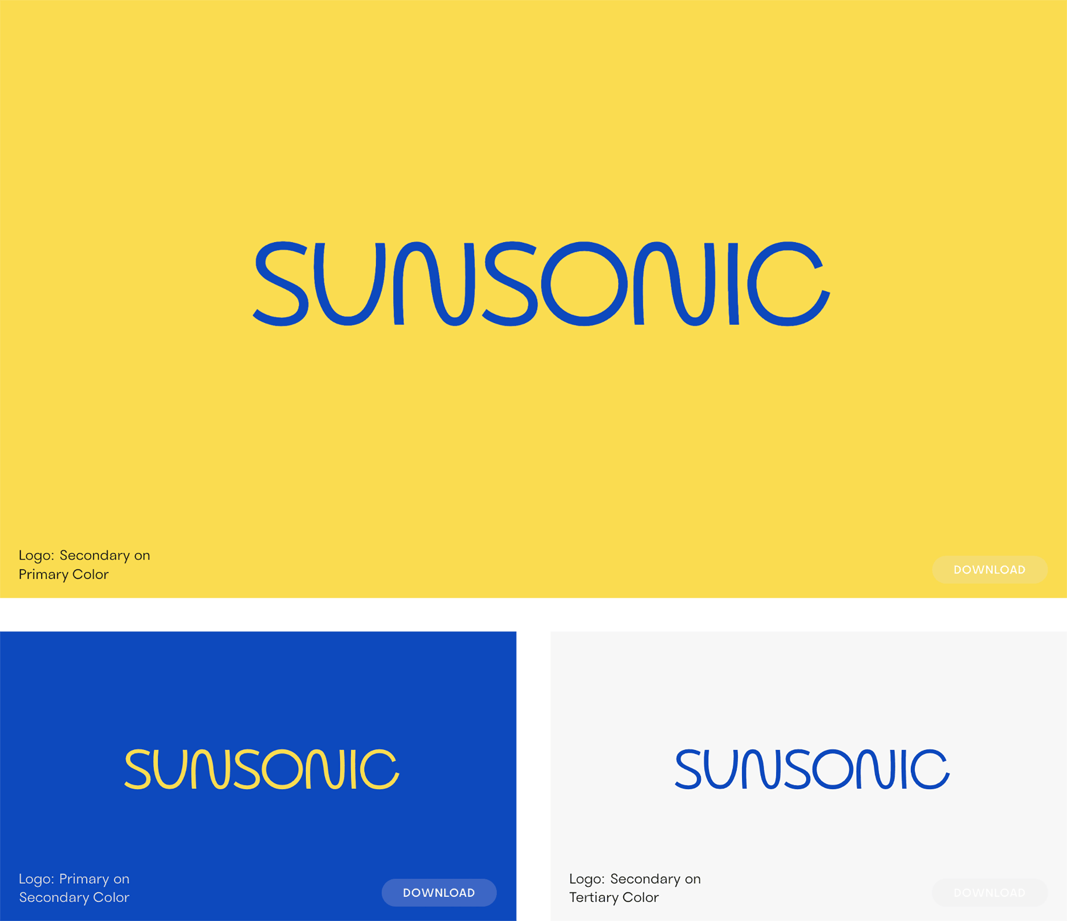
When picking a brand color whose primary color is a bright yellow, it’s important to select a darker color for enough contrast. Often, this color is black (see logos of popular brands in image below).
In a similar vein, the logo font is better when not too light so it’s easier to contrast it with the yellow brand color in various palette combinations.
Depending on what you’d like to convey, you might find this collection of beach fonts for a fun, summer vibe or this list of startup fonts to strengthen specific brand positionings helpful.
If you’re looking for a 70s vibe, try Cesty, our new rounded sans-serif font.
After looking at your competitors’ brand colors and selecting a few colors that are a) generally suitable for your brand and b) not being used by your closest competitors, make your final color choice based on color psychology and the general emotion you want to convey. Yellow’s positive traits are joy, logic, and wisdom. It is communicative and creative in its tone. Yellow’s negative traits are being too analytical, impatient, nervous, unstable, and judgmental.
Once you made your choice of a main brand color, start building a palette from there: select three gray tones (light, middle and dark gray) that will support this color, and, consider adding up to three secondary colors that can be used for secondary design elements such as infographics or buttons on a website.

Saskia is a designer and the founder of Mojomox. She writes about logos, type, and the working craft of identity.
