Logo maker
Article
Visual Identity: Building a Bold Brand with Strong Visuals
Visual identity is how your brand visually communicates who you are, what you offer, and why you matter. Think of it as your brand’s face—something customers remember and associate with you. In today’s image-driven world, a well-built visual identity can be the difference between being noticed or overlooked.
This guide covers the essentials of creating a strong visual identity and maintaining it. Whether you’re starting fresh or revamping an existing brand, follow these steps to create work that stands out.
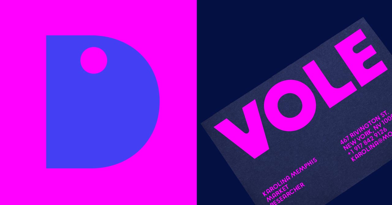
Visual identity includes the visual elements that define your brand’s look and feel. These components work together to create a consistent and recognizable image across all channels.
How to design a minimalist logo in 4 steps
While visual identity deals with what customers see, brand identity covers the broader experience.
Analogy: Think of your brand like a car. The visual identity is the car’s look—its color, shape, and design. The brand identity is how the car makes you feel, its performance, and its reputation.
Branding for startups: 4 questions to ask when starting out
A strong visual identity builds trust and recognition. Here are some reasons why it’s needed:
5 strategic steps to a professional business logo
Before designing, understand your brand’s mission, personality, and values. These will guide every visual choice you make.
Questions to Ask:
Logo
Your logo is most often the first interaction people have with your brand. Make it simple, memorable, and scalable.
Design Tip: Try creating or refreshing your logo with the Mojomox logo maker app.
Fonts
Fonts convey tone. A serif font can feel classic and formal, while a sans-serif font can be modern and clean. So if you have a brand trait on your list that represents a tone (a style, a way of doing things), a font is the easiest (and cheapest) way to communicate the trait across your marketing channels. A common and minimal way is to use the font in your logo and as your brand font in which you type your brand’s texts.
Examples:
Color Palette
Colors trigger emotions. In modern branding, it’s easiest to select one main color, a secondary color and a third color for accents. The main color will be “your” color—it’s the color of umbrellas if you’re a restaurant, the color of your company car if you have one, the color of your profile image for social media and so on. The secondary color is for design assets that require more variety—websites, brochures, illustrations etc. And finally, the third color is for accents—elements that need to stand out, such as call to action buttons (CTAs) on a website or in newsletters. All three colors need to be able to be next to one another without clashing.
No worries—each color can be used in shades and tints too, darker and lighter versions of the same color. This way, you’re not introducing new colors and dilute your palette but you add design variety instead. Of course, you can also have more or fewer colors than three but if you want to avoid building a complex color system, three colors are best practices.
Tip: Ensure your palette is accessible for people with visual impairments. Fewer colors, stronger colors will often help.
Shapes and textures enhance brand perception.
For one-of-a-kind logo symbols, check our shop at logo-icons.com.
A style guide ensures consistency across all touchpoints. Over time, build up a style guide—how your logo should be used, how it should not be used, color numbers (RGB, CMYK, and/or HEX values), a few applications of how you want your brand to look. A style guide can be as short or long as you want.
Include:
It’s easiest to build out a style guide as you build your brand—no need to overthink this. It’s mostly about having some sort of documentation of how to use brand elements technically, so you can copy and paste things next time you need to create assets, and for when you have multiple people working on your project—you don’t want them to come up with their own interpretation of your visual identity.
Tip: Assign a “visual identity owner” to ensure all visuals meet brand standards. This is usually the brand designer.
Organize your assets: Store brand elements in a central location using tools like Google Drive. Mojomox also has a simple brand assets view built in that can be shared with others. People can pull assets such as logos and font from it.
A strong visual identity is essential for creating brand loyalty and recognition. By following these steps and ensuring consistency, you can build a visual system that supports your brand’s growth.
Ready to refresh your brand? Check out our Mojomox font collections or logo maker to get started. Type your brand name below:

Saskia is a designer and the founder of Mojomox. She writes about logos, type, and the working craft of identity.
