Logo maker
Article
Trending fonts for logos in 2026
In the fast-paced world of graphic design, choosing the right font that reflects our society’s current spirit is important. It can set the tone for your brand, enhance user experience, and even influence conversions. So, what fonts are designers buzzing about in 2026? This article explores the best font trends, from bold geometric statements to elegant script styles, helping you stay ahead of the curve and make informed design decisions.

The food, design (including art, architecture, culture), and fashion industries are known to pull in lifestyle pioneers.
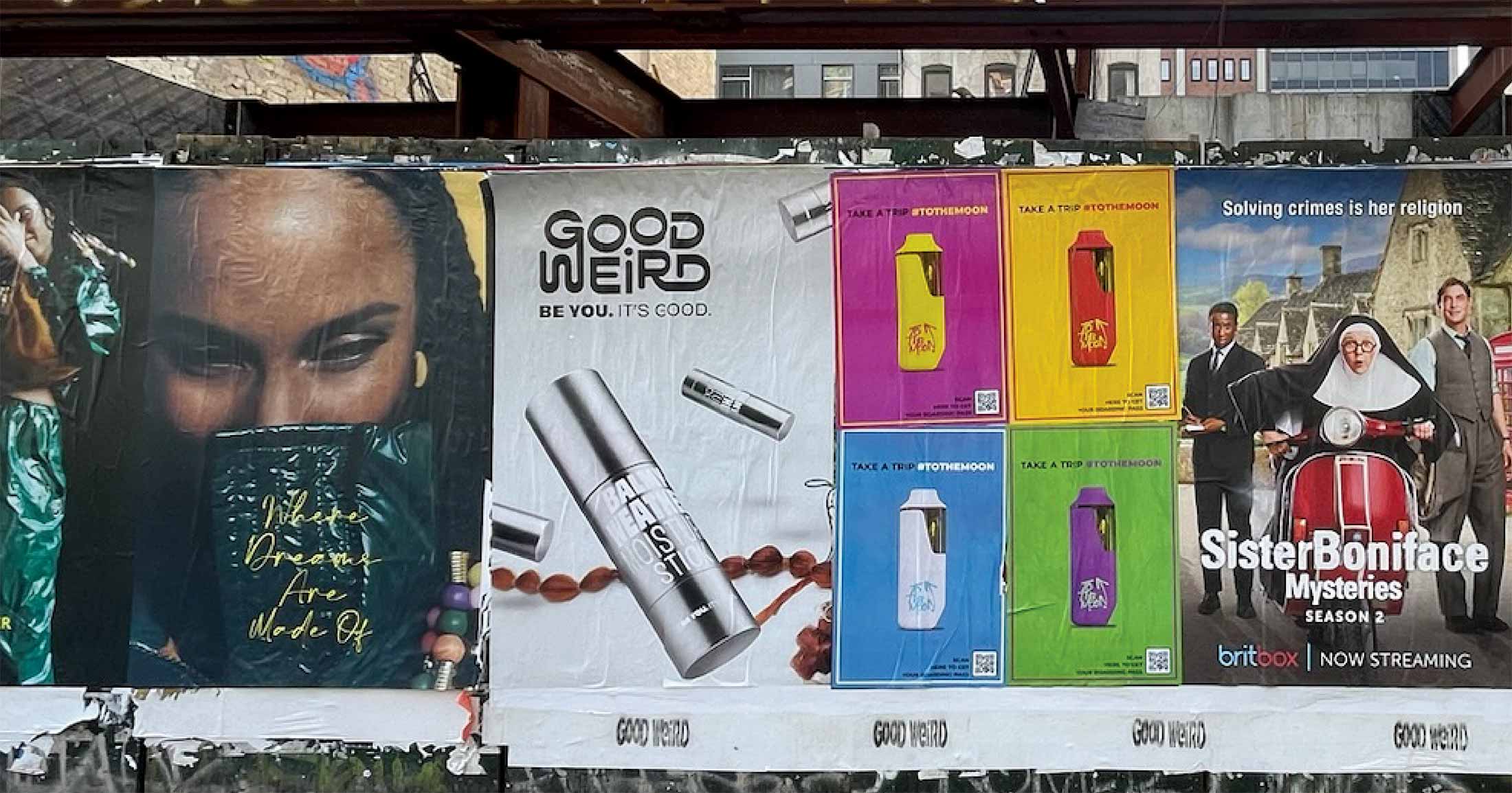
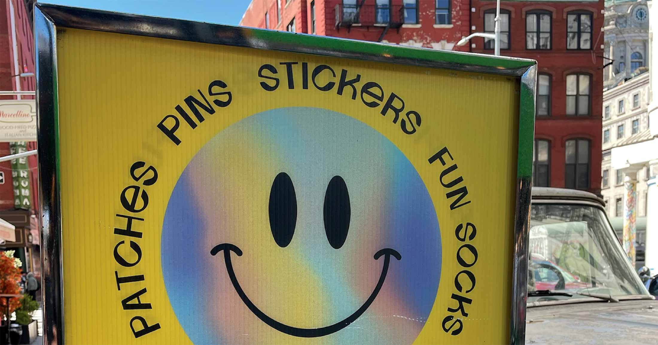
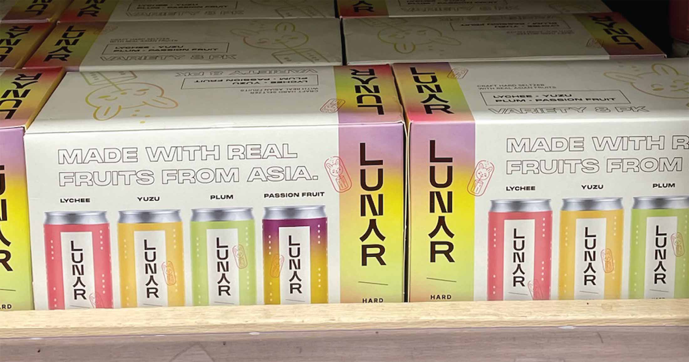
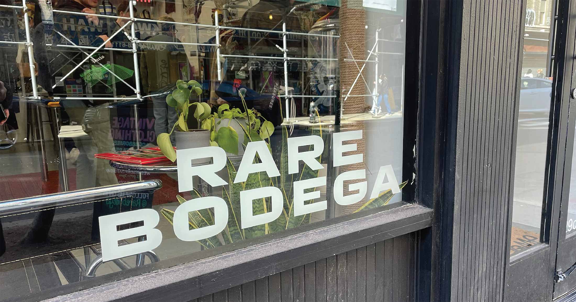
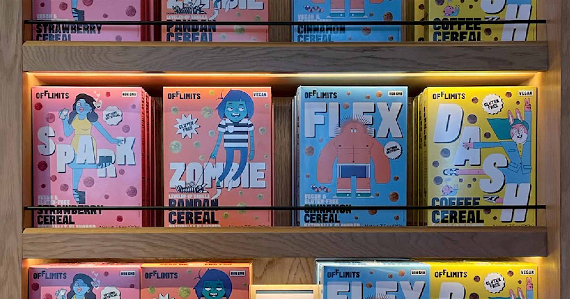
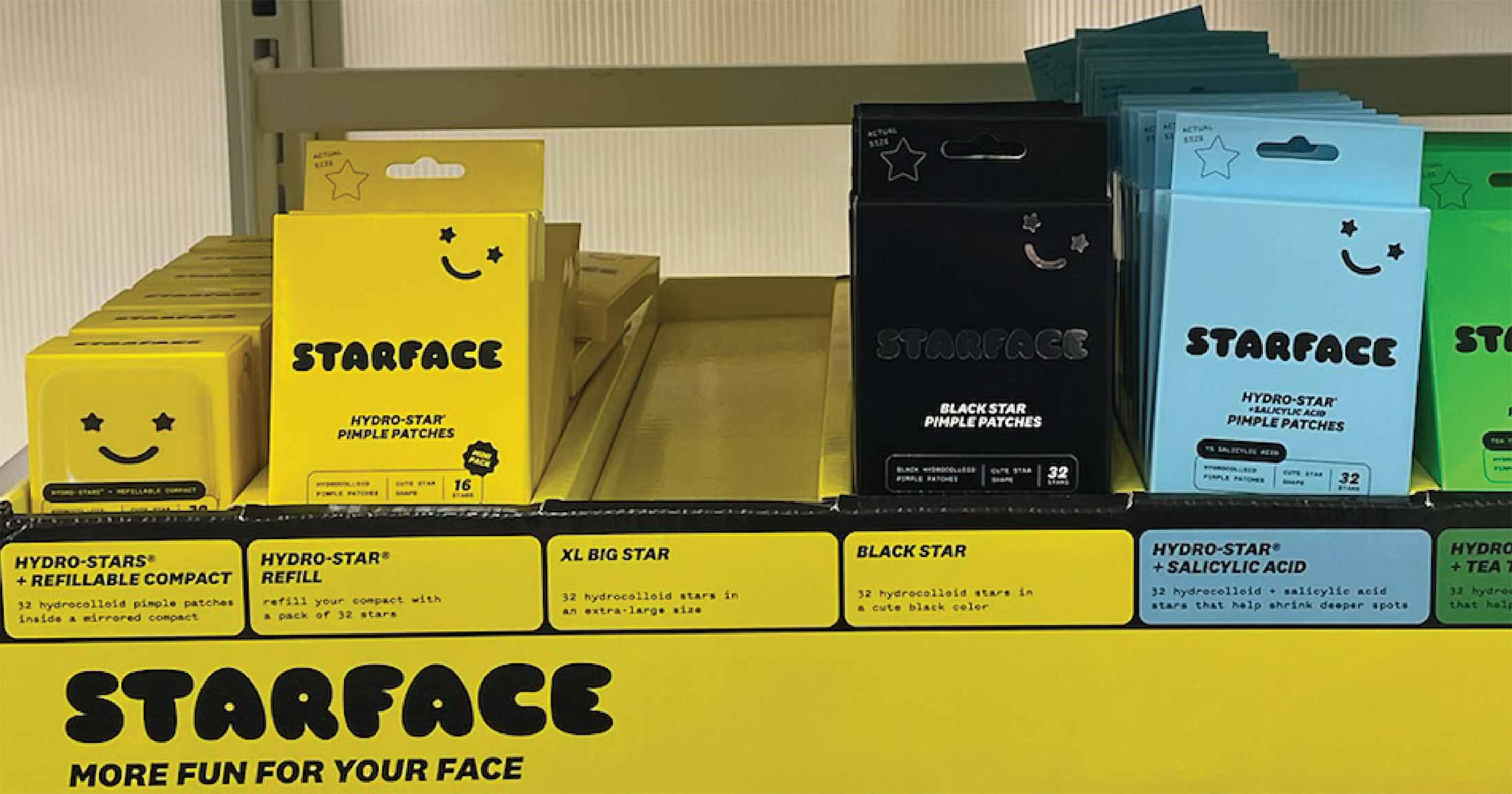
Food branding and design is likely the most diverse and fun space to get creative in. It includes brand identities for restaurants and the packaging of food products on shelves. Logos for restaurants and food products usually live without any symbols. Instead, brand character gets added by picking a typeface that’s memorable and mirrors the features and positioning of the brand.
For food-related branding, get inspiration from this list of whimsical fonts and playful type.
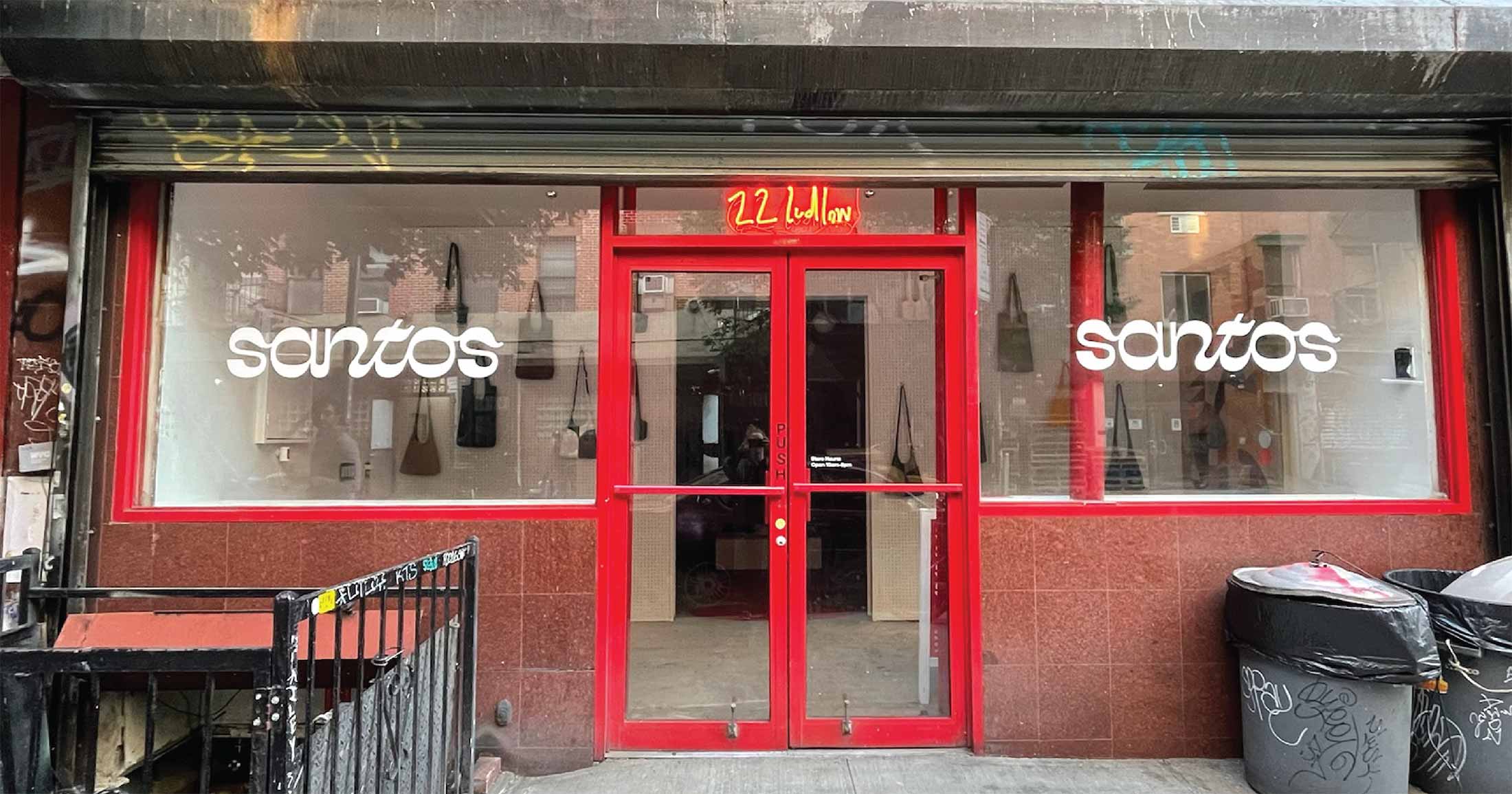
For luxurious typefaces that might be interesting for fashion projects, check out this list of elegant fonts.
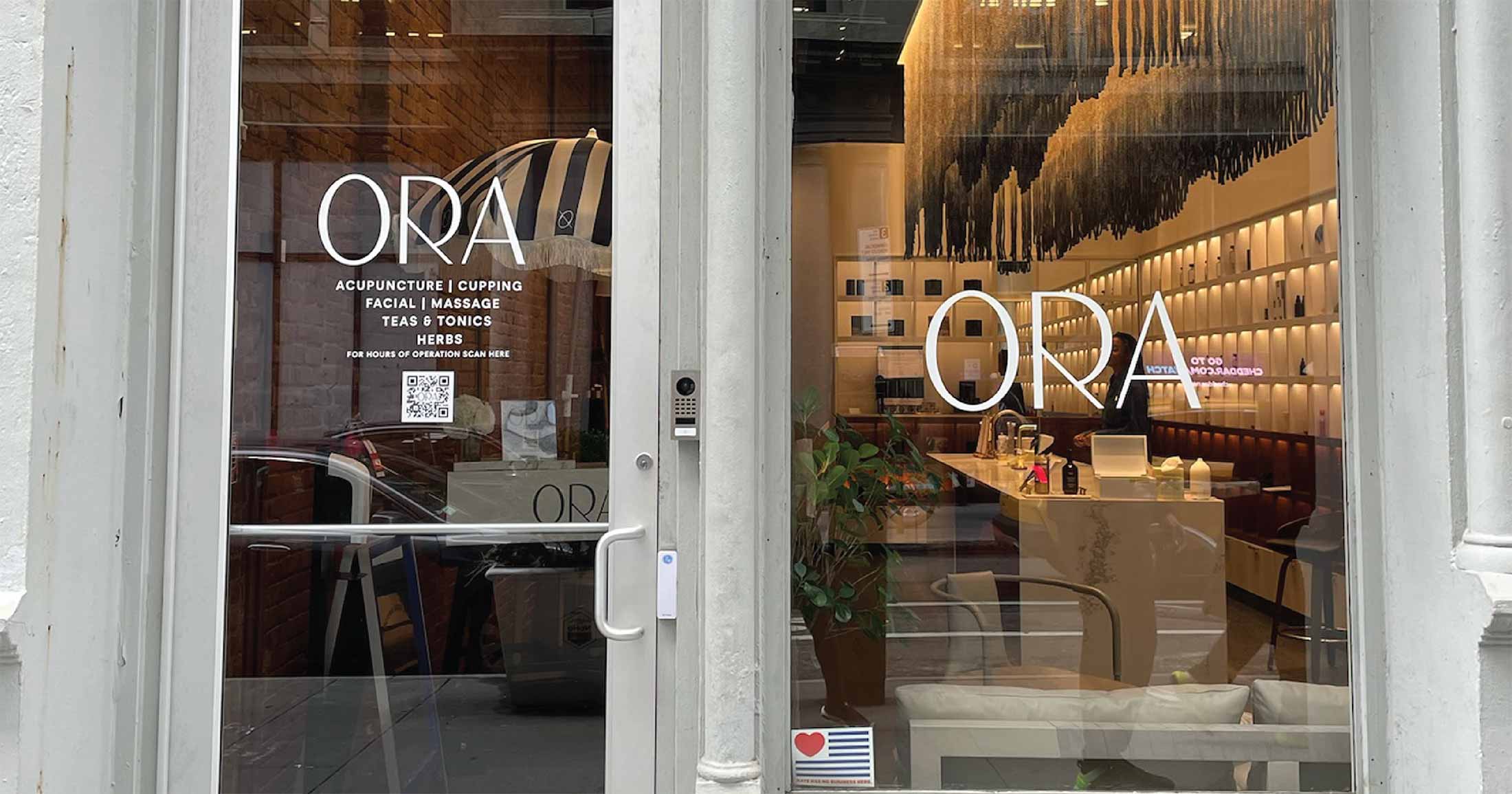
Finally, this collection of architecture typefaces works well for geometric and generally modern designs.
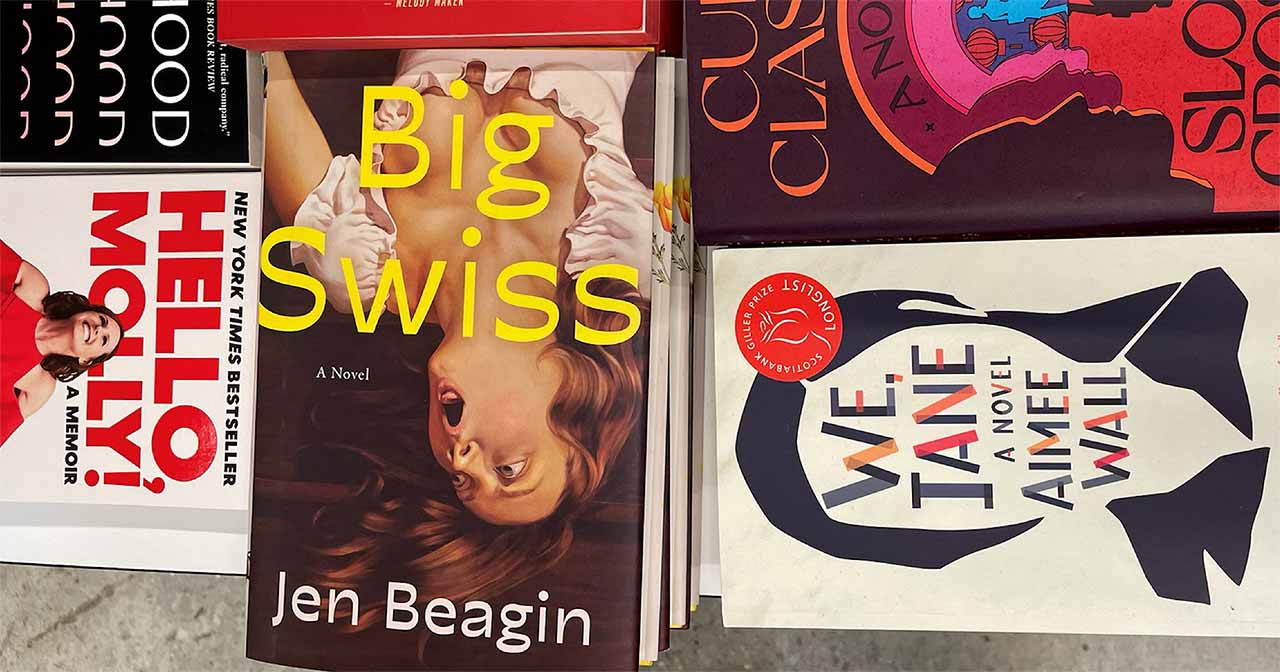
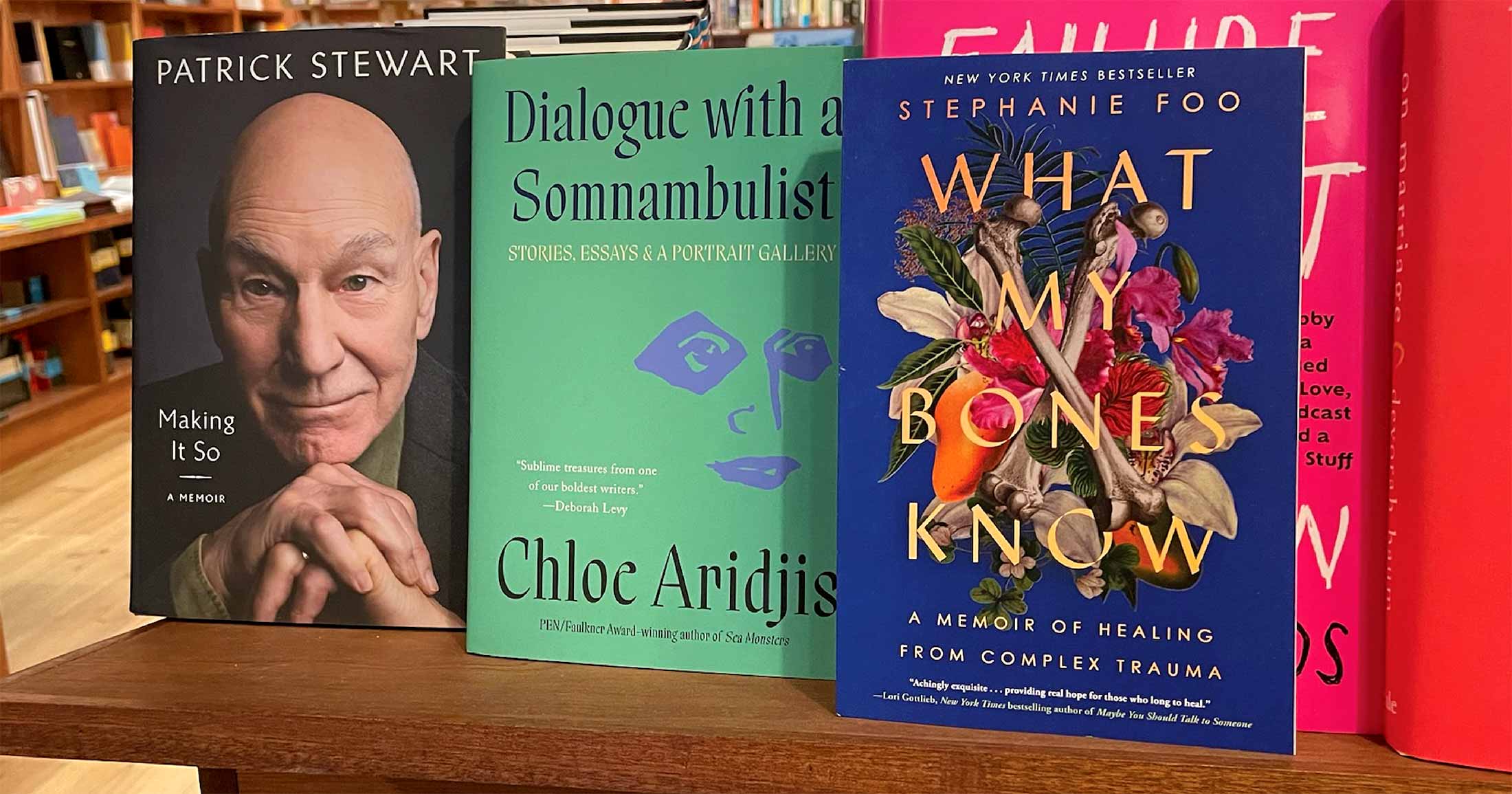
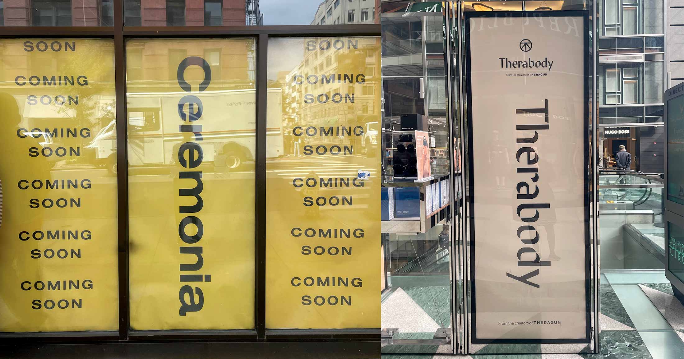
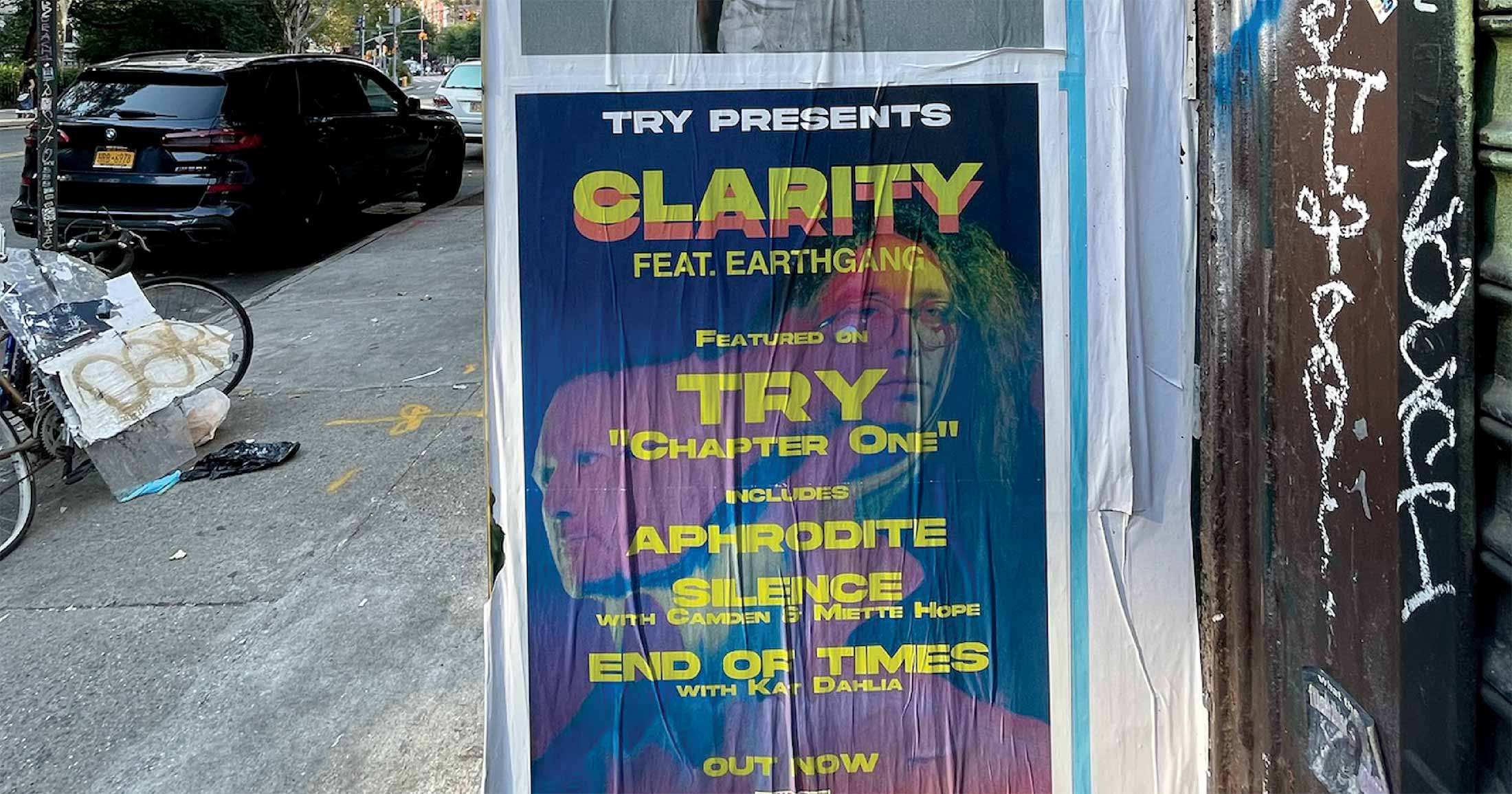
Book cover designs are a great resource when looking for font trends. Book titles are made from only type and usually don’t include logo symbols. Cover designs are often short-lived—they must appeal to the readership for a few months or perhaps one or two years.
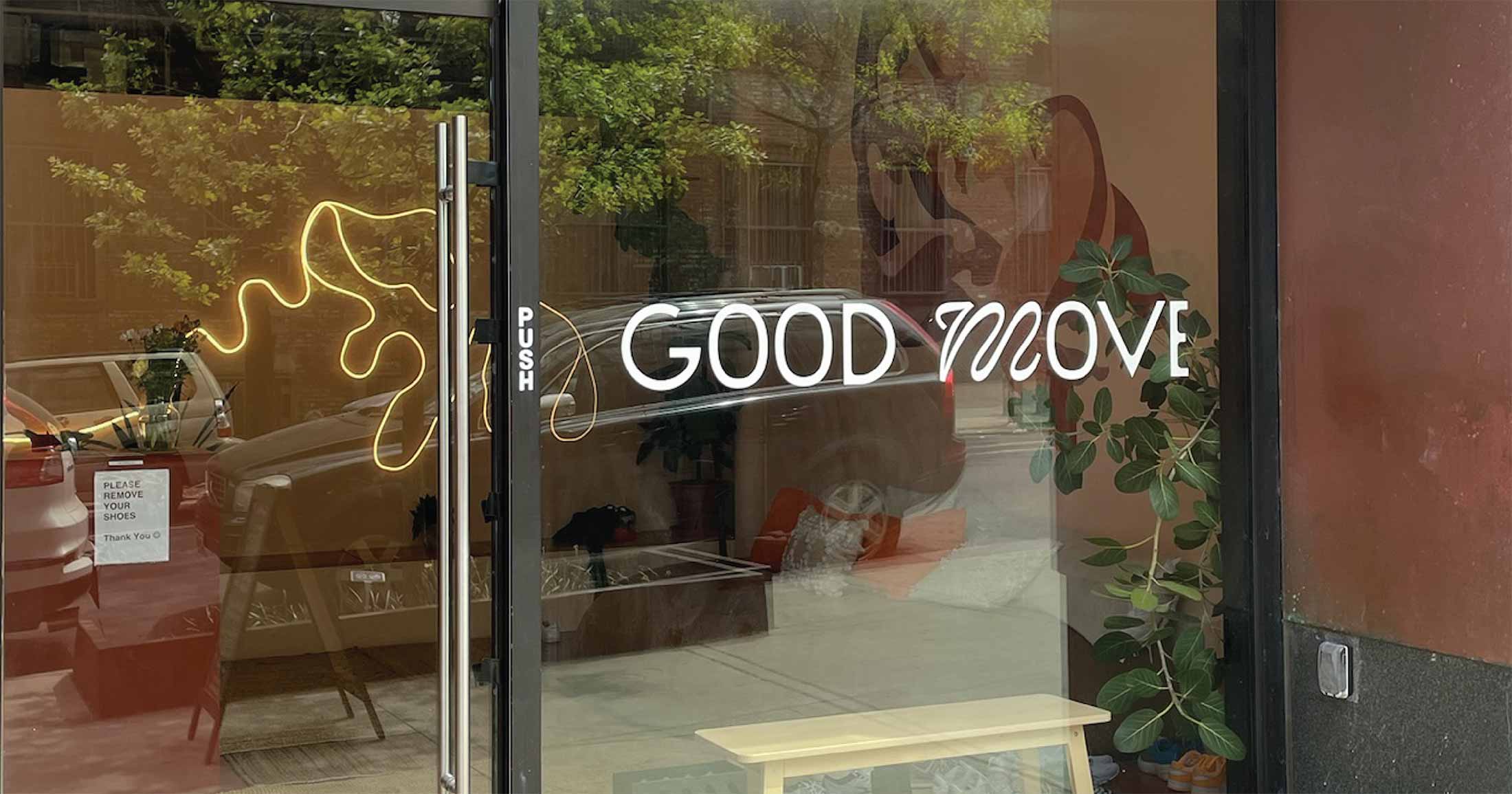
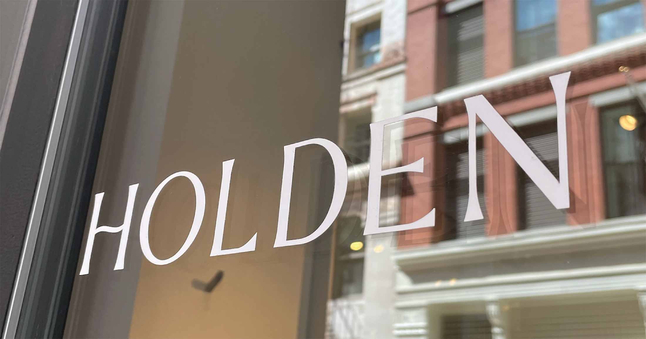
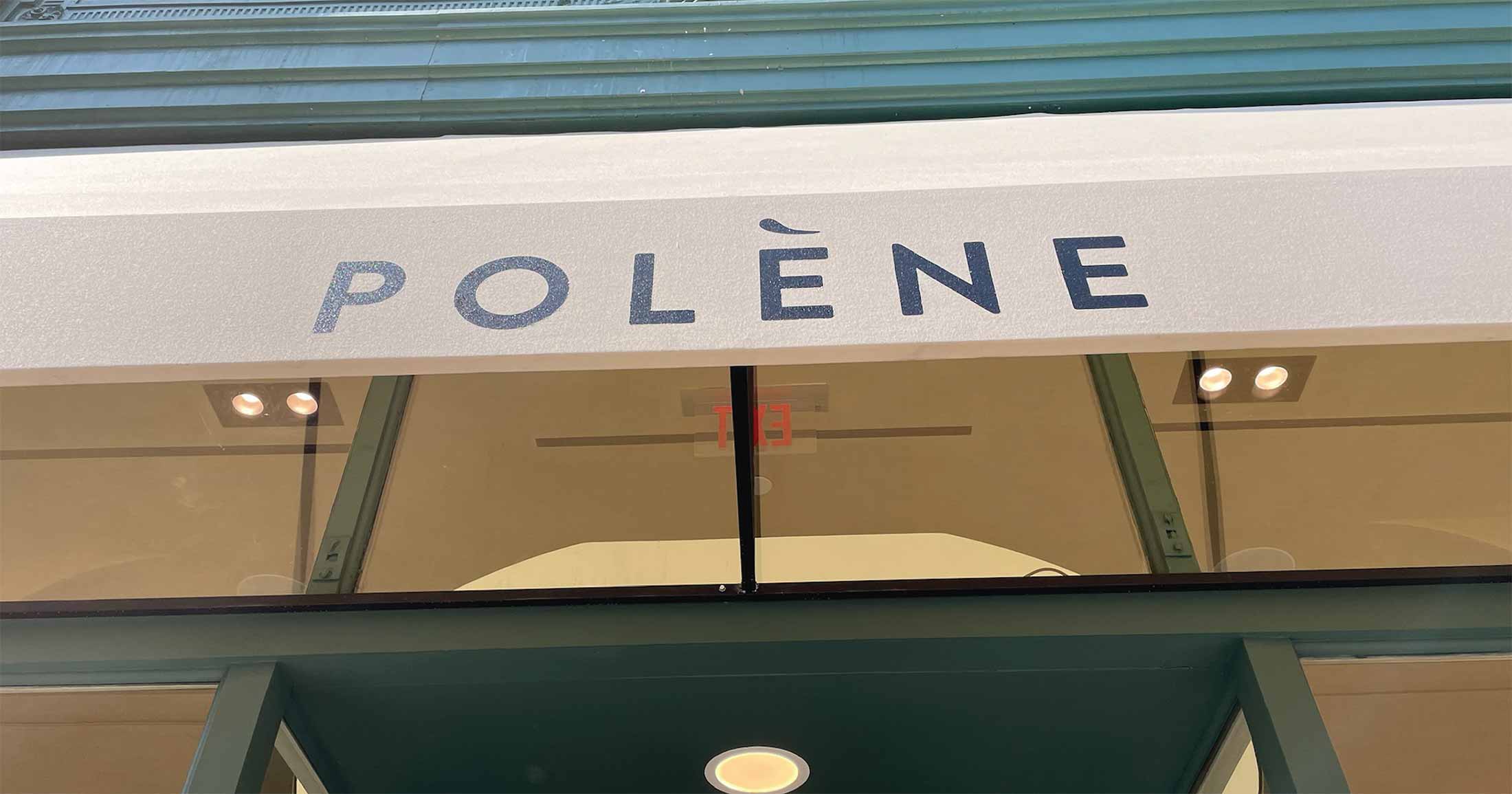
Unlike cover titles, company marks have a much longer life span, at least five years, but they’re usually designed to look contemporary for ten years. That’s why logo fonts and wordmarks often take a more classy or minimal approach, such as a timeless serif or sans-serif that will remain relevant for a few years.
If you’re working on a campaign logo meant to be around for a shorter period, such as an event logo or a seasonal sub-brand, you can opt for a trendier, less classy font.
Fonts with a strong retro feel remain popular because they stand out from the minimalist crowd and convey a particular character. The most popular typefaces are in the following three categories:
Thanks to the growing interest in fonts—due to simplified licensing, easier technical implementations, broader usage of design apps such as Canva, and generally a more curious design audience through the growth of Instagram and co—cool typefaces are more in demand than ever.
For big brands, custom fonts might, first and foremost, bring a financial advantage—licensing fees for large teams and various design applications may supersede the cost of a custom typeface, which can start at around $50k.
But just like the logo and the color palette, brand typography is also a primary contributor to a brand’s visual identity. Depending on the design asset, it might be the most memorable one.
One ongoing trend that’s based on the technical progress of modern browsers since 2016 is called variable fonts.
Sometimes, variable fonts are called flexible fonts because of the way they are marketed. Often, variable fonts are animated to show the nature of the font, for example, going from being condensed to extended in style—this makes fonts look flexible.
In logo design, variable sans-serif typefaces are especially useful when building a fully fleshed out brand identity. Often, you need flexibility across sizes and layouts—fonts like Bitec and Ark fit well into that clean, technical direction. Full families always include a variable font.
Variable fonts are fonts that have at least one variable axis that allows the designer to fine-tune that specific feature. A standard variable axis is the weight axis. So, instead of selecting a light, regular, or bold font weight, the designer can now select a weight between two other weights, for example, between semibold and bold. There are different, more creative variable font designs; one of my favorite projects from a few years ago is called the Climate Crisis Font, showcasing an axis of destruction by year.
Variable fonts are also great for web design because they are often smaller in file size, making websites load fast.
However, in practice, variable fonts make it more complex for the untrained design eye to suggest design options. The type designer predefines regular, non-variable typefaces by setting weight and other boundaries, creating a recommended restriction for how the graphic designer should use and apply the font to designs. In addition, variable fonts can’t be used in more basic design programs such as Canva. So if part of your team is using Canva, you’ll need a non-variable format of your fonts too.
To try out modern logo fonts, type in a title or brand name below. For exploring fonts, visit our font shop.
For rounded, friendlier logo directions (without going full script), you can also check out Auria or even Plox.

Saskia is a designer and the founder of Mojomox. She writes about logos, type, and the working craft of identity.
