Logo maker
Article
A tech logo consists of a geometric, abstract logo symbol paired with a sans-serif font.
Learn how to design a logo for a tech startup, how you can integrate brand strategy and positioning without knowing exactly where to take your startup and how to ensure you can pivot without having to redesign any of your assets every time you change your business direction.
Check out how you can use an online logo maker (that’s unlike any others you may have tried before), design a unique wordmark or logo with a tech symbol, find your color palette and font suitable for a tech business in a couple of clicks and see preview mockups of a website and business card.
Learn also how professional designers think about designing a logo and how to set up a brand system for growth.
In the logo examples above, a screenshot of Y Combinator’s startups, around half of the company logos listed are in the wordmark logo style. Wordmarks are logos without a symbol; people also call them text logos, typography logos, and logotypes.
Many of the logos with symbols use a monogram or lettermark logo style, where the symbol resembles the first letter of the company’s name. Examples are Airbnb, Doordash, Whatnot, and Podium.
Other startup logos illustrate the company name. For example, OpenSea shows a boat on a blue background, Rippling’s logo symbol is a circle with two ripples, Dropbox’s symbol is an open box, and Groww’s logo shows a growth graph.
Another common tech logo style is using cute or fun symbols. Examples are Instacart’s carrot, Twitch’s robot speech bubble, Benchling’s jellyfish, and GitLab’s abstract fox.
Popular font styles for tech logos are in the sans-serif fonts category. Sans-serifs don’t have feet—they look more casual, approachable, and friendly, especially when set in all lowercase letters—another common logo trait for technology logo design. A subcategory of sans-serif type is “rounded fonts.” These are fonts that have either rounded letter stems and terminals (think of Arial Rounded, the Instacart, Zepto, and Reddit logos use a rounded font), or rounded letter shapes (think of missing up-strokes, such as in the Cruise logo (first row), or, the Zepto logo in the last row).
While brush and handwritten fonts are usually a popular type choice in all industries, they often get replaced by a serif or sans-serif font in a professional redesign later. Cursive, handwritten, and brush-style fonts make companies often look more whimsical and smaller than they are. They communicate that a company cares about personal or creative values which is rarely in the foreground of a tech brand. An example of a tech logo in a brush font is Rappi in row three. Airbnb (first row) used to have a brush-style wordmark before its simplified sans-serif type took over.
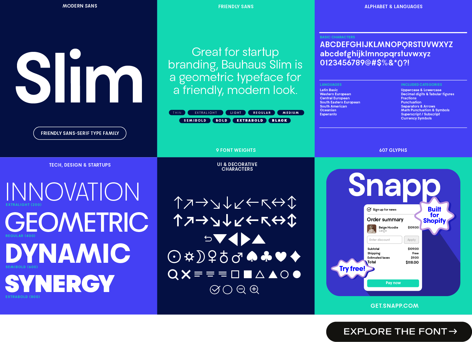
You might find this list of startup fonts and this list of tech fonts a great starting point for finding a suitable typeface either for a tech logo or for a more general text font. Check out Bauhaus Slim (shown above), a friendly sans-serif startup font that works well for tech, finance, and health businesses.
The logo maker helps you create a logo quickly, even if you don’t have any design skills. You can click through tech symbols, try logo fonts especially designed for logos, adjust font weights from thin to bold, swap letter designs, and create color palettes in just a few clicks. Plus, the app automatically generates a full starter brand kit, so you have everything ready to go in one step.
Stripe, the old Zapier logo (shown above in row 3), and Reddit’s logo all feature a particular letter i. Stripe’s i looks like a credit card in use, Zapier’s old i reminds us of a settings icon that lets users connect things, and Reddit repurposes its red dot from the symbol again.
Tech logos often make use of text style typefaces as opposed to “display type.” These two are different in style: Text fonts are readable when used in text (but they look a bit more boring overall), display type is usually only readable when used for headlines (title fonts) or posters (poster fonts). When you can’t read longer text sections because the font is too particular, you’re looking at display type. Examples of display type in the logo collection above are the Twitch logotype, Cruise and Scale, Rappi, and Webflow. An in-between design solution that is classy but stands out at the same time, is the font used in the Deel and Gusto logos.
Get started with cool logo ideas or by typing in your startup’s name below:

Saskia is a designer and the founder of Mojomox. She writes about logos, type, and the working craft of identity.
