How to Design a Minimalist Logo in 4 Steps
What is a minimalist logo?
A minimalist logo can be either a wordmark logo, also called a “logotype,” or a simple combined logo (symbol plus brand name).
The symbol is often geometric and paired with a minimal font. The color palette is usually stripped down to one or two colors.
Read on to learn what to pay attention to when designing a minimalist logo—whether it’s for a business or a personal brand.
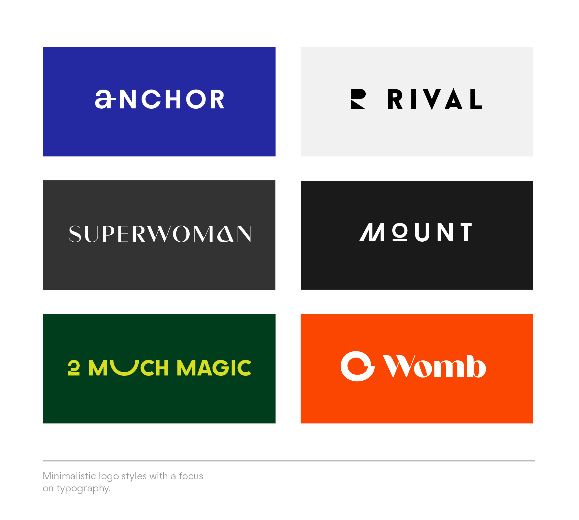
Step 1: Get logo ideas
Step one: Collect and create logo ideas via the Mojomox logo maker first. If you’re collecting ideas via images you found online, adding them to a a one-pager is best. Ten to twenty designs will give you a good overview of variations. Too many inspirational designs dilute the collection—keep adding and pruning back at the same time until the mood board feels compact and cohesive.
Highlight the things that you like about certain logos and state why in two or three words; for example, the color palette, the spelling (uppercase or lowercase) or spacing (wide or narrow), font specifics (serifs, pointy letters, etc.), or the tone (friendly, sophisticated, etc.).
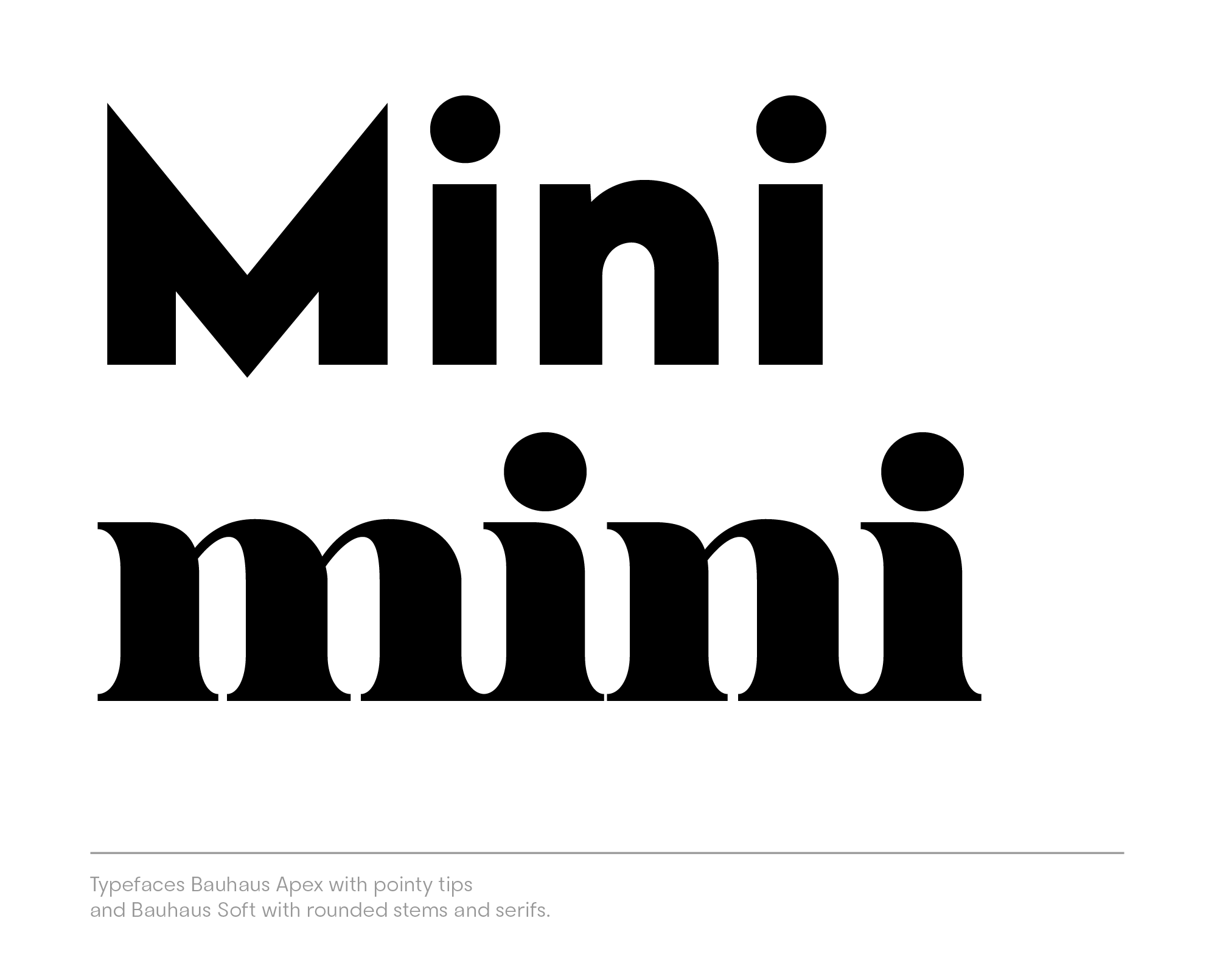
Step 2: Select a logo as a baseline
Step two: To get started quickly, use the Mojomox logo maker app. Type your brand name into the input field either on the logo maker page or below this article to generate simple logo ideas. Select one version to use as a baseline. You can customize further inside the app.
Step 3: Customize design
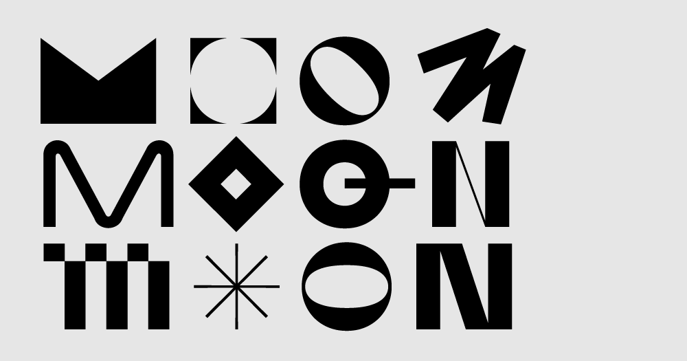
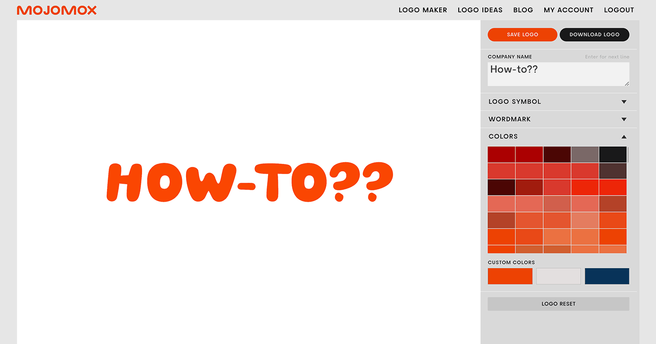
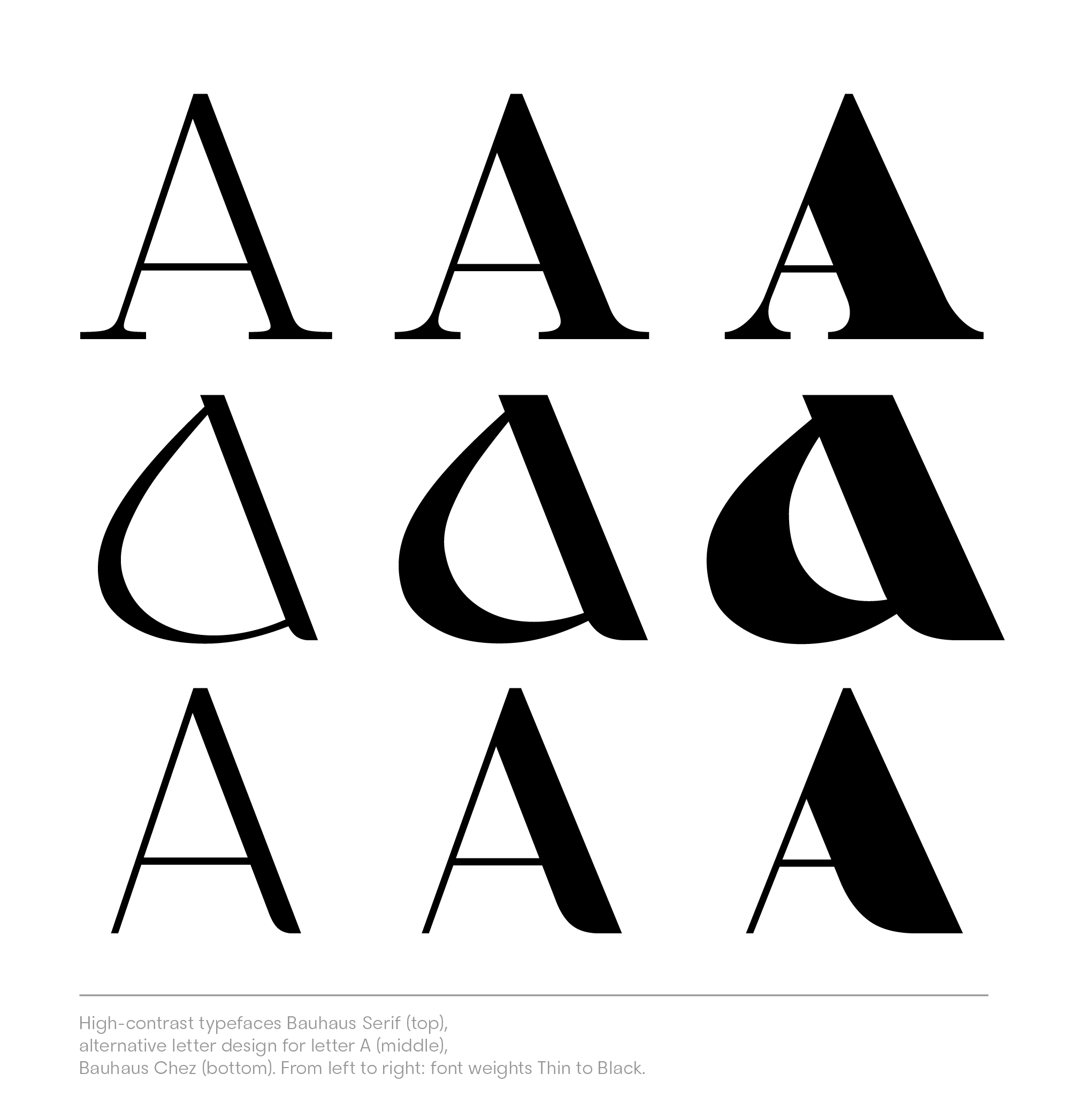
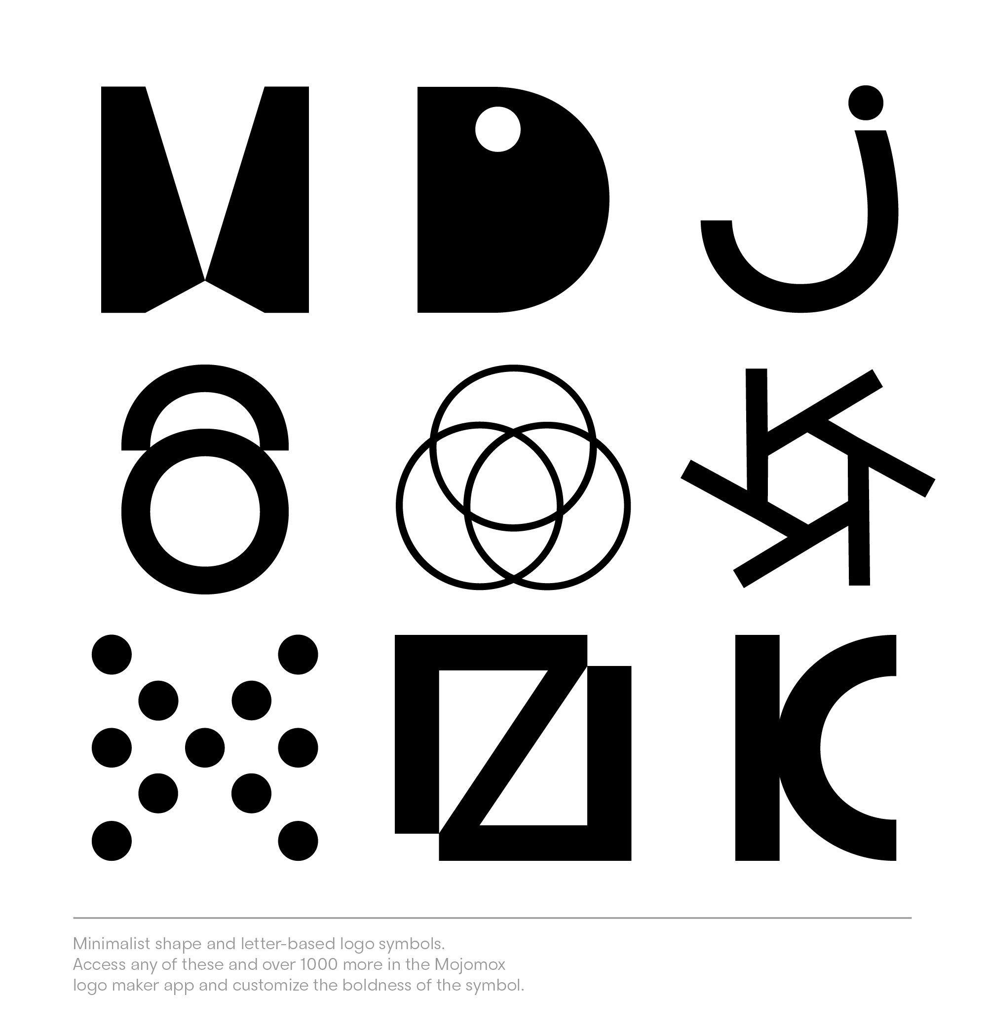
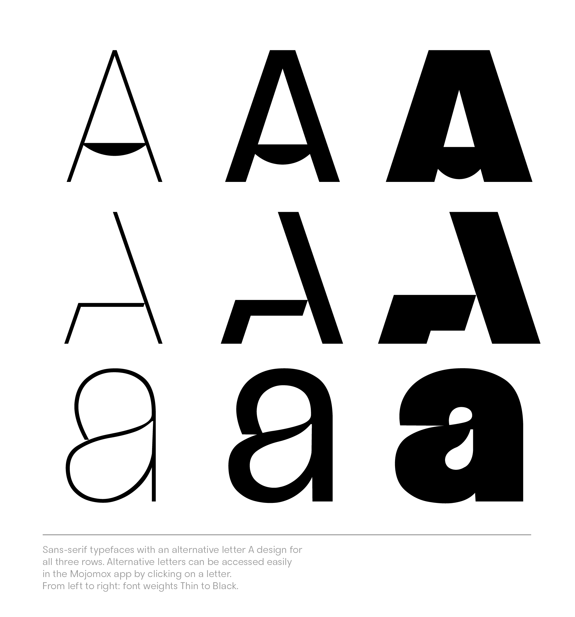
Step three: Now that you are in the logo maker app, click on one of the letters of your brand name inside the white editing area; this will pull up the alternative letter design menu from which you can select a different letter design—from minimalistic and organic to geometric shapes. If you’re not sure whether you should go for a wordmark logo or a logo with a symbol, you might find this article on logotype design helpful.
Step 4: Review logo within brand context
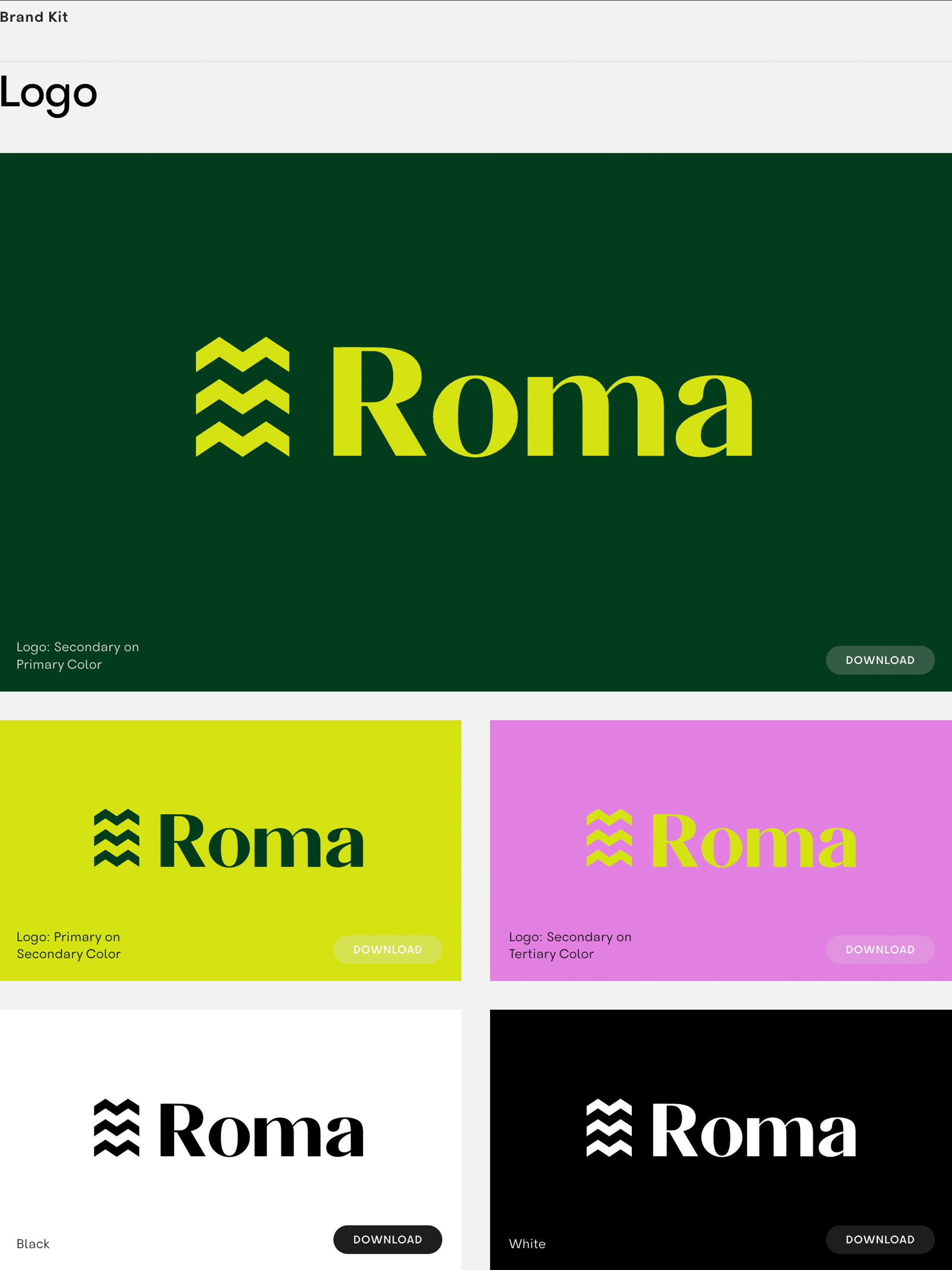
Step four: Finally, use one of the color presets that look modern, and check out the automatic brand kit section right below the logo editor to see how everything comes together. To customize the three preset colors, go into the gray sidebar at the top right, open up the Colors section, and click on one of the three fields. There, you can either select a new color or use the color picker to pull a color from another document or photo you have open on your computer.
There’s no need to get your brand visuals right from the beginning. A brand is a living project, and you can refine your designs as you develop your business.
Consider the step-by-step development of building a brand “lean style,” but in reality, building a brand is an ongoing process—for big brands, too.
Adjust colors and font weights as you see fit in a gradual fashion. Let’s say that during your web design process, you find that the light yellow you use could be a little lighter; adjust it and move forward with that tone instead. Over time, you build a rock-solid version that suits your real-life needs. That’s what good design is about: functionality.
