How to best pair Google fonts with a logo
Angles for how to pair fonts
Font pairing by brand strategy
Sometimes, even designers intermingle font pairing decisions—should selecting a typeface happen by strategy or design? Basing your design decisions on strategy is always easiest because it pulls in objectivity and reasoning. After creating a baseline concept, you’ll still have plenty of opportunities to reflect personal choices.
Developing a brand strategy can be a daunting and long-term process, but since we’re all about shipping stuff quickly, here’s the shortcut for how to create a brand strategy in thirteen minutes:
Step 1, one minute: Write a factual one-liner about your business. Example: “Mojomox is an online logo maker allowing small business owners to DIY a modern, professional brand kit quickly.” No marketing jargon, just what it is (shop, app, service), who it’s for (small biz owners), what it does (creates logo and brand kit), and how it does it (modern, fun, and quickly).
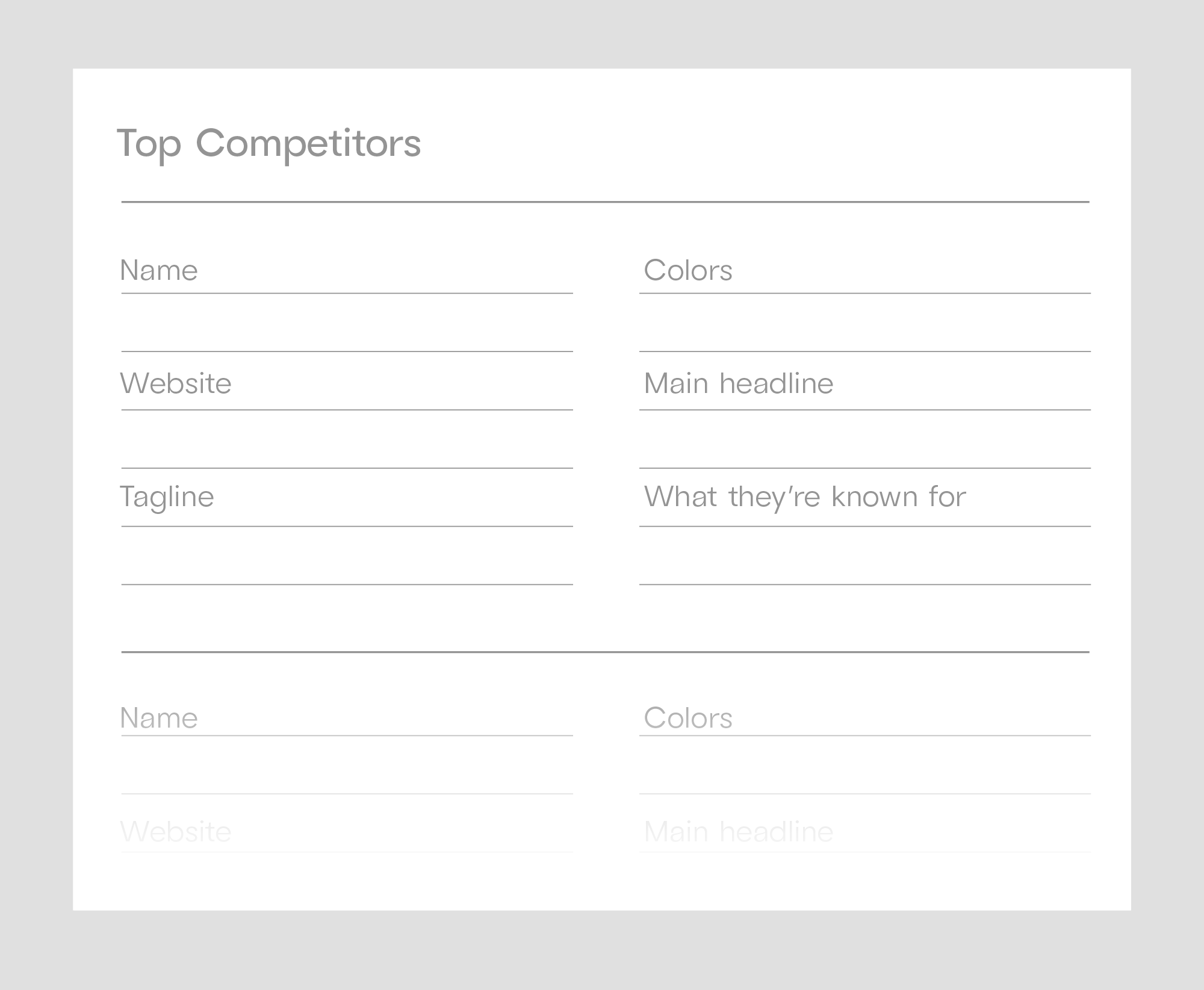
Step 2, two minutes: Write out your top five competitors and the one word that comes to customers’ minds when they think of each.
Step 3, ten minutes: Define your “one word.” Or two if needed. Pick a word that’s not yet taken by one of your competitors. The word doesn’t need anything obvious to do with your product, but it needs to be important to your customers. This “one word” shares a bigger idea of your brand, also called “positioning.” This is usually more significant than what you initially have in mind. Examples: “privacy” for iPhones, “magic” for Disney, and three more detailed examples.
This is brand strategy in a nutshell. However, having the strategic background in place makes it easy for you to create font pairings.
Brand strategy applied to fonts
Now, from your one-liner, distribute all the brand traits to a visual or tonal element. You don’t need to say things twice, but you can. Most importantly, make sure everything in your one-liner shows up somewhere in how you look and sound. There’s no right or wrong—in reality, some traits lend themselves more easily to be shown in a logo or in type, others are easier to apply to a color palette, tagline, etc. But since this article is about logo fonts and font pairings, let’s do an example under that lens using the Mojomox brand itself:
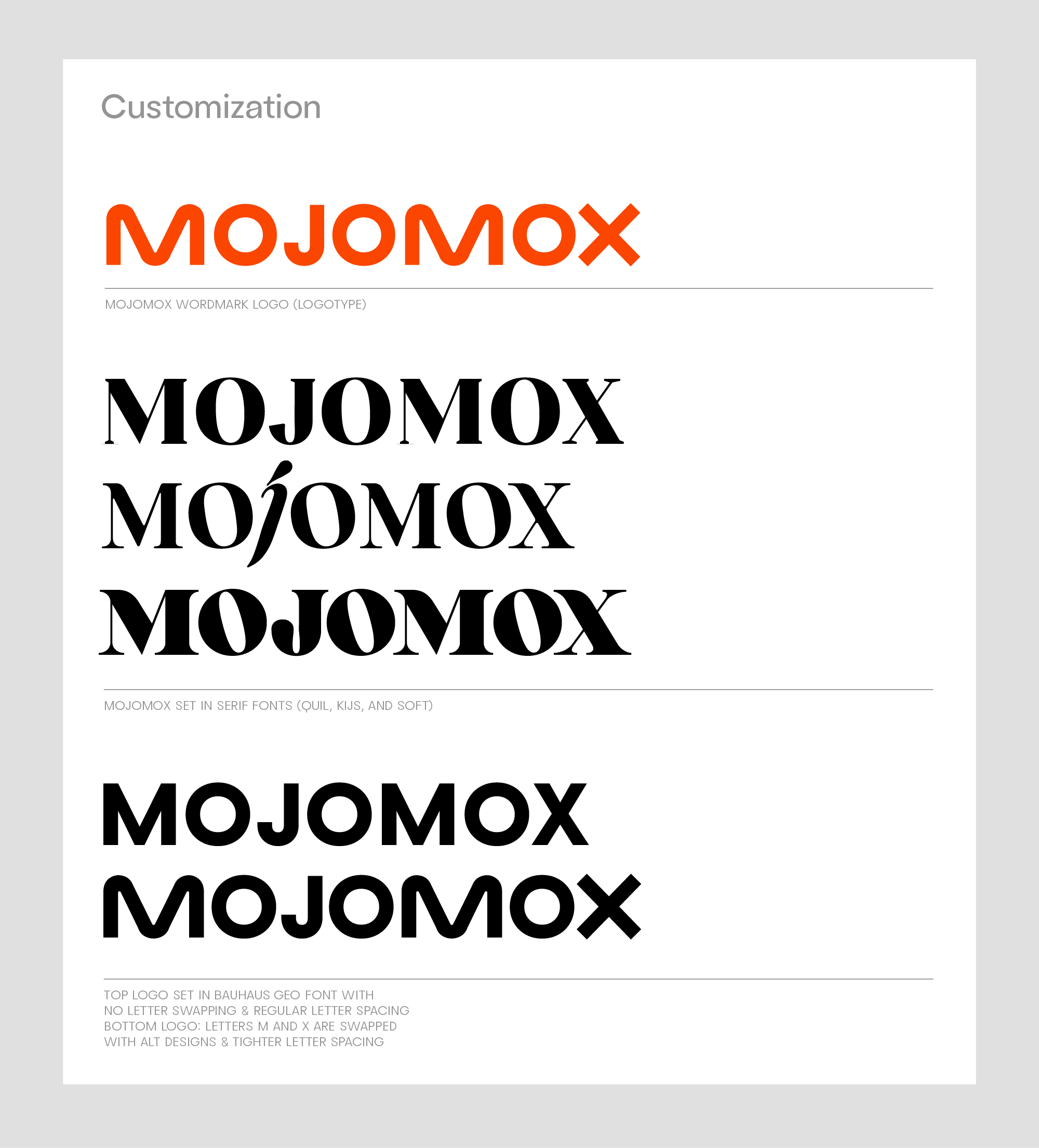
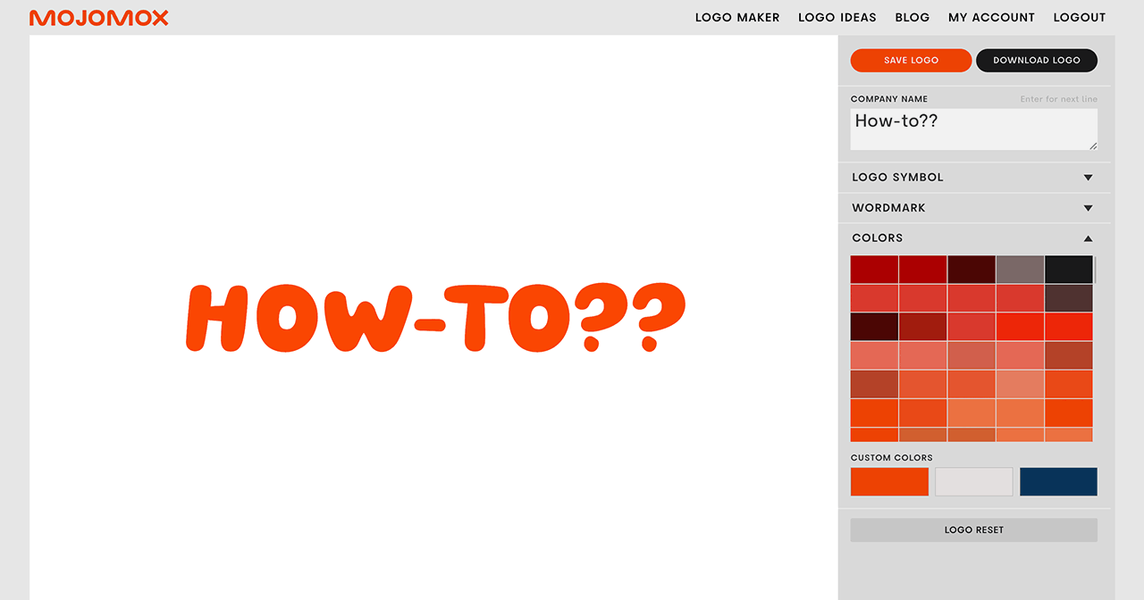
Logotype: The Mojomox logo is set in the geometric sans serif Bauhaus Geo with alternate letters M and X (inside the logo app, click on a letter of your brand name, which brings up a popup modal with other designs of that letter); semibold font weight and slightly negative letter spacing (also called kerning). The logo is set in all caps.
Picking a sans-serif type makes the Mojomox wordmark look simple and “no-fuss”—this speaks to people looking to create something quickly. Having alternative letters, M and X, that don’t come from a standard geometric typeface makes the mark more unique and fun. Setting the logotype in all caps and slightly tighter makes it look younger and bolder (without using a very bold font weight).
Font pairing by design
I have a logo—what’s next in the font pairing process?
First off, the primary brand font doesn’t need to have anything to do with the logo font. However, note a few design elements that stem from your logo font by peeling back three layers:
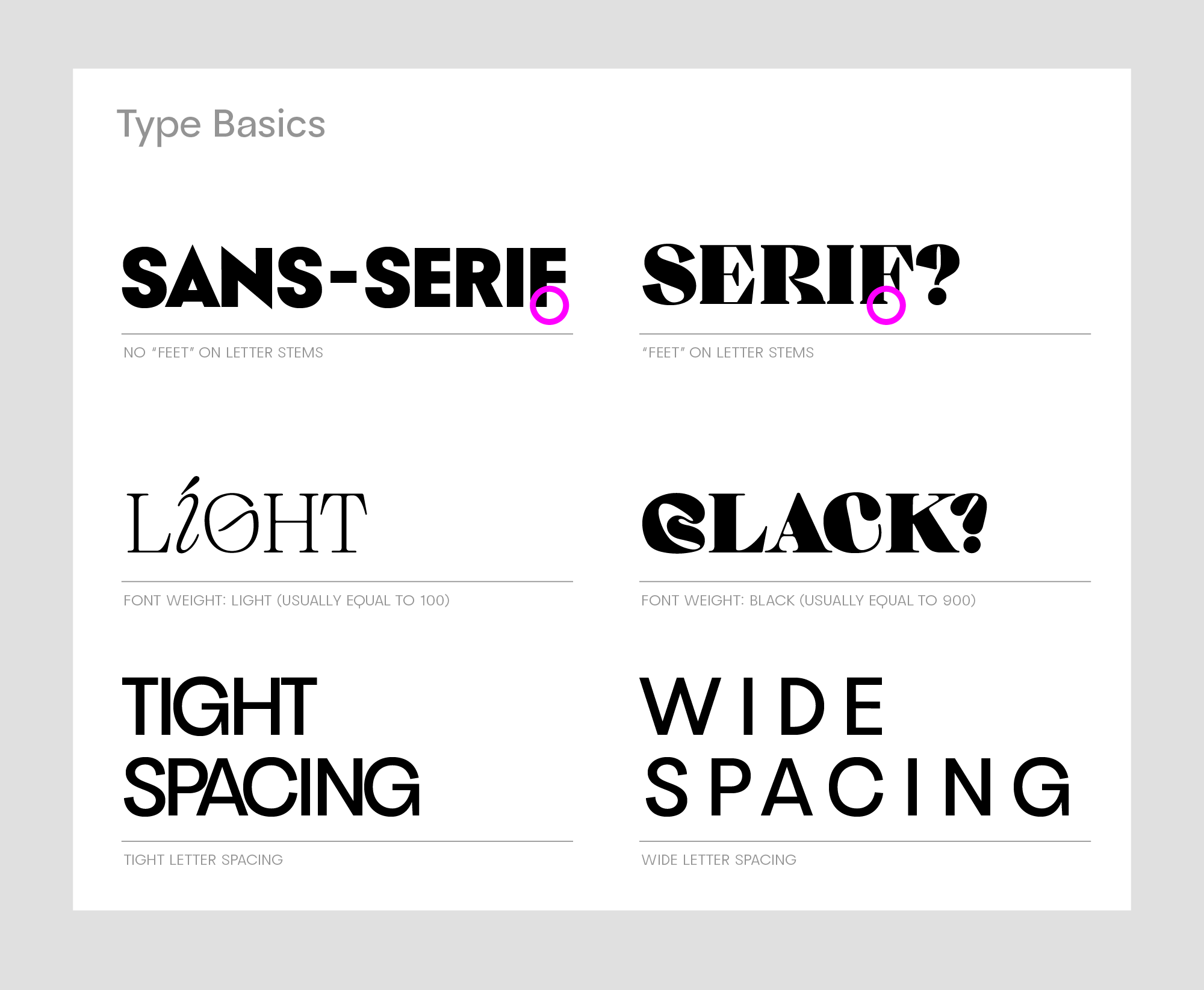
Layer 1—Basics: Is it a sans or a serif? Is it Light or Extrabold? Does it have tight letter spacing, or is it pretty airy? Is it set in all caps, title, or lowercase?
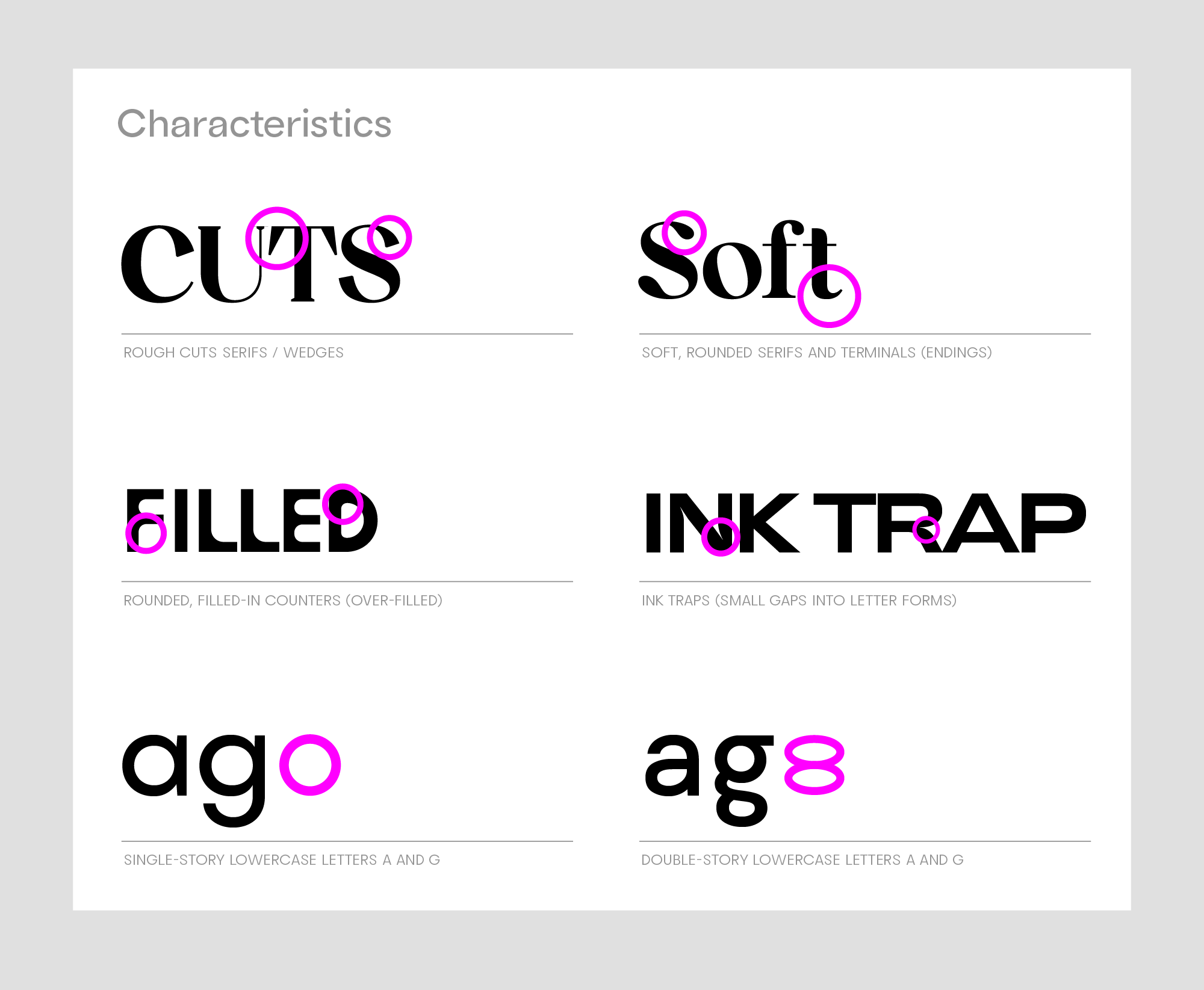
Layer 2—Type details: Any font details that stand out? Are the serifs rough cuts, or are they soft? Are the counters filled in, or are there ink traps?
Layer 3—Letter specifics: Are any of the letters unusual? Tilted letter O? Very short letter t? Double-story letters a and g?
From the analysis above, what brand aspect is not reflected (enough) in the logo? Could you strengthen this aspect by picking an additional font with similar traits? Or is the logo set in stone but could use a counterbalance from a strategic standpoint? Then, pick a font that supports balancing qualities.
Selecting a primary font
The primary font is a typeface the customer sees most often. Usually, that’s big headers on a website or a direct mailer. And sometimes, that’s also the body copy if the same font is selected. They can be the same font in the same weight but don’t have to be. They can be of the same font family in different weights (Extrabold and Regular weights) but don’t have to be. Or, they can be different fonts altogether. There’s no right or wrong—it’s all about the visual style and tone you want to create.
From your logo typeface’s traits above, pick one or two that you want to strengthen or counterbalance. Head over to Google Fonts and select 10 fonts that could potentially be a fit.
What fonts could be a fit?
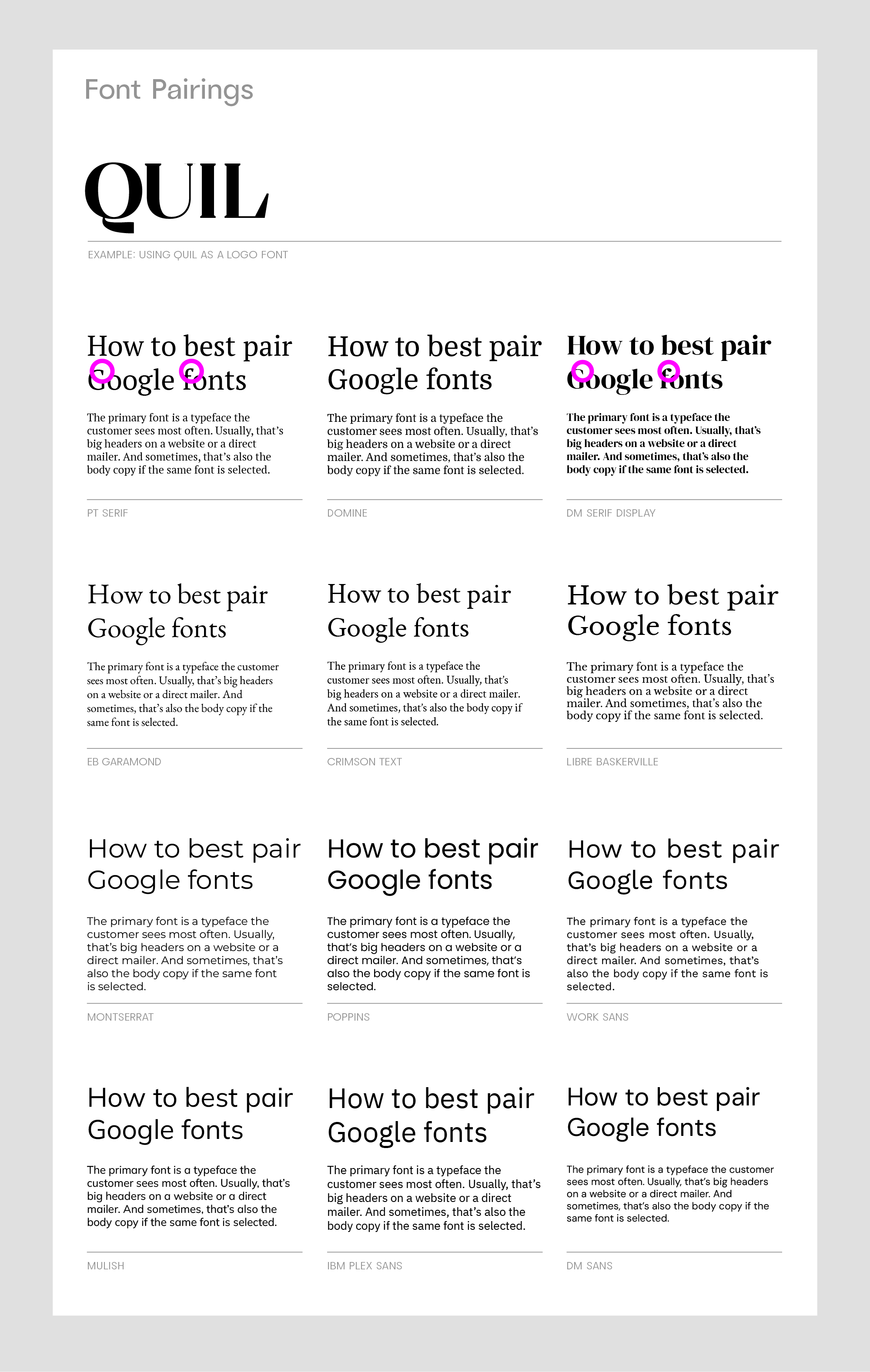
You’re looking for similar design aspects here—so, for example, if your logo font is Mojomox Quil with sharp, cut serifs and you want to emphasize the concept of “craft,” fonts like PT Serif or Domine would be a great supportive fit. If you want to add a bit of “history” instead, classic styles like EB Garamond, Crimson Text, and Libre Baskerville are great choices. For boosting a softer and friendlier tone, DM Serif Display is excellent. DM Serif Display features sharp serifs on letters E and s like Quil but has rounded terminals, e.g., letters a and j.
Going away from the serif font choices, you might be interested in adding approachability or simplicity to your brand concept. Picking a sans-serif type is an easy way to do that. Modern fonts that pair well with Quil are Montserrat and Poppins—both are very popular and might feel overused. Alternatives are Work Sans (very approachable in tone), Mulish (geometric and open), IBM Plex Sans (for a more technical feel), and DM Sans (cool, modern).
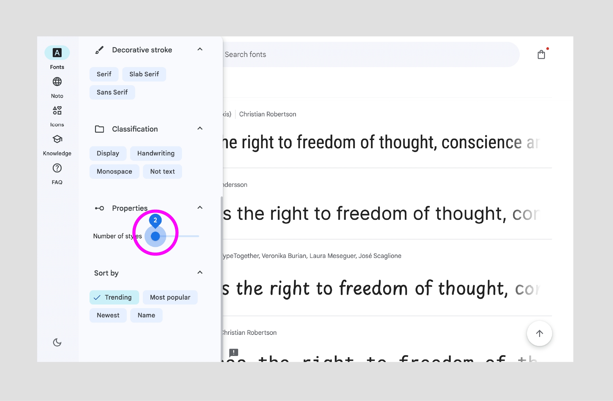
Tip: In the Properties panel (left sidebar in Google Fonts), set the “Number of styles” to 2 or more. Having only one font weight for headlines and body copy is rarely enough. You can also use variable fonts with an axis for “weight”—variable fonts usually include what amounts to four or more font weights.
Still in Google Fonts, type your best brand headline into the type tester tool. Don’t use Lorem Ipsum copy or a poorly written line—the closer the text gets to reality, the easier it’ll be to see what’s right.
What about a secondary font?
We’ve been in a more minimal design phase for the past decade or so. The ongoing trend is to only use what’s necessary—restrict embellishments and eliminate secondary fonts. Instead, work with larger font families and use formatting (uppercase, letter spacing, color) for more design variety.
Of course, you can ignore that if you like. If you have a brand whose trait is abundance or playfulness, you might find a secondary font a welcoming addition.
Font pairing by technicalities
Other ways to pair fonts are by technical characteristics.
By frame/skeleton: If two fonts have the same x-height (height of the lowercase letters) and cap height (height of the uppercase letters), they match more easily.
By designer: Type designers often have a style that carries through font designs like a common thread. Using fonts from the same designer can make pairings a more organic fit.
By use case: If your brand is a scientific journal or a site translated into many non-Latin languages, picking a typeface might also be restricted by ensuring all needed glyphs are in the font, for example, a more extended selection of math symbols.
By legibility: While legibility is also a part of functionality and being functional is essential to any design, finding a font that’s super easy on the eyes doesn’t need to be your primary goal if your brand’s site uses mainly one or two-paragraph text snippets. In contrast, finding an easy-to-read typeface is necessary if you’re a publication that publishes 6000-word articles.
In a nutshell
When it comes to finding the right font to pair with a logo, know there’s no right or wrong, but instead, you get to strengthen or counterbalance a brand’s positioning and tone. Like the logo and color palette of a brand, a brand’s typeface functions as a central element that helps people identify brands and creates the string that pulls brand assets from website and business cards to packaging together.
