Logo Styles · Long read
Boho meets
01What is a Boho logo style?
Boho, short for "Bohemian," is a style often associated with artists, writers, and intellectuals. It pulls inspiration from different cultures, historical periods, and the natural world.
In the same vein, Boho logos express a free spirit and unconventional living through a personal, natural lens — thinner weights of serif and sans-serif fonts, blended with romantic layering in earthy tones, cosmopolitan pattern-like symbols, or individualised wordmark styles.
02Origins of Boho.
The Bohemian aesthetic draws inspiration from the wandering way of life led by the Romani community between the late 1800s and early 1900s. The label "Bohemian" comes from the French "Bohémien," historically linked to the Roma and an incorrect belief that their roots traced back to Bohemia, now the eastern part of Czechia.
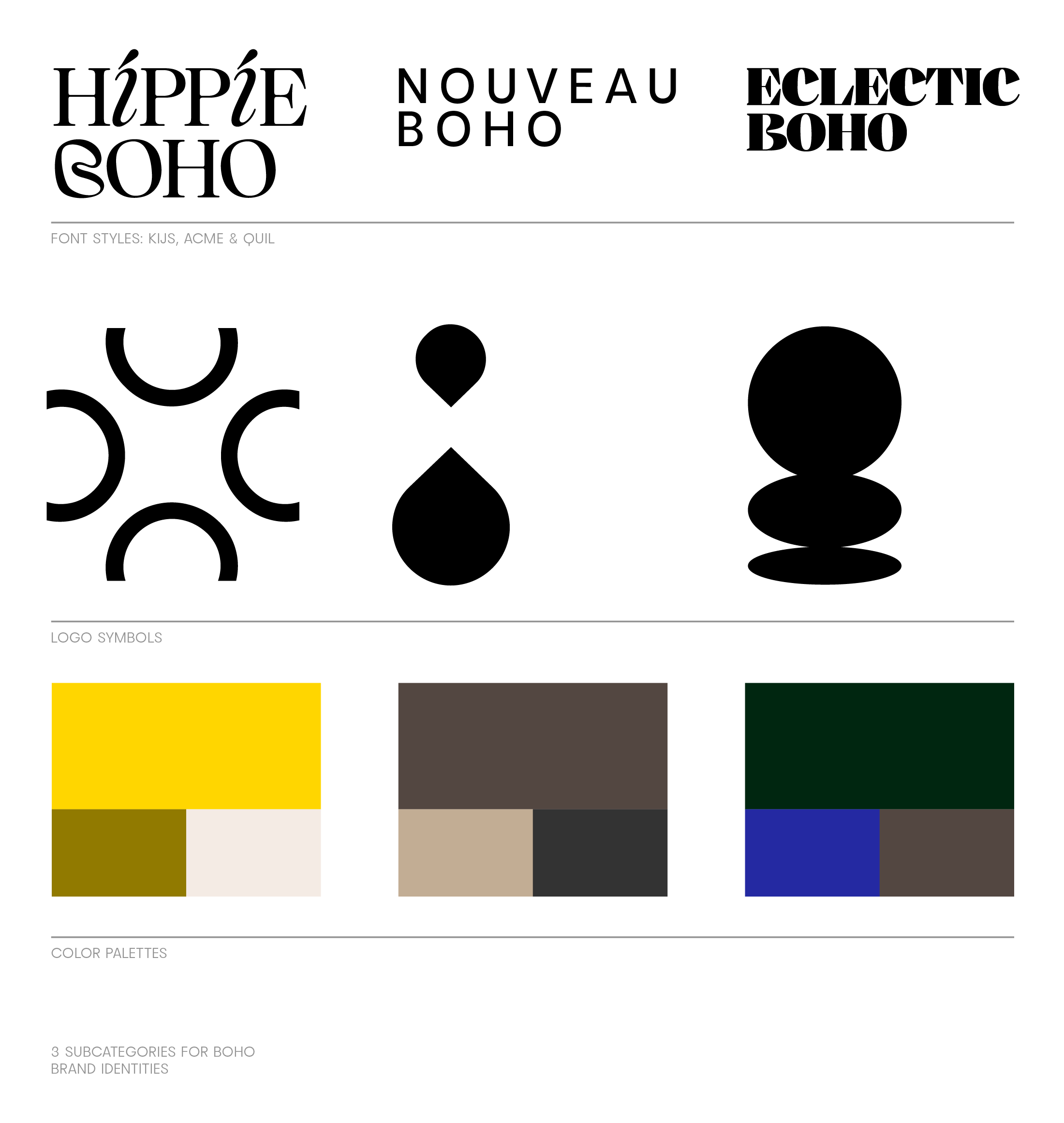
03Three Boho subcategories — the Hippie, Nouveau, and Eclectic.
The Boho style celebrates individuality, freedom, and a deep connection with the world around us. The umbrella encompasses subcategories that each carry a distinct visual identity.
— The Hippie Boho
Personal and flowy. Natural, warm tones in lighter and medium colors; friendly, romantic handwriting; thin contrast and serif fonts. No symbol, or a light, symmetric emblem — a sun, rainbow, rainshower. Not too much color contrast.
— The Nouveau Boho
Chic and minimal. Earthy tones in lighter hues contrasted with darker accents; a more graphic appearance; thin and medium-weight font styles in both sans-serif and serif. Skillful personalization of wordmark logos, often in all caps with generous spacing.
— The Eclectic Boho
Established and polished. Decorative or strong font choices, serifs in medium and bolder weights, contrast fonts in all caps. No symbol, or a detailed, stamp-like mark. Darker palettes in ochre, brown, and green hues. Patterns, layers, bold choices. No need for perfection.
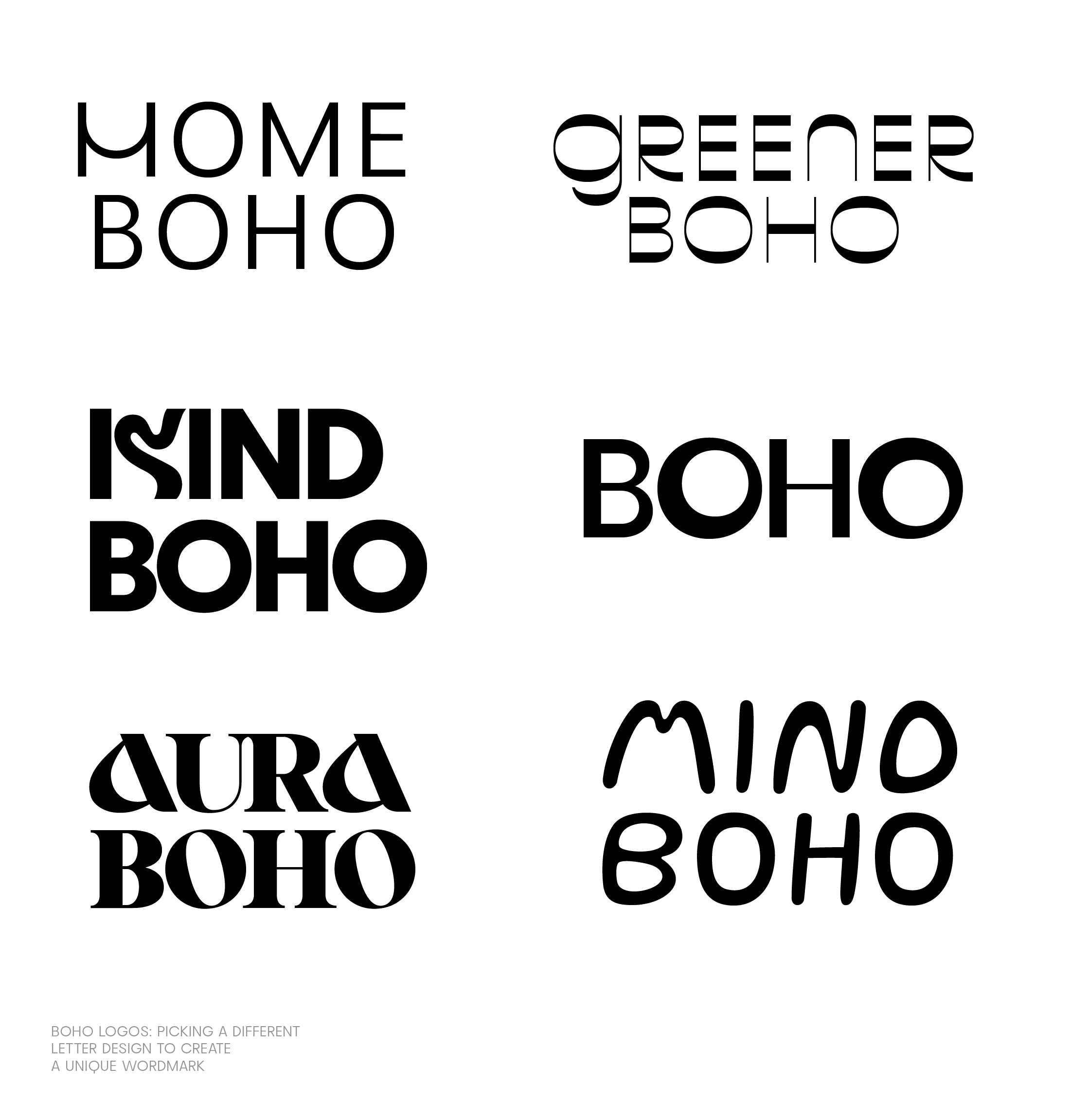
04Symbols & wordmarks.
When designing the mark itself, consider not using a symbol at all — and going for a wordmark instead. Wordmarks consist only of text; they can feel less corporate and more personal. To get a text logo to stand out, swap a letter for something more distinctive. You can do this easily inside the Mojomox app.
If you prefer a symbol, lean toward geometric, free-form, or abstract styles rather than realistic illustration.
Try it yourself
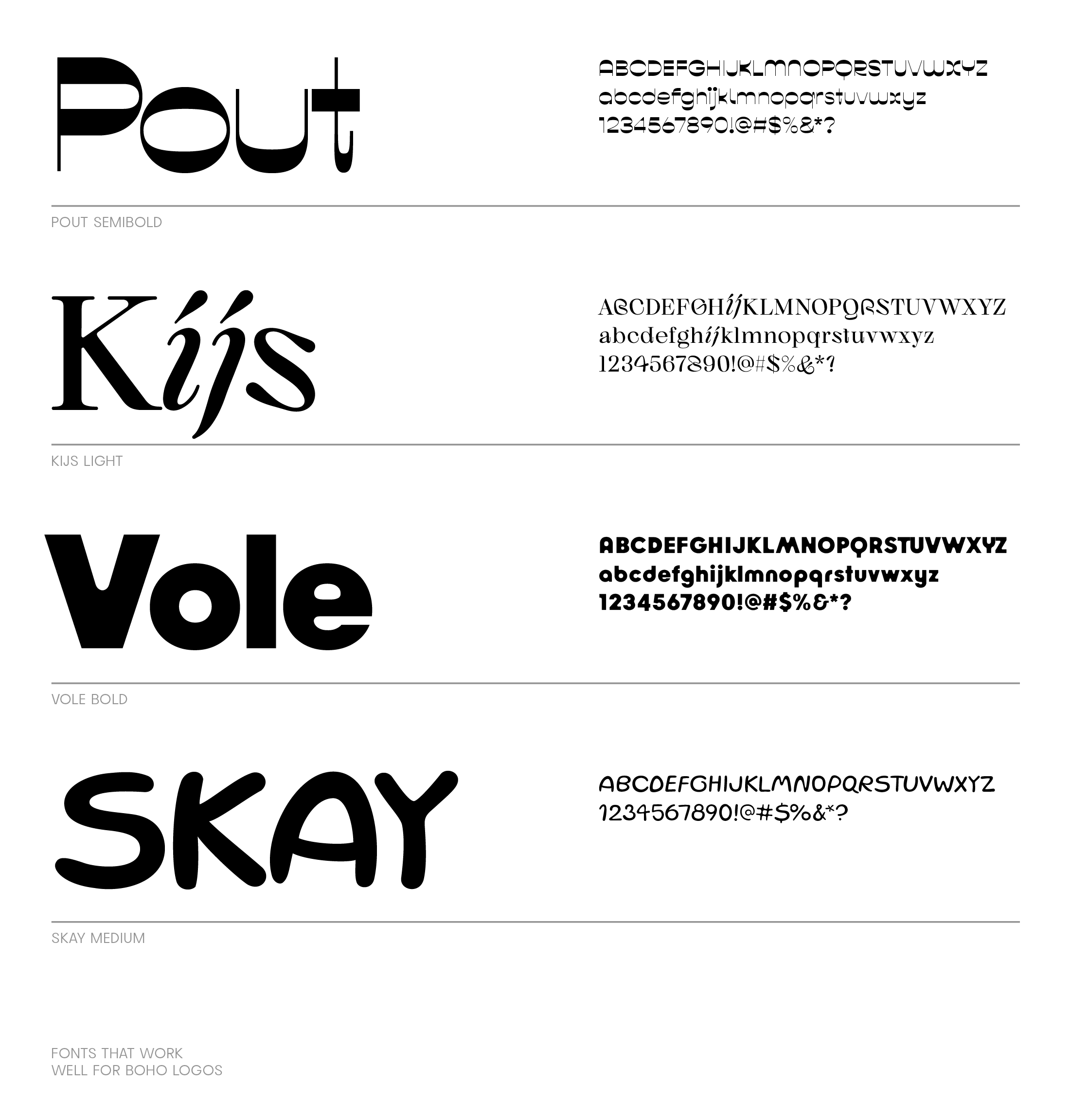
Open the editor →05Boho font styles.
For diving deeper, there's a collection of Boho fonts on the font shop. Below are four favorites — a contrast serif, a wedged serif, a thin sans, and a handwritten display.
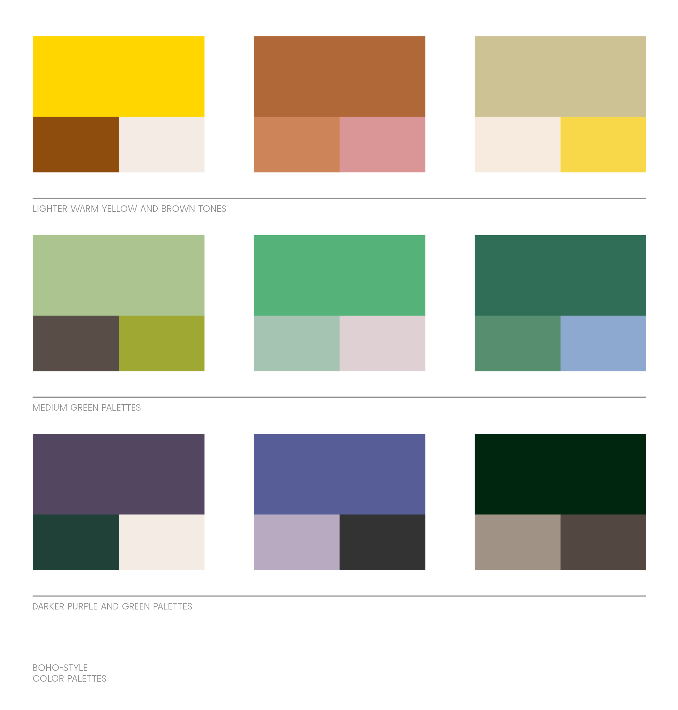
06Color palettes.
Brand palettes usually consist of three colors — primary, secondary, and accent — plus tints and shades. Pick your main color first, then build outward.
07Where brands intersect with a Boho philosophy.
The obvious fit is a brand that lives the philosophy in its product — home decor, jewelry, clothing, bags, shoes, wellness, and beauty. Food, farming, and community projects can land here too.
Overall, you're aiming to:
- Create an earthy, free-spirited brand identity.
- Cater to a target audience that values individuality and a connection to nature.
08Visualization styles.
— Layering
Boho mixes colors, patterns, and textures. In graphic design, you can use transparencies, gradients, fading, and pattern overlays to reinforce the idea of layering. Pair an old-style typeface with a modern one — heirlooms next to contemporary pieces.
— Nature-inspired
Plants, feathers, natural materials. In branding, product shots can use plants and natural accessories to complement the look without falling into pastiche.
— Craftsy
Macramé, crochet, hand-drawn doodles. Earthy palettes in warm hues and muted pastels carry the craft feel; a handwritten display font like Lace or Skay seals it. Pair display fonts with a readable secondary font for long-form copy.
— Cosmopolitan
Motifs from diverse cultures — Eastern European, North African, Indian. Geometric symbols, floral elements, and paisley add layers without falling into kitsch.
Logo maker
Type a name, swap a letter, and watch the logo come alive.

Saskia
Founder, Mojomox
Saskia is a designer and the founder of Mojomox. She writes about logos, type, and the working craft of identity.
